-
-
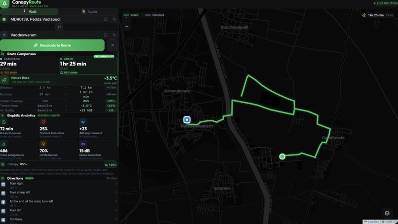
Dark mode
-
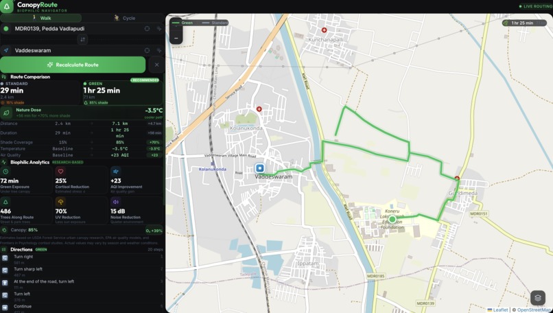
Standard mode
-
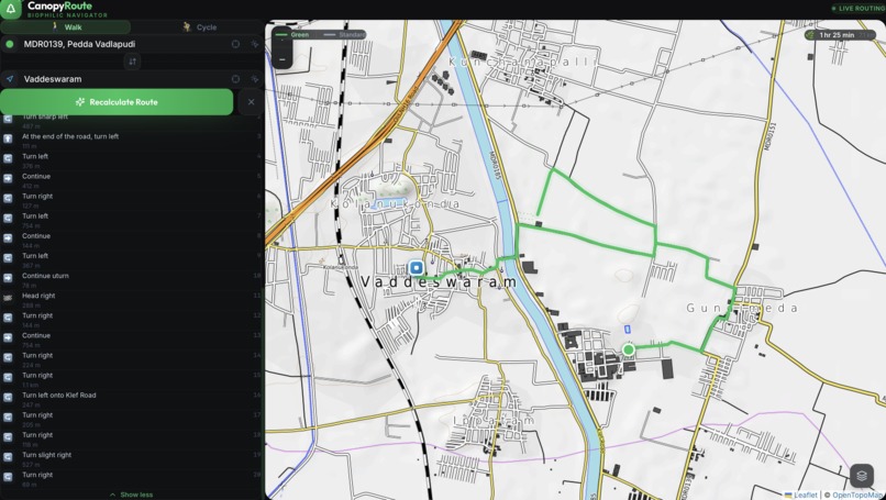
Terrian mode
-
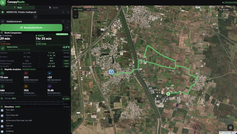
Satellite mode
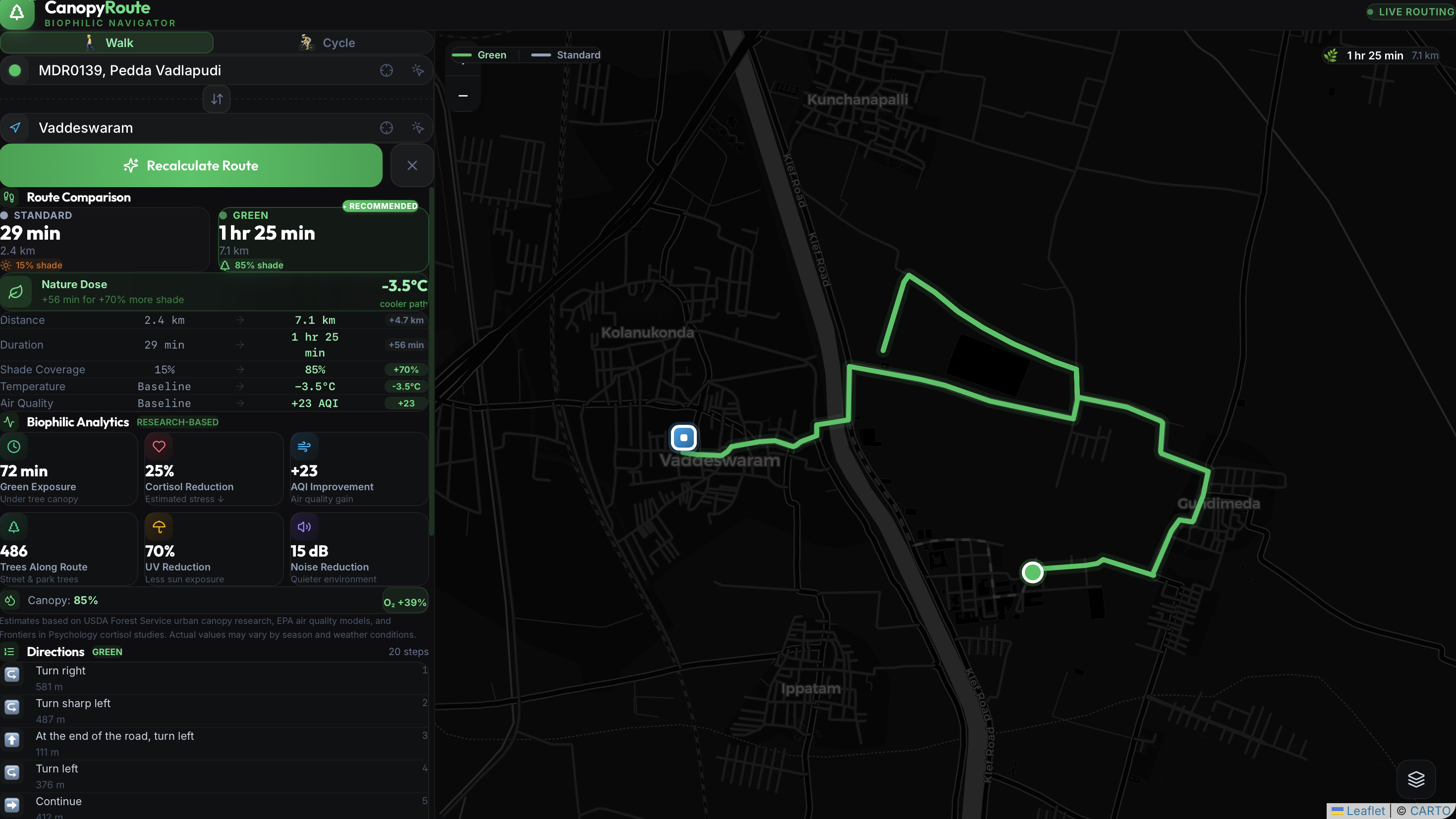
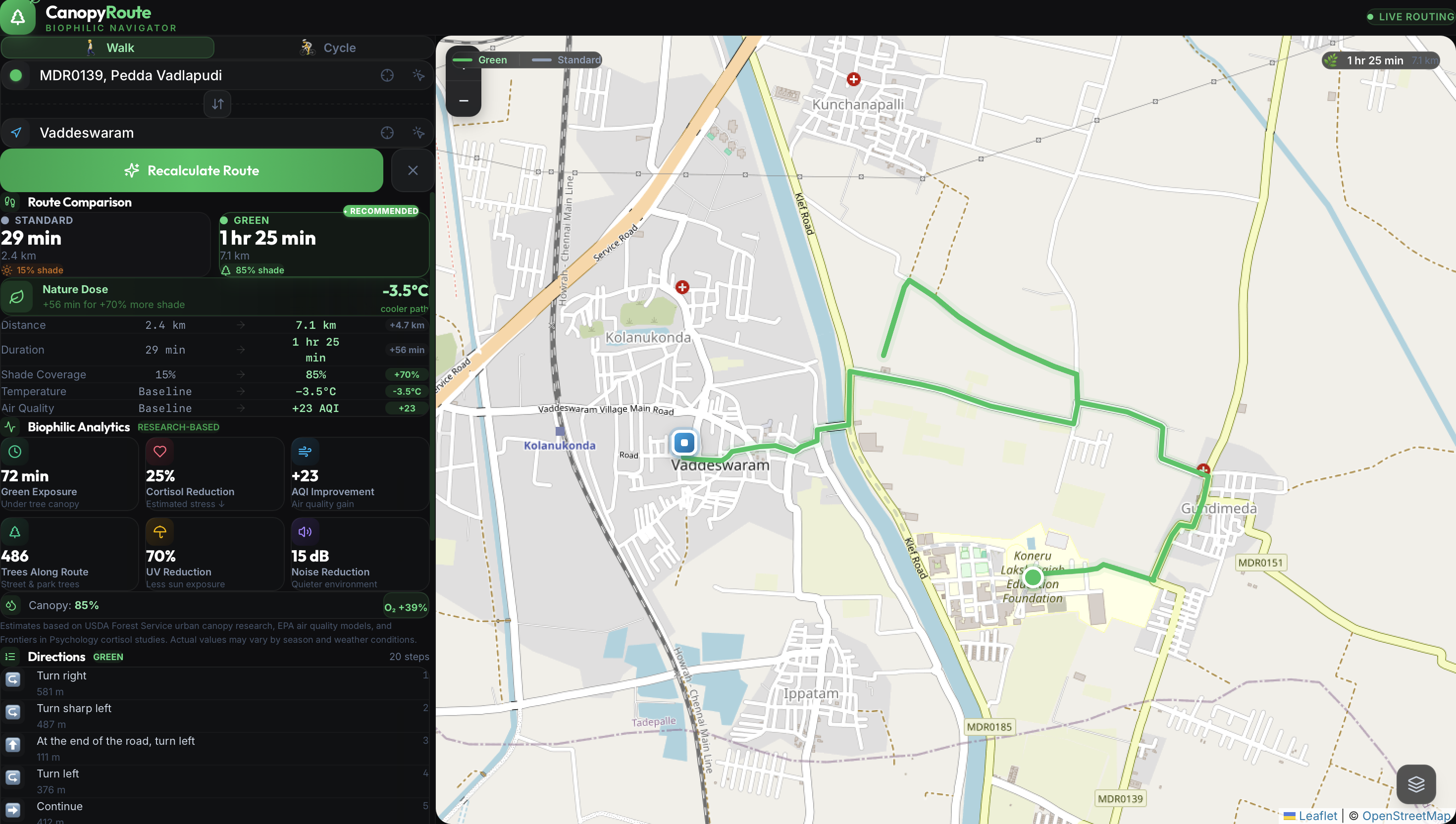
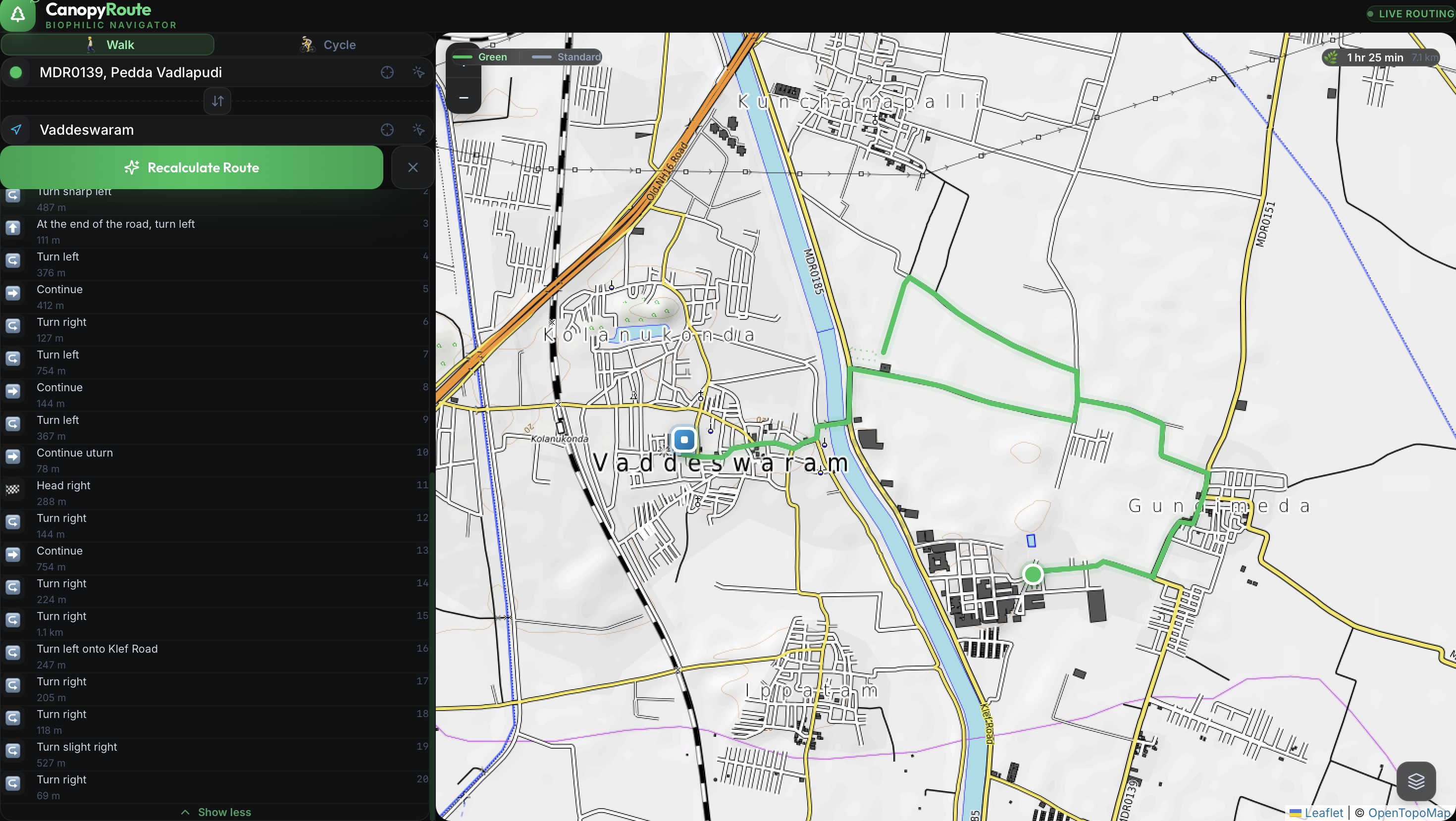
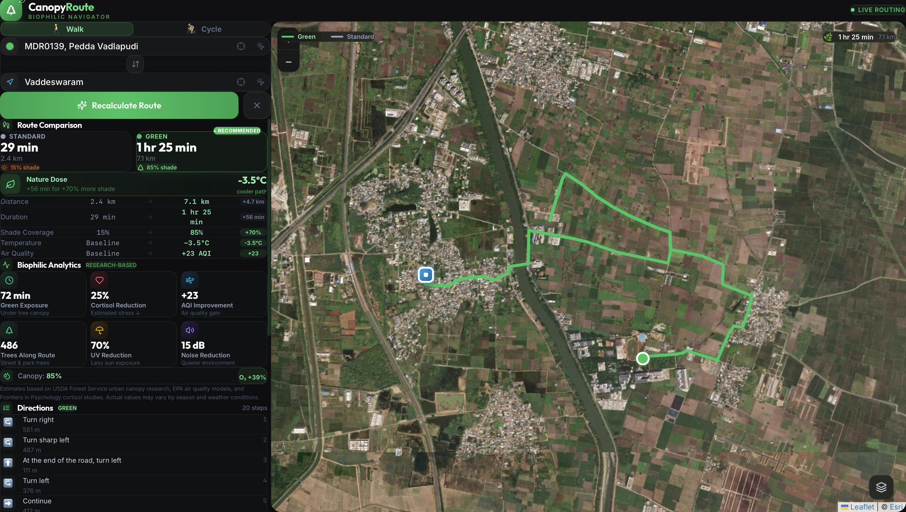
Inspiration When we navigate through cities, standard mapping applications optimize for one metric: speed. They route pedestrians and cyclists through the fastest, most direct corridors, which usually means heavy traffic, concrete pavements, and zero shade. Living in a busy urban environment, I realized this constant exposure to "urban heat islands" actively degrades our daily mental and physical health, while also isolating us from our neighbors. I wanted to build technology that doesn't just move people efficiently, but moves them healthily—encouraging community connection and a reconnection with nature.
What it does CanopyRoute is a biophilic navigation dashboard. Instead of calculating the fastest path, it calculates the greenest path.
Users input their starting point and destination, and the app provides a dual-route comparison: The Standard Route: Fast, but with high heat stress and zero canopy coverage. The Canopy Route: A slightly longer path optimized for maximum tree shade, pocket park density, and lower micro-temperatures. The dashboard also calculates a "Nature Dose" score, visualizes Air Quality Index (AQI) improvements, and pinpoints community POIs like heritage trees or urban gardens along the way, encouraging users to interact with their environment rather than just walking through it.
How we built it To bring this vision to life within a 24-hour sprint, I relied heavily on modern full-stack web development practices. I built the application's interactive frontend using React and Tailwind CSS, which allowed for rapid, responsive UI scaffolding. For the visual geospatial component, I engineered interactive SVG map overlays to simulate live biophilic data layers—demonstrating how a production-level mapping engine would render the routing geometry and nature hotspots.
Challenges we ran into The biggest hurdle was determining how to represent complex environmental data (like canopy density and micro-climate temperatures) in a way that felt accessible to an everyday user. Raw data can be overwhelming, so the challenge was synthesizing those data points into an easy-to-read "Biophilic vs. Thermal" matrix and a single "Nature Dose" score. Additionally, mocking the geospatial routing logic without relying on heavy, paid mapping APIs required creative problem-solving with SVG paths.
Accomplishments that we're proud of I am incredibly proud of the user interface and the dual-route comparator. The app successfully bridges the gap between raw environmental data and human wellness, presenting it in a clean, visually striking dashboard. Proving that navigation can be centered around nature and community—rather than just cars and concrete—is a huge win.
What we learned Building CanopyRoute reinforced the idea that software engineering is not just about writing algorithms; it is about shaping human behavior. By simply tweaking how a route is calculated, technology can encourage "pro-social" behavior, pushing people toward shared green spaces where community interaction actually happens.
What's next for CanopyRoute The immediate next step is transitioning the simulated data into a fully production-ready backend. I plan to integrate live OpenStreetMap (OSM) data for global park mapping, connect live AQI and weather APIs to pull real-time heat index data, and add a crowd-sourcing feature so local communities can tag new, unmapped community gardens or shaded walking paths.
Built With
- css
- html
- javascript
- node.js
- react
- svg
- tailwindcss
- vite

Log in or sign up for Devpost to join the conversation.