-
-
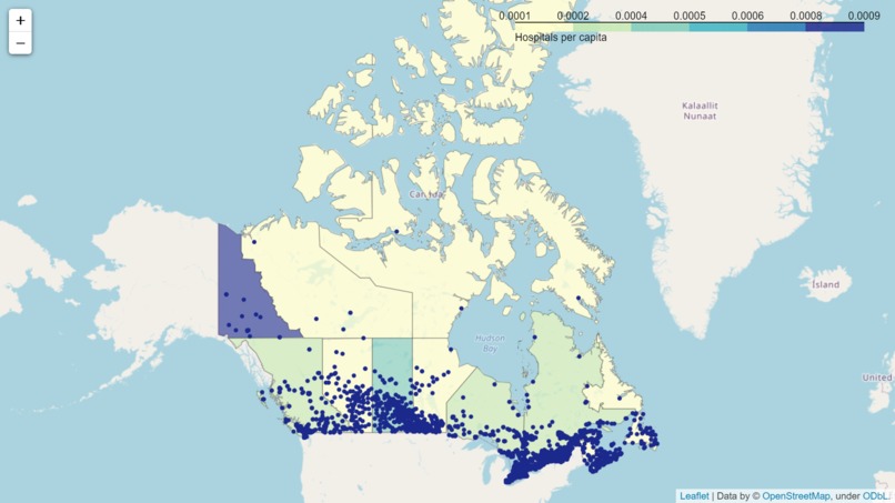
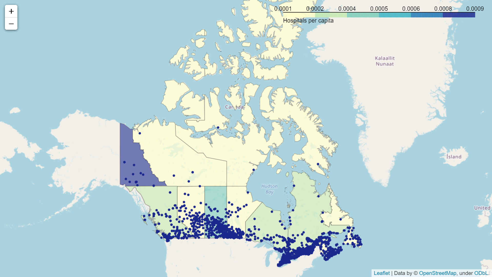
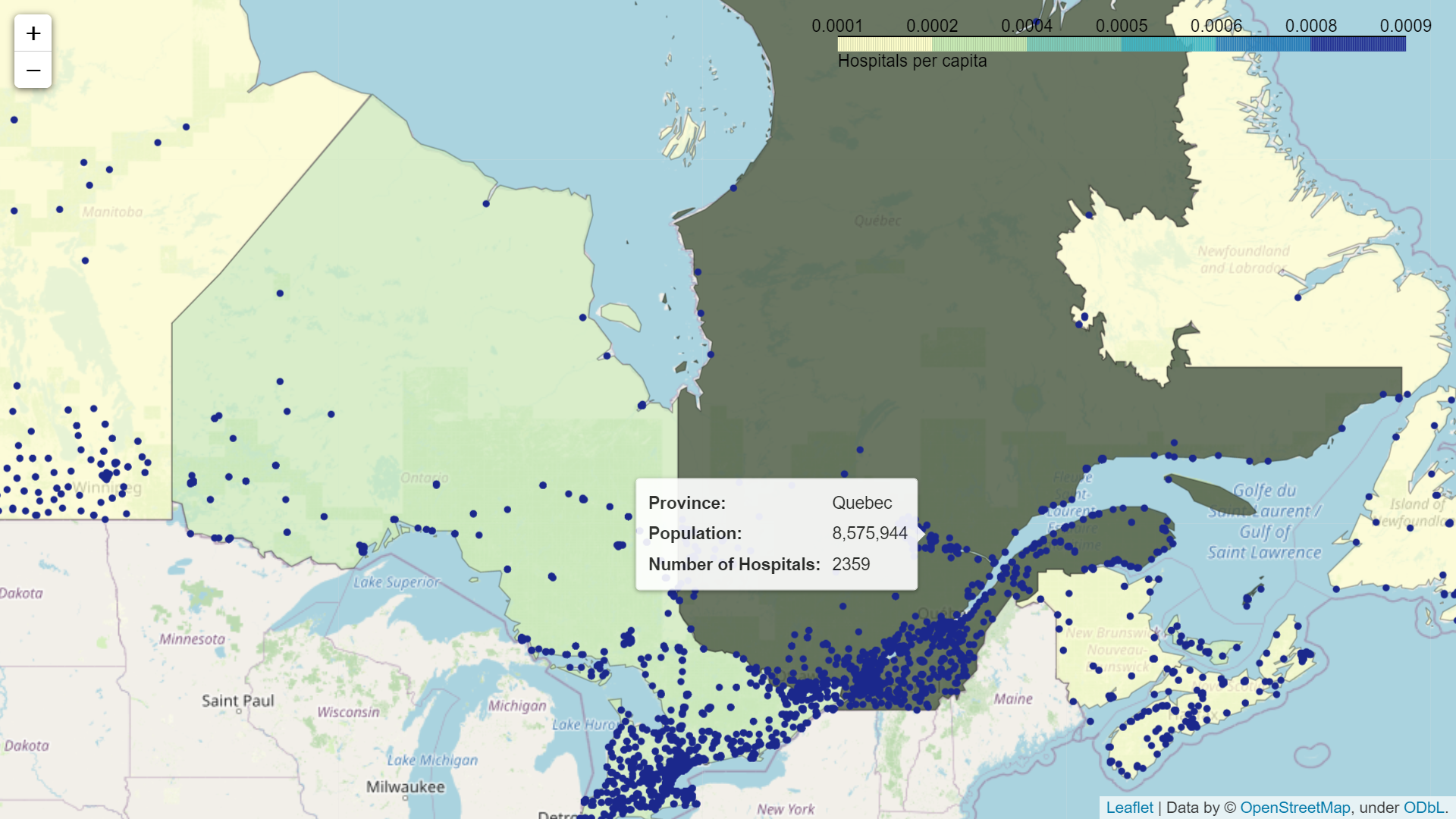
Interactive Choropleth Map: Canadian Hospitals by Province/Territory
-
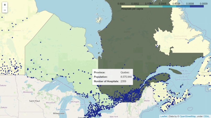
Map Demo
-
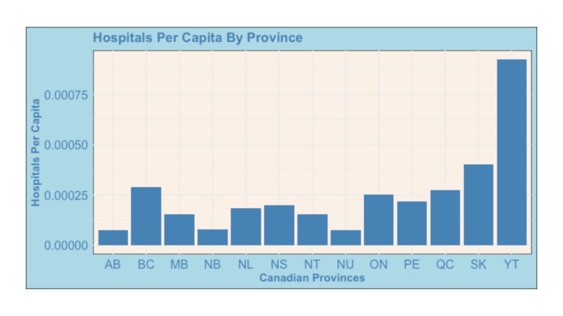
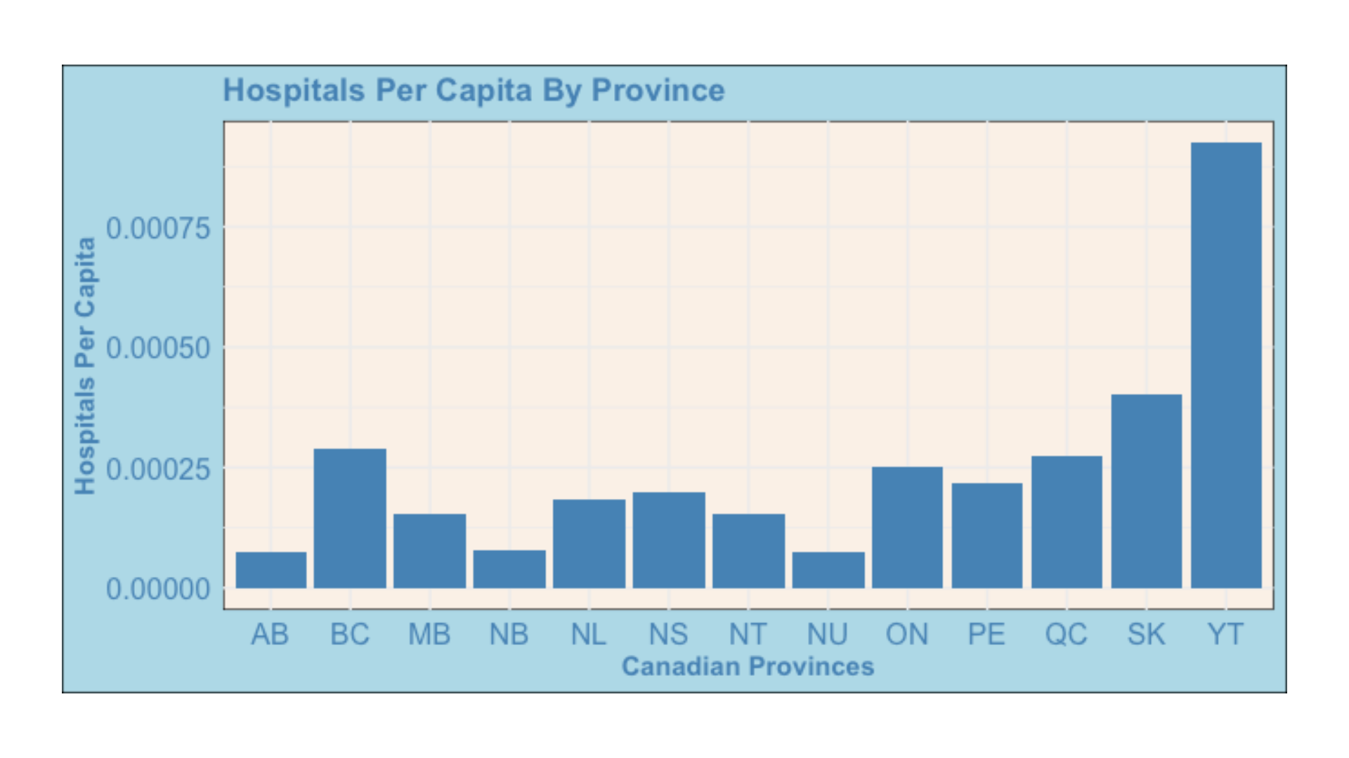
Bar Graph: Hospitals per Capita by Canadian Province
-

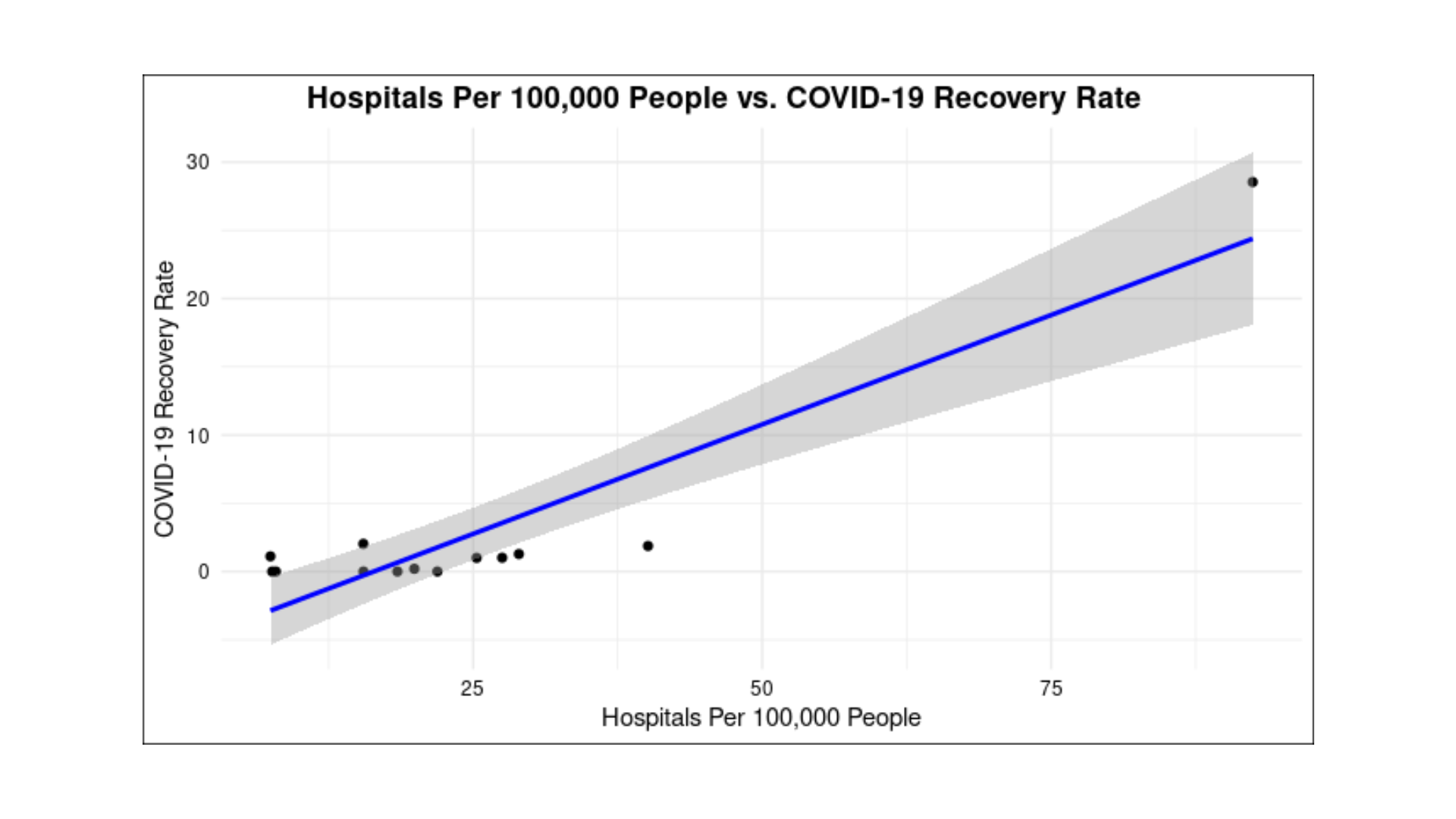
Linear Regression: Hospitals per 100,000 vs COVID Recovery Rate
-
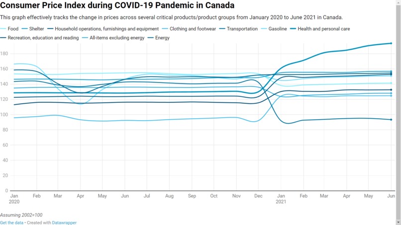
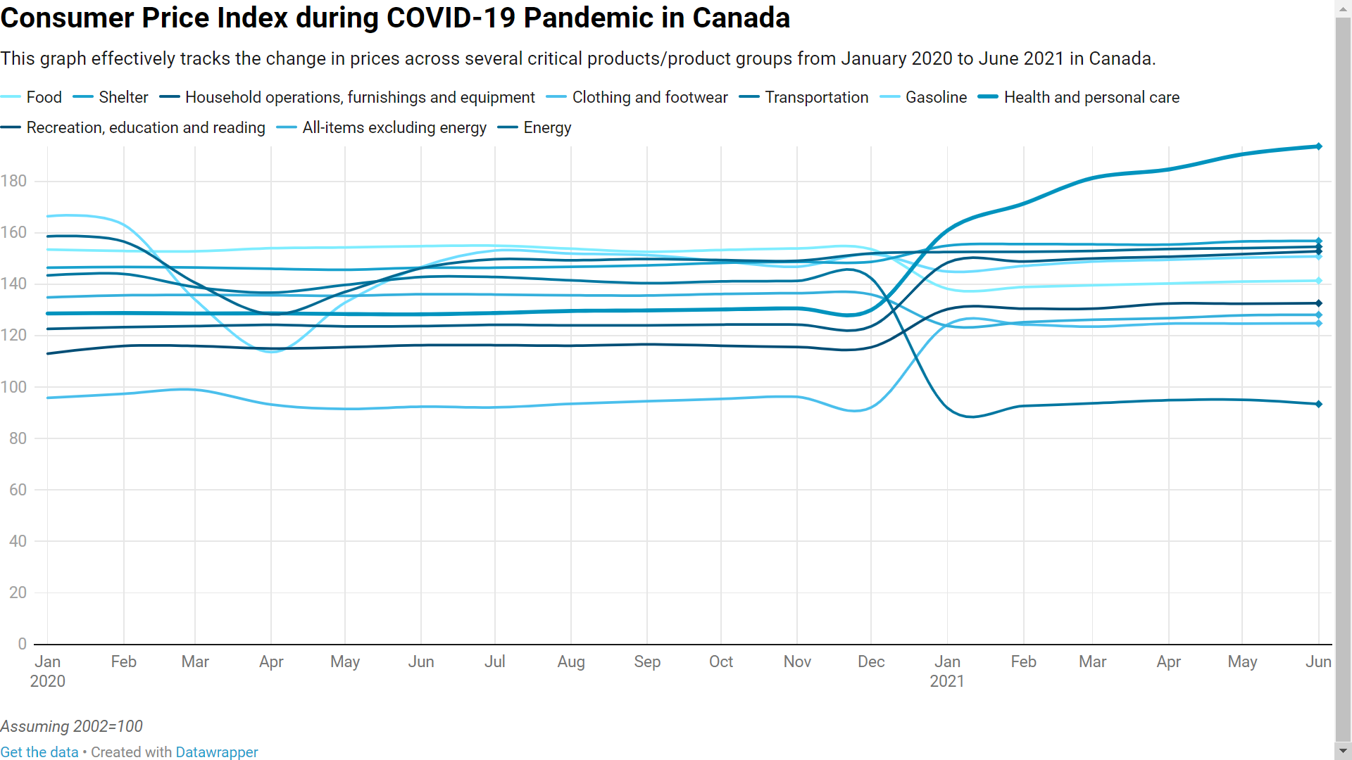
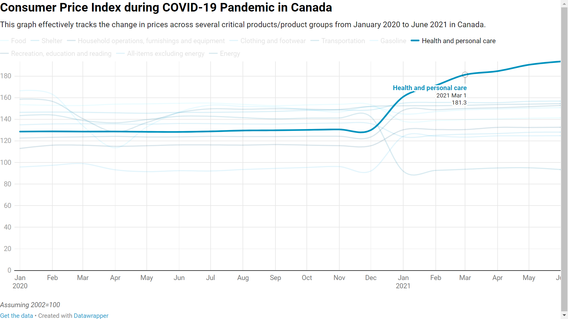
Interactive Line Graph: Canada Consumer Price Index during COVID-19 Pandemic
-
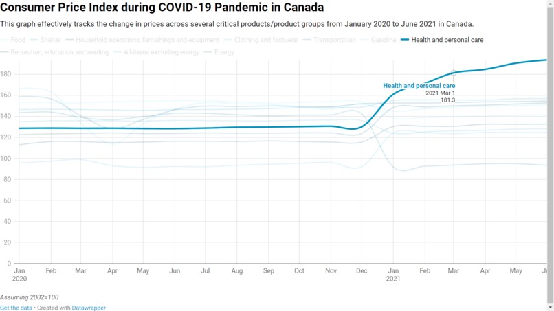
Line Graph Demo
Inspiration
We wanted to analyze the impact Canadian Health facilities and the impact that COVID-19 has had on them. Knowing that COVID is still a large part of our lives, analyzing Canada has allowed us to demonstrate many key findings through visualizations like interactive maps, graphs, linear regressions, and charts.
What it does
Our project showcases Canadian healthcare facilities and the impact of hospitals on COVID-19. Our interactive map shows the number of healthcare facilities in Canada divided up by province and allows for individuals to hover, zoom in, and zoom out. Our graphs highlight many key findings of our visualisations using tools like R and datawrapper to create crisp charts and graphs. The Consumer Price Index graph is also interactive showcasing the changes in prices starting at the beginning of 2020 and spanning all the way to present. It also allows individuals to hover over a specific product and see the increases/decreases in overall price.
How we built it
Python, along with the Folium and Pandas libraries, was used to create the interactive map (in Visual Studio Code). The linear regression and bar graph visuals were made in R (RStudio). The Consumer Price Index interactive visual was made in Datawrapper.
Challenges we ran into
As every member on our team were beginners with little/no experience in visualizing/coding, we faced the extra issue of learning while creating the project. Using Python/Folium was a very difficult process that was riddled with errors and setbacks, as with cleaning public datasets for use in our analyses.
Accomplishments that we're proud of
The choropleth Folium map was our greatest accomplishment, as we progressed past many technical hurdles and made a fully interactive and coded visualization.
What we learned
Knowledge in Python and R were significant gains on our end, as this was our first real experience with applied data science. In addition, we learned a lot about using online resources and help to overcome technical challenges presented by programming.
What's next for Canada Health Facilities and COVID Analysis
Although we had a very rough time as beginners in this competition, we have enjoyed the work we have done as a team and we have seen each one of us grow as data visualizers. In the future, we hope to continue to spark our interest in STEM and potentially go into fields that incorporate data visualization. We are so grateful Vizathon has granted us this opportunity.

Log in or sign up for Devpost to join the conversation.