-
-
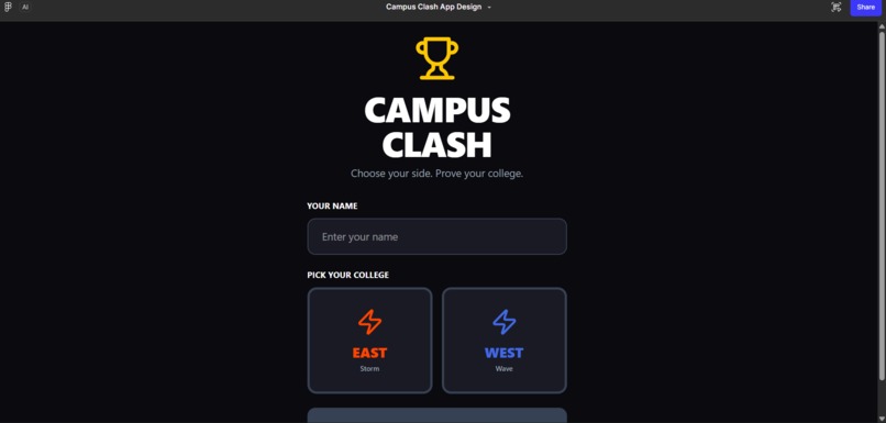
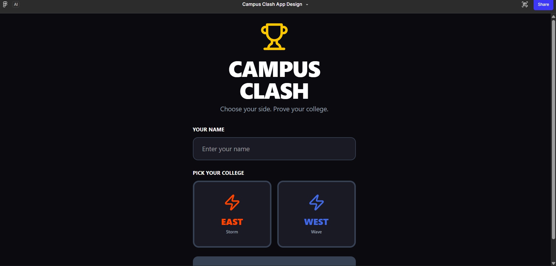
this is homepage of campus clash platform
Inspiration College rivalries are everywhere — in sports, fests, debates. But there was never a dedicated space for students to channel that energy digitally. We wanted to build something that turns college pride into friendly, fun competition. The "East vs West" theme sparked the idea — what if campuses could actually battle each other in real time? What it does Campus Clash is a mobile app where students compete in daily creative challenges — caption contests, photo battles, quizzes — vote on rival submissions, and climb a live leaderboard. Colleges are ranked East vs West, with individual profiles tracking streaks, badges, and past wins. How we built it We designed the entire UI/UX in Figma using an 8px grid system, dark-mode first approach, and a consistent component library. Adobe Express was used to create the brand identity — logo, badge icons, and challenge card templates. All screens follow mobile-first principles at 375×812px. Challenges we ran into Balancing information density was tough — the Arena screen needed to show live scores, countdowns, and active challenges without feeling cluttered. Designing the swipe-based voting screen to feel intuitive yet fun took multiple iterations. Keeping visual consistency across 6+ screens while maintaining energy and personality was a constant challenge. Accomplishments that we're proud of We're proud of how cohesive the final design feels — every screen tells the same visual story. The East vs West live score banner and the podium leaderboard design came out particularly strong. Using Adobe Express meaningfully for brand assets rather than as an afterthought was also a win. What we learned We learned how much micro-interactions and motion hints elevate a static UI. We also learned that great UX is about creating emotion — urgency, pride, excitement — not just clean layouts. Designing for a young Indian college audience taught us to be bold and not play it safe visually.

Log in or sign up for Devpost to join the conversation.