-
-
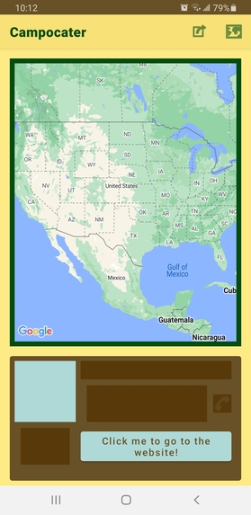
The screen when launching the app.
-
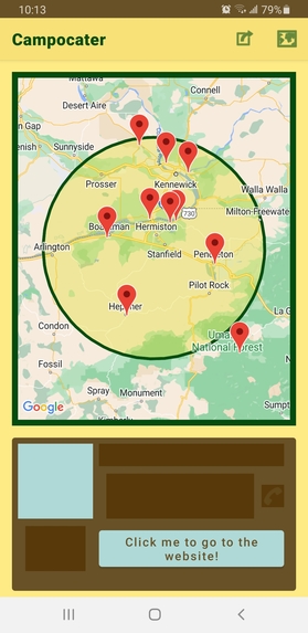
What the map looks like after tapping on a location.
-

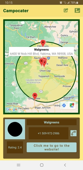
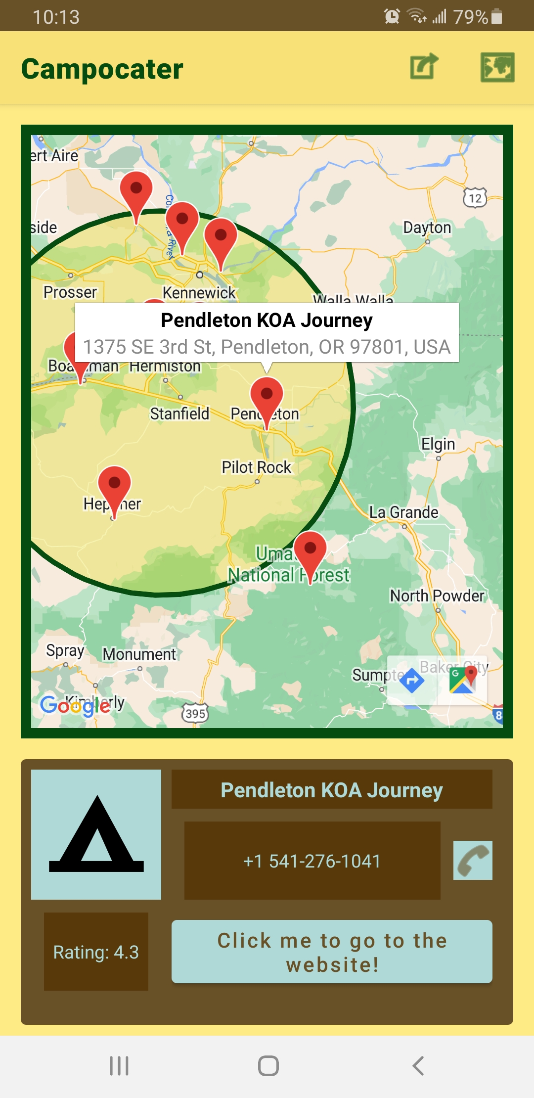
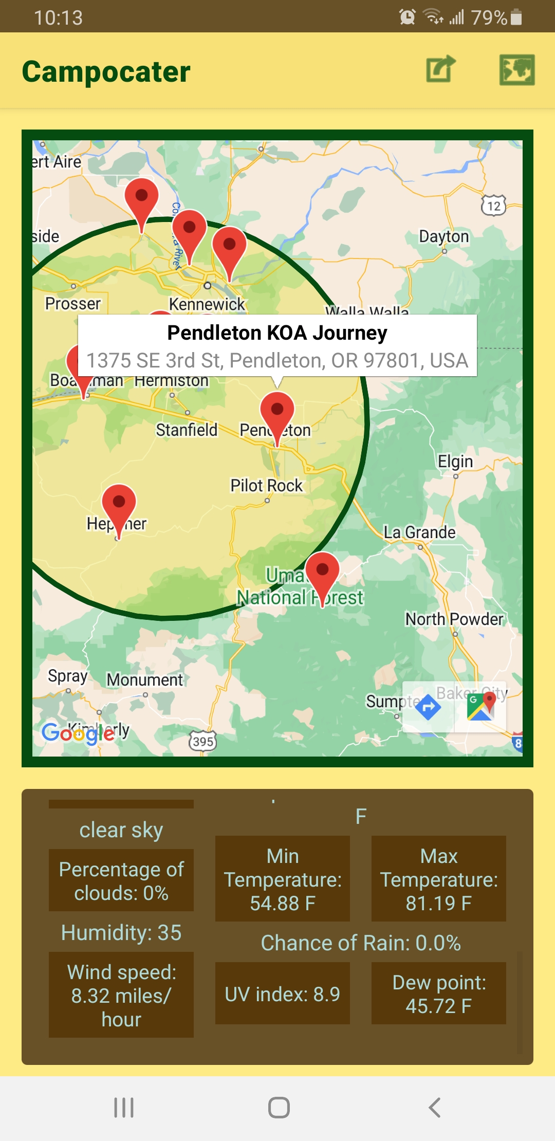
What tapping on a marker does.
-
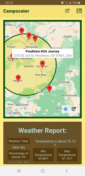
The first half of the weather report.
-

The second half of the weather report.
-
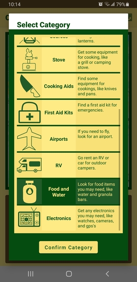
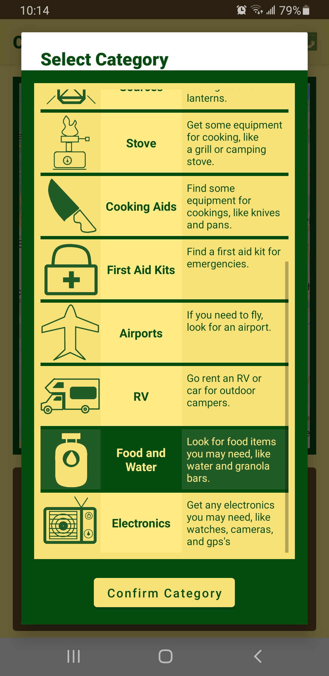
Part of what the categories screen looks like.
-
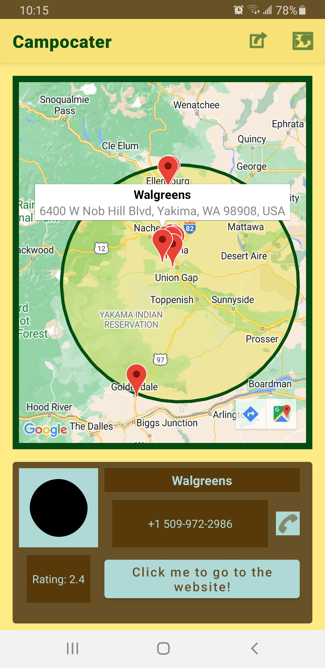
Showcase of what happens when the "food and water" category is selected.
-

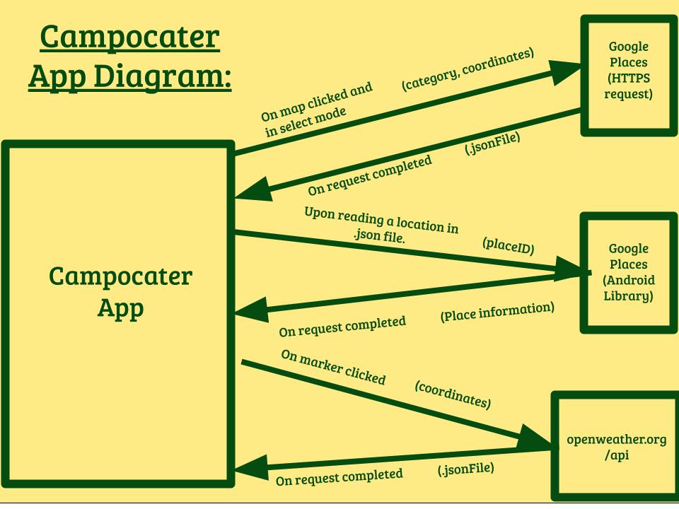
A diagram for how the app communicates with other APIs

Inspiration
I thought of how people often go on camping trips during summer and how convenient it would be if people had access to a tool that allowed them to look up potential campsites around a given area. The name was made by combining “camping” with “locater” while making it sound catchy.
What it does
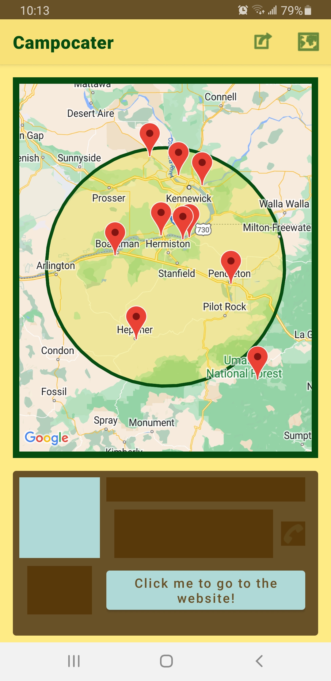
It shows a map with two buttons in the menu at the top and a box at the bottom with a brown background. Clicking on the leftmost button allows the user to select a category out of a predetermined list, including campgrounds, general equipment (like tents), and camping stoves. The choice will be confirmed after clicking the aptly named confirm button, which then closes the tab. Clicking on the other button in the menu will cause the icon to appear selected along with a message popping up to notify the user they are in ‘selection mode.’ The user is then able to click on any given position on the map, where it will zoom in and display a slightly translucent circle with a radius of 40 kilometers (or about 25 miles). A second or two may pass until another message pops up, saying that all places have been discovered and will be displayed shortly. If there were not enough places though, then the user will see a message informing them that their search did not work and they must try again. Assuming that ten places were found though, then the markers will be displayed and showcase locations that are either inside or near the circle. (The circle merely acts as a reference point.) Tapping on one of these markers will cause the camera to center on it, whereupon a little display with the title of the place and the address will pop up. In the brown box however, there will be more detailed information about the place, which includes: () An icon at the top left that shows what type of store this place is. () The title of the place () A phone number, if applicable. Clicking the call button next to it will allow the user to call the location, again assuming the phone number exists. () A rating of the location. () A button that lets the user go to the website of this place. If there is none, then a failure message will be displayed. After a bit more time, the app will load a weather report of the location. This information is based on a daily forecast of the location. The information displayed includes: () The type of weather, along with a description of it. () How cloudy it is expected to be. () How humid it is. () The wind speed, giving the user an idea of how intense the wind may be. () The expected temperature, along with the minimum and maximum reported temperature for that area. () The chance of rain. () The UV index, which serves as a measure for how intense UV radiation may be. (*) The dew point temperature, which can help a user determine if the weather around that area would be uncomfortable for them. (The higher it is, the dryer it feels.)
How I built it
I used Android Studio to build my app and the Google Maps API to create a map display. Tapping on the screen would then give me a latitude and longitude, which allows me to make an HTTPS request to Google in order to find information about a place, especially with its place id. With that, I can then make a call to the Google Places API to get even more information about the place. Those same latitude and longitude coordinates are also used to make another HTTPS request to https://openweathermap.org/api to get a weather report.
Challenges we ran into
This was my first time using the Google Places API and I had to think of a color scheme that looked good, worked with summer, and worked with camping. My first thought was yellow, dark green, dark blue, and light red, but the light red did not have much to do with camping. I later decided on brown for wood, dark green for wildlife, yellow for the sun, and blue for a bright blue sky.
Accomplishments that we're proud of
I’m proud that I was able to create a large project like this for my second hackathon and that I had a good sense of what colors worked best.
What we learned
I learned about the equipment a person needs or would want when camping along with the basics of UI design.
What's next for Campocater
After some light revisions to the UI, I plan to publish this to the Google Play Store.
Built With
- android-studio
- google-maps
- google-places
- java
- openweather

Log in or sign up for Devpost to join the conversation.