Inspiration
Most technology is designed for one kind of person: calm, rested, literate, and safe. But the moments when people need the web most are often the moments when they are least able to use it — panicked after bad news, injured, elderly, overwhelmed, low-literacy, or in the middle of an emergency.
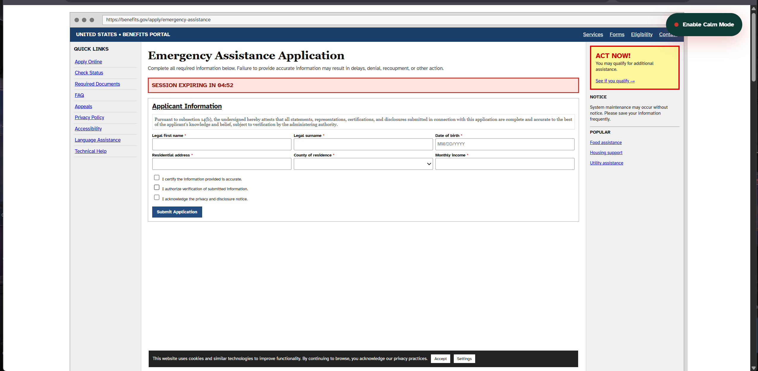
We opened real government forms, hospital discharge papers, and emergency pages, and the pattern was unmistakable: the more urgent the situation, the harder the interface. Dense legalese. A blinking SESSION EXPIRING IN 04:59 timer. A cookie banner. A popup ad. Eighteen warnings shouting at once. The page assumes you have time, focus, and steady hands. The person on the other side of the screen has none of those.
So we asked one question: what if the web could notice that someone is struggling — and immediately become simpler, calmer, and more human?
What it does
CalmLayer is a prototype crisis mode for the internet. It does not delete important information. It changes the order, language, spacing, and interaction so a stressed person can focus on the one thing that matters right now.
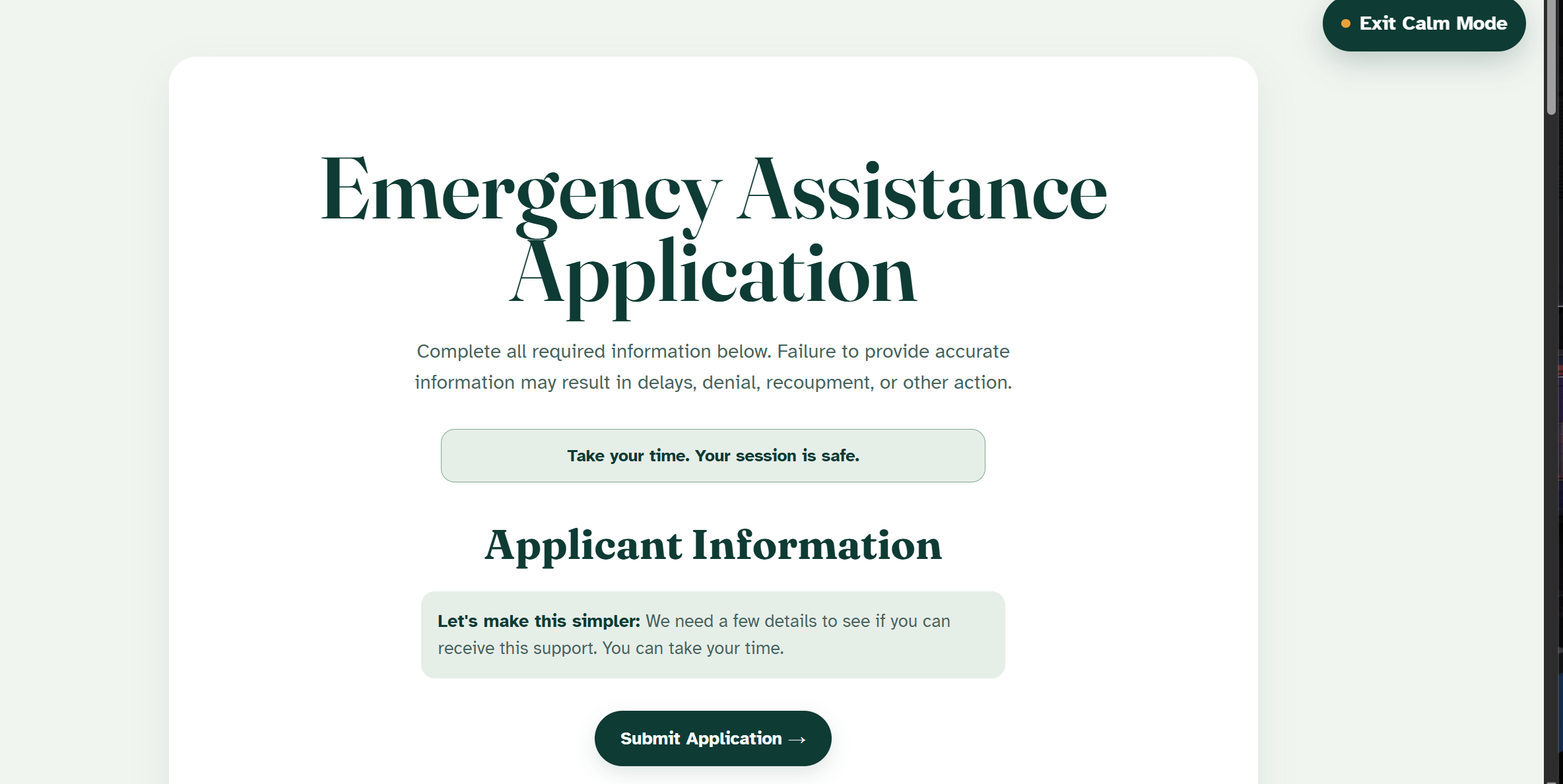
The demo page proves the idea on itself. It opens as a deliberately chaotic benefits portal — legalese, banners, ads, and a countdown that refuses to wait. One press of Enable Calm Mode and the whole page exhales: the timer stops and quietly reads "Take your time. Your session is safe.", the noise vanishes, and the language becomes plain.
Below that, three tests show the layer on real content:
- Government aid form — twelve fields of legalese collapse into one answer at a time (Step 1 of 4), with enormous buttons and an I need help escape hatch on every screen.
- Medical discharge instructions — one dense clinical paragraph becomes three things you can actually remember, with a working Read this aloud button for tired eyes.
- Emergency information page — eighteen competing warnings become a single next action and a guided breathing pacer (inhale 4s, hold, exhale 6s) for the moment before you act.
How we built it
CalmLayer is one self-contained page: semantic HTML, a dual-mode design system driven entirely by CSS custom properties, and vanilla JavaScript with no frameworks and no build step. The entire interface lives in two states — Normal and Calm — switched through a single attribute on the body. Every color, font size, radius, and spacing value listens to that attribute, which is why one press can transform the whole page in a single smooth transition rather than a reload.
The Read this aloud feature uses the browser's Web Speech API, and the breathing pacer is pure CSS and JS — no libraries, no assets. Typography is a deliberate choice: Fraunces for display, and Atkinson Hyperlegible — a typeface designed by the Braille Institute for maximum readability — for body text.
Challenges we ran into
The hardest part was restraint. A "calm" interface is easy to make boring or patronising. We iterated on Calm Mode until it felt supportive rather than dumbed-down: plain language that still respects the reader, large buttons that still feel dignified, motion that slows the page down instead of decorating it.
The second challenge was making the chaos feel honest. Normal Mode had to be genuinely stressful — the blinking timer, the legalese, the competing banners — so the transformation would be felt, not just seen. Balancing a parody of bad design with a sincere example of good design, on the same screen, took more tuning than the code itself.
Accomplishments that we're proud of
We are proud that the page demonstrates the product on itself. There is no separate mockup and no slide deck standing in for the idea — the visitor lives the problem and the solution inside the same ten seconds.
We are also proud that a project about accessibility actually practices
it: full keyboard navigation, aria-live announcements on every mode
change, AA+ contrast in both states, large hit targets in Calm Mode, and
complete prefers-reduced-motion support. The tool walks its own talk.
What we learned
We learned that accessibility is not only about permanent disabilities. It is also about temporary states — stress, panic, fatigue, fear, injury, urgency. Almost everyone will be in one of those states at some point in their life, which means a calm interface is not a niche feature for a few. It is the part of humane technology that everyone eventually needs, often on the worst day they can remember.
What's next for CalmLayer
CalmLayer could grow in three directions:
- A browser extension that adds Calm Mode to any website a person is struggling with, not just our demo.
- An open-source SDK that public services, hospitals, and emergency platforms can embed in a few lines of code.
- A design standard for stress-aware interfaces — concrete guidelines for language, spacing, motion, and pressure signals like countdown timers that should never appear when someone is already under pressure.
The web should adapt to people in crisis — not the other way around.
Built With
- accessibility
- api
- css3
- design
- health
- html5
- inclusive
- javascript
- mental
- social
- speech
- ux
- web


Log in or sign up for Devpost to join the conversation.