Inspiration
If you get a concussion, the advice most people still hear is to sit in a dark room and wait. No screens, no reading, no going outside until you feel normal again.
That advice is out of date. Doctors now know that shutting yourself away for weeks actually makes recovery slower, and it wrecks your mood while it does it. What actually works is staying active and staying social, just kept below the level that makes your symptoms flare up.
The problem is that nobody tells you where that level is. You get a leaflet, maybe a follow up appointment in two weeks, and then you are on your own guessing whether reading one more chapter is fine or whether it will cost you the next two days. We wanted to build the thing that sits with you in those two weeks.
What it does
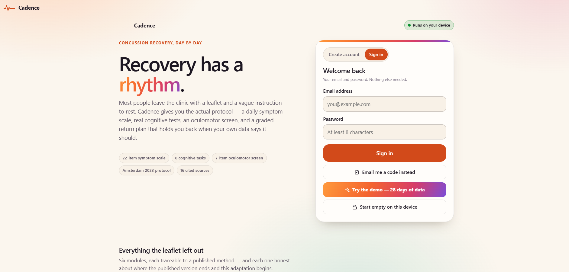
Cadence is a recovery companion for the weeks after a concussion.
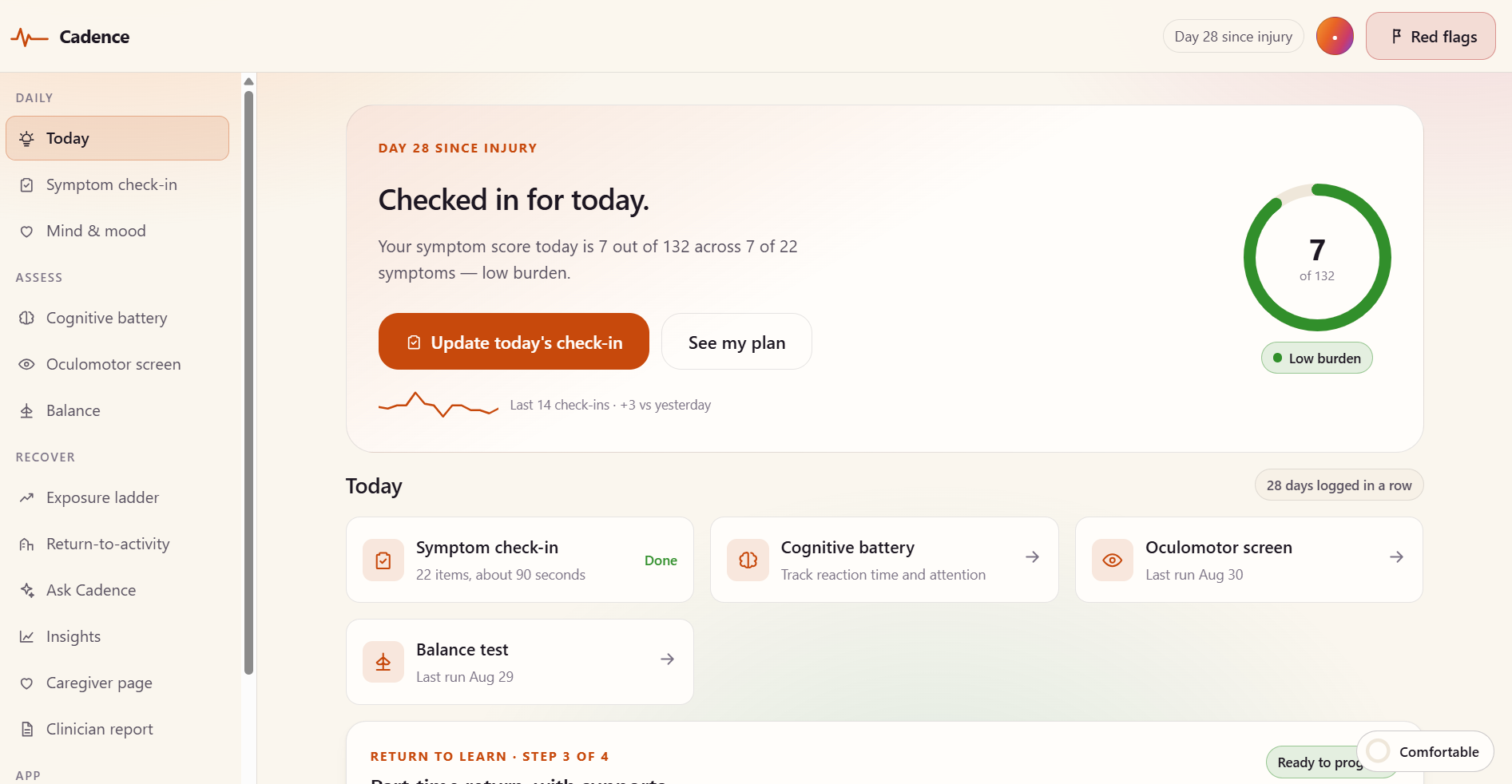
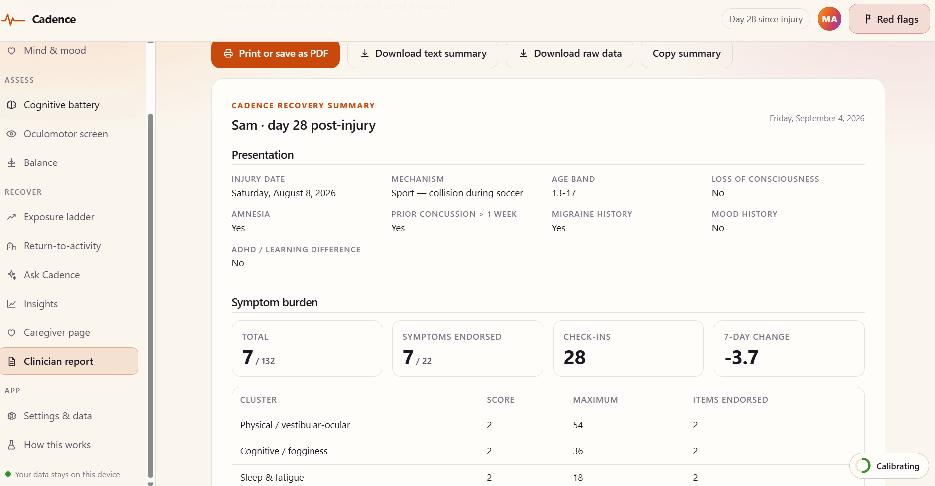
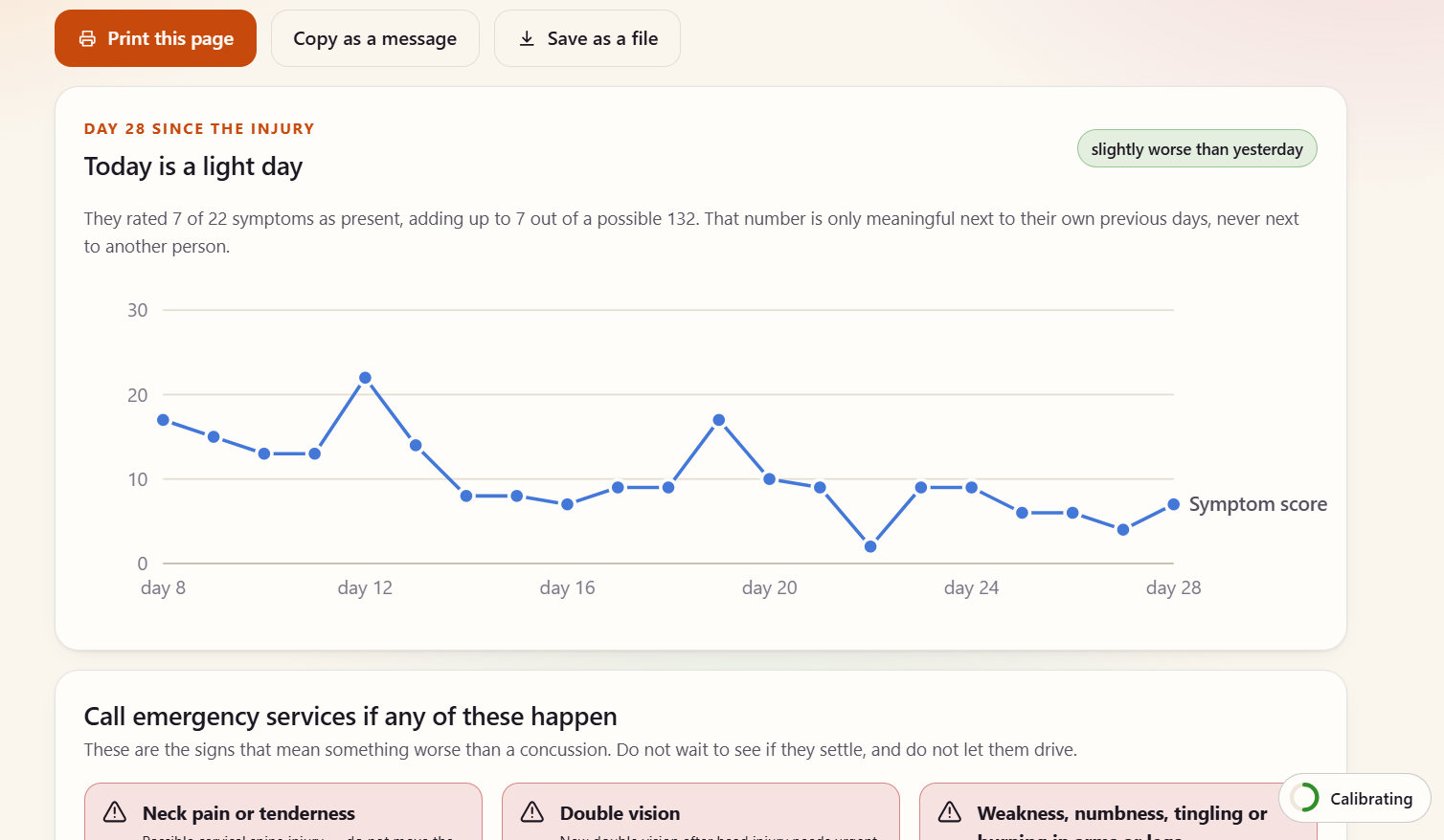
Every day you rate 22 symptoms on a scale of 0 to 6. This is the same list clinicians use, and Cadence sorts your answers into four groups so you can see whether it is your head, your thinking, your sleep or your mood that is actually moving.
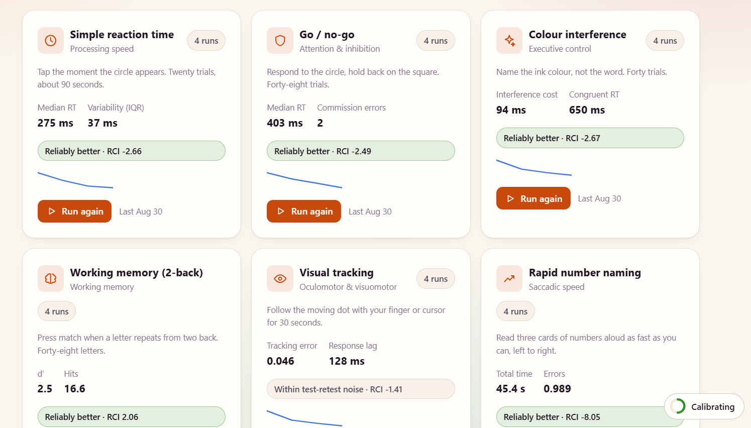
There are six short tests you can run: reaction time, a go and stop task for impulse control, a colour word test, a memory task, a moving target you follow with your finger, and a page of numbers you read out loud as fast as you can. Cadence saves your first run as your baseline and compares everything after that against you, not against an average person.
There is a guided eye and balance screen with seven movements, where you rate your headache, dizziness, nausea and fogginess before and after each one. There is a balance test with three stances. If your phone has motion sensors it measures how much you sway.
The return to activity plan is the real thing from the 2023 international concussion guidelines, running as actual software. Four steps for getting back to school, six for getting back to sport. It holds you at each step for at least 24 hours, it will not let you move up if your symptoms jumped, and it drops you back a step on its own if you log a bad flare.
The part we are proudest of watches how you use the app. It looks at how steady your cursor is, how often you scroll back over a line you already read, how many times you hit backspace, how often you leave the tab, how long your pauses are, and how long you have been staring at the screen. It turns that into a number out of 100. When that number climbs, the app quietly makes the text bigger, kills the animation and flattens the background. When it gets high enough, it tells you to stop.
Everything stays on your device. Your account holds an email address and nothing else. If you turn on backup, your data is scrambled in your browser first with a password only you know, so the server stores something it cannot read.
How we built it
Plain JavaScript, no framework, no build step. The whole thing runs from a small Node server with zero packages installed.
All six models are written from scratch, because we wanted to actually understand them:
The recovery curve fits a decay equation to your daily scores using a method called Gauss Newton, then reshuffles the errors 240 times to work out how much to trust the answer. It gives you a range, not a single confident number.
The off trend detector builds a forecast for each thing it tracks and compares today against it, using a median based score so one terrible day cannot poison the baseline.
The trigger finder looks for links between what you did and how you felt, both same day and next day. It runs a shuffle test 1500 times on each one and then corrects for the fact that testing lots of things at once produces coincidences. Most days it finds nothing and says so, which is the point.
The cognitive tests use a reliable change index, which is the standard way of asking whether a score moved for real or just wobbled.
The charts are hand drawn SVG. The colours were run through a colour blindness checker before we used them.
Challenges we ran into
Email nearly beat us. We set up one provider and it turned out it would only send to our own address until we proved we owned a website domain, which we do not. So we switched providers. The new one kept saying the API key was invalid. We were about to generate a fifth key when we finally read the full error message and found it was actually blocking our home internet address by default, and had nothing to do with the key. We had wasted an hour on the wrong problem because the error said the wrong thing.
That happened twice more in different forms. A tool we wrote to check the email setup was calling an endpoint our key was not allowed to use, so it reported a working key as broken. Another check treated a failed lookup as proof that something did not exist. We ended up rewriting all our error messages to say what actually came back instead of what we guessed it meant.
The app also froze for a while and we could not work out why. It was a blur effect on the top bar. Looked lovely, cost us the entire frame rate.
Building the tolerance meter was the hardest part conceptually. Our first attempt just measured how long you had been on the screen, which is useless because everyone is different. It only started working once we made it learn each person's own normal first and compare against that, and made it refuse to do anything at all until it had enough data.
Accomplishments that we're proud of
The tolerance meter works, and we tested it. Wiggling the cursor around pushed the score up and the text really did get bigger on its own.
It found something real in our test data. It spotted that days with high screen strain were followed by worse symptoms the next day, with a correlation of 0.70. More importantly it found nothing for the same day, which is correct. It is not just agreeing with whatever we hoped.
Every model has a card you can open that explains what it does, what it needs, and how it can be wrong. We wrote down the ways our own code fails. That felt more honest than pretending it does not.
We cited 16 real papers and we were careful to say when we changed something from the original. Our version of the number reading test is not the real validated one and we say so on the same screen.
Nothing gets sent anywhere. No tracking, no analytics, no company reading your worst days.
What we learned
We learned that the dark room advice is not just outdated, it actively hurts people, and that almost every app in this space still quietly assumes it.
We learned that tiredness shows up in how you move a mouse before you notice it yourself.
We learned about false discovery rate, which is the maths for not fooling yourself when you test many things at once. It would have been easy to show users five exciting patterns. Four of them would have been noise.
Mostly we learned to read the whole error message. Every single thing that blocked us for more than twenty minutes was a case where the error told us one thing and the truth was something else. We now write our error messages assuming a tired person will read them
What's next for Cadence
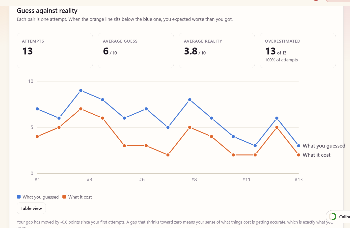
An exposure ladder. After a head injury the biggest thing holding people back is often fear rather than damage. You get scared of the thing that hurt last time, so you avoid it, so you never find out it got easier. The plan is to have you guess how bad something will feel before you try it, then log how it actually went, then show you the gap. Most people find out they have been guessing far too high, and seeing that on a chart is what breaks the cycle.
A mode for the person looking after you. Parents and coaches get handed a confusing sheet of paper and told to watch for warning signs. They deserve a simple daily list and a clear page of what to ask for at school.
A neck check. Most head impacts hurt the neck too, and neck problems cause headaches and dizziness that get blamed on the brain.
And we would like to get it in front of a real physiotherapist and be told which parts of it are wrong.
Built With
- brevo
- css
- featherless
- html
- javascript
- render


Log in or sign up for Devpost to join the conversation.