-
-
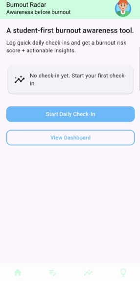
This is the home screen for Burnout radar, it has buttons both in the middle of the screen and at the bottom navigation bar.
-
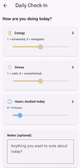
This is the check-in screen, this screen allows users to make customized inputs based on their mood.
-
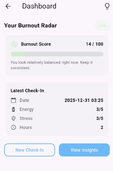
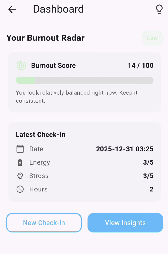
This is the dashboard screen, it gives the user a score based on their check-in which gives the user some insight on how their doing.
-
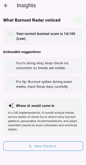
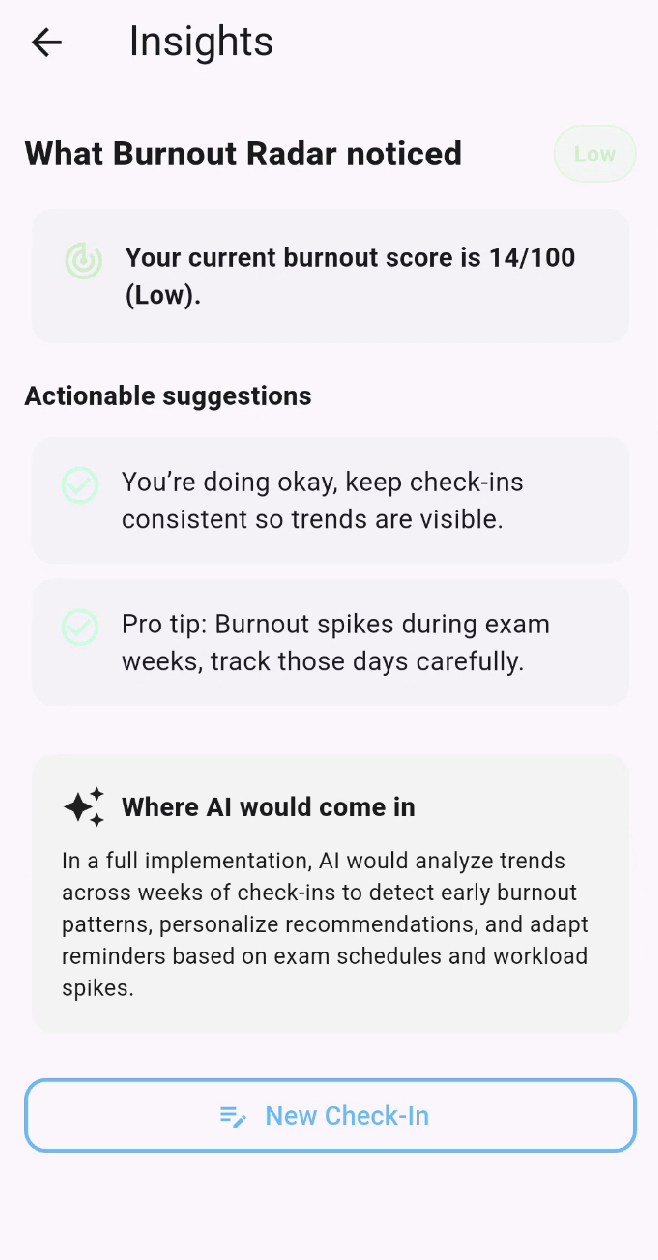
This is the insights screen, this screen tells the user how they are actually doing and what they can watch out for to regulate their stress


Inspiration
Burnout is something I’ve personally dealt with as a student, and I realized that it usually doesn’t happen all at once. It builds slowly through long study hours, constant pressure, and ignoring how you actually feel until it’s too late. Most apps focus on productivity, but very few focus on awareness. I wanted to build something that helps students recognize burnout early, before it turns into a crash.
What it does
Burnout Radar is a student-first wellness app that helps turn quick daily check-ins into clear burnout insights. Users log their energy level, stress level, and hours worked or studied, and the app translates that information into a burnout risk score. That score is then visualized in a simple dashboard and paired with actionable suggestions, making it easier for students to understand their habits and make small adjustments before burnout becomes serious.
How we built it
Burnout Radar was built using Flutter and Dart, allowing for a clean and responsive UI. The app includes a daily check-in flow, a rule-based burnout scoring system, a dashboard for visualizing burnout risk, and an insights page that provides practical recommendations. The burnout score is calculated using a weighted formula that considers workload, stress, and energy levels, and the result is normalized to a 0–100 scale so it’s easy to interpret. The system is also designed in a way that allows AI-based trend analysis to be added in future versions.
Challenges we ran into
One of the biggest challenges was deciding how to handle AI without overclaiming its role. Instead of forcing complex machine learning into the project, I focused on making the logic transparent and explainable. Another challenge was UI and UX design, especially making sure the app felt calm and supportive, even when showing high burnout risk. This required careful use of colour, spacing, and layout to avoid overwhelming the user.
Accomplishments that we're proud of
I’m especially proud of building a fully functional and polished app within the hackathon timeframe. The UI clearly communicates burnout risk in a way that feels approachable rather than stressful, and the scoring system is both intuitive and explainable. Most importantly, the app reflects real student experiences instead of being a generic wellness tracker.
What we learned
Through this project, I learned that clarity matters more than complexity. A simple system that users understand and trust is far more valuable than a black-box solution that looks impressive but isn’t transparent. I also learned how much thoughtful UI and honest scope matter when building tools related to mental health and wellness.
What's next for Burnout Radar
Next, I want to persist check-in history across sessions, add trend analysis over longer periods like exam weeks, and integrate AI to personalize insights based on long-term patterns. I also plan to share Burnout Radar with other students to gather real feedback and continue improving it. The core goal will stay the same: helping students build awareness before burnout.

Log in or sign up for Devpost to join the conversation.