-
-
Home is a room you can read at a glance: what's left this month, and what's due next.
-
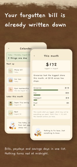
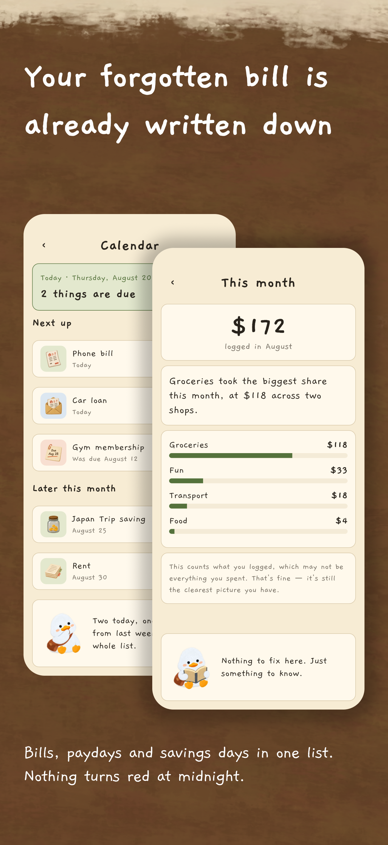
Bills, paydays and savings days in one list. Nothing turns red at midnight.
-
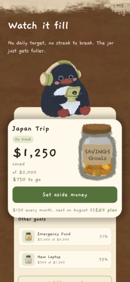
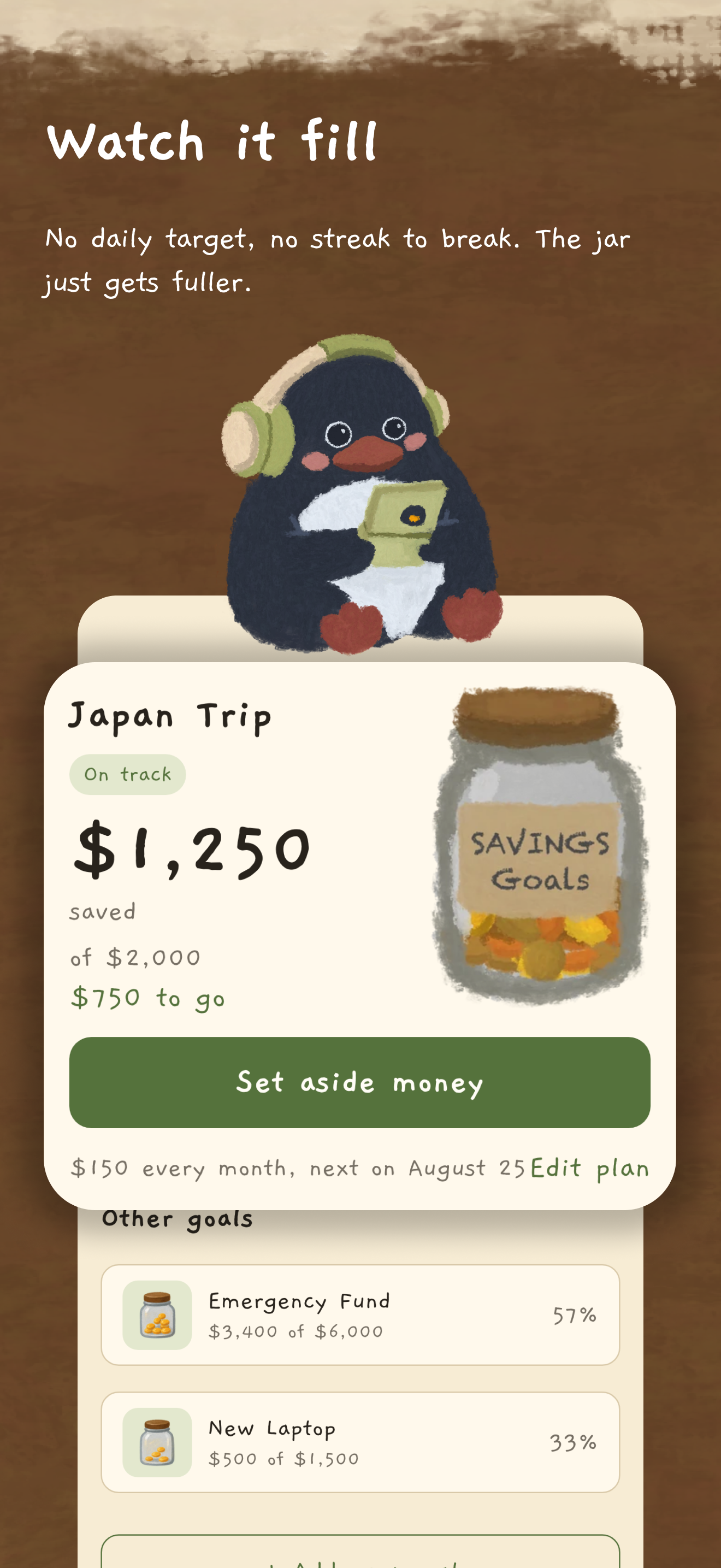
A jar that only fills. No daily target, no streak to break, nothing to lose by missing a day.
-
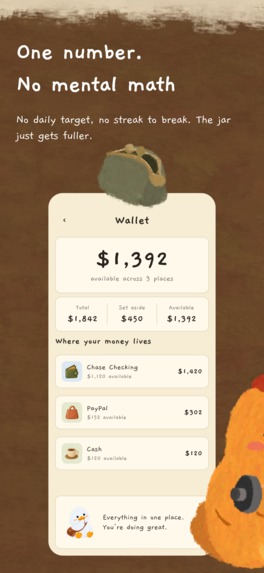
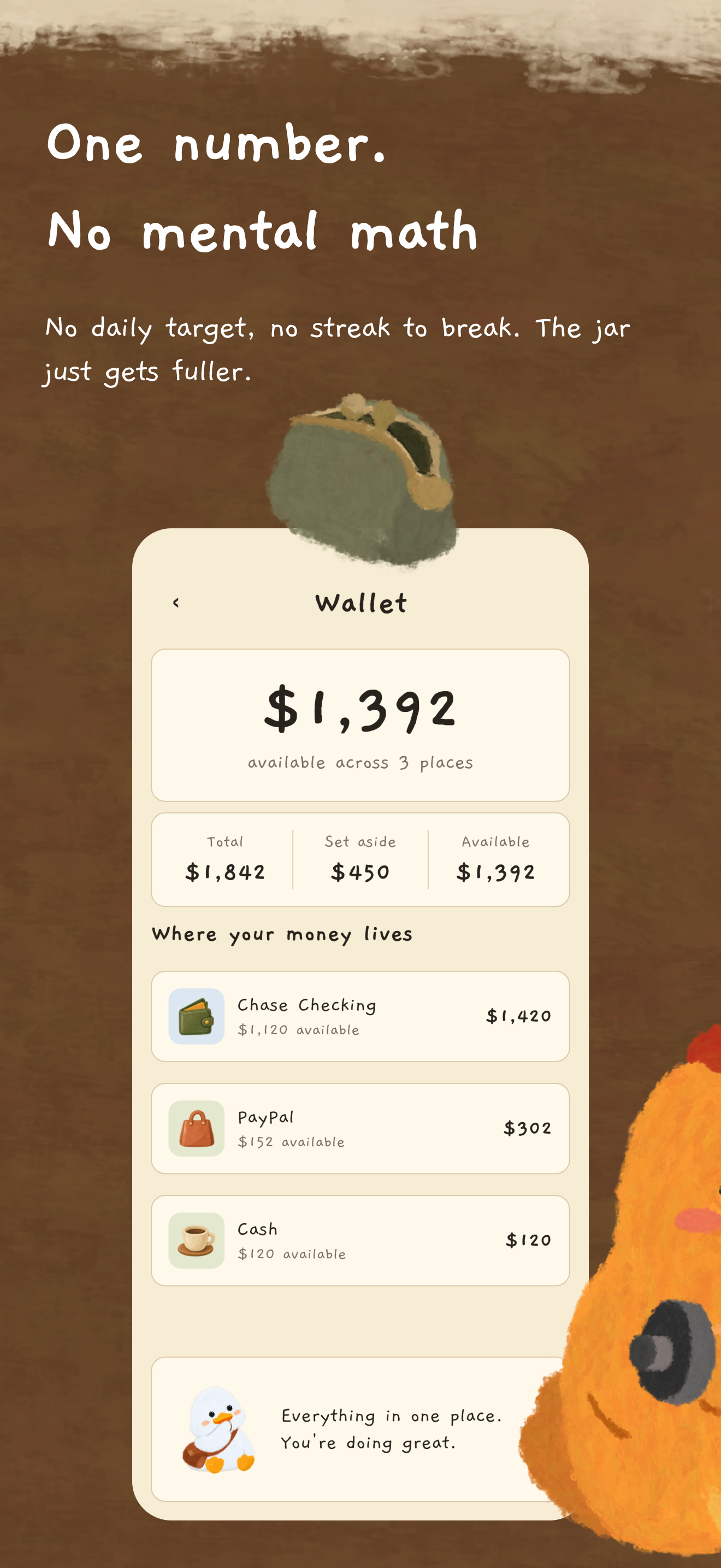
One number, no mental math - every place your money actually lives, in one list.
-

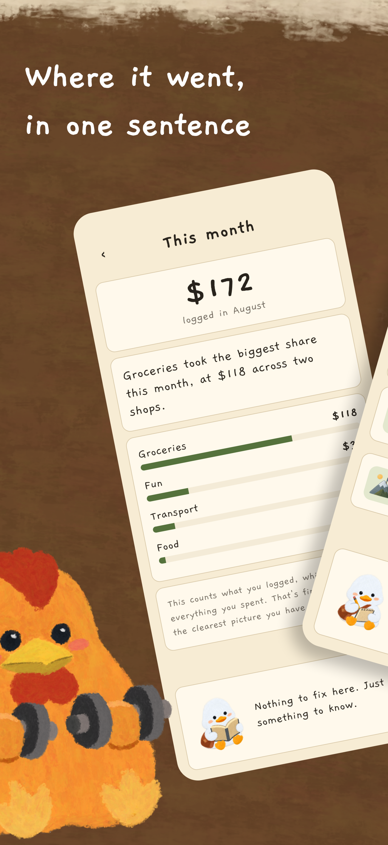
Where it went, in one plain sentence and an ordered list. No charts, ever.
-
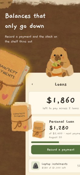
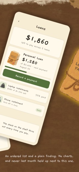
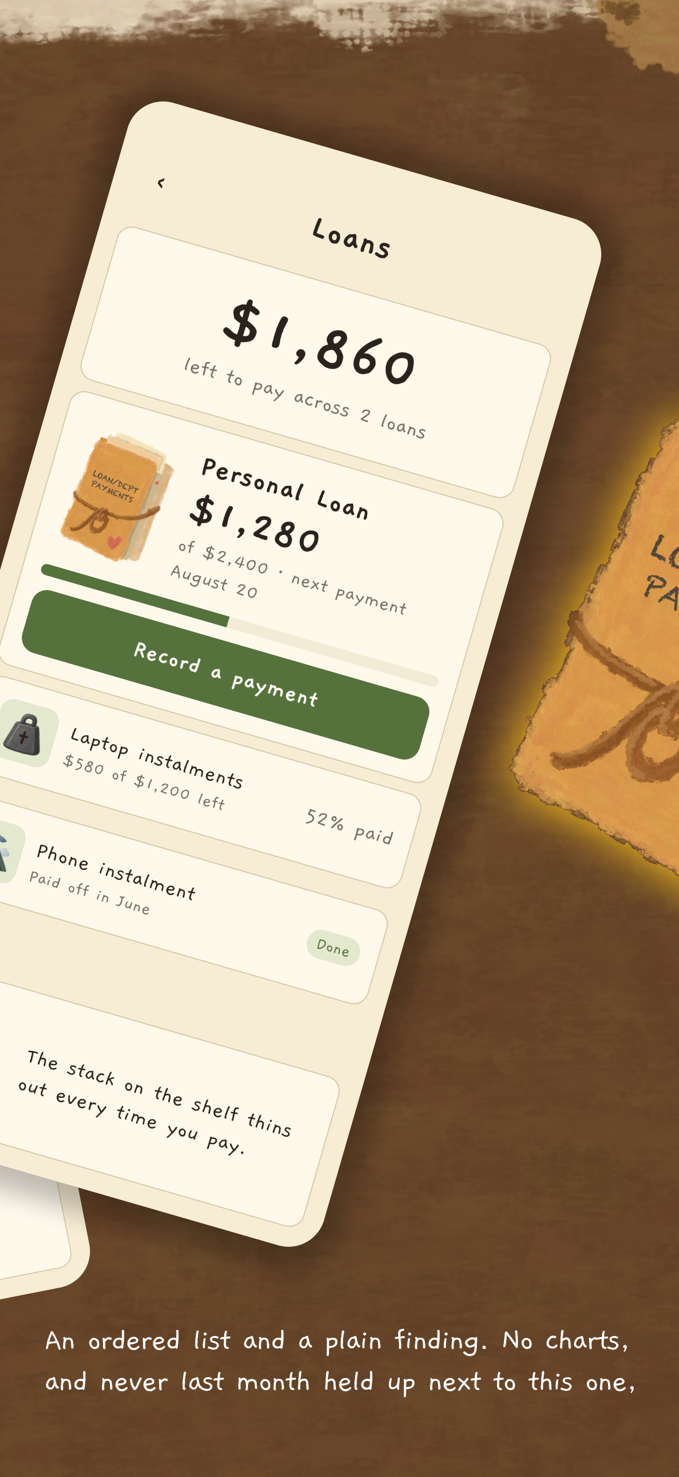
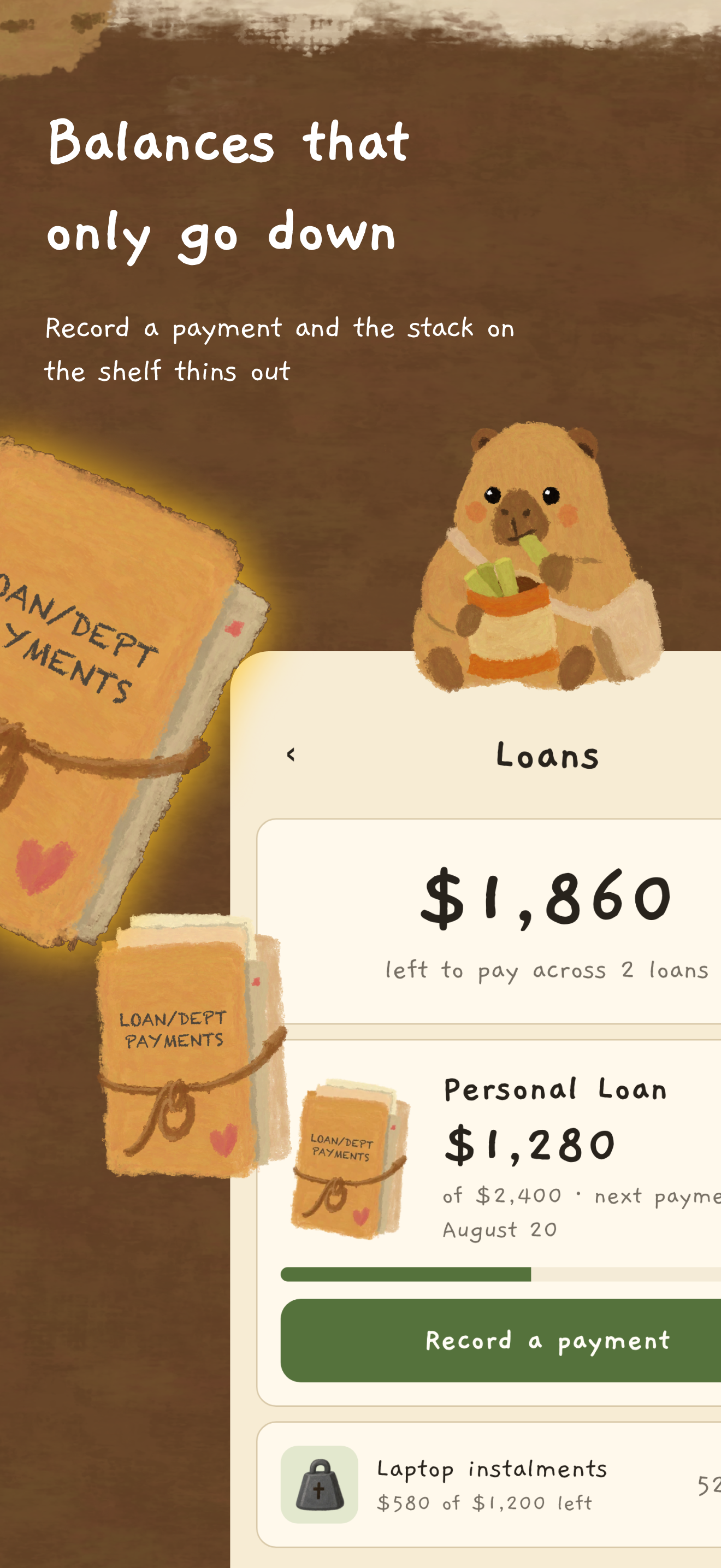
What you owe, and a stack on the shelf that thins out every time you pay•
-

Payments really deduct. No interest math, no penalties, no red.
-

Away three weeks? Nothing to catch up on. No streaks, no account, it stays on your phone.


Zero AI art. Zero stock assets. Zero generated frames. Every image in this app was painted by a human hand, one frame at a time — a whole cozy room, built for the people every budgeting app quietly gives up on.
Inspiration
Budgeting apps are built for people who are already good at budgeting.
They open with a chart. They compare this month to last month. They give you a streak, and then they take it away. For an ADHD brain, that isn't motivation — it's a scoreboard you're already losing, so you stop opening the app, and once you stop opening it the data goes stale, and now the app is lying to you too.
I wanted to build the opposite: a place you'd want to return to after two weeks away, with nothing to be ashamed of when you got there.
So I drew a room.
What it does
Bujji is a budget tracker that lives inside a hand-painted room. Your money isn't in a dashboard — it's furniture. The wall calendar holds what's coming up. The wallet on the desk holds what you have. The envelope holds what you owe. A duck sits at the desk and keeps the paperwork.
Five real finance modules underneath the art:
- Calendar — what's coming up
- Savings — what you're building toward
- Wallet — what money you actually have
- Expenses — where it went
- Loans — what you owe
And a set of things it deliberately refuses to do:
- No charts. Ordered lists and proportion bars only.
- No comparing two months. A comparison is a scoreboard.
- No streaks, no badges, no nagging. One local notification at 6am on days something is actually due — a single digest, never one per reminder.
- No shame.
Spentmeans what you logged, not what you spent, and every screen that shows it says out loud what it doesn't know.
Tap the character and the whole room lifts to reveal an accessory panel — restylable layers and a cast of characters who can take the chair (duck, penguin, chicken, capybara so far). The room can be exported as a text-free wallpaper. None of it is a reward you have to earn.
How I built it
Expo + React Native + TypeScript. Zustand and AsyncStorage for state, validated with Zod. Native stack navigation. No backend, no account, no sync — your money data never leaves the device.
The Home screen is the unusual part. It renders on a fixed 1080 × 1920 master
canvas with a single scale factor, screenWidth / 1080. Height is never
stretched; extra vertical space just becomes more floor. Every coordinate in
the room lives in one file, sceneLayout.ts — no scene component is allowed to
hardcode an x, y, width or height. That one rule is why the art can be
repainted, or a penguin can replace the duck in the chair, without a single
number moving anywhere else.
RevenueCat owns access, and this is where most of the design thinking went.
Three products, one entitlement:
| plan | why it exists |
|---|---|
duck_budget_pro_yearly |
the recommended yearly plan |
duck_budget_pro_monthly |
month to month |
duck_budget_pro_lifetime |
one-time buyers |
Yearly uses one product with no introductory offer. An earlier build carried a separate trial product; it never sold a subscription, so it could be deleted outright rather than left withdrawn. That is one fewer decision on the screen and one fewer product to price, translate and keep alive in two consoles.
Had it sold even one, it would have had to stay: a receipt outlives the catalog, and deleting a product with a subscriber ends their renewal.
The rest of the app never learns any of that. There is exactly one access
question in the entire codebase — useIsPro() — and nothing anywhere branches
on which plan was bought. Adding a fourth product later teaches the app nothing
new.
src/paywall/purchases.ts is the only file that imports
react-native-purchases. It's a boundary, not a wrapper: everything above it
deals in my own Entitlement and PurchaseResult types, so no vendor type
ever reaches a component, and a build with no API key is a state the app
renders rather than an exception it throws on launch.
The paywall asks before it sells
Step one is a question, not a price. One painted screen, the duck introducing the app, one button. Step two is the plans: Yearly, Monthly, Lifetime, with yearly first, highlighted and preselected — the recommended row, the row the button will buy, and the row at the top are all the same row.
No free trial on any of them. There was one, on a second yearly product that existed only to carry it, and both are gone. The stores attach a trial as an introductory offer and auto-apply it to every eligible buyer, so offering one meant shipping two near-identical yearly products and a question to pick between them — two identically-priced yearly rows, one with free days and one without, is a decision with a wrong answer hidden in it. One product per cadence is one fewer thing to price, translate, and keep alive in two consoles.
The paywall the app raises has no close. Past it is buy, restore, or redeem
a code — all three are on the screen, and Redeem code floats above every step
because somebody who was given the app has no other door. The paywall the
user opens — from the Menu, a lock card, a module's limit — still closes.
What Pro actually is — and what I refused to gate
Recording is free. Forever. Calendar, Savings, Wallet, Loans, logging an expense, Home, reminders, wallpaper, the whole room. Someone who avoids money cannot be charged for the thing that finally gets them to come back.
Pro is looking back — the Activity list and This month — over records you already kept. A real feature, and nobody's re-entry point.
Export and restore were Pro once. I took the paywall off them. A gate in front of the door out means a user who stops paying can read every record in the app but can't get a copy of it. That's a data-portability problem before it's a product one. Your own data leaving the app is not a feature to sell. What Pro buys is the app writing that copy for you, on a schedule you never have to think about.
A locked screen shows a card instead of the module and never mounts it. The card says what the screen is, that Pro opens it, and — this line matters most — that nothing you've logged depends on it. No countdown, no scarcity, no "you're missing out". The fear this app exists to defuse is that your money data has quietly gone wrong somewhere out of sight. A paywall must never impersonate that fear.
Challenges I ran into
A confident wrong number is worse than no number. Wallet and Savings were
linked at first: Available = total − set aside. It's the obvious model and I
had it fully built. Then I realised a reservation is a standing claim that
has to stay true for weeks against a balance the user must keep current — and
for the person this app is for, that balance goes stale. Then both numbers
are wrong with no way to tell which. I tore it out for one line that's now a
hard rule: events deduct, standing claims do not. A logged expense or a
loan payment is money that actually left on a date. A savings jar is a
decision, so it moves nothing.
Blur doesn't work behind a native sheet. The Pro gate used to be a blur over the real screen. Then every module became a sheet — and a blur works by covering what's beneath it, while a native sheet is its own presentation. The blur landed behind the sheet and left every amount perfectly readable in front of it. It became a card that replaces the screen entirely.
An offline launch must never demote a paying user. An entitlement refresh
that can't reach the store returns undefined and writes nothing, so the
last confirmed answer stands. unknown isn't Pro — but it only ever appears
before the first store answer on a fresh install, which is exactly when the
paywall should be showing anyway.
Drawing every frame by hand. The onboarding flow renders a baked picture of the room rather than the live scene, for performance — which makes it the one thing in the repo that can silently go stale. So a script rebuilds it, and "re-run it whenever the room is repainted" is written at the top of the contributor guide in bold.
Accomplishments I'm proud of
- 100% human-drawn art, and still growing. Separately animated characters who share one chair, one canvas, and one registration point each, so swapping who's sitting there moves nothing else in the room.
- A monetization design where every single gate has a written reason — and two features that got un-gated because the reason didn't hold up.
- One entitlement question in the entire codebase.
- It ships on iOS and Android from one codebase.
What I learned
That the hardest part of a paywall isn't the SDK — RevenueCat took an afternoon. It's deciding what you're allowed to charge for. Every gate I put in front of a habit had to come back out. Every gate in front of a convenience stayed. The paywall got smaller and I like the product much more.
And that constraints written down as rules ("never redraw the art in code",
"financial text stays real <Text>, never baked into an image", "no charts,
ever") do more for a codebase than any amount of architecture. Every rule in the
contributor guide was earned by a bug.
What's next
The app is built. Q4 is about getting it in front of people.
Distribution. Ship to the App Store and Google Play, then go where the audience already is — ADHD communities, cozy-game and slow-app corners, and the people who share hand-drawn things because they're hand-drawn. This app is easier to show than to explain, which is a distribution advantage I haven't spent yet.
Marketing. The story is the wedge: a finance app that refuses to shame you, painted by hand in a market full of generated art. Short clips of the room — tapping the wallet, the character swap, the wallpaper export — do more than any feature list.
Sales. Real RevenueCat data instead of my assumptions. Watch which cadence converts, whether yearly earns the row it leads with, and what lifetime buyers actually look like. The architecture is already built for that: three products, one entitlement, and nothing in the app that cares which plan was bought — so I can change the offer without touching a single screen.
The product roadmap waits. Loan interest math, a proper archive view, and more characters for the chair, hand-drawn one at a time. Never a chart.
Built With
- android
- async-storage
- expo-file-system
- expo-notifications
- expo.io
- google-play-billing
- ios
- python
- react
- react-native
- react-native-purchases
- react-navigation
- revenuecat
- storekit
- typescript
- zod
- zustand


Log in or sign up for Devpost to join the conversation.