Observing how poorly resources and infrastructure are distributed across Buffalo neighborhoods inspired this project.
What it does
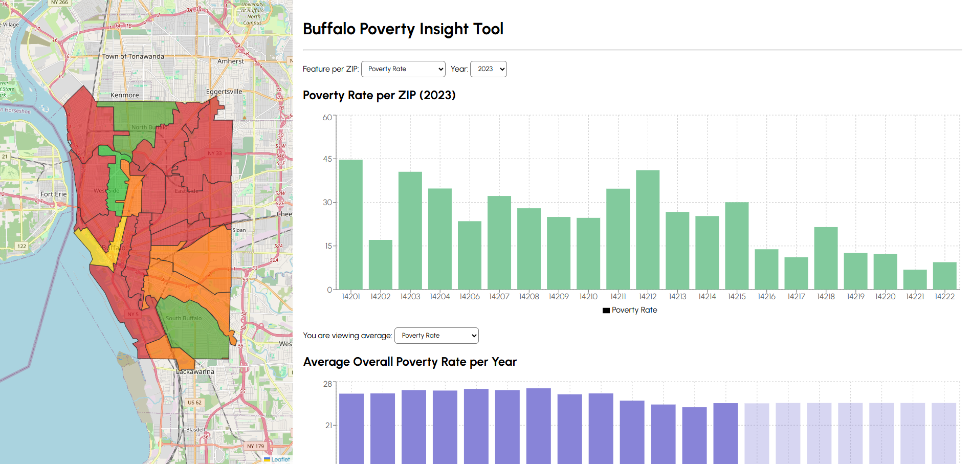
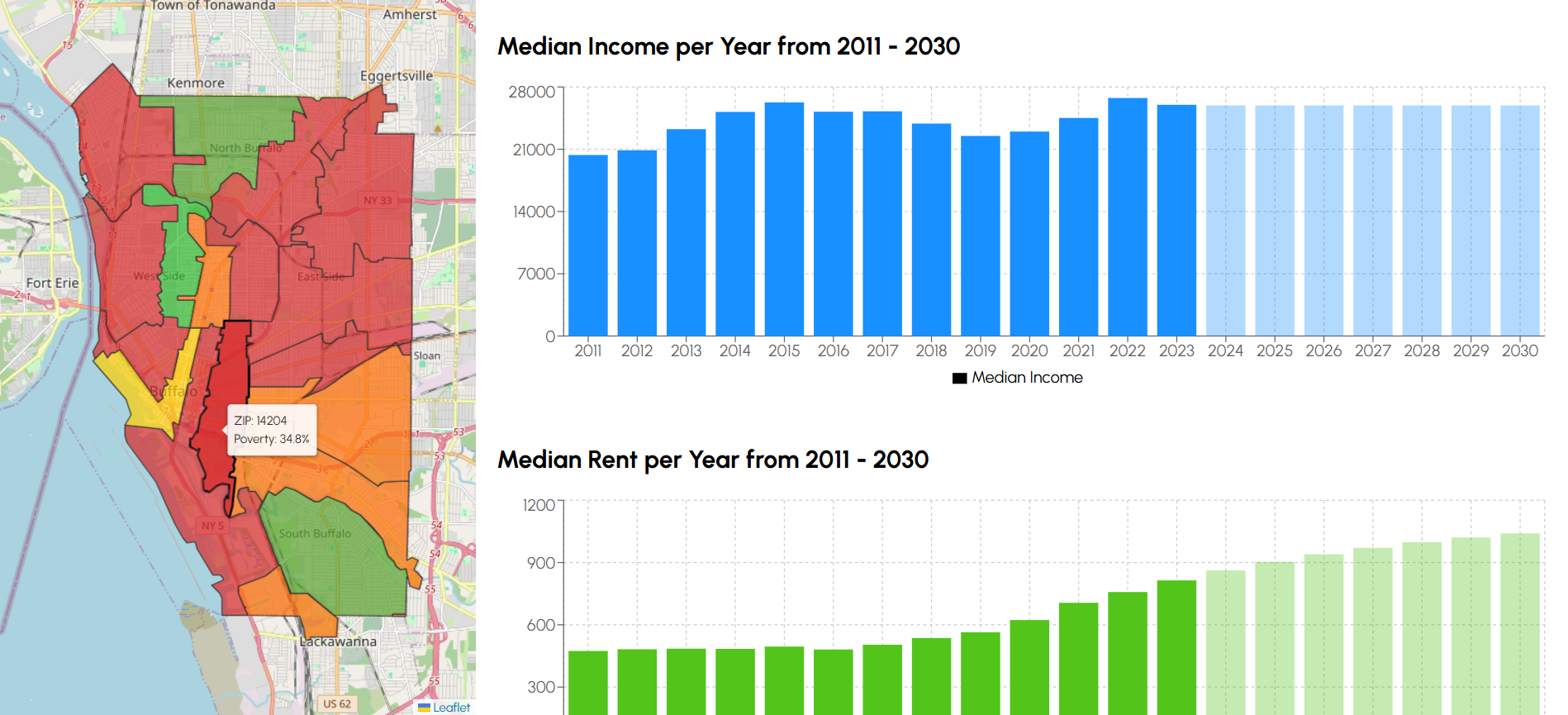
An AI-powered analysis tool for Buffalo’s neighborhoods that visualizes infrastructure, socioeconomic trends, and poverty-related insights at the ZIP code level.
Displays ZIP-level maps and charts showing trends over time and comparisons.
Predicts poverty rates for hypothetical scenarios through a simulation interface.
Incorporates Gemini to answer user questions
How we built it
Machine learning with PyTorch and Scikit-Learn.
Backend using FastAPI and MongoDB to serve ZIP-level and historical data.
Frontend with React and Leaflet for interactive maps and charts.
Challenges we ran into
Collecting consistent and reliable data across all ZIP codes.
Making machine learning models work effectively with a relatively small dataset (~420 elements).
Accomplishments we’re proud of
Successfully integrated mapping, interactive charts, and predictive simulations into a cohesive interface.
Built a functioning poverty prediction model that responds to user input scenarios.
What we learned
How to source and preprocess census and city data.
Practical experience working with GIS data and integrating it with React and Leaflet.
What’s next
Gathering more data to improve the accuracy and reliability of the ML model.

Log in or sign up for Devpost to join the conversation.