-
-
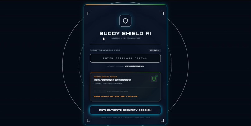
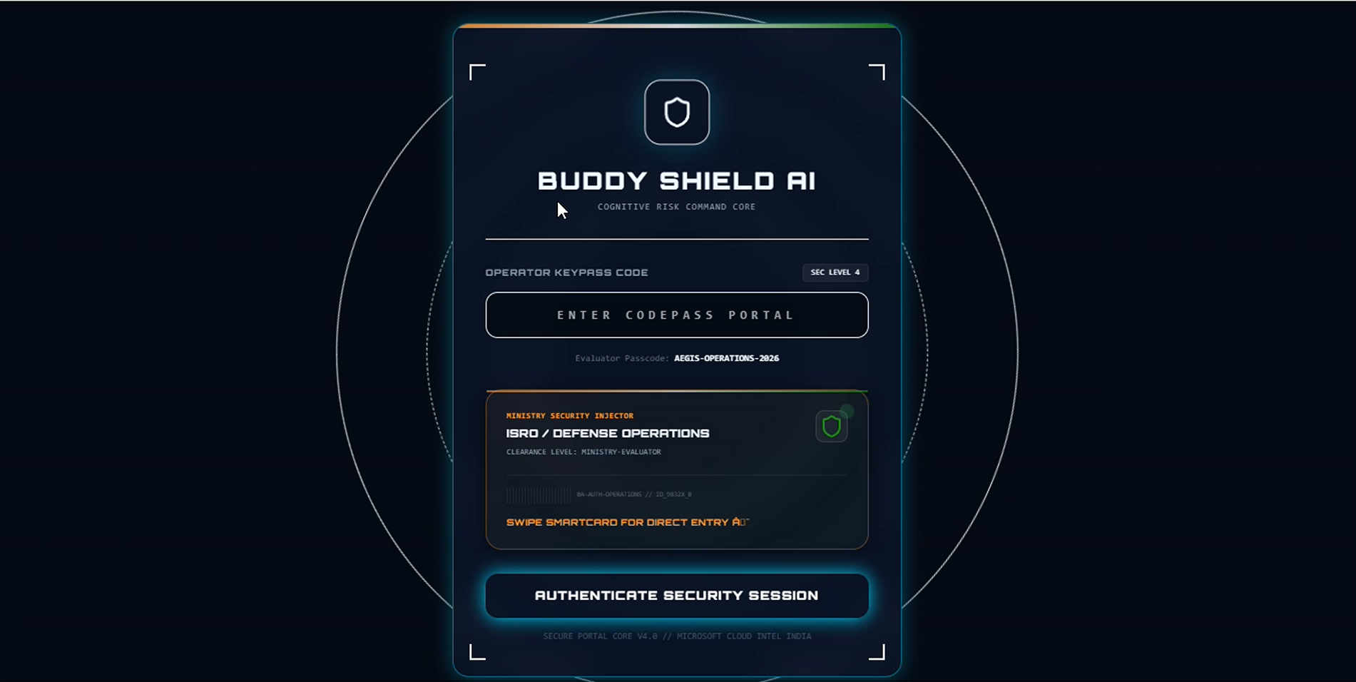
Cyber-terminal login screen — operator keypass authentication and ministry-level security clearance before entering the command core.
-
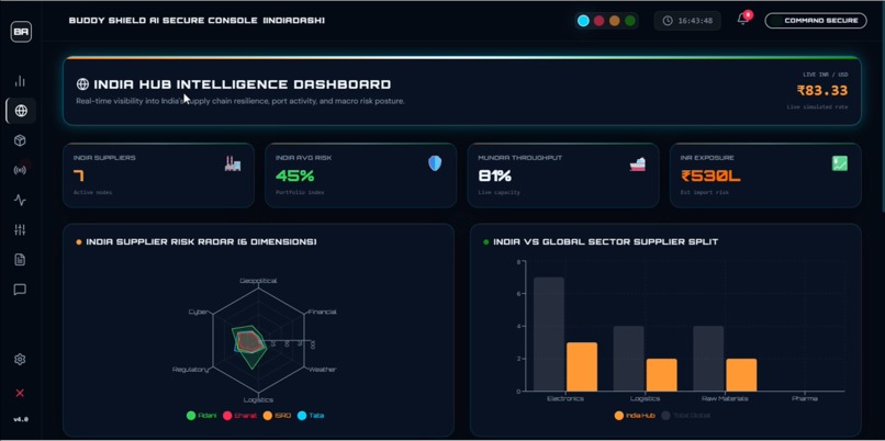
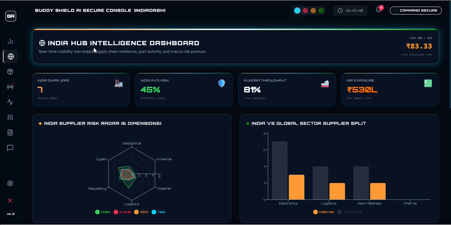
Live supplier risk radar, port throughput, INR exposure, and sector split — India's supply chain vitals in one command view.
-
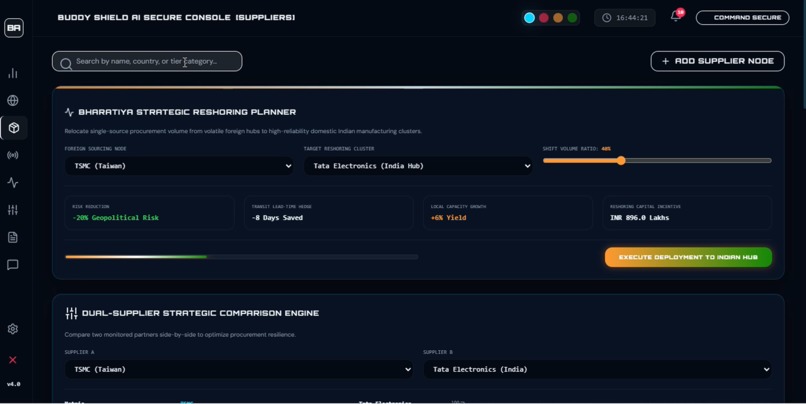
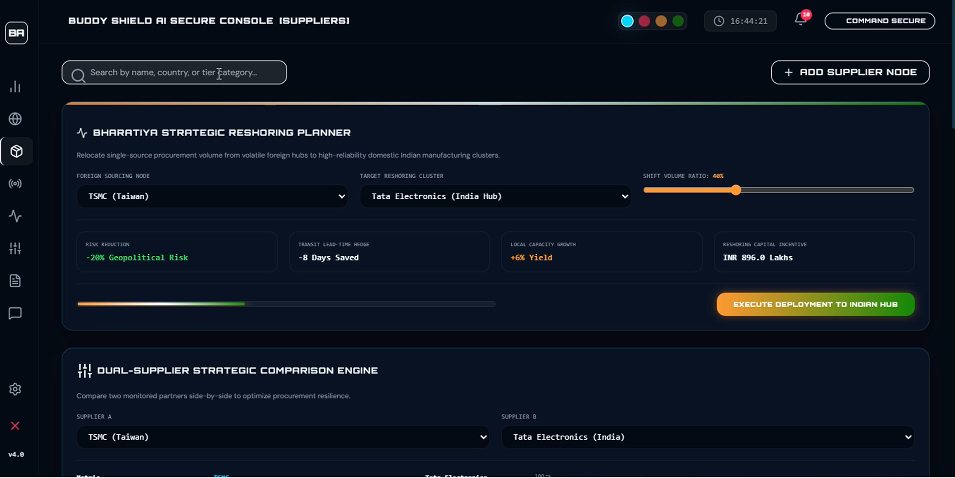
Reshoring planner — simulate shifting foreign procurement to Indian hubs with live risk reduction, lead-time, and capital incentive metrics.
-
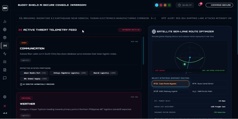
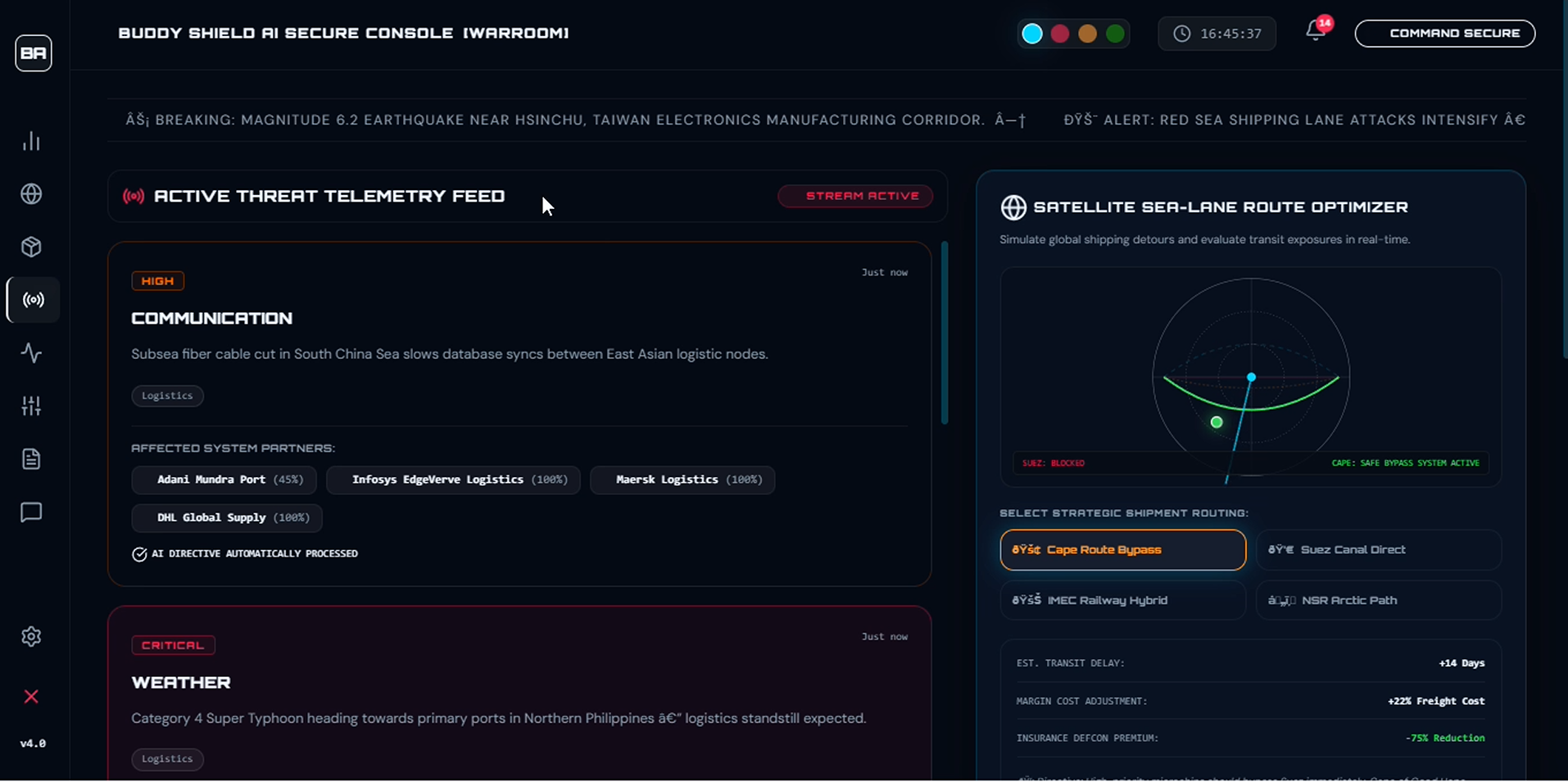
War Room live threat telemetry feed with AI-auto-processed directives and a satellite sea-lane route optimizer for shipping detour decisions
-
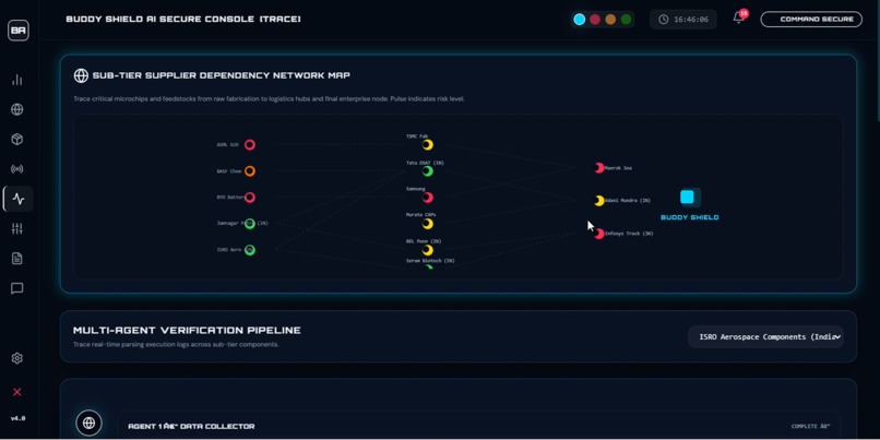
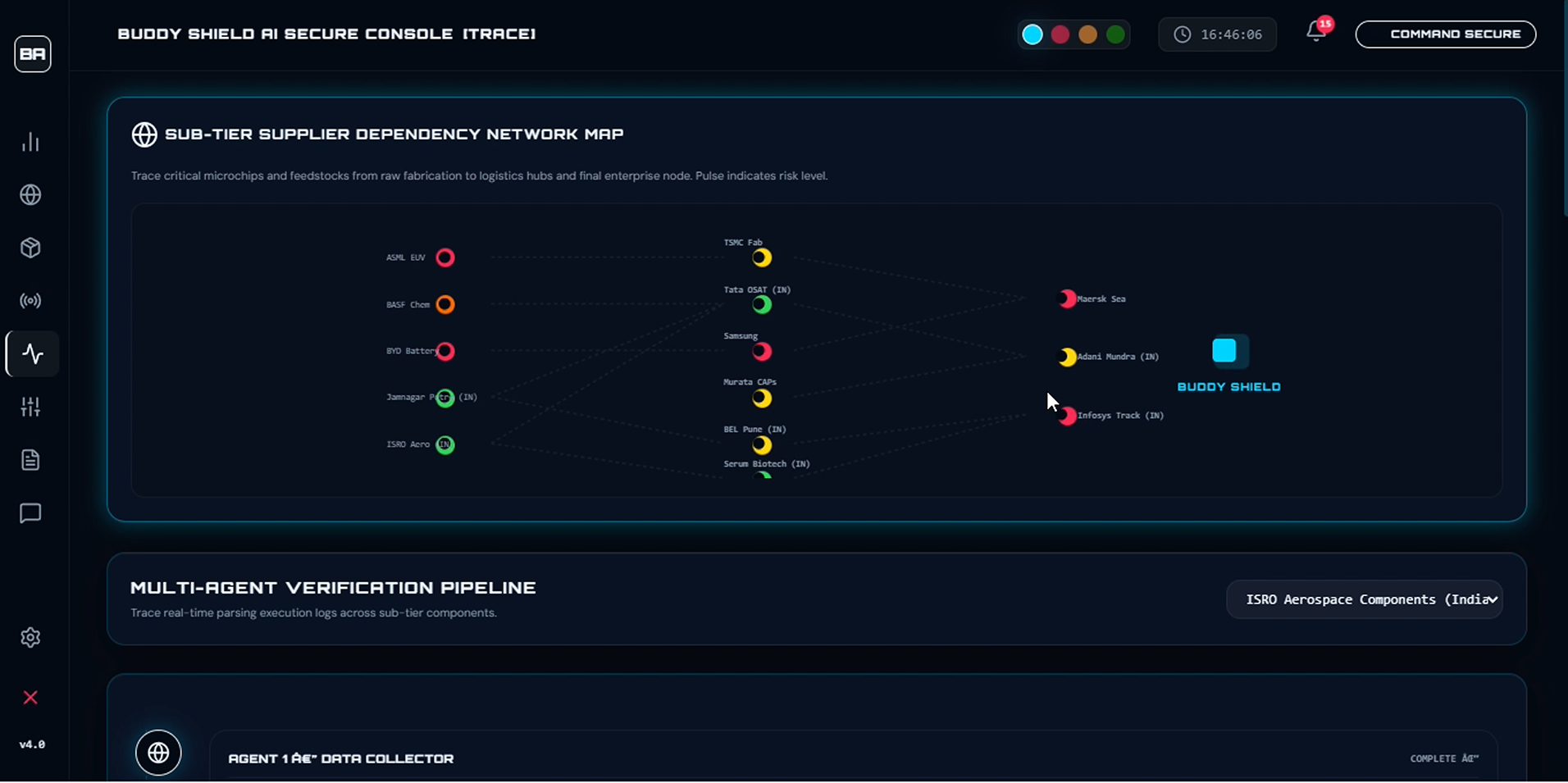
Sub tier supplier dependency map trace critical components from raw fabrication to final node, with pulse indicator showing live risk levels
-
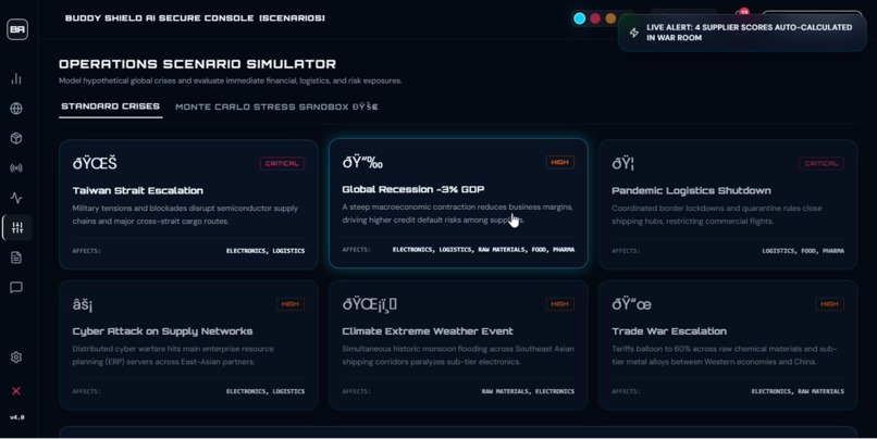
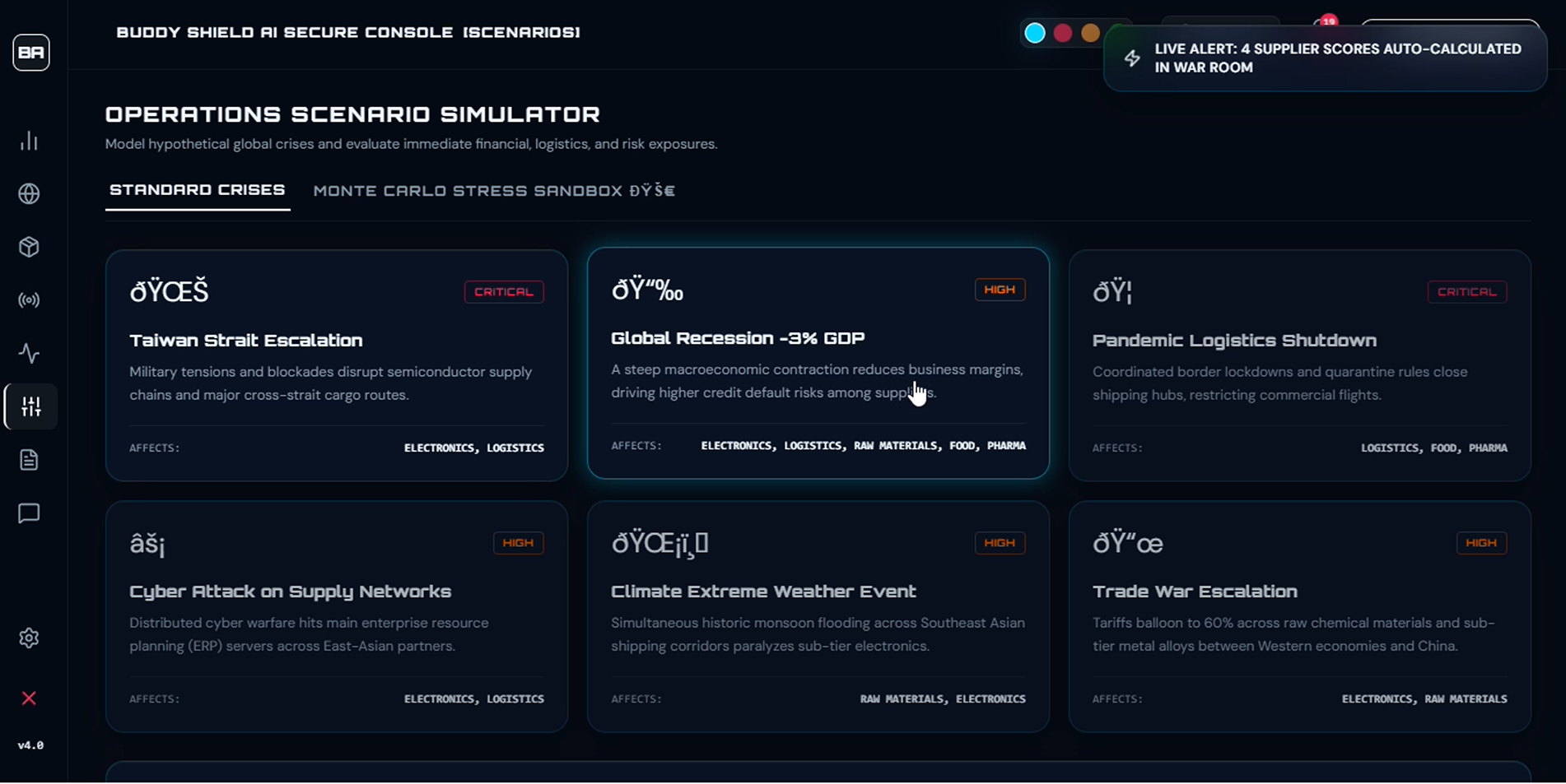
Operations Scenario Simulator model global crises like Strait escalation, trade wars,pandemic shutdowns to stress-test supply chain exposure
-
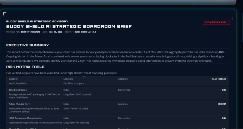
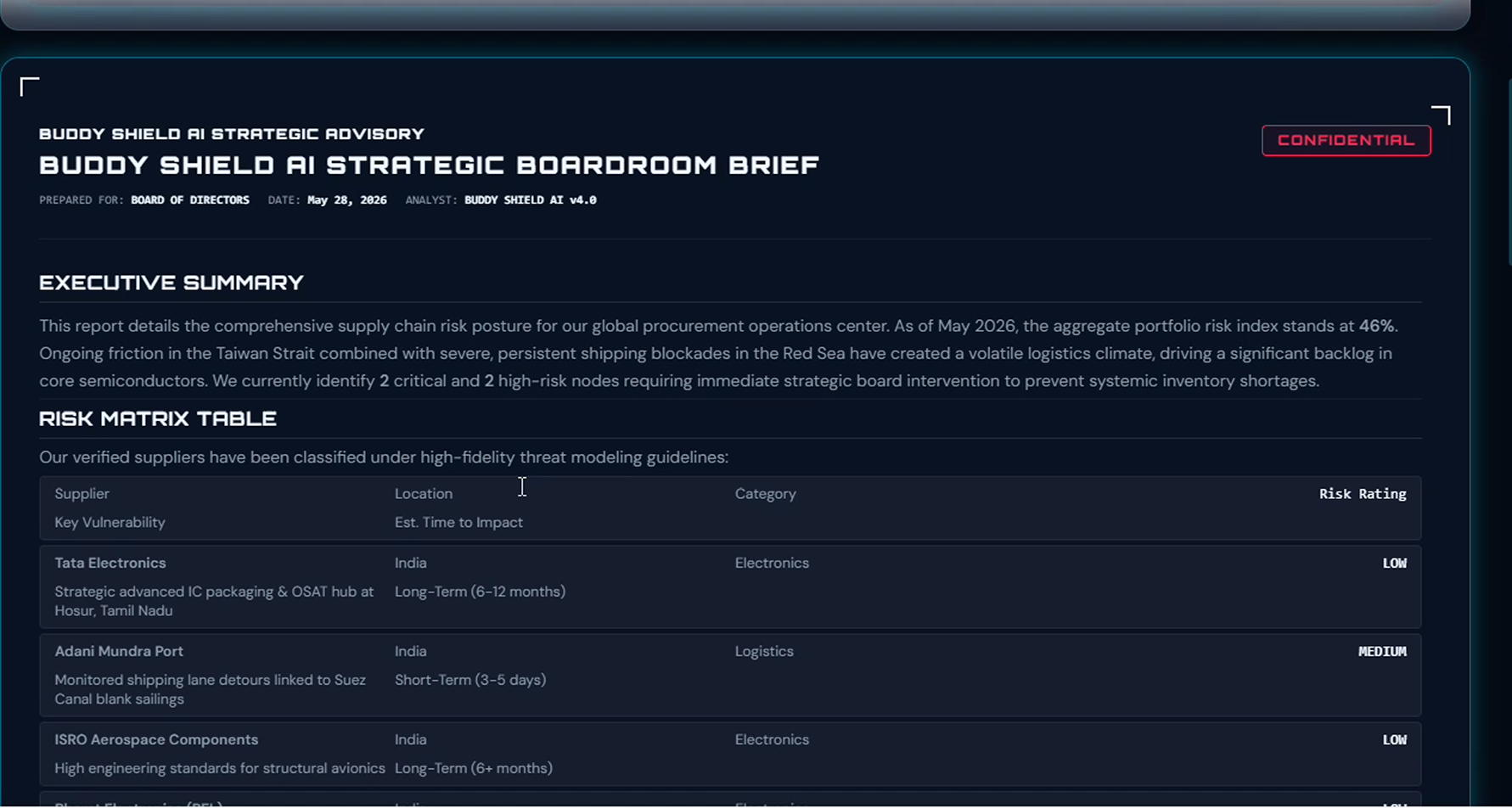
AI-generated Strategic Boardroom Brief executive summary, risk matrix,supplier vulnerability table ready for board-level decision making.
-
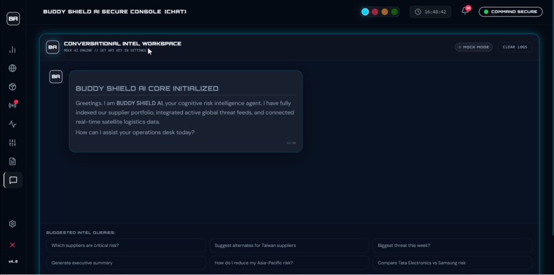
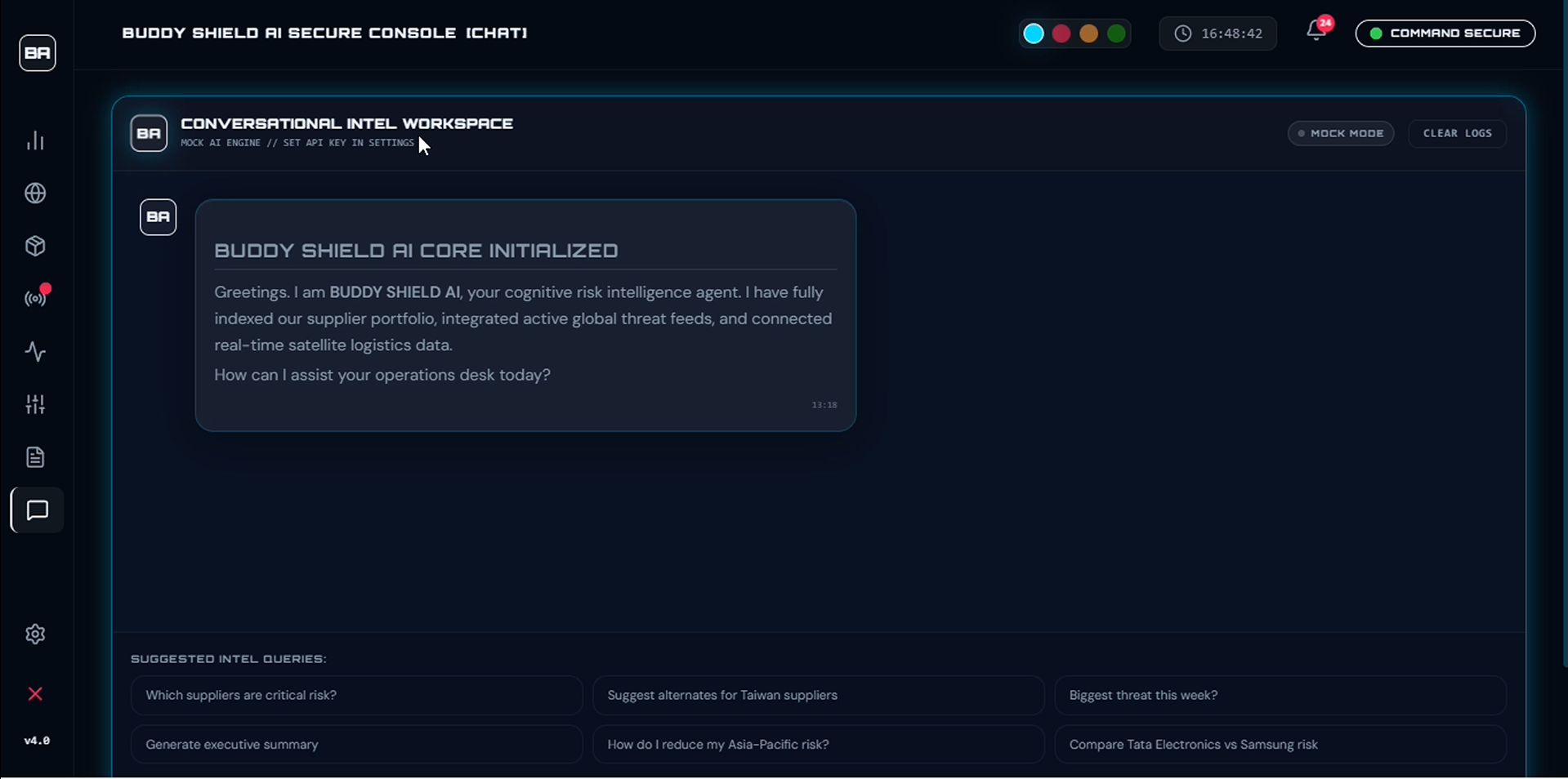
Conversational intel agent — query supplier risks, threat alerts, and Asia-Pacific exposure in plain language, instantly.
BUDDY SHIELD AI — Project Story
💡 Inspiration
India is one of the world's fastest-growing economies, deeply embedded in global supply chains — from semiconductors to pharmaceuticals. Yet most risk intelligence tools are built for Western markets, leaving Indian businesses exposed to geopolitical shifts, port disruptions, cyber threats, and regional instabilities with no dedicated command layer.
I looked at the tools available to Indian supply chain decision-makers and found a glaring gap: generic dashboards built for London or New York, retrofitted with India data as an afterthought. There was nothing that felt like it was made for the complexity of Indian supply chain geopolitics — the port dynamics of JNPT and Chennai, the semiconductor dependencies, the regional border sensitivities, the cyber threat vectors unique to Indian logistics infrastructure.
I wanted to build something that felt like a mission control room — real-time, sharp, and built specifically for the Indian context. That spark became BUDDY SHIELD AI.
🔨 How I Built It
The entire project was built on a modern React frontend stack, designed from the ground up for high-density intelligence visualization:
| Technology | Role |
|---|---|
| React 19 | Component-driven UI architecture |
| Vite | Fast development and optimized production builds |
| Tailwind CSS | Utility-first responsive styling |
| Recharts | Real-time risk dashboards and dynamic data charts |
| Lucide React | Clean, consistent iconography throughout |
The Design Philosophy
Dashboards are not just about displaying data — they are about how fast a human can make a decision under pressure. Every design choice in BUDDY SHIELD AI was made with that constraint in mind.
The interface uses a deliberate cyber-terminal aesthetic — scanline overlays, dark command-center themes, and high-density modular panels — designed to feel like a live intelligence operations hub. Color-coded severity tiers run consistently across every chart and panel:
$$\text{Risk level} \rightarrow \text{Color} = \begin{cases} \text{Green} & \text{Low / Stable} \ \text{Amber} & \text{Elevated / Watch} \ \text{Red} & \text{Critical / Action required} \end{cases}$$
This visual language means a decision-maker can scan the entire dashboard in seconds and immediately know where to focus.
The Data Model
Rather than trying to boil the ocean, I scoped the data model tightly around India-specific risk categories:
- Geopolitical threat vectors relevant to Indian trade routes
- Port disruption signals across major Indian logistics hubs
- Cyber threat intelligence targeting Indian supply chain infrastructure
- Regional instability indicators affecting cross-border trade
This focus kept the MVP tight, relevant, and genuinely useful — rather than a generic global feed that buries the signal in noise.
📚 What I Learned
1. Information density is a design problem, not a data problem
The hardest challenge wasn't getting data onto the screen — it was making high-density information layouts scannable without overwhelming the user. Modular card-based layout with clear visual hierarchy was the solution: each panel owns exactly one type of intelligence, and the grid makes spatial relationships instantly readable.
2. Visual language is a performance feature
The decision to use color-coded risk tiers — green → amber → red — across every chart and panel wasn't aesthetic. It was functional. A user should never have to read a number to know whether a situation is safe or critical. The color communicates the answer before the eyes reach the label.
3. Terminal aesthetics require discipline
The cyber-terminal feel — scanline overlays, monospace accents, dark command-center palette — creates powerful mood and sharpens focus. But applied too heavily, it destroys usability. The discipline was in applying these effects subtly: mood without friction, atmosphere without confusion.
4. Domain research is half the engineering
Building an India-specific supply chain intelligence tool required deep research into Indian port logistics, geopolitical risk frameworks, cyber threat vectors in Indian infrastructure, and the specific trade dependencies that make India's supply chain unique. The data model is only as good as the domain understanding behind it.
🧱 Challenges
Information overload on one screen
Fitting geopolitical risk, port status, cyber threats, and regional instability into a single dashboard without overwhelming the user required a fully modular card-based layout with strict visual hierarchy. Every panel has exactly one job.
Making risk data instantly readable
Raw numbers don't communicate urgency. Implementing consistent color-coded severity tiers — green, amber, red — across all Recharts visualizations required careful theming and a unified design token system applied throughout the component tree.
Terminal aesthetic without hurting usability
CSS scanline effects and dark terminal themes look sharp but can reduce readability if overdone. The solution was restraint: apply atmospheric effects at low opacity and reserve high-contrast elements for actual data, not decoration.
Scoping the data model for India
Global risk intelligence is an endless domain. The discipline of focusing exclusively on India-specific risk categories — rather than a generic global feed — was both a product decision and a technical one. It made the MVP faster to build, easier to understand, and far more useful to the target user.
🏁 What's Next
BUDDY SHIELD AI is a complete, deployable React intelligence dashboard. Future directions include:
- Live API integrations — connecting to real-time port status feeds, geopolitical news APIs, and cyber threat intelligence streams
- Alert system — push notifications when any monitored risk tier escalates to critical
- Exportable intelligence briefs — one-click PDF generation of the current dashboard state for boardroom reporting
- User-configurable watchlists — let decision-makers pin the specific corridors, ports, and threat categories most relevant to their business
🏁 Final Thought
India's supply chain decision-makers deserve tools built for them — not adapted from tools built for someone else.
BUDDY SHIELD AI — Because India's supply chain deserves its own command center.
Built With
- css
- html
- javascript
- lucide-react
- node.js
- react-19
- recharts
- tailwind-css
- vite

Log in or sign up for Devpost to join the conversation.