-

-

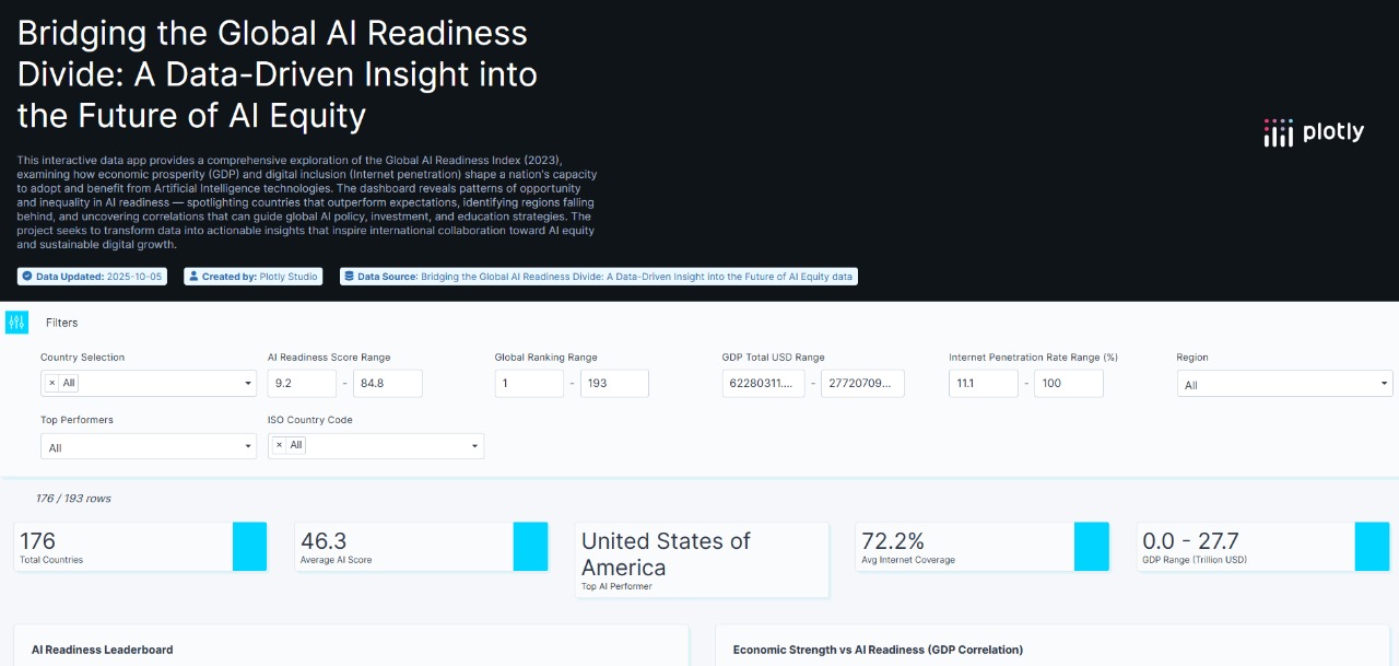
Cover page

Inspiration
The inspiration behind Bridging the AI Readiness Divide came from a simple observation — while AI is advancing rapidly, not every country has equal access to the resources or infrastructure required to benefit from it. We wanted to understand why this gap exists, and how data can help visualize and reduce it. By combining AI Readiness, economic indicators, and digital accessibility, we aimed to tell a global story of innovation, inequality, and opportunity.
What it does
We created an interactive Plotly dashboard that analyzes and visualizes the relationship between AI Readiness, GDP, and Internet Penetration for over 190 countries. The app includes dynamic filters, choropleth maps, bubble matrices, and correlation plots to help users explore insights such as:
-> Which countries lead or lag in AI readiness
-> How GDP and Internet access influence readiness
-> Which nations perform better than expected given their resources
This makes the dashboard both analytical and actionable — a tool for policymakers, educators, and researchers.
How we built it
Data Collection — Gathered AI Readiness Index (Oxford Insights 2023), GDP (World Bank), and Internet Penetration (% of population) data.
Data Merging & Cleaning — Processed and normalized datasets using Python (Pandas, NumPy) to create a unified CSV.
Visualization & Interactivity — Designed an interactive dashboard in Plotly Studio, including:
-> Correlation charts (GDP ↔ AI Readiness)
-> Choropleth maps
-> Regional box plots
-> AI Overachiever Detection Matrix
Styling & Theming — Applied a modern teal–blue theme emphasizing innovation and global connectivity.
Challenges we ran into
Aligning country names and ISO codes across datasets
Dealing with missing or inconsistent data in developing regions
Maintaining interactivity and responsiveness for large-scale data
Structuring a story that combines data science + policy relevance
Accomplishments that we're proud of
Successfully integrated and visualized three global datasets (AI Readiness, GDP, Internet Penetration) into one unified, interactive dashboard.
Identified “AI Overachiever” countries that perform above expectations despite limited resources.
Designed a professional, insight-rich Plotly Studio app that clearly communicates the global AI readiness landscape.
What we learned
How to merge heterogeneous data sources and normalize them for cross-country comparison.
The power of visual storytelling in transforming raw data into meaningful insights.
How economic and digital factors collectively influence AI adoption worldwide.
What's next for Bridging the AI Readiness Divide
Add a predictive machine learning model to forecast AI readiness trends for 2025 and beyond.
Integrate time-series data from previous years to analyze progress over time.
Expand the dashboard with policy recommendations and AI readiness improvement simulations for developing regions.


Log in or sign up for Devpost to join the conversation.