🌍 Breathing From Space
🚀 What it does
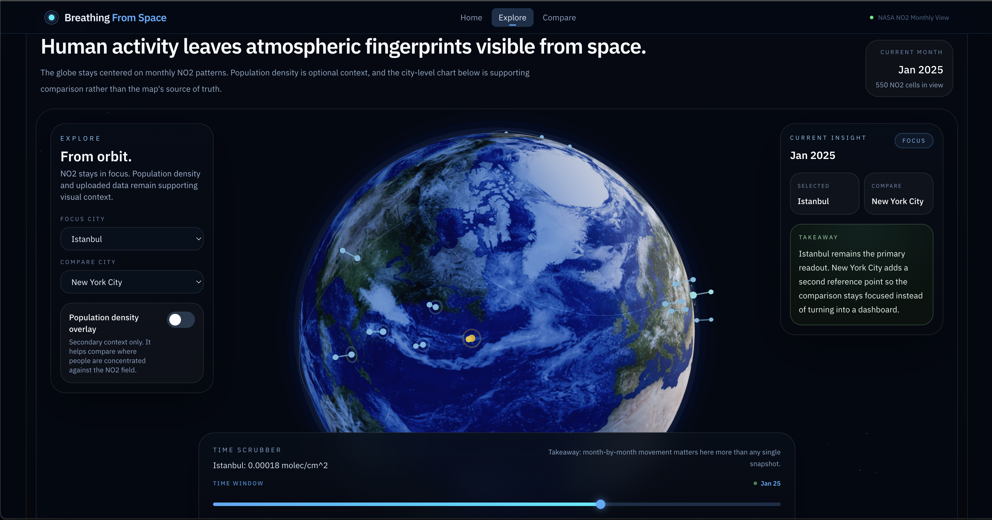
Breathing From Space is an interactive web app that uses NASA satellite data to visualize atmospheric patterns across the globe—making invisible environmental signals visible to everyone.
By exploring nitrogen dioxide (NO₂) levels from space, users can:
- compare cities around the world
- track changes over time
- understand how human activity appears in Earth’s atmosphere
The goal is simple: turn complex space data into a clear, intuitive story about the air we live in.
💡 Inspiration
Most people know pollution and climate change matter—but the data behind it is abstract, technical, and hard to interpret.
NASA collects incredibly rich atmospheric data, but it’s rarely presented in a way that feels human and understandable.
We wanted to answer one question:
What does human activity look like from space?
🧠 How it works
We process NASA atmospheric datasets (focused on NO₂) into lightweight, map-ready data and build a fully interactive frontend that prioritizes storytelling over dashboards.
Key features:
- 🌐 Interactive global map with atmospheric overlays
- ⏳ Time slider to explore patterns over months/years
- 🏙️ City comparison tool (2–4 cities side-by-side)
- 📊 Trend visualizations and simple metrics
- 💬 Plain-English explanations and insight cards
Instead of overwhelming users with raw data, we highlight patterns and provide clear, human-readable takeaways.
🛠️ Tech stack
- Frontend: Next.js, React, TypeScript, Tailwind CSS
- Visualization: Mapbox / charting libraries
- Data processing: Python (pandas)
- Data source: NASA Earth atmospheric datasets
- Hosting: Vercel
No heavy backend—everything is preprocessed and served as fast static data.
⚙️ Challenges we ran into
- NASA datasets are large and not web-friendly → required preprocessing and aggregation
- Avoiding overclaiming scientific conclusions while still telling a compelling story
- Balancing visual polish with hackathon time constraints
- Designing something that feels like a product, not just a demo dashboard
🏆 Accomplishments we’re proud of
- Turning raw satellite data into an intuitive, story-driven experience
- Building a polished, fast, and visually engaging interface
- Making complex atmospheric science understandable to non-experts
- Creating a clear narrative instead of just charts
📚 What we learned
- Data storytelling is more impactful than raw analytics
- Simplicity and clarity matter more than feature count
- Preprocessing is key when working with scientific datasets
- Good UX can make complex topics accessible to anyone
🔮 What’s next
- Add more environmental datasets (temperature, aerosols, etc.)
- Improve insight generation (AI-assisted summaries)
- Expand to more granular geographic data
- Add a guided “story mode” for education
🌌 Why it matters
NASA data shows patterns we can’t see—but those patterns reflect how we live.
Breathing From Space makes those invisible signals visible, helping people understand the relationship between human activity and the atmosphere in a way that’s intuitive, visual, and memorable.

Log in or sign up for Devpost to join the conversation.