-
-
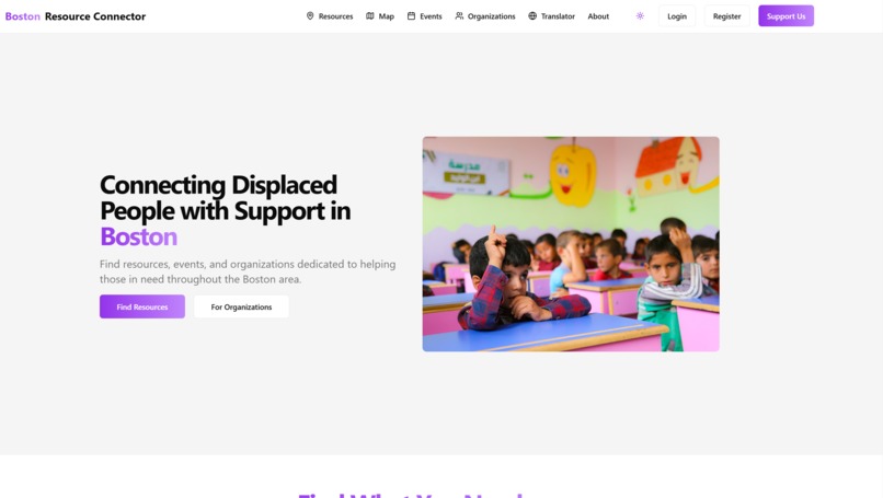
web design

🎯 Boston Resource Connector - Contribution Widget
A modern, animated contribution widget designed to make community participation seamless and engaging. This widget provides an intuitive interface for users to contribute resources, events, and feedback to the Boston Resource Connector platform.

✨ Features
🎨 Visual Design
- Floating action button with gradient background
- Smooth expand/collapse animations
- Color-coded contribution categories
- Dark mode support
- Responsive design for all screen sizes
- Micro-interactions for enhanced user engagement
🛠️ Functionality
- Five contribution types:
- 💡 Add Resource
- 🏢 Register Organization
- 📅 Submit Event
- 📍 Add Location
- 💭 Give Feedback
- Real-time visual feedback
- Toast notifications for user actions
- Seamless integration with existing applications
🎭 User Experience
- One-click access from any page
- Intuitive step-by-step flow
- Clear visual hierarchy
- Accessible design patterns
- Smooth transitions and animations
🚀 Installation
Install the required dependencies:
npm install framer-motion lucide-react @radix-ui/react-toastCopy the widget component:
cp components/contribute-widget.tsx your-project/components/Import and add to your layout:
import { ContributeWidget } from "@/components/contribute-widget"
export default function Layout({ children }) { return ( <> {children} </> ) }
## 💻 Usage

The widget is designed to be plug-and-play. Once added to your layout, it will appear as a floating action button in the bottom-right corner of your application.

```tsx
// Basic usage
<ContributeWidget />

// With custom position
<ContributeWidget className="bottom-4 right-4" />

// With custom theme
<ContributeWidget theme="custom" />
🎨 Customization
Contribution Types
Modify the contributionTypes array to customize available options:
const contributionTypes = [
  {
    id: "custom-type",
    title: "Custom Action",
    description: "Your custom description",
    icon: <YourIcon className="w-6 h-6" />,
    color: "bg-custom-500",
  },
  // ... more types
]
Styling
The widget uses Tailwind CSS for styling. Customize the appearance by modifying the following classes:
- Button gradient:
from-purple-500 to-blue-500 - Card background:
bg-white dark:bg-gray-900 - Animations: Modify Framer Motion variants
- Icons: Replace Lucide icons with your preferred icon set
Animations
Customize animations by modifying the Framer Motion variants:
<motion.div
  initial={{ scale: 0.8, opacity: 0 }}
  animate={{ scale: 1, opacity: 1 }}
  exit={{ scale: 0.8, opacity: 0 }}
  transition={{ duration: 0.2 }}
>
  {/* Widget content */}
</motion.div>
📊 Performance
The widget is optimized for performance:
- Lazy-loaded animations
- Minimal bundle size
- Efficient re-renders
- Responsive to all screen sizes
🤝 Contributing
We welcome contributions! To contribute:
- Fork the repository
- Create your feature branch
- Commit your changes
- Push to the branch
- Create a Pull Request
📝 License
🙏 Acknowledgments
- Framer Motion for animations
- Lucide Icons for beautiful icons
- Tailwind CSS for styling
- shadcn/ui for UI components
📞 Support
For support, please:
- Open an issue on GitHub
- Contact us through our website
- Join our community Discord
Made with ❤️ for the Boston community :D
Built With
- next.js
- react
- tailwind

Log in or sign up for Devpost to join the conversation.