-

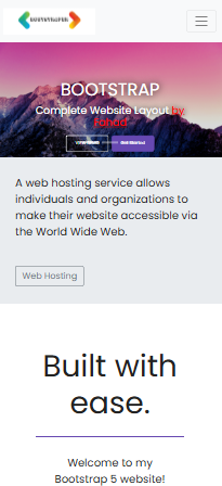
Mobile View
-

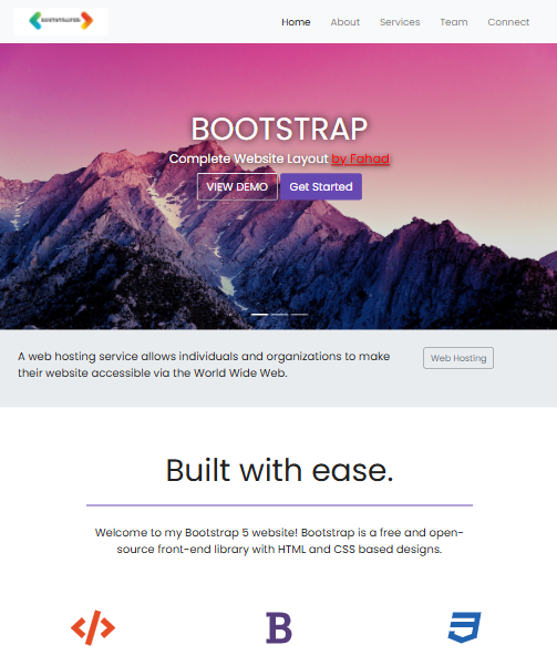
Tablet View
-
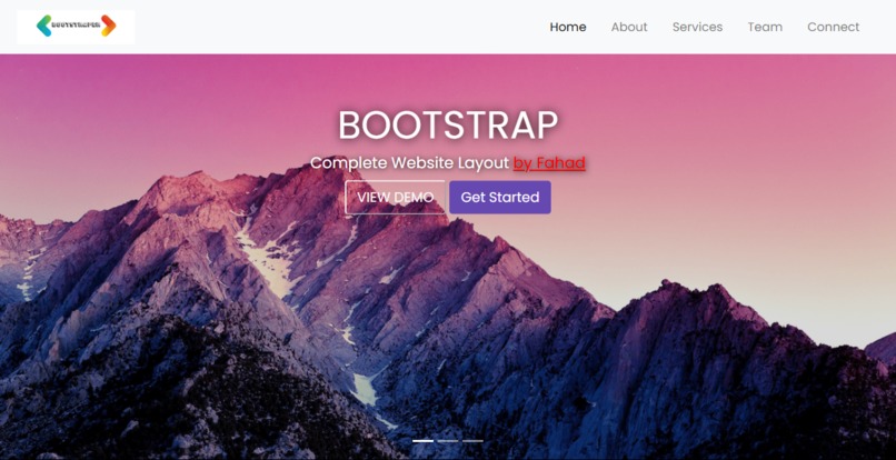
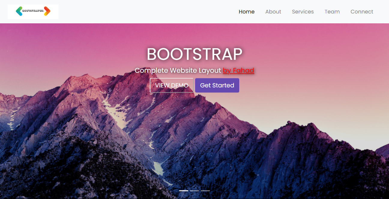
Desktop View
Inspiration
I wanted to create a cool website that looks great on any device. Bootstrap seemed perfect because it makes designing websites easier with ready-to-use components.
What it does
The Bootstrap Website Template I made is all about showing off a modern design that works well on phones, tablets, and computers. It has a slick navigation bar, a cool image slider, and even fun emoji gifs you can click on.
How we built it
I built this project using Bootstrap, leveraging its grid system and components to ensure scalability and responsiveness across different devices. HTML5 and CSS3 were used for structuring and styling, I did'nt apply any JavaScript for enhancing user interactions yet, but will do it in future.
Challenges we ran into
Customizing Bootstrap to match exactly what I wanted was tricky. Making sure everything looked good on different screen sizes was a bit of a puzzle too. I had to tweak a lot of settings in CSS to get it just right.
Accomplishments that we're proud of
I'm really happy with how it turned out visually. Getting the navigation smooth and making sure the website looks good on any device felt like a big win.
What we learned
I learned a ton about using Bootstrap effectively. It's great for making websites that look good fast. I also got better at tweaking CSS to make things fit perfectly.
What's next for Bootstrap Website Template
Next, I want to add more cool features and maybe upgrade it a bit and use JS. I'll keep improving it to make sure it's easy to use and looks awesome on any screen.


Log in or sign up for Devpost to join the conversation.