-
-
logo top left
-
text left bottom
-
-
logo left bottom


Inspiration
Hackathon participants were struggling with ugly, intrusive badge requirements that ruined their beautiful designs. We saw developers choosing between compliance and aesthetics - an unnecessary compromise.
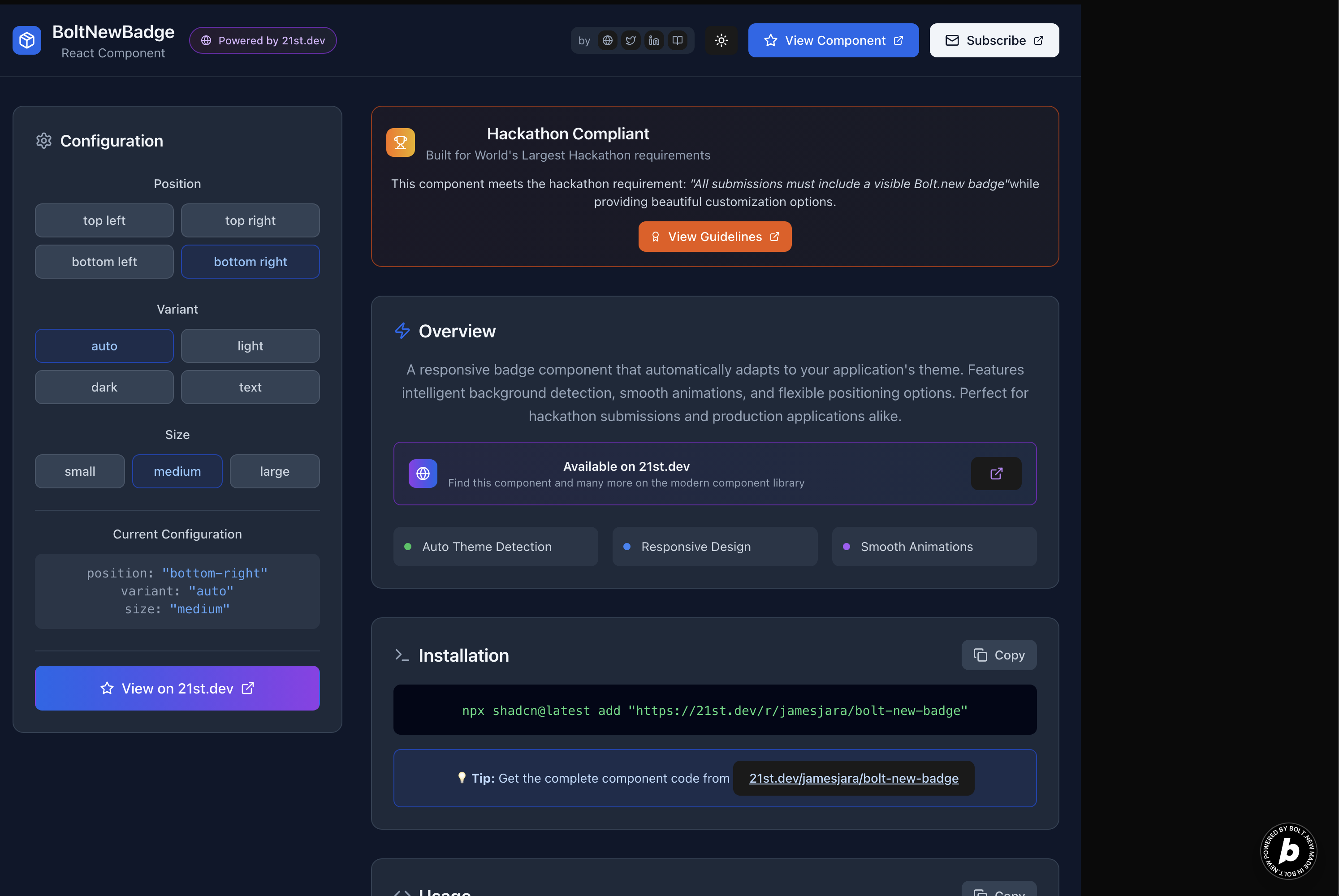
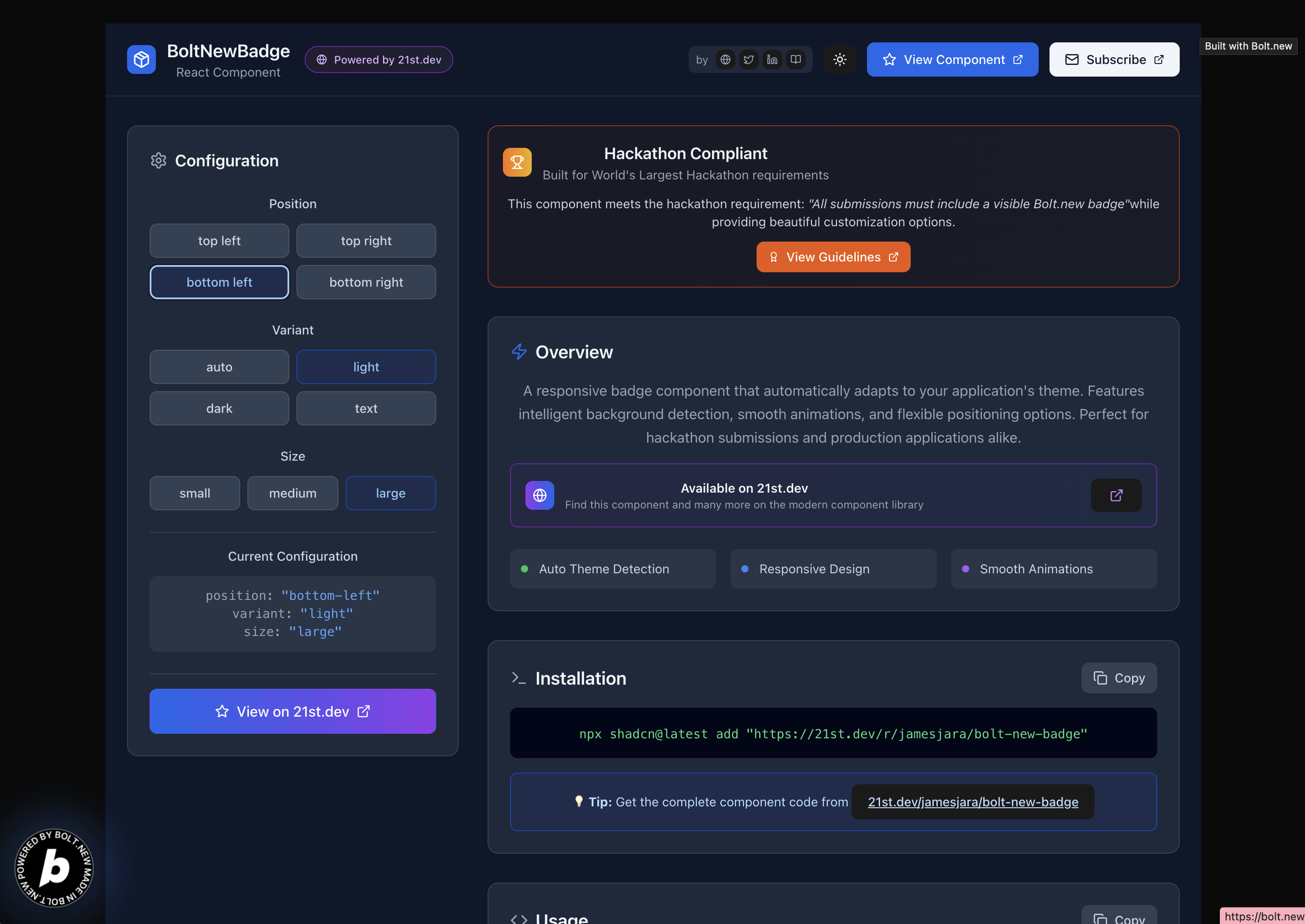
What it does
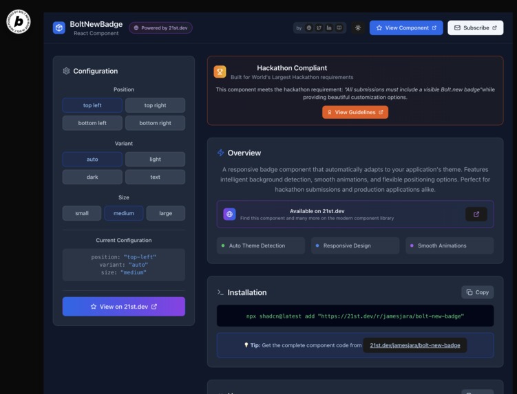
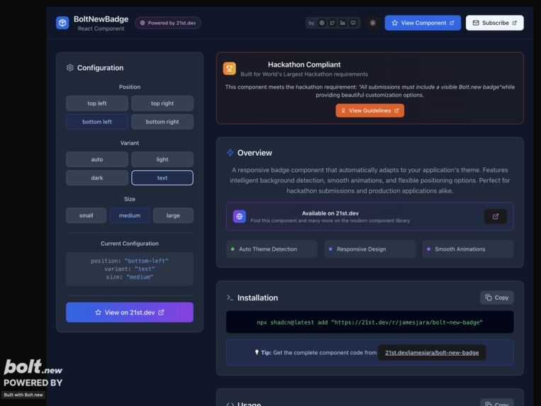
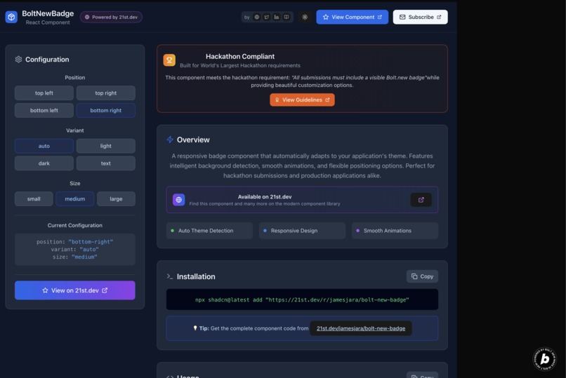
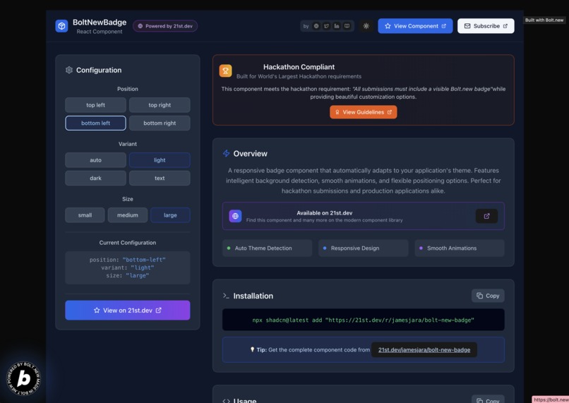
BoltNewBadge automatically adapts to your app's theme, offers flexible positioning (4 corners), multiple variants (auto/light/dark/text), and three sizes. It's hackathon-compliant while maintaining design integrity.
How we built it
Built with React, TypeScript, and Tailwind CSS using shadcn/ui architecture. Implemented intelligent theme detection, smooth animations, and responsive design. Distributed through 21st.dev's component registry for easy installation.
Challenges we ran into
Theme detection across different backgrounds was tricky. Balancing visibility requirements with aesthetic appeal required multiple iterations. Ensuring responsive behavior across all device sizes took careful testing.
Accomplishments that we're proud of
Created the first hackathon badge that developers actually want to use. Achieved seamless theme integration and built a reusable component that works in any React project with one-line installation.
What we learned
Good design doesn't have to sacrifice functionality. Component libraries need both technical excellence and developer experience. Sometimes the best solution is the one that removes friction entirely.
What's next for BoltNewBadge 21st.dev Component
Adding animation presets, custom branding options, and analytics integration. Planning to expand the 21st.dev component library with more hackathon-friendly tools that prioritize both compliance and beautiful design.
Built With
- 21st.dev
- bolt.new
- javascript
- react


Log in or sign up for Devpost to join the conversation.