-
-

Icon
-
-
-
-
-
-
-
-
-
-
-
-

Inspiration
Bite started as a very personal project.
After quitting smoking, I gained some weight and wanted a simple way to become a little more aware of what I was eating. I tried the usual calorie-tracking approach, but I quickly realized that I didn't want another app built around numbers, targets, and logging every gram of food.
I wanted something lighter.
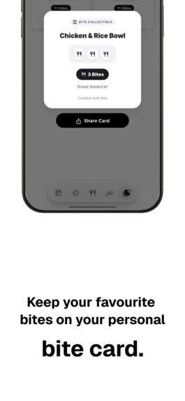
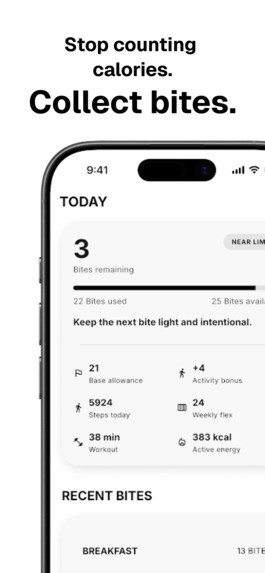
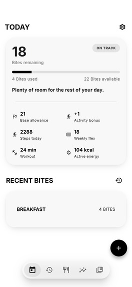
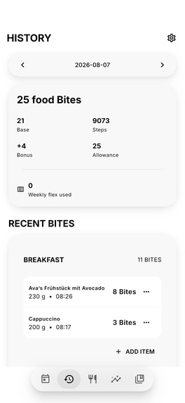
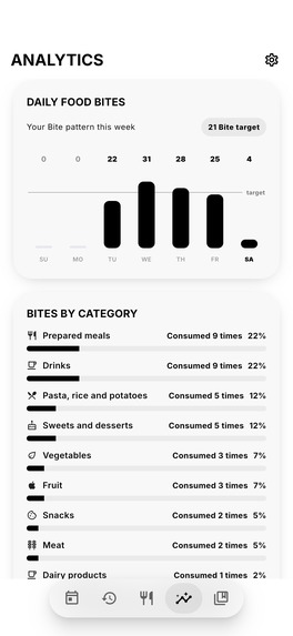
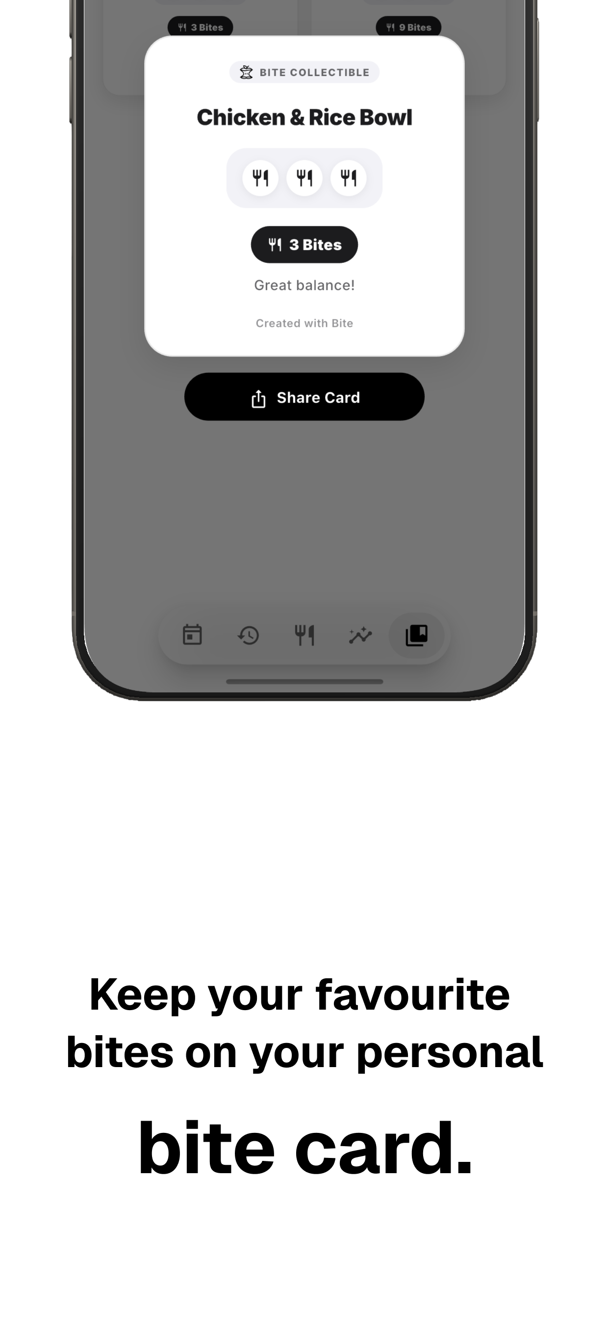
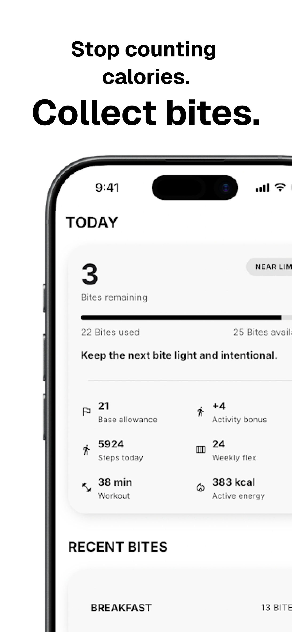
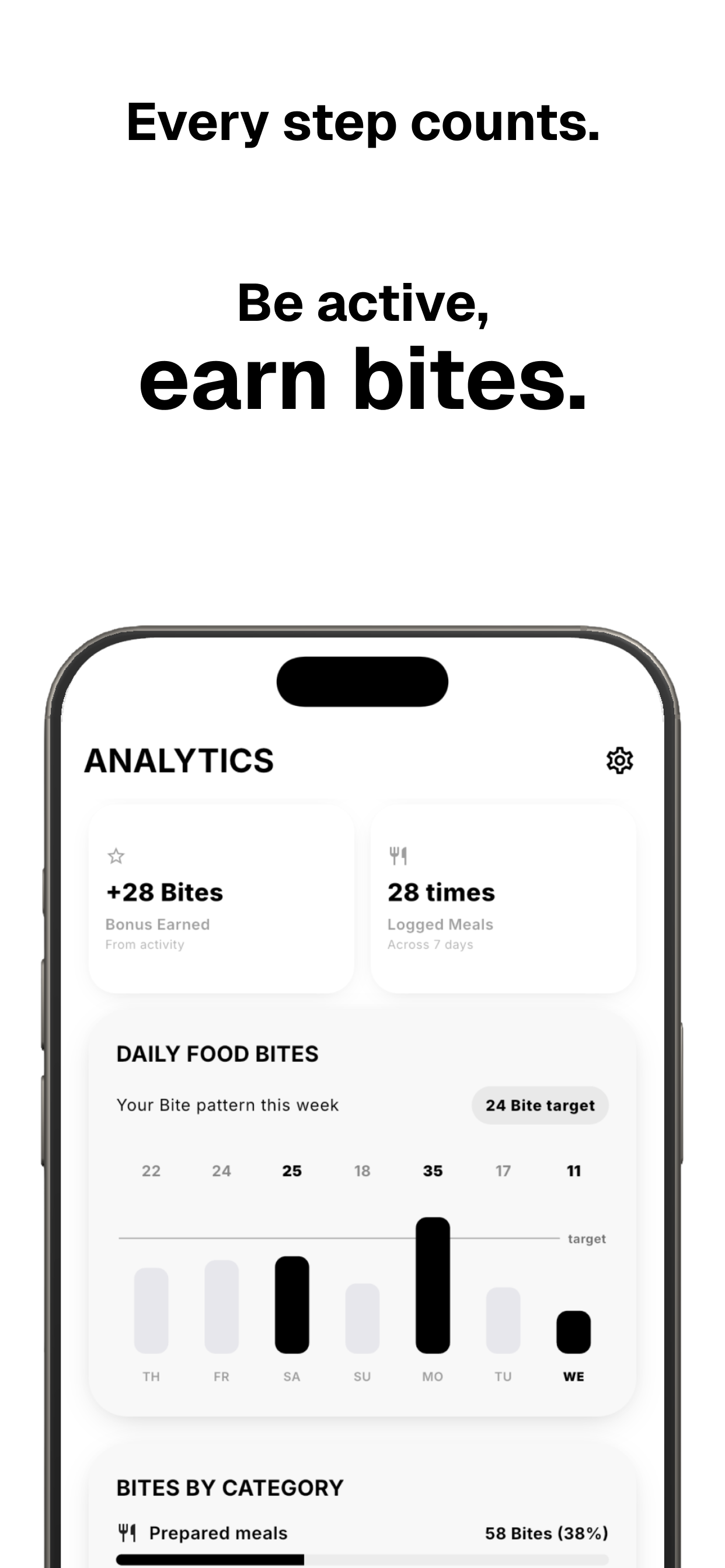
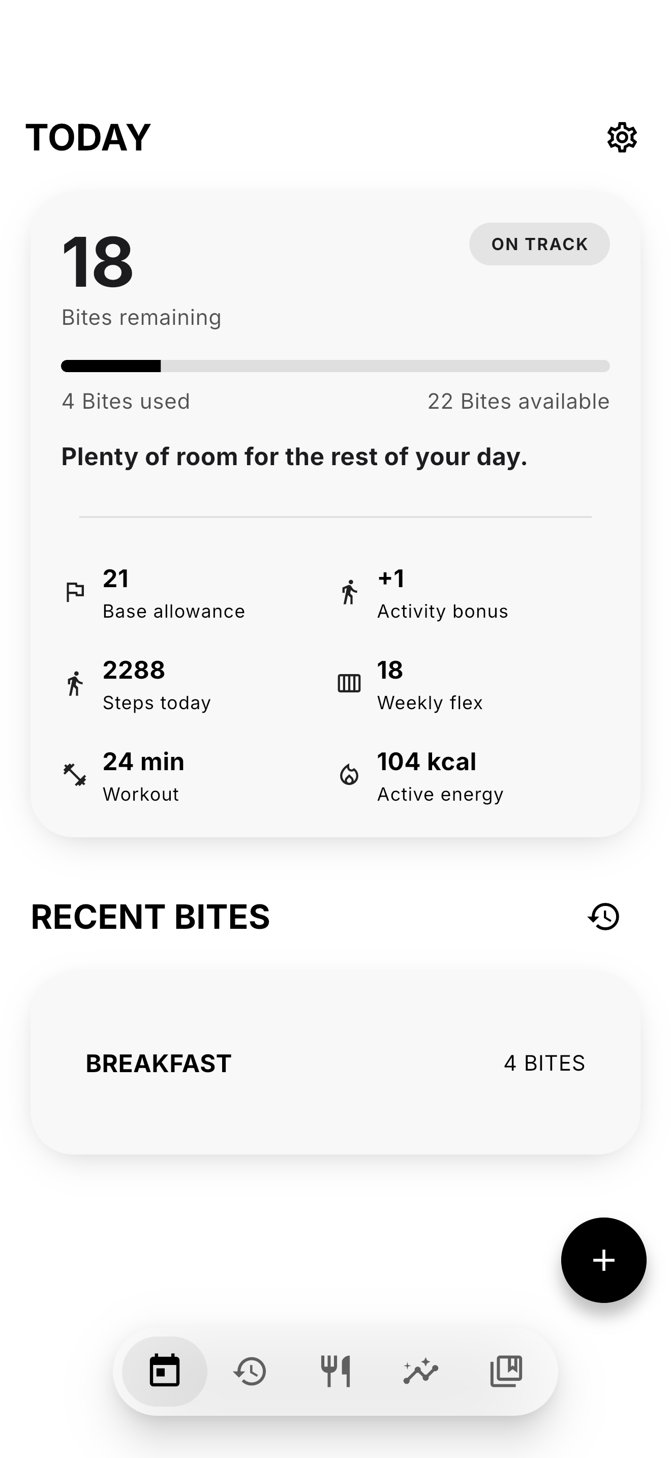
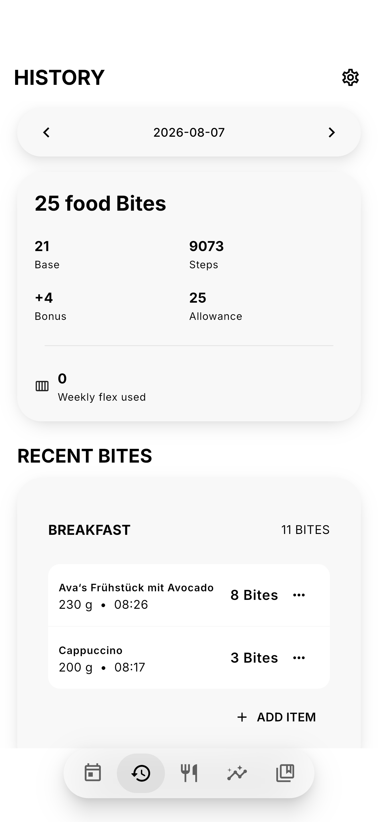
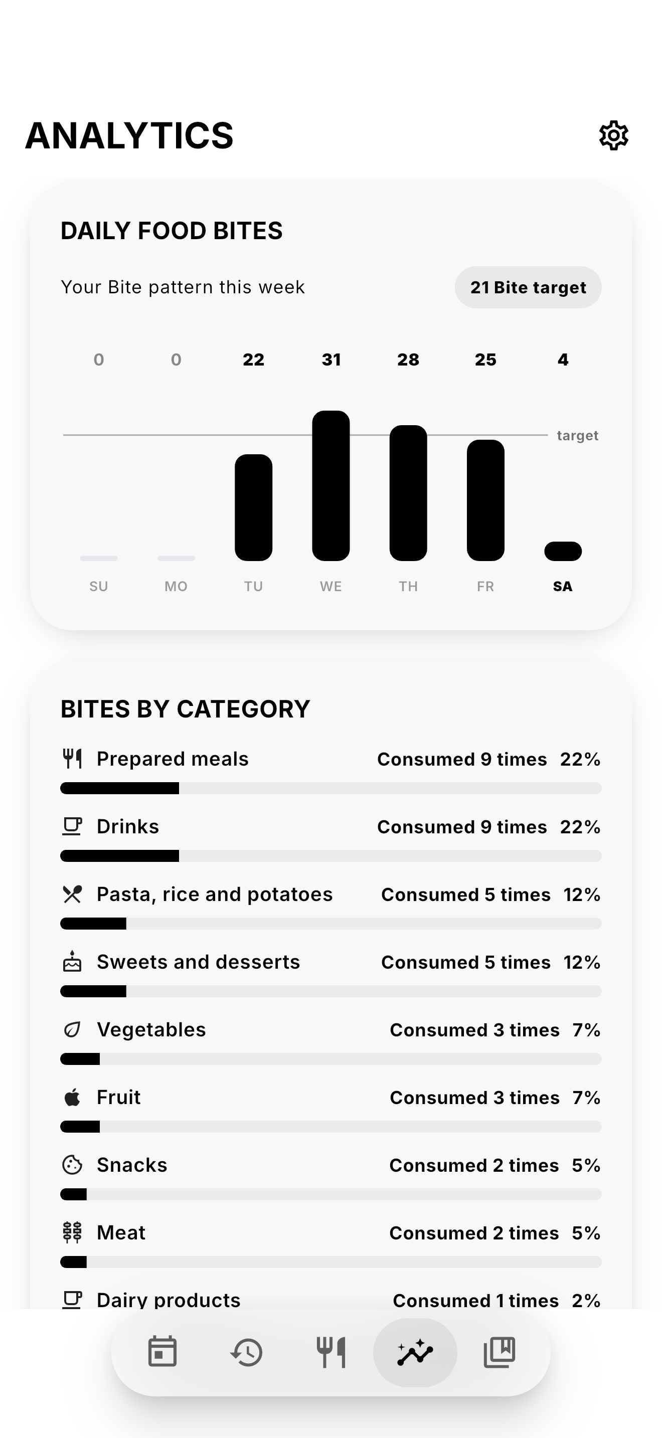
The idea behind Bite became: instead of counting calories, give food a simple value called Bites and make tracking feel quick enough that I would actually keep doing it.
From AI to the Bite Editor
My first idea was to use AI and image recognition: take a photo of a meal, identify the food, and calculate the Bites automatically.
It sounded great in theory, but meals are surprisingly difficult to understand from an image alone. Portion sizes are ambiguous, ingredients are hidden, and visually similar foods can have completely different nutritional values.
I eventually realized that investing more time into the AI wasn't necessarily making the experience better.
So I changed direction.
Instead, I built the Bite Editor.
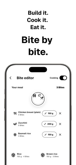
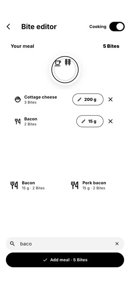
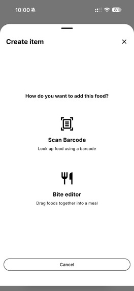
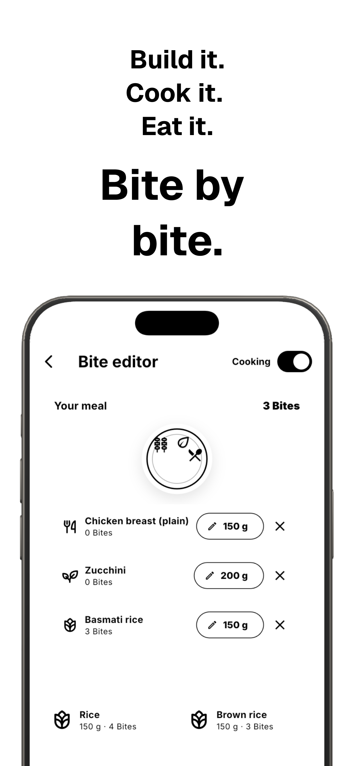
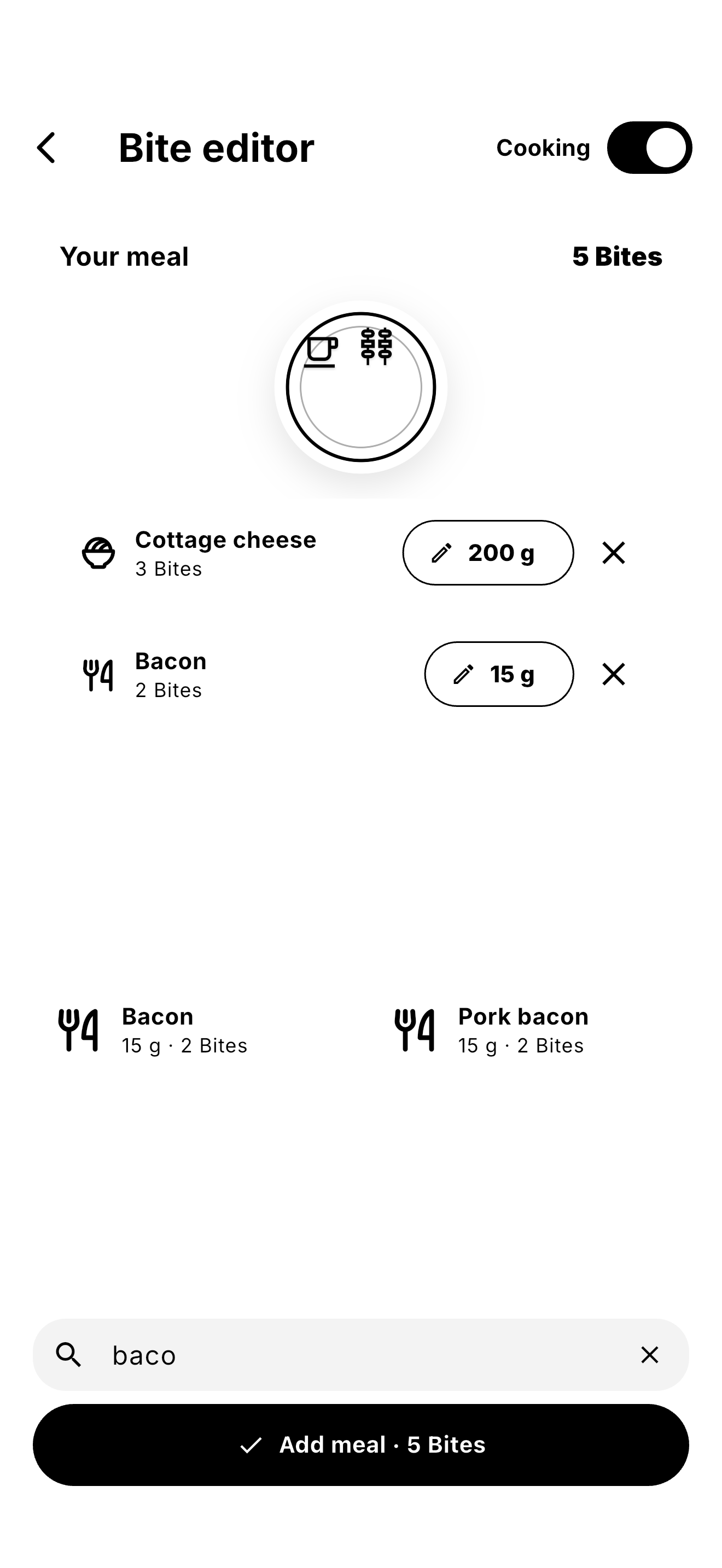
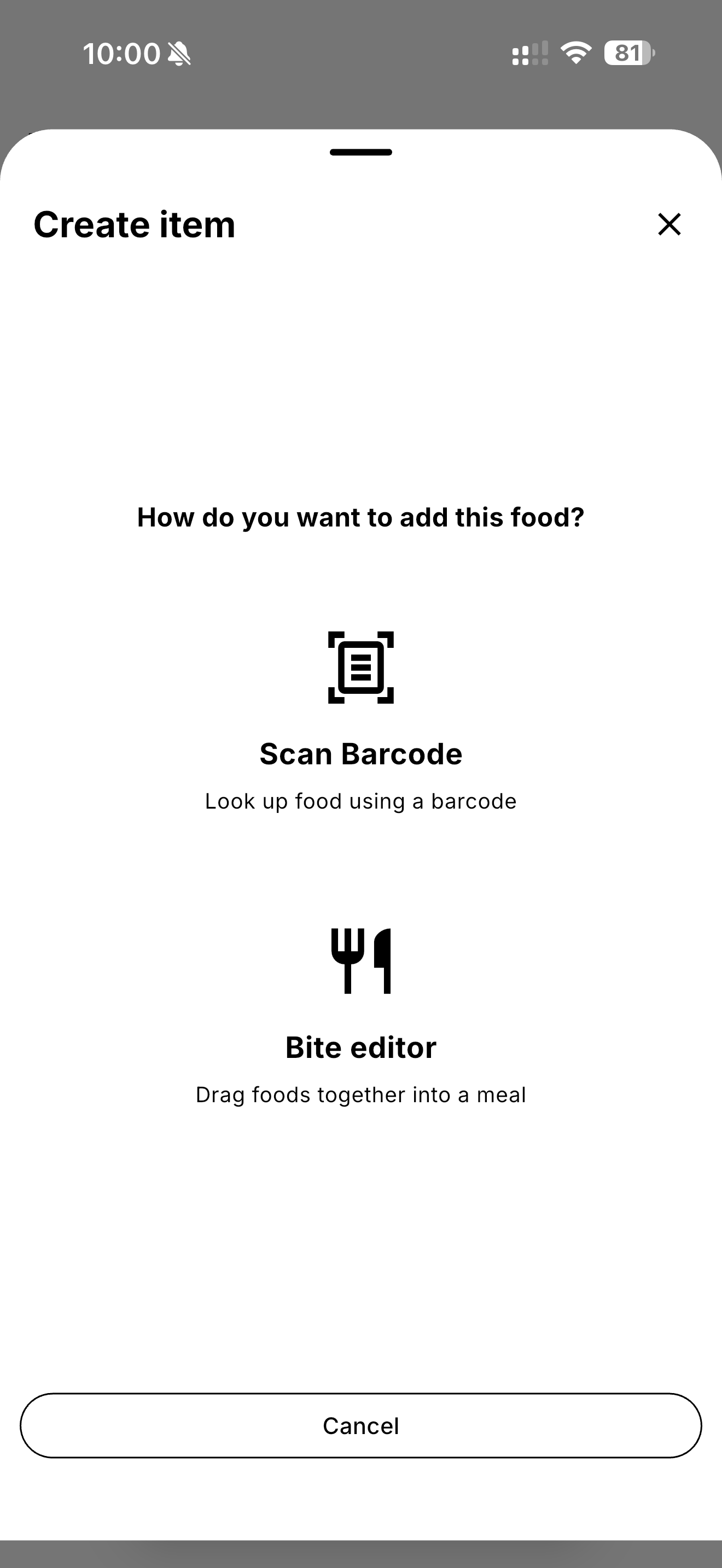
The Bite Editor works a little like writing down a receipt. You build your meal one ingredient at a time, add the amount, and Bite calculates the result while you go.
For example:
- 60 g oats
- a little quinoa
- 1 tsp maple syrup
- cinnamon
The interaction is intentionally small and fast. It gives the user control over what actually went into the meal without turning meal tracking into filling out a spreadsheet.
For packaged food, Bite also supports barcode scanning, so users don't have to manually build everything they eat.
What I learned
The biggest lesson from building Bite was that automation isn't always the best user experience.
AI could make the first interaction look more impressive, but reliability matters much more in an app people use every day. If users constantly have to correct what the app thinks they ate, the automation becomes additional work instead of removing it.
The Bite Editor ended up being much simpler technically, but also much more predictable and understandable for the user.
It also changed the philosophy of the app.
Bite isn't trying to perfectly analyse your plate.
It's trying to make food tracking lightweight enough that it doesn't feel like food tracking.
The goal
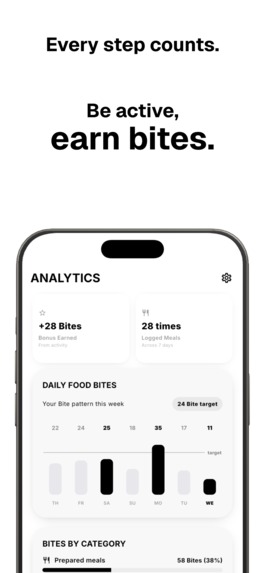
Bite is designed for people who want a little structure around what they eat without using a traditional calorie counter.
There are no complicated dashboards required to log a meal and no expectation that every meal has to be documented perfectly.
Build the meal, see the Bites, and move on.
How I built it
Bite is built as a cross-plattform Flutter application for both iOS and Android, with a local-first approach.
Instead of relying on cloud services or AI APIs, I focused on creating an experience that is fast, reliable and predictable.
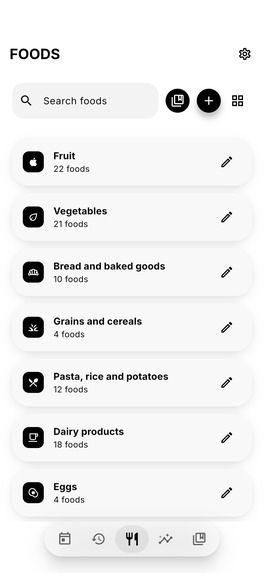
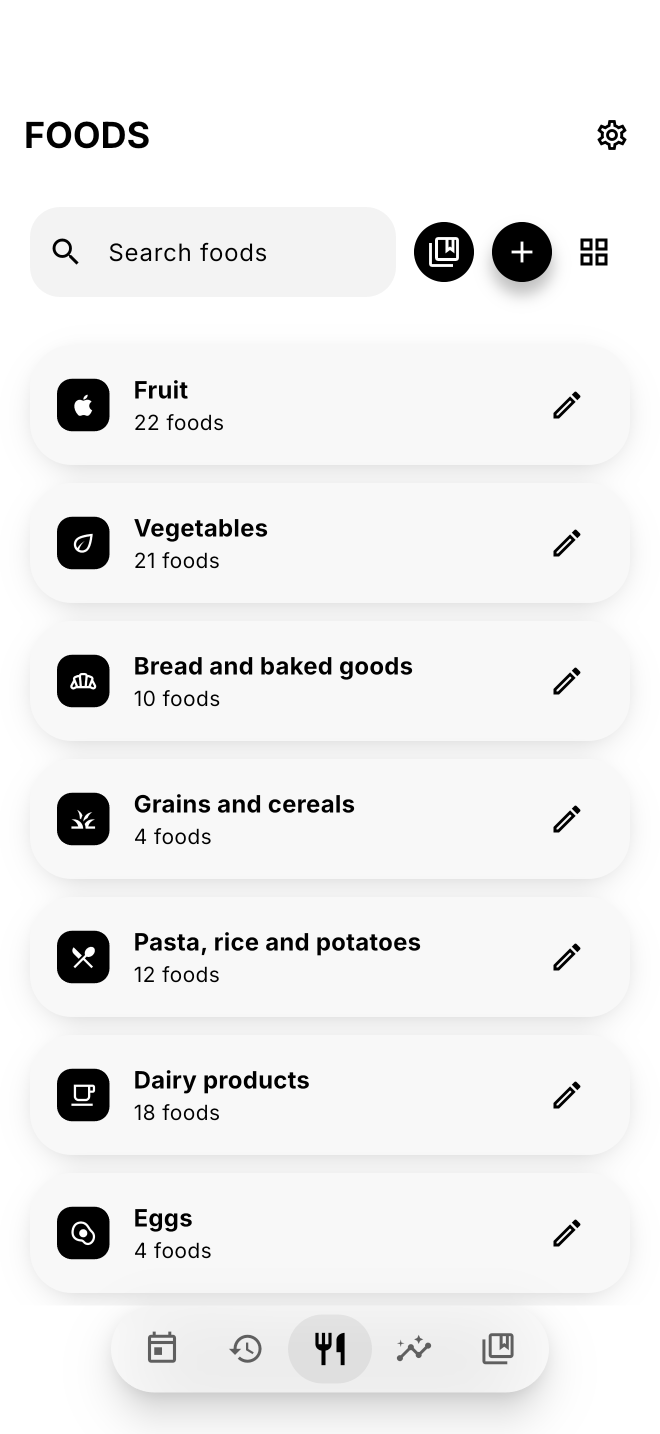
The core of the app is the Bite Editor, where meals are built ingredient by ingredient. Users can search the food library, specify quantities, and compose meals just like writing a grocery receipt. For packaged food, barcode scanning makes adding products almost instant.
Everything was designed around reducing friction so that logging a meal takes only a few seconds.
Challenges I ran into
The biggest challenge was knowing when to remove features instead of adding more.
Originally, Bite relied heavily on AI image recognition. While the concept was exciting, it struggled with portion sizes, hidden ingredients and mixed dishes. I realized that asking users to constantly correct AI predictions created more work than simply letting them build the meal themselves.
Choosing to remove AI entirely was probably the hardest decision, but it ultimately resulted in a much better product.
Designing a meal editor that felt lightweight while still supporting detailed nutrition information was another interesting challenge.
Accomplishments that I am proud of
- Building a meal editor that is genuinely enjoyable to use.
- Creating a lightweight alternative to traditional calorie trackers.
- Supporting both manually created meals and barcode scanning in one simple workflow.
- Designing an experience that prioritizes speed and simplicity over unnecessary complexity.
- Having the confidence to simplify the product instead of continuously adding features.
What I learned
This project reinforced a lesson I had learned before: impressive technology does not automatically create a better user experience.
Removing AI wasn't a compromise—it was an improvement.
By focusing on reliability, transparency and user control, Bite became faster, easier to understand and more enjoyable to use. Sometimes the best solution is the simplest one.
What's next for Bite
The next step is expanding the food library and making meal creation even faster.
I am also exploring smarter ways to suggest foods and recipes without sacrificing the transparency and control that define Bite.
The long-term goal is to make healthy eating feel approachable—not by counting every calorie, but by giving people a simple, sustainable tool they'll actually want to use every day.


Log in or sign up for Devpost to join the conversation.