Inspiration
Every intro AI curriculum teaches that models can be biased. Almost none of them can show it, because showing it needs three things at once: a working model, real data with a real base rate difference, and a control the student can move.
So students learn "AI can be biased" as a sentence to memorize. They have never watched it happen, and you cannot recognize in your own work something you have never seen.
The thing that bothered me most is that a fairness failure does not look like a failure. It does not crash. It reports 84 percent accuracy and it is telling the truth. The damage lives in the gap between how the model fails for one group versus another, and that gap is invisible in every metric a beginner is taught to check.
I wanted to build the ten minutes where that stops being a sentence.
What it does
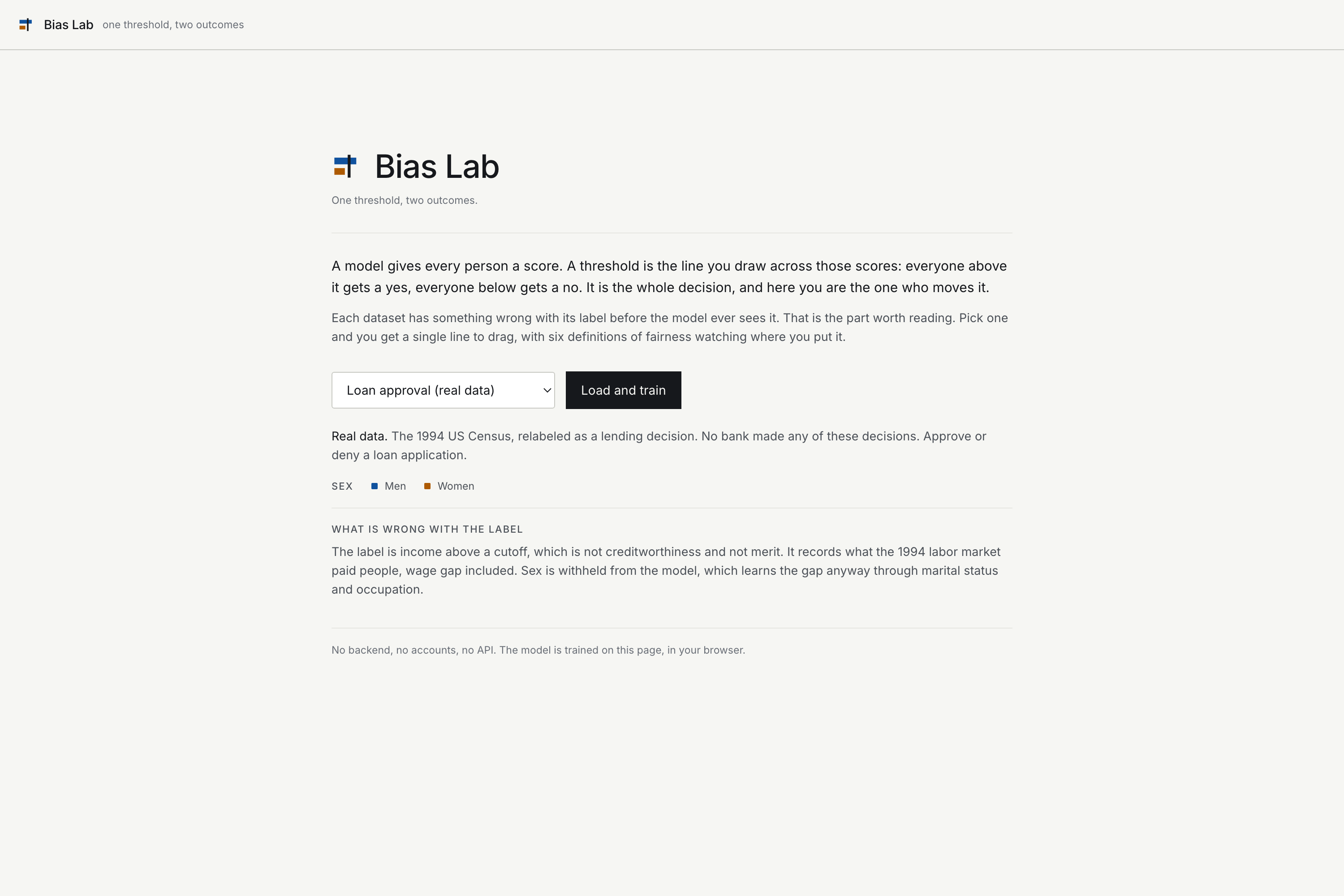
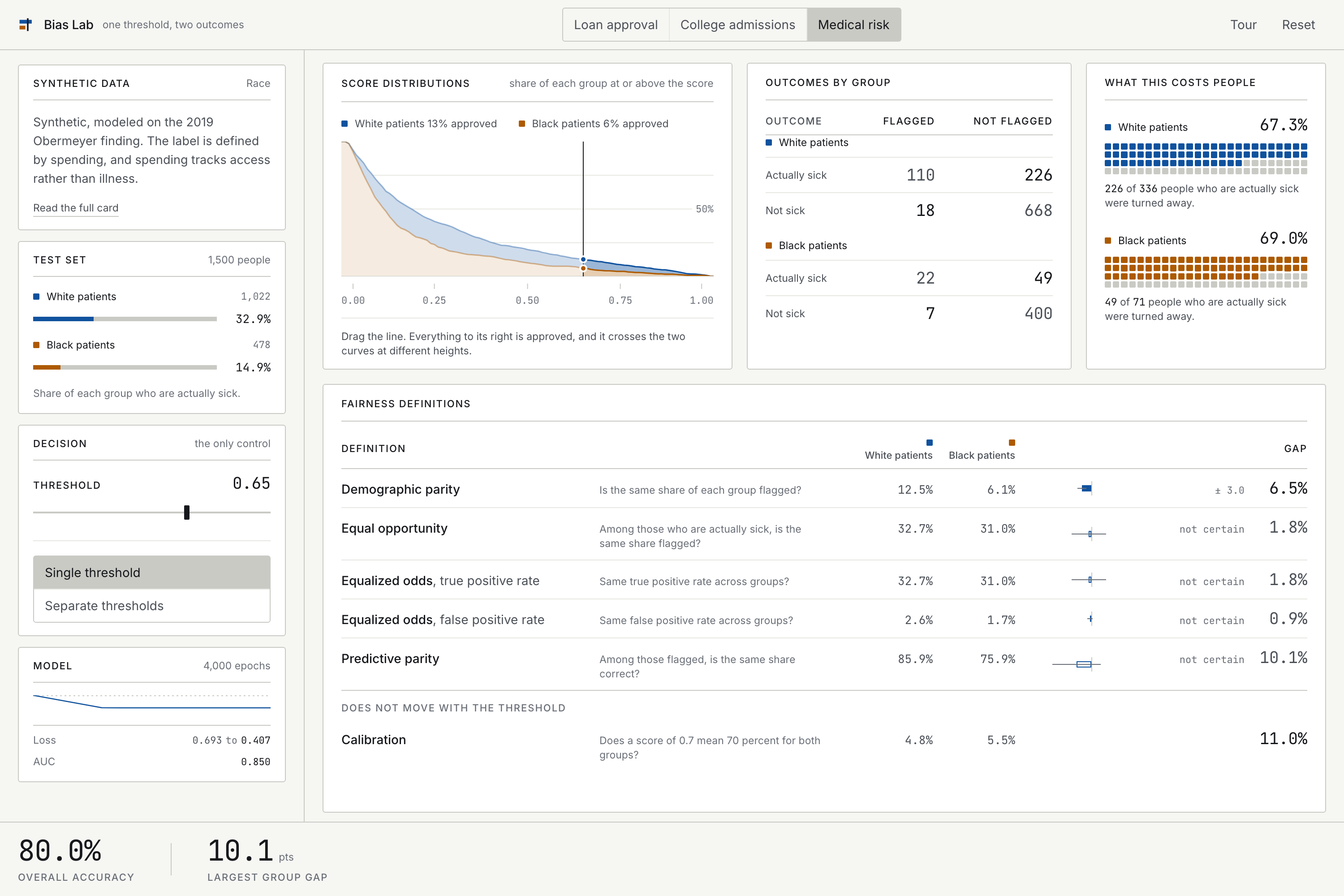
Bias Lab is a browser app where a student trains a real classifier on real data, then drags one decision threshold and watches error move between two groups while overall accuracy stays almost still.
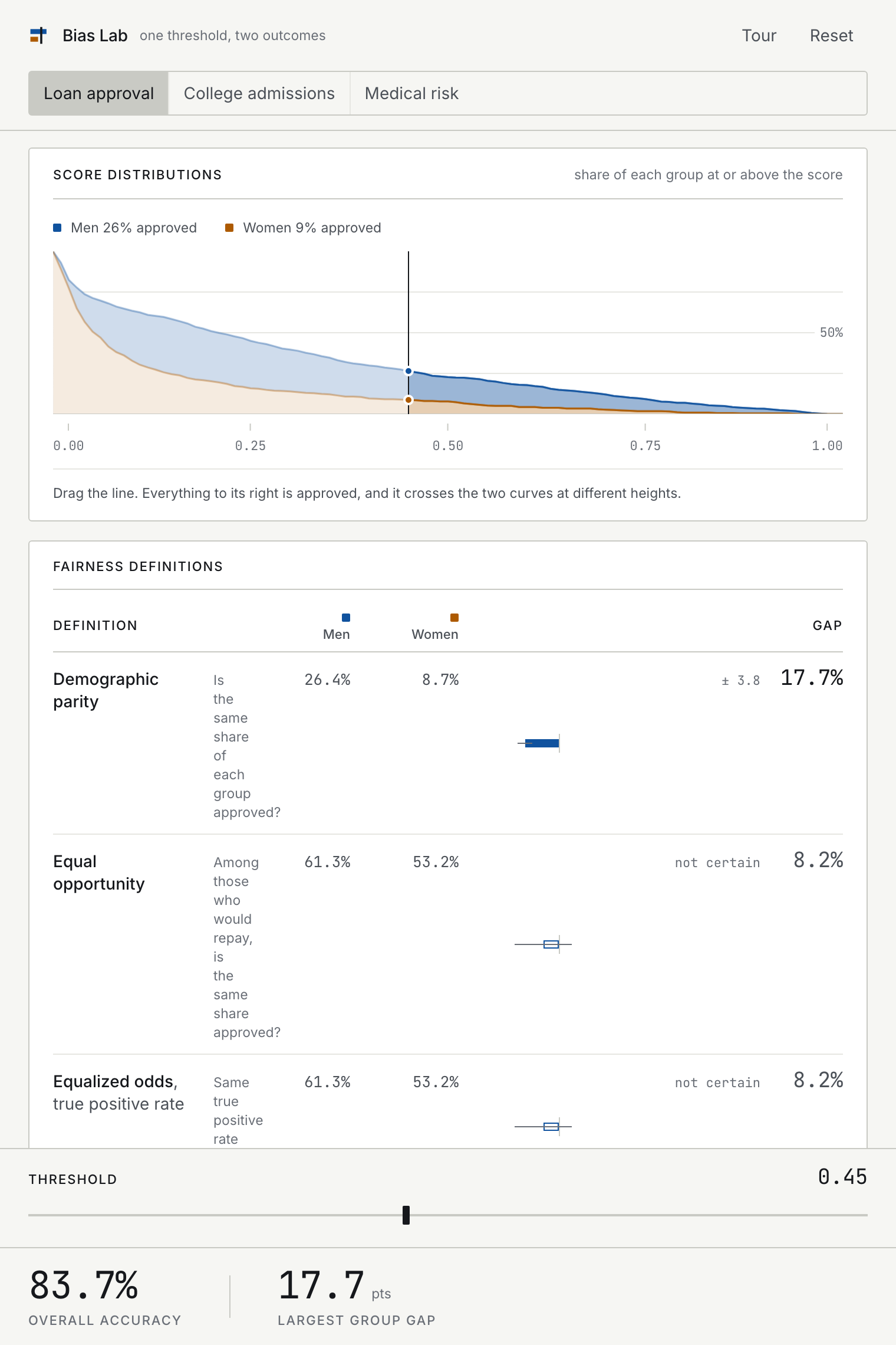
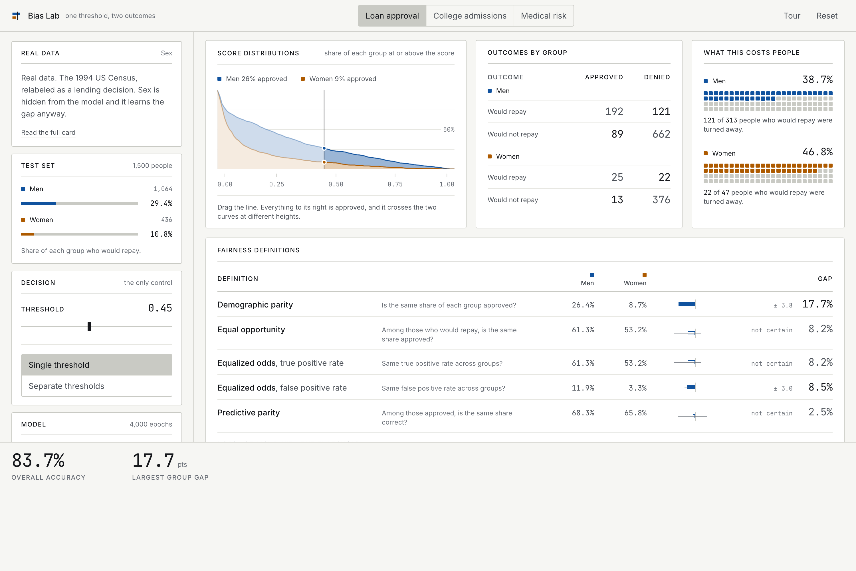
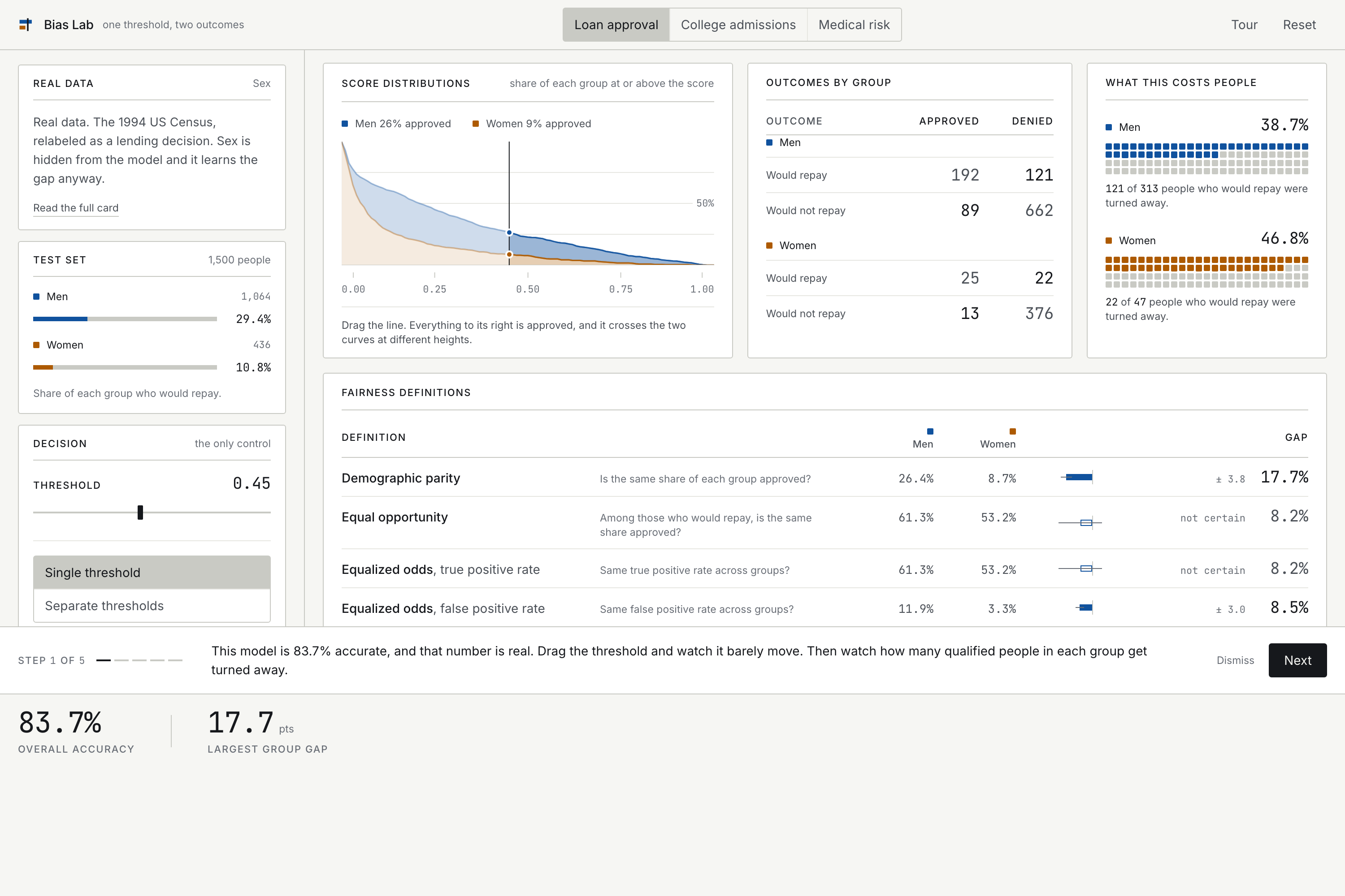
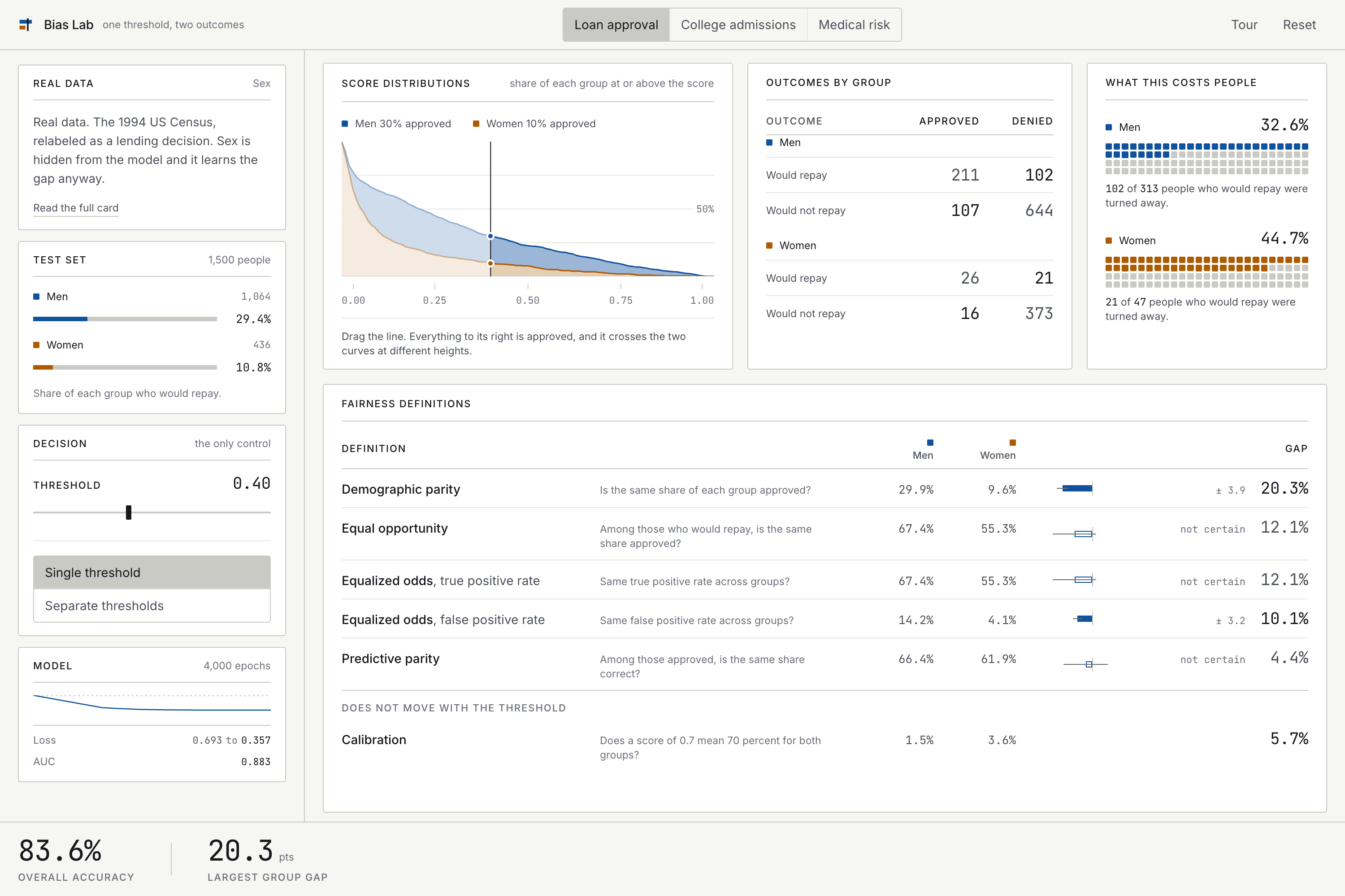
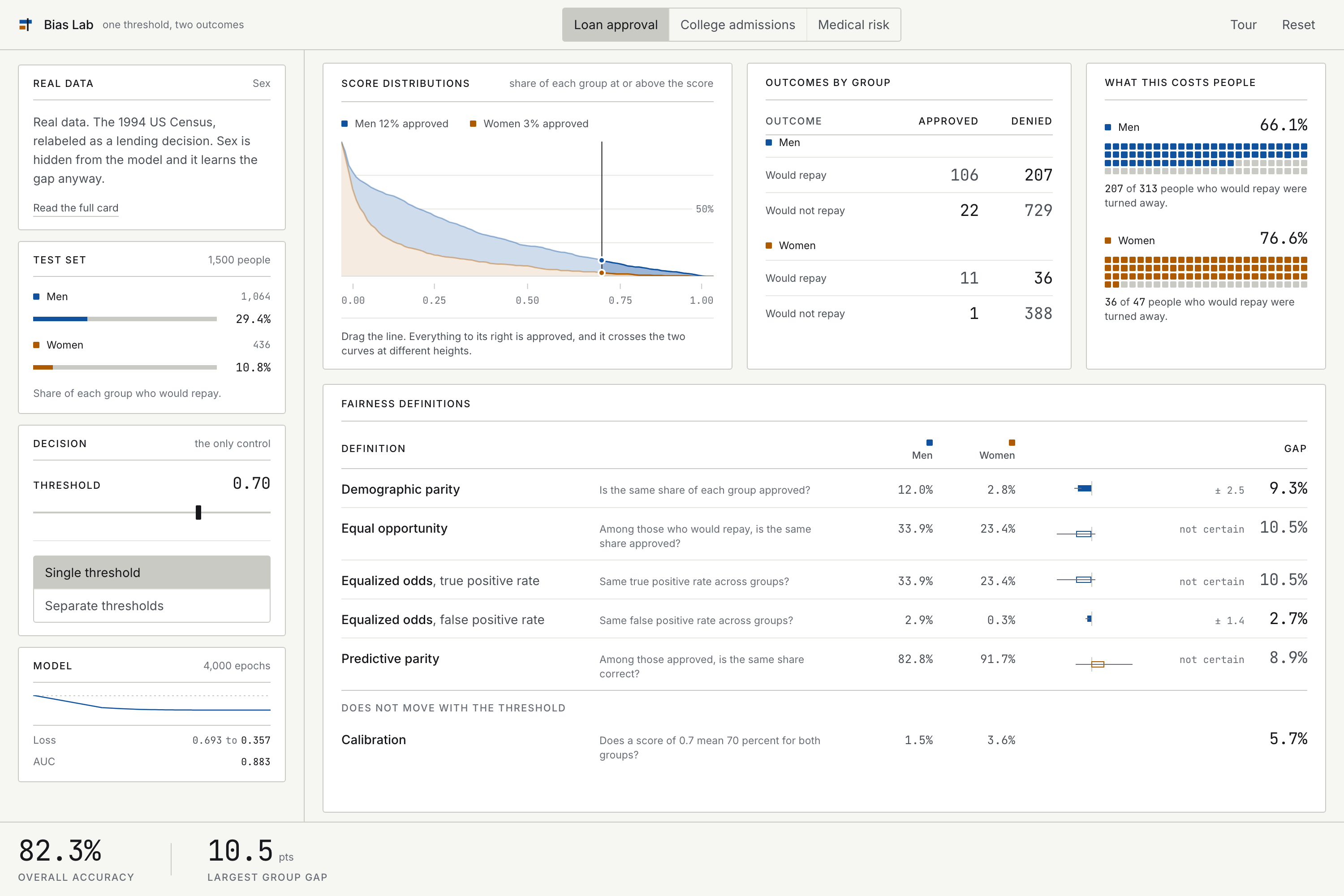
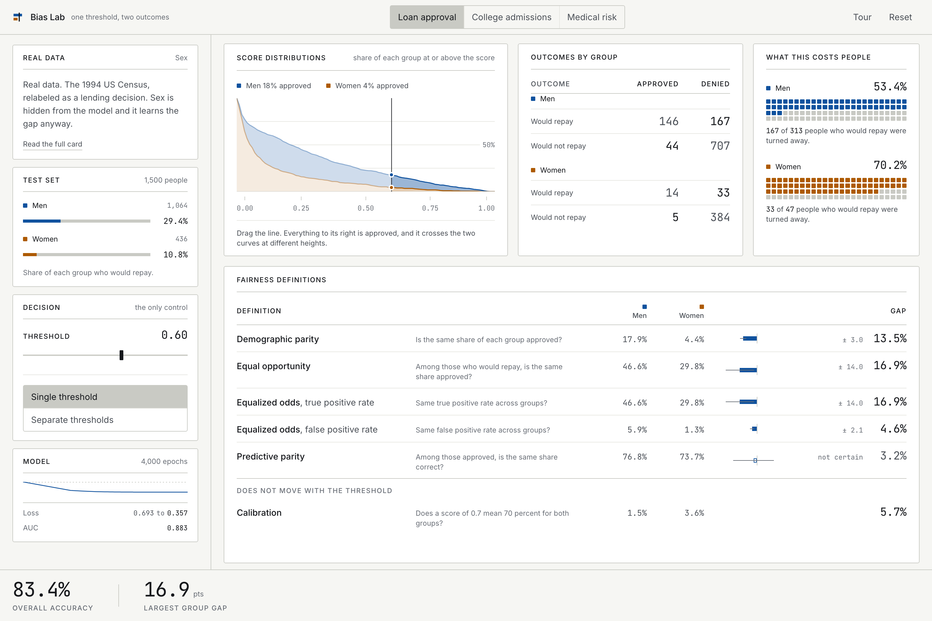
On the loan dataset, moving the threshold from 0.40 to 0.60 changes overall accuracy from 83.6 percent to 83.4 percent. Two tenths of a point. Over that same drag, qualified men denied a loan goes from 102 to 167, and qualified women denied goes from 21 to 33 out of only 47 who qualify. That is 45 percent of them to 70 percent of them. The headline number does not react. The people do.
Six fairness definitions stay on screen at once, never behind a tab or a dropdown. That is the single most important design decision in the project. A student who can see only one definition at a time concludes that fairness is achievable. A student who sees all six watches closing one gap open another.
The impossibility result
This is the part that separates a fairness demo from a fairness lesson.
Let \(p\) be the base rate in a group, \(PPV\) the share of approvals that were correct, and \(FNR\) the share of qualified people denied. For any classifier:
$$ FPR = \frac{p}{1-p} \cdot \frac{1-PPV}{PPV} \cdot (1 - FNR) $$
If two groups have different base rates, you cannot have equal PPV, equal FNR and equal FPR at the same time. Fix any two and the identity forces the third apart. This is Chouldechova (2017). Kleinberg, Mullainathan and Raghavan (2016) prove a companion result in score space.
There are exactly two escape hatches: equal base rates, or perfect prediction. Neither is available in the real world.
So the student's task is not to find the fair threshold. It is to understand that they are choosing which unfairness to accept, and on whose behalf.
The moment it lands
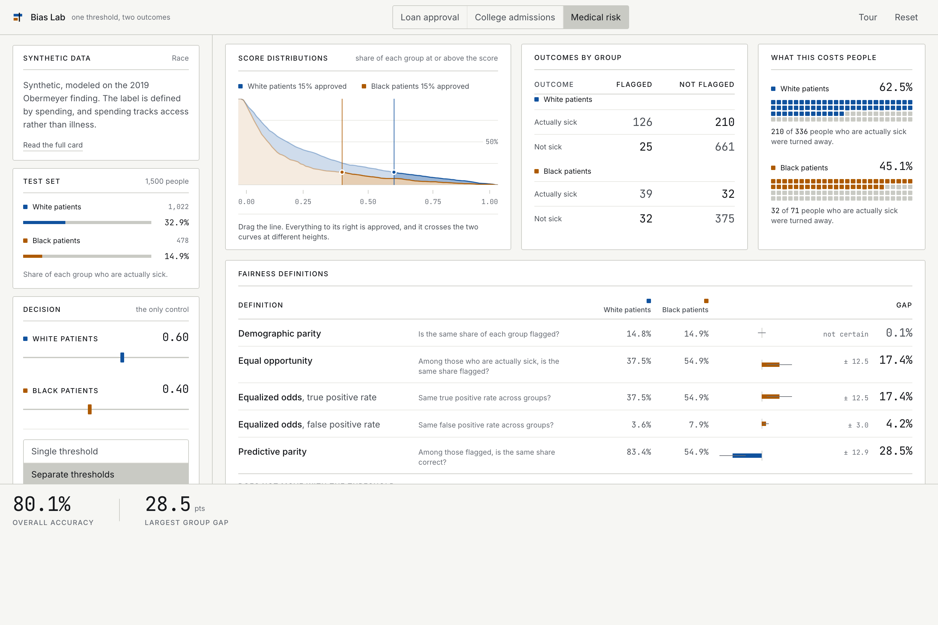
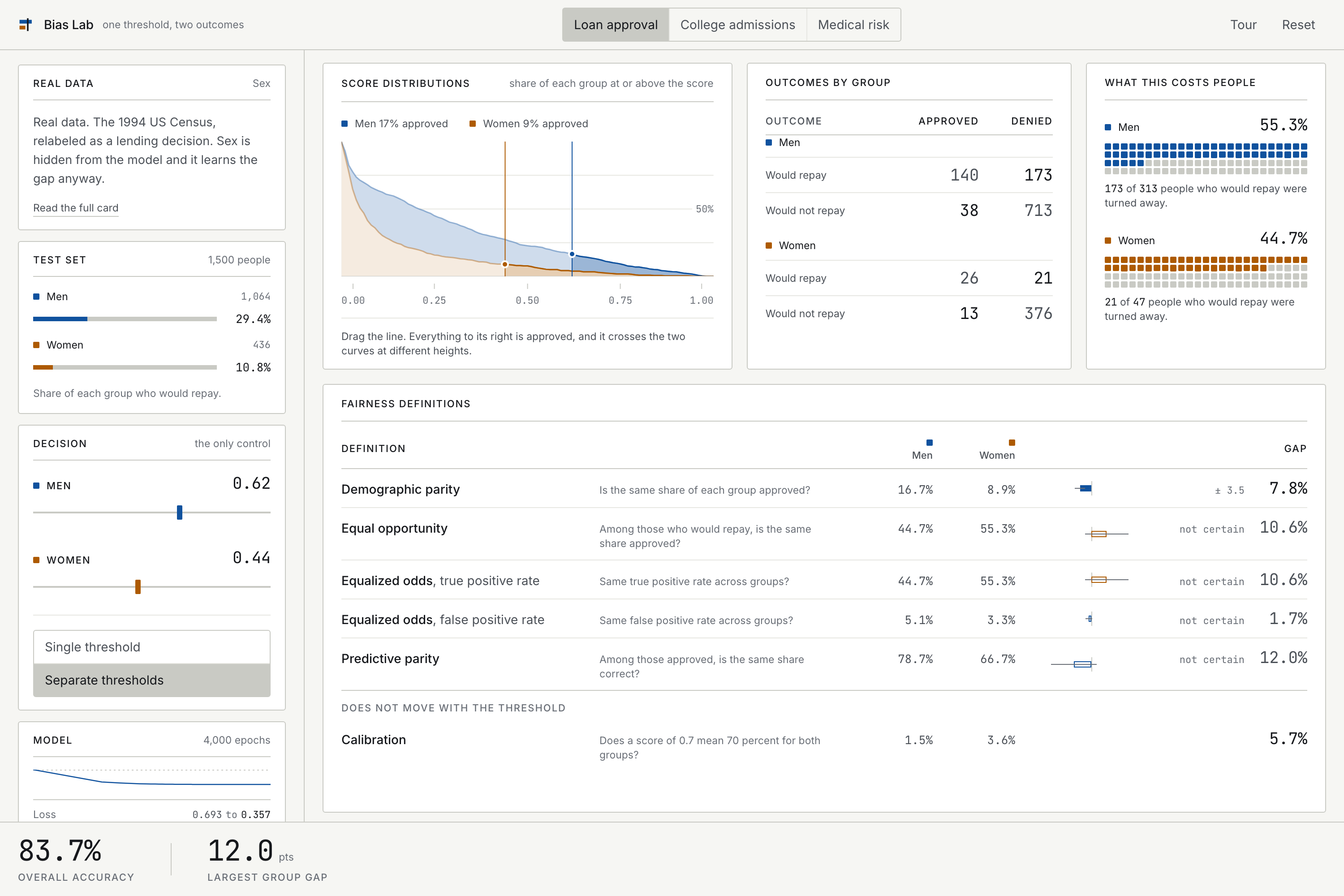
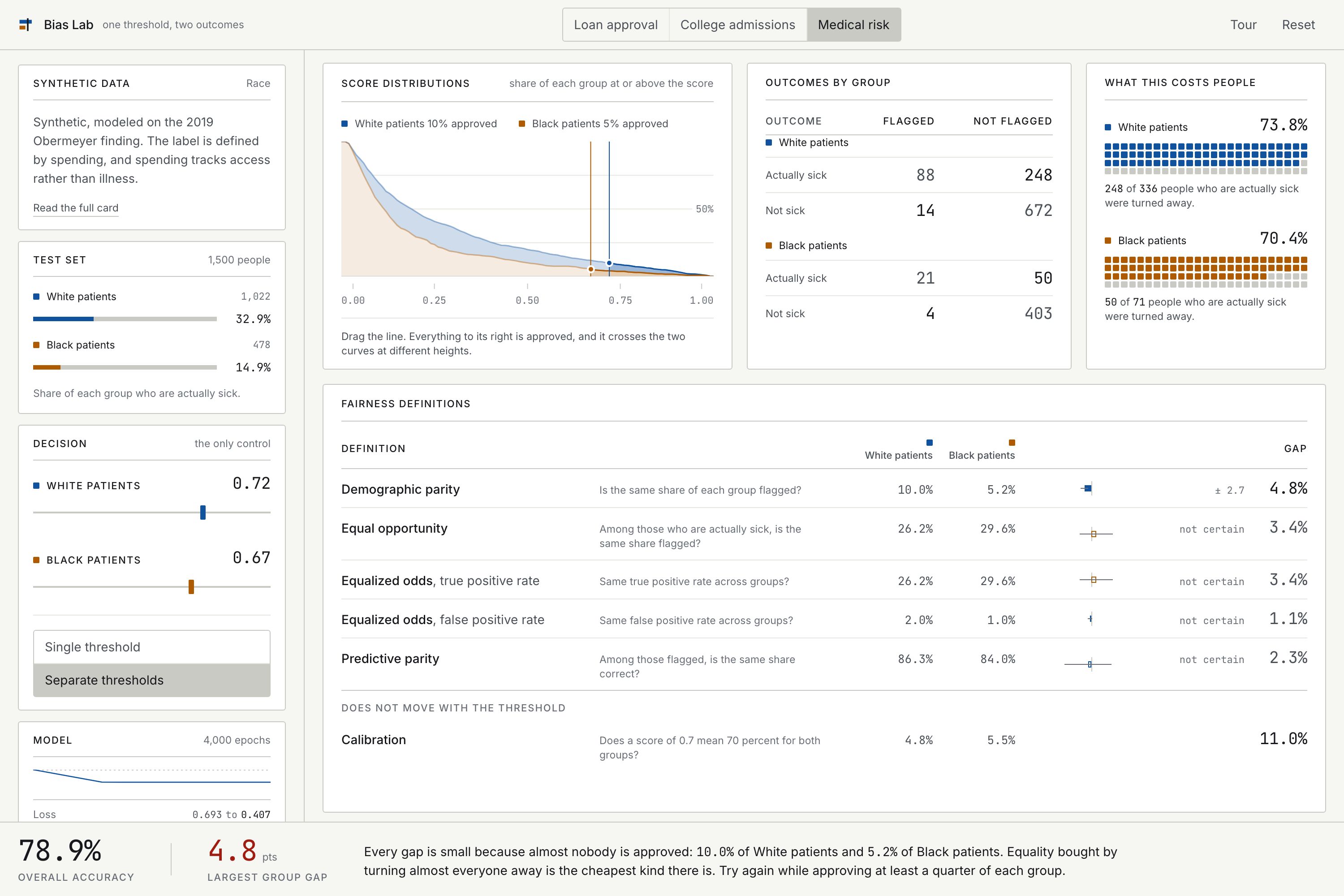
The worksheet asks students to get every fairness gap under 5 percent. On the medical dataset, separate thresholds at 0.72 and 0.67 does it. Demographic parity 4.8 percent, equal opportunity 3.4 percent, false positive rate 1.1 percent, predictive parity 2.3 percent. By every definition on screen, they succeeded.
Then they see what it cost: 10.0 percent of White patients flagged, and 5.2 percent of Black patients. They achieved fairness by denying almost everybody. The app says so directly when they get there.
That is the lesson, and it is a reversal rather than a demonstration. They were trying to be fair. They succeeded by the metrics. The success is worthless. A metric can be fully satisfied while the thing it was meant to protect is abandoned, and the dashboard will congratulate you.
How I built it
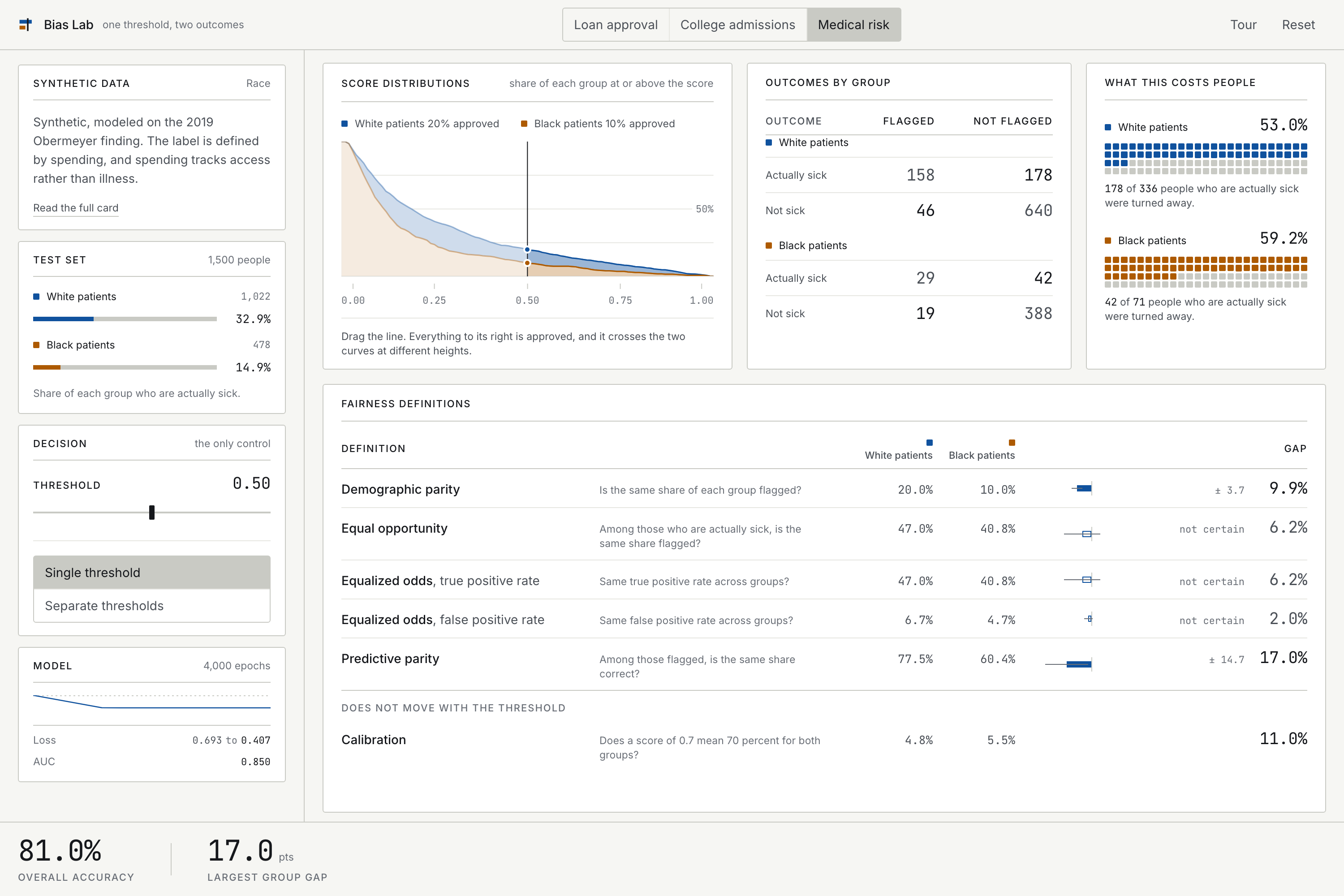
React, Vite, Tailwind and Web Workers on the front end. The model is a logistic regression written from scratch: sigmoid, binary cross entropy, full batch gradient descent, about sixty lines, no machine learning library. It trains 4,000 epochs in roughly a quarter of a second in a Web Worker, and the loss curve runs from 0.693 down to 0.407. That 0.693 is not a round number. It is the natural log of 2, which is exactly the loss of a coin flip, so you can watch the model start at chance and learn from there.
Everything is client side. No backend, no API, no external inference, no accounts, no API key. First load is about 187 KB gzipped and it works offline afterwards. There is nothing that can be down when a judge opens the link.
Three commands in the repository verify the work rather than assert it:
npm run parityfits scikit-learn on the identical committed split with regularization genuinely disabled and asserts agreement with the hand written model. Worst case across three datasets: 6.8e-07 on predicted scores, zero difference in AUC.uv run data/audit.pychecks every claim each dataset card makes against what the generator actually produces, and fails if a card describes bias the data does not contain.npm testruns 103 tests, including one that grid searches every threshold pair and proves the impossibility result holds on the shipped data, plus its converse: the gaps do close when base rates are equal.
The three datasets
Loan approval is real: the UCI Adult extract of the 1994 US Census, relabeled as a lending decision. Sex is deliberately withheld from the model, which learns the gap anyway through marital status and occupation. Base rates are 29.4 percent for men and 10.8 percent for women, a difference of 18.6 points, and that difference is what makes the impossibility bite. The label is income above a cutoff, which is not creditworthiness and not merit.
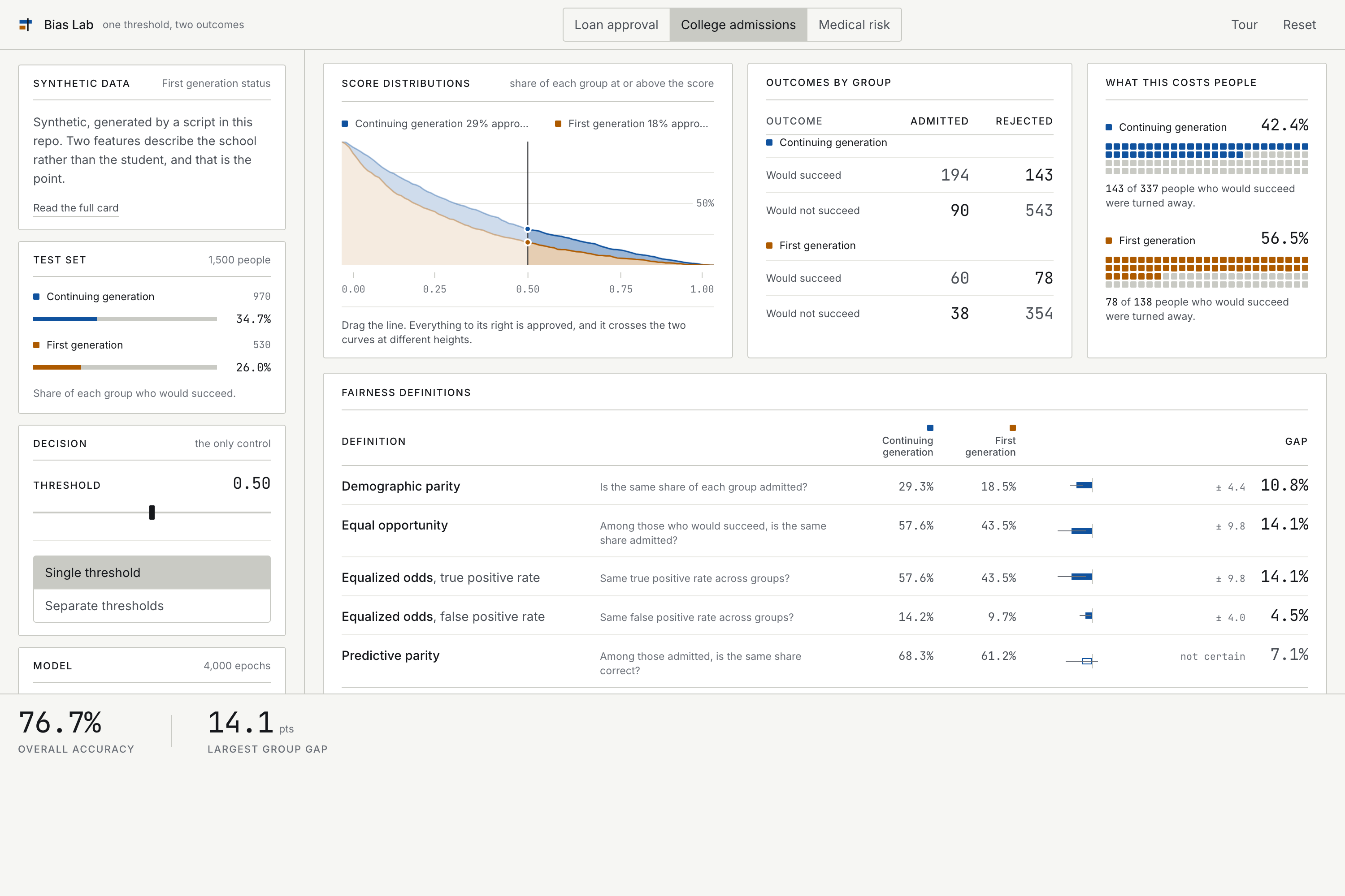
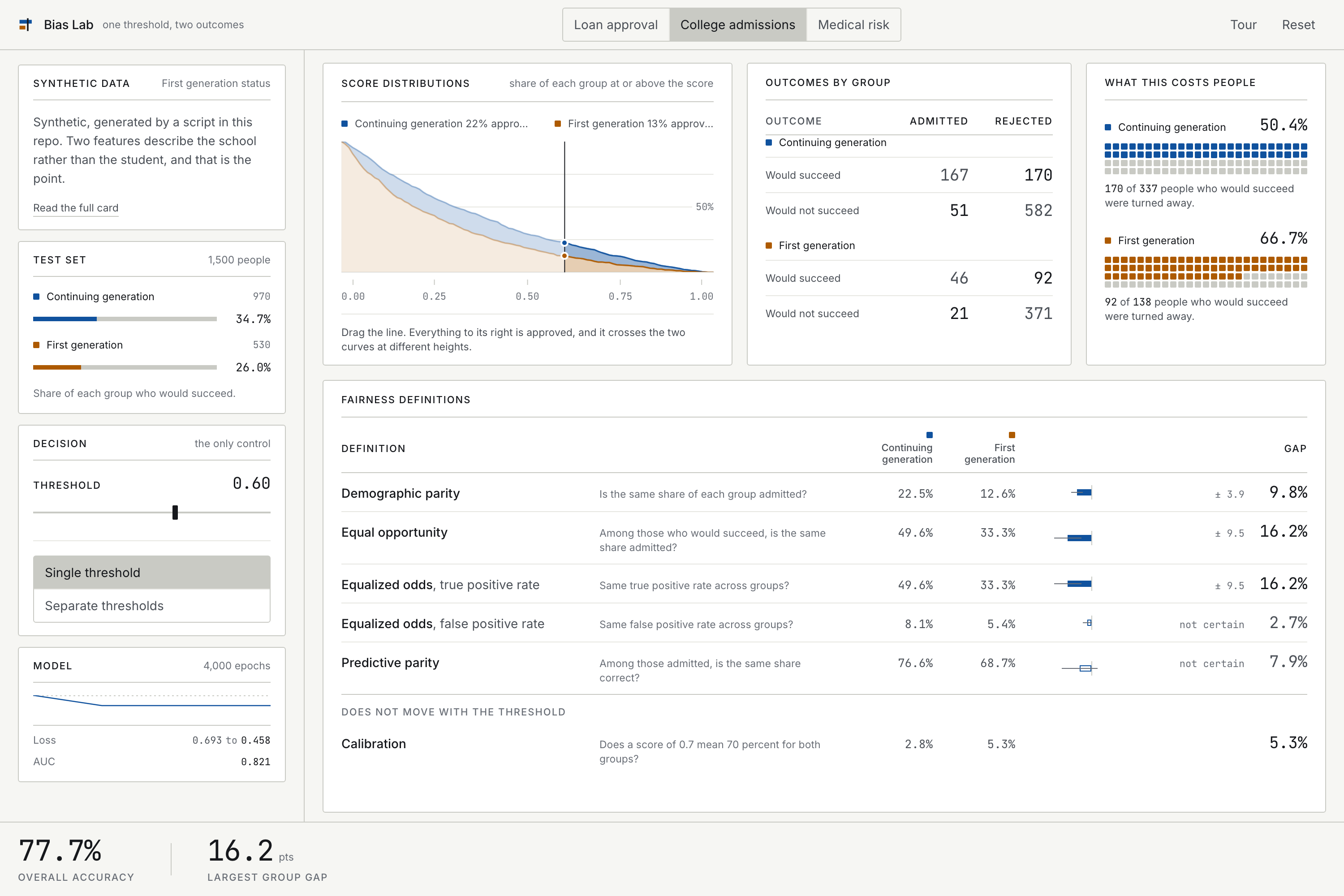
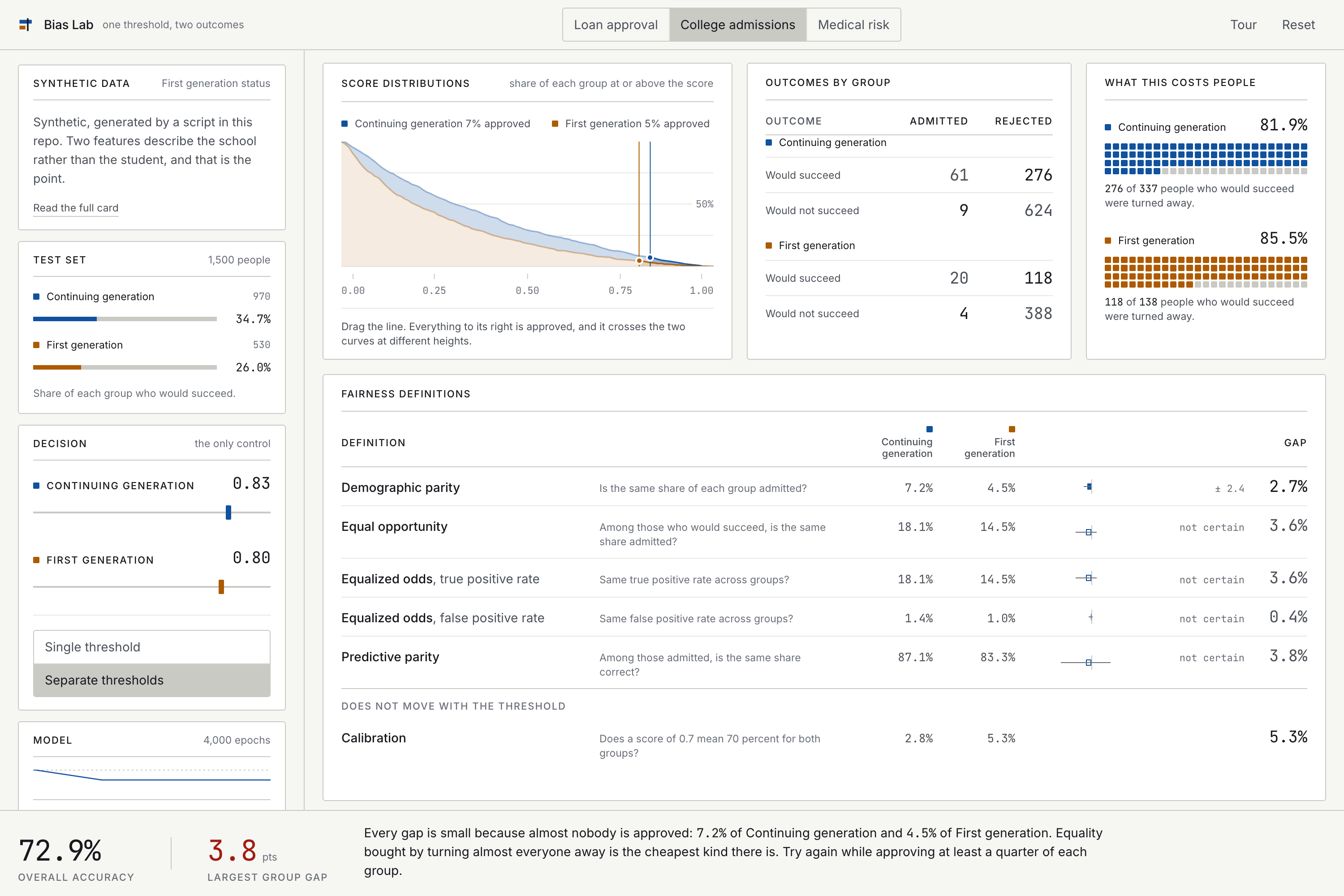
College admissions is synthetic. Two features describe the school rather than the student: how many AP courses it offers, and how many students share one counselor. Each correlates with first generation status at about 0.31, deliberately mild, because real proxies usually are. That is proxy discrimination: delete the protected attribute and the bias walks back in through the side door.
Medical risk is synthetic, modeled on the mechanism Obermeyer et al. identified in 2019. The label is a high risk flag defined by spending, and spending records who had access rather than who was sick. Illness is drawn from one distribution for both groups, so they are equally sick by construction. Only access differs, and they still get flagged at about half the rate. The label is wrong before the model sees it, so every metric on the page measures agreement with a biased record rather than agreement with reality. No threshold fixes that.
What I learned
Three things I did not expect.
Correct math and a useful metric are not the same thing. I first implemented the calibration row as the difference between each group's expected calibration error. That is a real quantity, and it is also useless: two groups miscalibrated in opposite directions cancel to a gap of zero. It took a deliberate attempt to break my own tool to find it.
A test can pass for the wrong reason. My first test of the impossibility result searched for the threshold pair that minimized the equalized odds gap and confirmed predictive parity was large there. It passed. It was also finding the approve everyone corner, where the rates are equal by construction, on a fixture that happened to be linearly separable. The test name said impossibility and the test was measuring prevalence.
Unregularized logistic regression does not converge on separable data. My medical generator originally defined the label as a threshold on a feature the model could see, so the problem was perfectly separable, AUC was 1.000, and the coefficients ran off to infinity. The parity check caught it because the coefficient difference against scikit-learn was 734.
Challenges I ran into
Making the impossibility survive contact. With separate thresholds and no floor on how many people you approve, you can drive every gap under 5 percent. That is not a counterexample to the theorem, it is the degenerate corner the theorem allows. Rather than hide it, the app now names it when you reach it, and the worksheet asks students to find it on purpose and then retry with a floor. The defect became the better lesson.
Statistics on small groups. The disadvantaged group has 47 qualified people in the loan test set. A true positive rate computed on 47 cases moves more than two points when one person crosses the line. Reporting that to three decimals with no interval would teach students to over read noise, in an app about the perils of over reading numbers. Every threshold dependent gap now carries an Agresti-Caffo confidence interval, and gaps that cannot be distinguished from zero are labeled not certain.
Showing a distribution that is extremely skewed. The first bin of the score histogram held 29 percent of one group and 49 percent of the other, so 19 of 20 bins were squeezed into a low smear no matter what height transform I used. I replaced the histogram with two survival curves: the share of each group at or above the score. A share axis always spans 0 to 100 percent, so the chart cannot go flat, and the vertical distance between the two curves at the threshold is exactly the disparity.
Target users
Students finishing an introductory AI curriculum, and the instructors teaching them.
It was built for this challenge and is designed to slot into the ethics module of the ML Empowerment Foundation curriculum. It runs from one link, needs no setup and no accounts, and takes about ten minutes. WORKSHEET.md in the repository is a sixteen question worksheet with an answer key for anyone who wants to run it in a class.
Social impact
The beneficiary is specific: the students in this challenge, and every future cohort that goes through the Foundation's curriculum.
No install, no account, no API key and no cost, which matters for exactly the students an accessibility focused program is trying to reach. A student on a school Chromebook gets the same experience as one on a workstation, because the model trains on their own machine.
The claim is smaller than it sounds, deliberately. This tool will not make any deployed system fairer. What it can do is change what a student notices. Someone who has watched 84 percent accuracy hold steady while one group's denial rate climbs will, for the rest of their career, ask a second question after seeing an accuracy number. That is a small change repeated across a cohort, and it is the honest size of the impact.
Limitations
Stated plainly, because this tool is easy to over read.
- Binary protected attributes only. Real people are not partitioned into two groups, and the most important fairness failures often appear at intersections this tool cannot represent.
- Binary outcomes only. No regression, no ranking, no multi class.
- The intervals are nominal. A student who hunts for the smallest gap across a hundred threshold settings and then reads its 95 percent interval is doing post selection inference, and the stated coverage does not hold there.
- Two of the three datasets are synthetic. They demonstrate mechanisms that occur in the world. They are not evidence about the world.
- It has not been classroom tested yet.
- Real fairness auditing is considerably harder than this tool suggests. Contested ground truth, distribution shift, feedback loops where today's decisions become tomorrow's training data. None of that is here.
Prior work
This is not the first threshold explorable. Google PAIR's "Attacking Discrimination with Smarter Machine Learning" (2016) put a threshold slider next to two groups and did it well. The What-If Tool, Fairlearn and Aequitas cover overlapping ground for practitioners.
What is different here: six definitions on screen simultaneously rather than one at a time, sampling uncertainty shown inline on a teaching tool, a named warning when equality is bought by approving almost nobody, a model the student trains rather than one that is precomputed, and three datasets whose labels are broken in three documented ways with a committed audit script that checks the documentation against the generator.
Why there is no LLM in this
An LLM would explain fairness to the student. This tool makes the student produce the evidence: train a real classifier, move a real threshold, and watch a real number change on a test set they can inspect. The lesson only holds if they did the training and dragged the slider, so that is the one step it does not hand off.
References
Chouldechova, A. (2017). Fair prediction with disparate impact. Big Data, 5(2), 153-163.
Kleinberg, J., Mullainathan, S., and Raghavan, M. (2016). Inherent trade-offs in the fair determination of risk scores. arXiv:1609.05807.
Obermeyer, Z., Powers, B., Vogeli, C., and Mullainathan, S. (2019). Dissecting racial bias in an algorithm used to manage the health of populations. Science, 366(6464), 447-453.
Becker, B. and Kohavi, R. (1996). Adult. UCI Machine Learning Repository.
Built With
- github
- javascript
- logistic-regression
- numpy
- pandas
- python
- react
- scikit-learn
- svg
- tailwindcss
- uv
- vite
- vitest
- web-workers

Log in or sign up for Devpost to join the conversation.