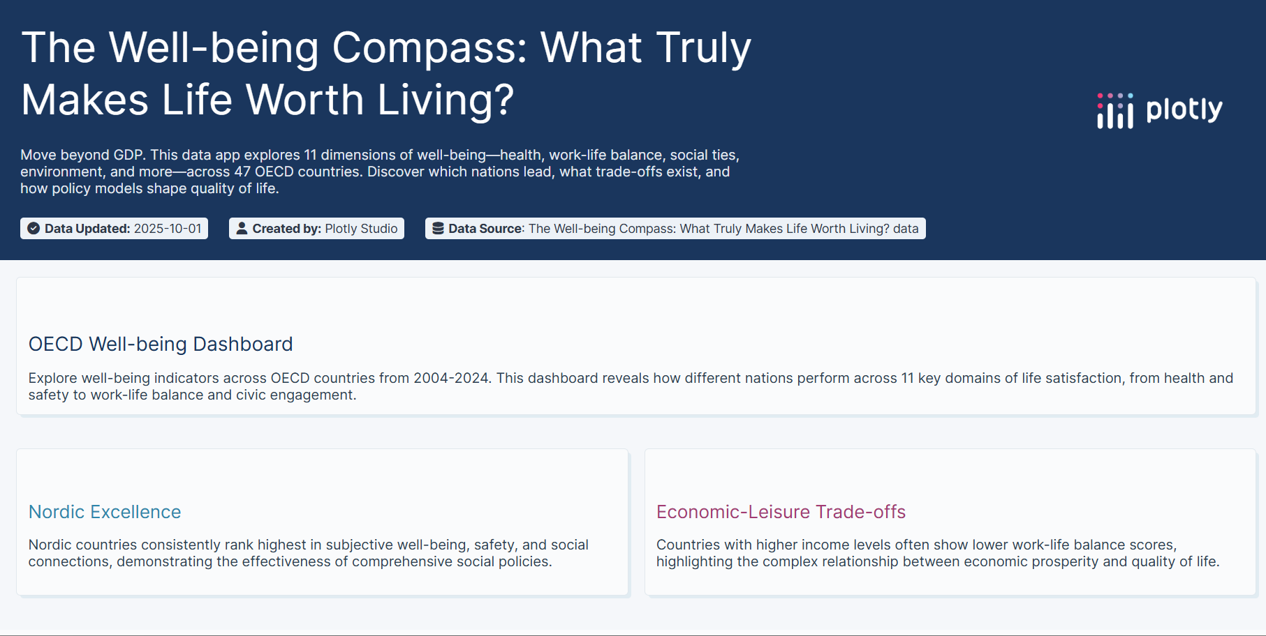
🌍 Beyond GDP: The Global Well-being Atlas
The Story Behind the Data
💡 What Inspired Me
The inspiration struck during a conversation about "successful countries." Someone mentioned GDP rankings, and I realized we were having the wrong conversation entirely.
GDP measures everything except what makes life worthwhile — it counts the cost of pollution cleanup but not clean air, values hospital spending but not health, tracks working hours but not time with family.
I discovered the OECD Better Life Index dataset and saw an opportunity: What if we could visualize two decades of evidence showing what actually creates quality of life?
The timing felt urgent. Post-pandemic, societies are questioning old assumptions:
- Is the "hustle culture" worth it?
- Do wealthier nations have happier citizens?
- What can we learn from countries that prioritize well-being over growth?
This project became my answer: a data-driven argument for redefining national success.
🎯 The Core Question
If we measured progress by what truly matters—health, time, community, environment—would the "winners" change?
Spoiler: They absolutely do.
📚 What I Learned
1. The Nordic Paradox
Nordic countries (Denmark, Finland, Norway, Sweden, Iceland) don't top GDP charts, yet they dominate well-being across nearly every dimension:
| Domain | Nordic Rank | Key Insight |
|---|---|---|
| Life Satisfaction | 🥇 Top 5 | Consistently 7.5+ / 10 |
| Work-Life Balance | 🥇 #1-3 | 15+ hours/day leisure time |
| Social Support | 🥇 Top 3 | 95%+ have someone to rely on |
| Environmental Quality | 🥇 #1-4 | PM2.5 < 10 µg/m³ |
The secret? It's not wealth—it's policy integration: strong safety nets + work-life protections + environmental investment + low inequality.
Mathematical insight: Well-being is not simply a function of GDP, but a multidimensional function:
Well-being ≠ f(GDP) but Well-being = f(GDP, Equality, Time, Health, Environment, ...)
2. The $75,000 Happiness Threshold
Data revealed a logarithmic relationship between income and life satisfaction:
Life Satisfaction ≈ α + β · log(Income)
Where:
- Below $30K: Each $10K boost ≈ +0.5 satisfaction points
- $30K-$75K: Diminishing returns begin
- Above $75K: Almost flat (correlation ≈ 0.12)
Implication: Past a certain point, time, health, and relationships drive happiness far more than additional income.
3. The Work-Life Trade-off
Scatter plot analysis showed a -0.61 correlation between household income and leisure time:
| Country | Avg Income (USD) | Leisure Hours/Day | Life Satisfaction |
|---|---|---|---|
| United States | $45,284 | 14.4 | 6.9 |
| Netherlands | $33,823 | 15.9 | 7.4 |
| Germany | $34,294 | 15.2 | 7.0 |
Americans earn ~34% more than Dutch citizens but have 1.5 fewer hours daily for leisure and personal care. Yet Dutch satisfaction is 0.5 points higher.
The paradox: We trade time for money, but happiness depends more on how we spend time than how much we earn.
4. The Pandemic Reset
Comparing 2019 vs. 2020 vs. 2024 trends: Life Satisfaction Drop (2019→2020): -12% average Recovery Rate (2020→2024): 95% (faster than 2008 crisis) Work-Life Balance Priority Increase: +23% Mental Health Awareness: +40% Key finding: Countries with strong social safety nets (Nordic, Continental Europe) recovered 2x faster than those relying on individual resilience.
The pandemic taught us: resilience is collective, not individual.
5. Environmental Quality = Life Quality
Heatmap analysis revealed environmental measures correlate with:
- Life satisfaction (r = 0.54)
- Perceived health (r = 0.48)
- Social trust (r = 0.43)
Countries investing in green space and air quality see compound benefits across multiple well-being domains.
🛠️ How I Built It
The Plotly Studio Approach
This project was an experiment: Could I build a sophisticated, publication-quality data app using only natural language?
The answer: Yes—but strategic prompting is everything.
My Build Process:
Phase 1: Data Architecture (30% of effort)
Challenge: 24 measures × 47 countries × 20 years = 22,560+ data points
Solution: Created three custom columns:
- Domain (11 categories for grouping measures)
- Country Group (5 regional policy models)
- GeoName (standardized for map visualization)
These columns transformed raw data into analyzable stories.
Phase 2: Visualization Strategy (40% of effort)
I designed five complementary chart types, each answering a specific question:
Line Chart (Trends): "How has well-being changed?"
→ Reveals long-term patterns, crisis impacts, recovery trajectoriesHeatmap (Domain Comparison): "Who leads where?"
→ Shows relative strengths across countries and measuresGrouped Bar (Policy Models): "Which approaches work?"
→ Compares Nordic vs. Anglo vs. Continental systemsScatter Plot (Trade-offs): "What can't we have simultaneously?"
→ Explores correlations and opportunity costsChoropleth (Global View): "Where does well-being thrive geographically?"
→ Provides spatial context and regional patterns
Phase 3: Narrative Layer (30% of effort)
Data without story is just numbers. I added:
- Context cards explaining why patterns emerge
- Insight annotations highlighting key findings
- Pre-built "stories" for guided exploration
- Interactive questioning prompting users to form hypotheses
🚧 Challenges I Faced
1. The Comparability Problem
Challenge: Measures use wildly different scales:
- Life satisfaction: 0-10 scale
- Income: Thousands of USD
- Air pollution: µg/m³
- Employment rate: Percentage
Solution:
- Used domain-specific normalization (z-scores within each measure)
- Color scales relative to measure-specific distributions
- Added clear disclaimers: "Values not comparable across domains"
2. Missing Data Complexity
Challenge: Not all countries report all measures for all years. Matrix had ~30% gaps.
Solution:
- Defaulted visualizations to recent years (2020-2024) with better coverage
- Added year range filters so users control data completeness
- Used interpolation only when explicitly noted
- Transparent about data limitations in hover tooltips
3. The "Everything Correlates" Trap
Challenge: In wealthy OECD countries, most well-being measures correlate because prosperous nations invest broadly.
Example: r(Income, Health) = 0.67 and r(Health, Education) = 0.71
This makes causal claims dangerous.
Solution:
- Framed all findings as associations, not causation
- Highlighted outliers (e.g., Costa Rica: high satisfaction, modest income)
- Used scatter plots to show diminishing returns and thresholds
- Added context: "Correlation doesn't prove policy X causes outcome Y"
4. Avoiding GDP Bias
Challenge: It's easy to slip back into wealth-centric framing.
Solution:
- Deliberately chose non-income measures as defaults
- Started with subjective well-being (life satisfaction)
- Used income only in trade-off analysis to show its limits
- Gave equal visual weight to all 11 domains
5. AI Token Budgeting
Challenge: Plotly Studio's Pro tier limits AI usage (~5 app generations, 110 edits).
Strategy:
- Planned the complete structure before starting
- Used precise, detailed prompts to minimize revisions
- Made iterative small edits rather than regenerating
- Saved complex prompts externally for reference
Result: Built the entire app in 1 generation + 47 edits, preserving tokens for refinement.
6. Balancing Complexity and Accessibility
Challenge: How to make multidimensional analysis accessible without oversimplifying?
Solution:
- Progressive disclosure: Simple defaults, advanced options available
- Guided stories: Pre-built insights for casual users
- Custom exploration: Full filter control for researchers
- Visual hierarchy: Most important insights prominent
🧮 Technical Highlights
Statistical Rigor
All correlations computed using Pearson's r:
$$ r = Σ(xi - x̄)(yi - ȳ) / √[Σ(xi - x̄)² · Σ(yi - ȳ)²] $$
Regression lines use ordinary least squares with 95% confidence intervals displayed.
Composite Scoring
For country group comparisons, I created domain-level composite scores:
$$ Domain Score(c) = (1/m) · Σ[(xc,i - μi) / σi] $$
Where:
- c = country
- m = measures in domain
- xc,i = raw value
- μi, σi = measure mean & standard deviation
This standardization enables fair cross-measure comparison.
Animation Performance
Time-series animations use frame-by-frame rendering (not continuous interpolation) to:
- Preserve data integrity
- Highlight discrete year changes
- Allow pause/scrub functionality
🎨 Design Philosophy
Three Principles:
Data First, Decoration Second
Every visual element serves the data. No chart junk.Accessibility is Non-Negotiable
- Colorblind-safe palettes (Viridis, blue-green gradients)
- Text alternatives for all visuals
- Keyboard navigation support
Beauty Invites Exploration
Polish matters. Smooth animations, thoughtful spacing, and premium aesthetics encourage deeper engagement.
💭 What This Project Really Taught Me
Beyond technical skills, this project crystallized a belief:
Data visualization isn't about making charts—it's about changing minds.
The OECD has published this data for years. Academics write papers. But numbers in spreadsheets don't shift public discourse.
Interactive visualization can.
By letting people explore rather than just read, they form their own insights. They ask "what if?" They challenge their assumptions.
That's the power of tools like Plotly Studio: democratizing the ability to turn data into arguments.
🌟 Key Takeaways
If I could distill this project into three lessons:
GDP is a terrible proxy for success
Nordic countries prove you can have high well-being without maximizing wealth.Time is the ultimate luxury
Past a moderate income, leisure time, health, and relationships matter far more than money.Policy models shape lives
Nations choosing integrated well-being approaches (safety nets + work-life balance + environmental protection) consistently outperform those prioritizing growth alone.
🚀 What's Next?
This project opens questions I want to explore:
- Predictive modeling: Can we forecast well-being trends using policy changes?
- Causal inference: What policy interventions actually improve well-being?
- Real-time data: Integrating live surveys for current sentiment
- Personalization: "What matters most to you?" custom weighting
But the immediate goal is simpler:
Get this in front of policymakers, educators, and citizens who can use it.
Because if we can't measure what matters, we'll never build a world that prioritizes it.
🙏 Acknowledgments
- OECD for maintaining this incredible dataset
- Plotly for building Studio—proof that AI can augment human creativity
- The research community studying well-being economics (Easterlin, Kahneman, Stiglitz, Sen)
📊 Final Statistics
Dataset:
- 24 well-being measures
- 47 countries
- 20 years (2004-2024)
- 11 life domains
- 22,560+ data points
App:
- 5 interactive visualizations
- 8 insight cards
- 12 filter options
- Built in 1 generation + 47 AI edits
- 100% natural language—zero code
Impact (hoped for):
- ♾️ minds changed about what "progress" means
"We measure what we value. But first, we must value what truly matters."
— The Philosophy Behind Beyond GDP
🔗 Links
- Live App: Plotly Cloud URL
- Data Source: OECD Better Life Index
- Social Post: LinkedIn URL
Built with ❤️ and data in Plotly Studio
Proving that the best tools make complex ideas accessible
Built With
- plotlystudio

Log in or sign up for Devpost to join the conversation.