-
-
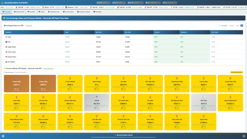
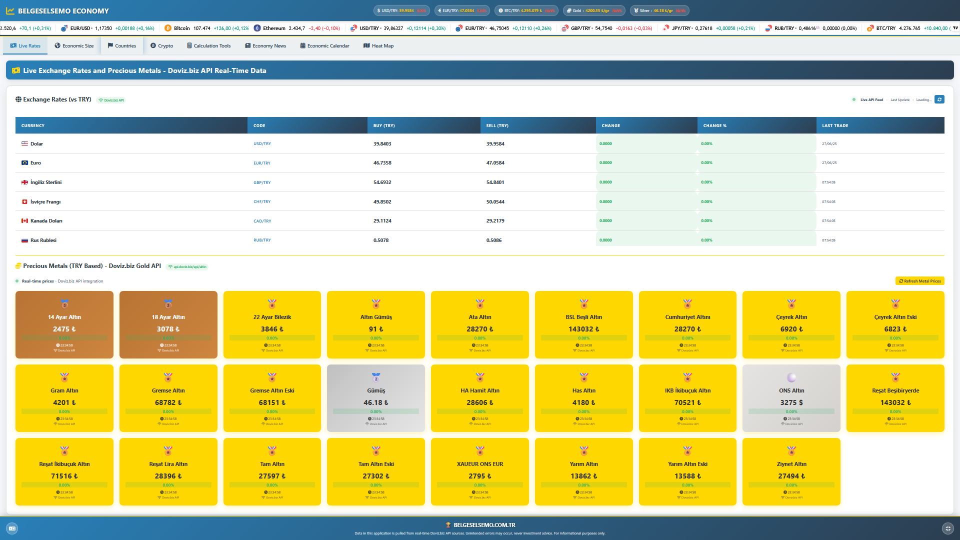
LiveRates
-
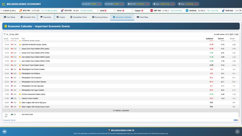
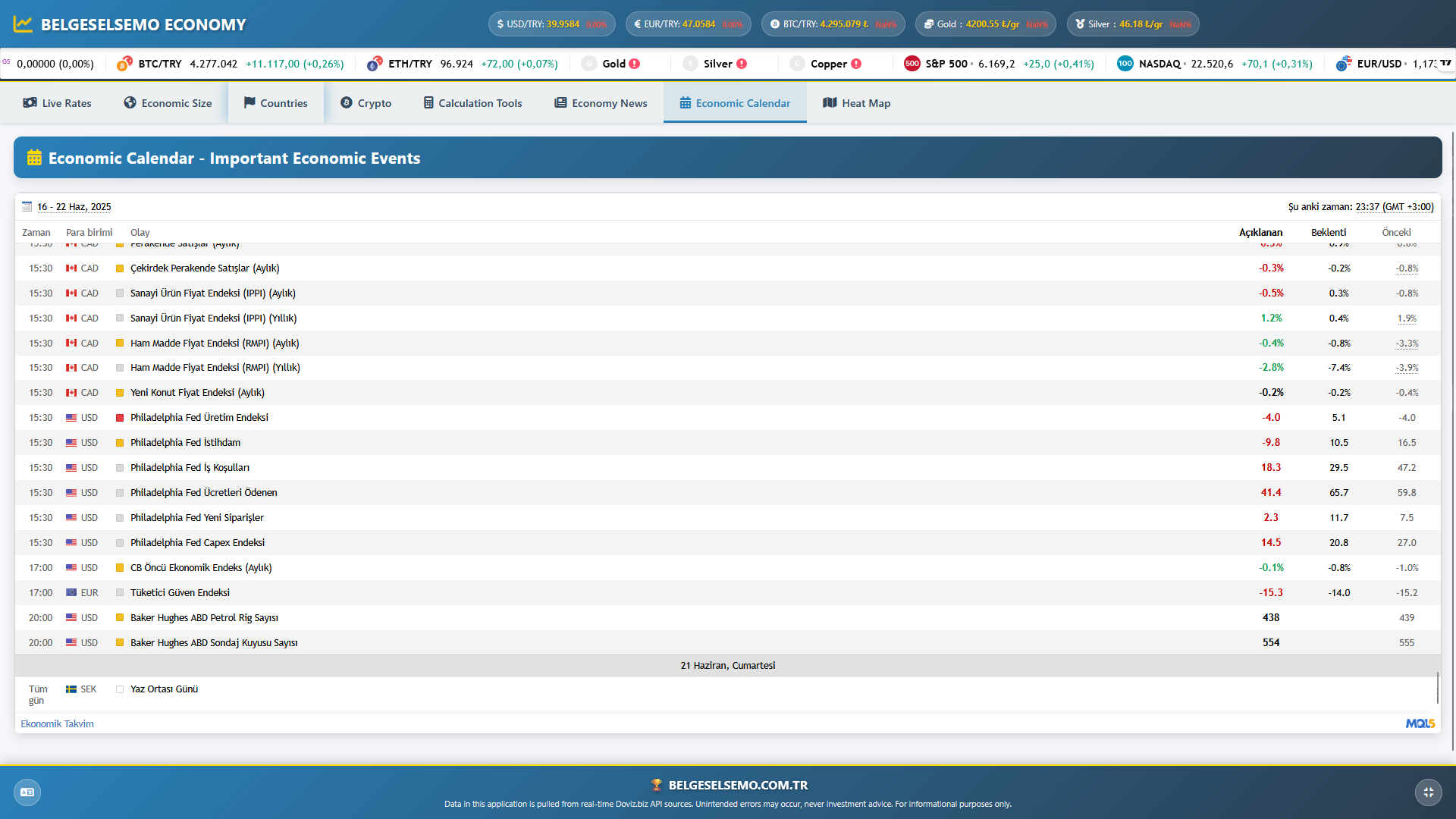
Economic Calendar
-
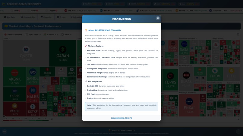
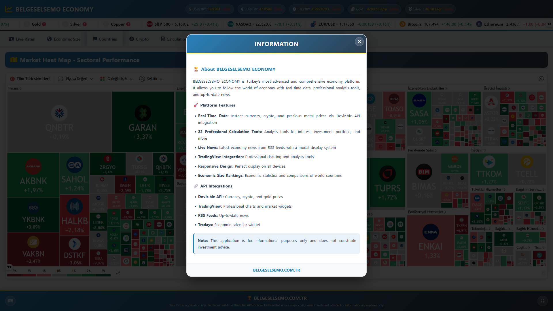
INFO POPUP
-
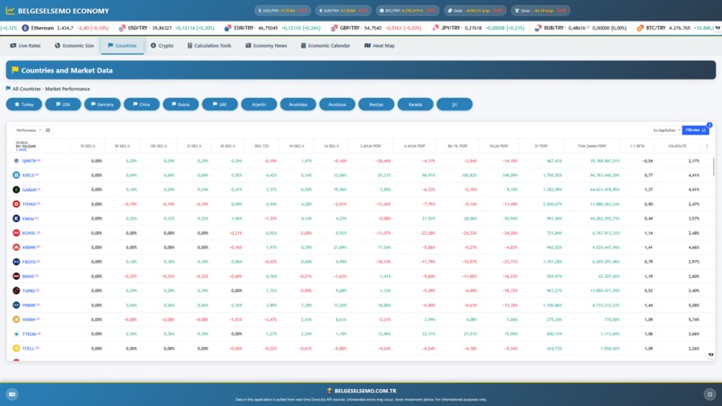
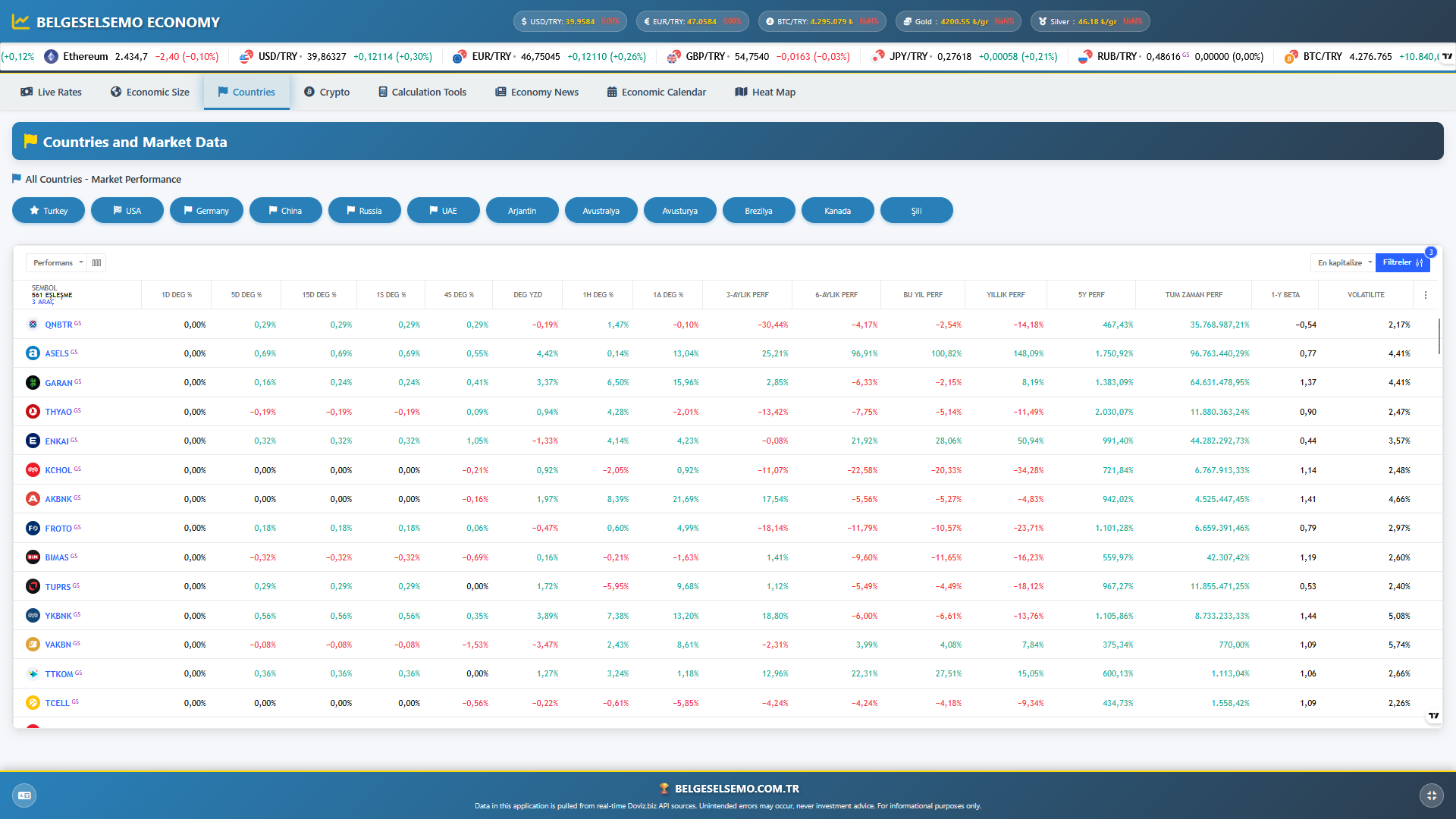
Countries
-
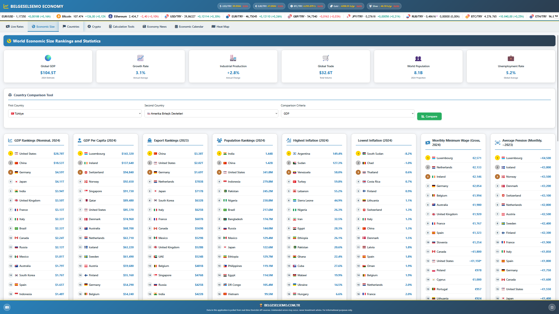
Economic Size
-
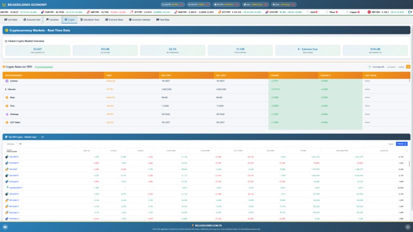
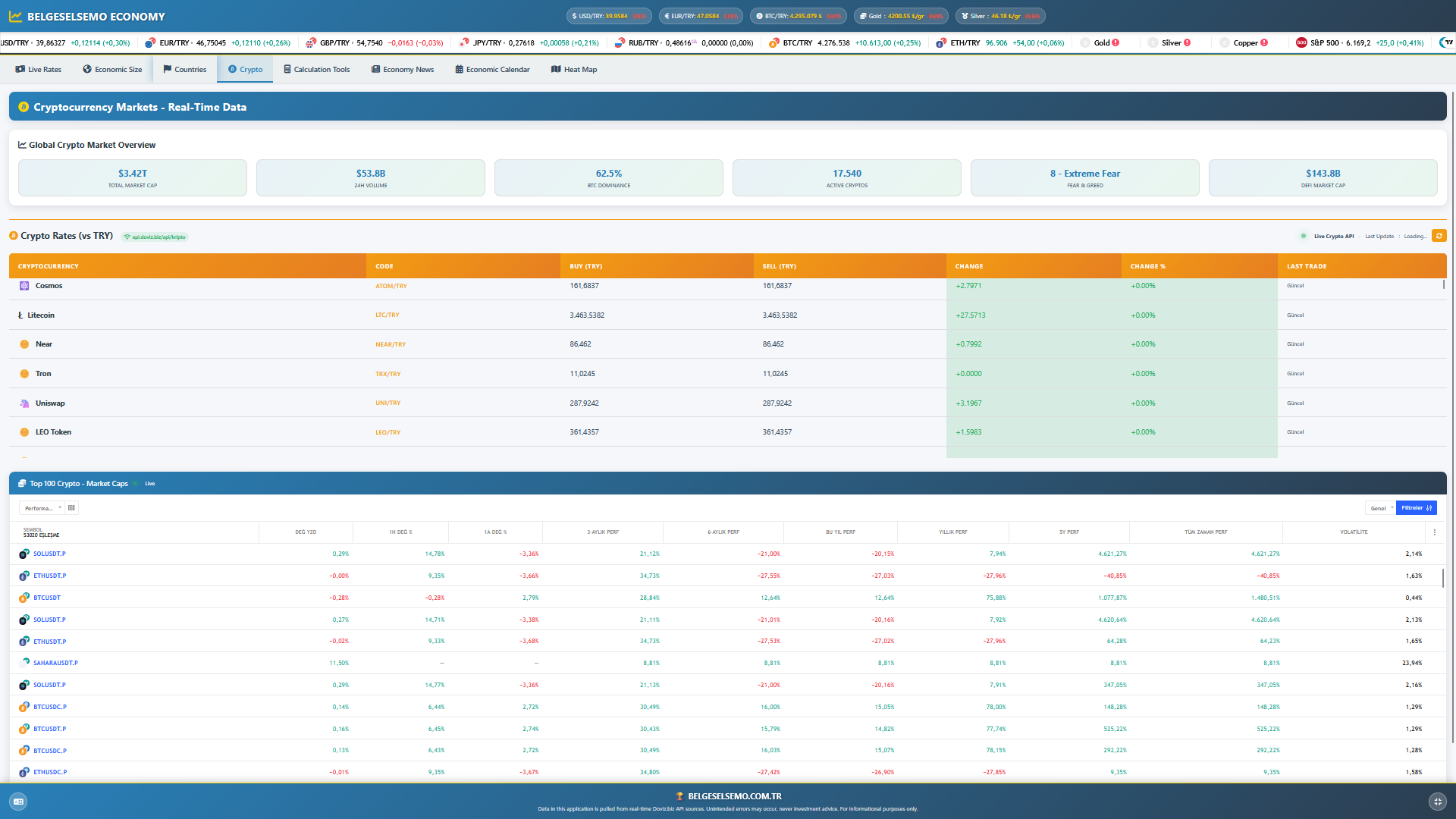
Crypto
-
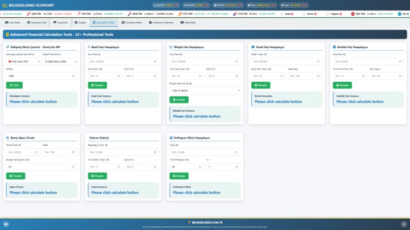
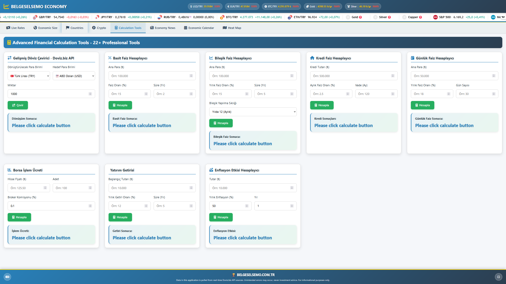
Calculation Tools
-
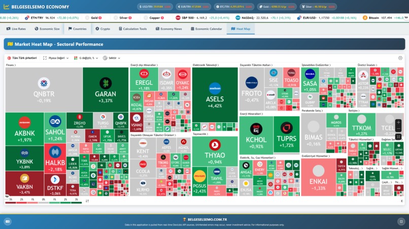
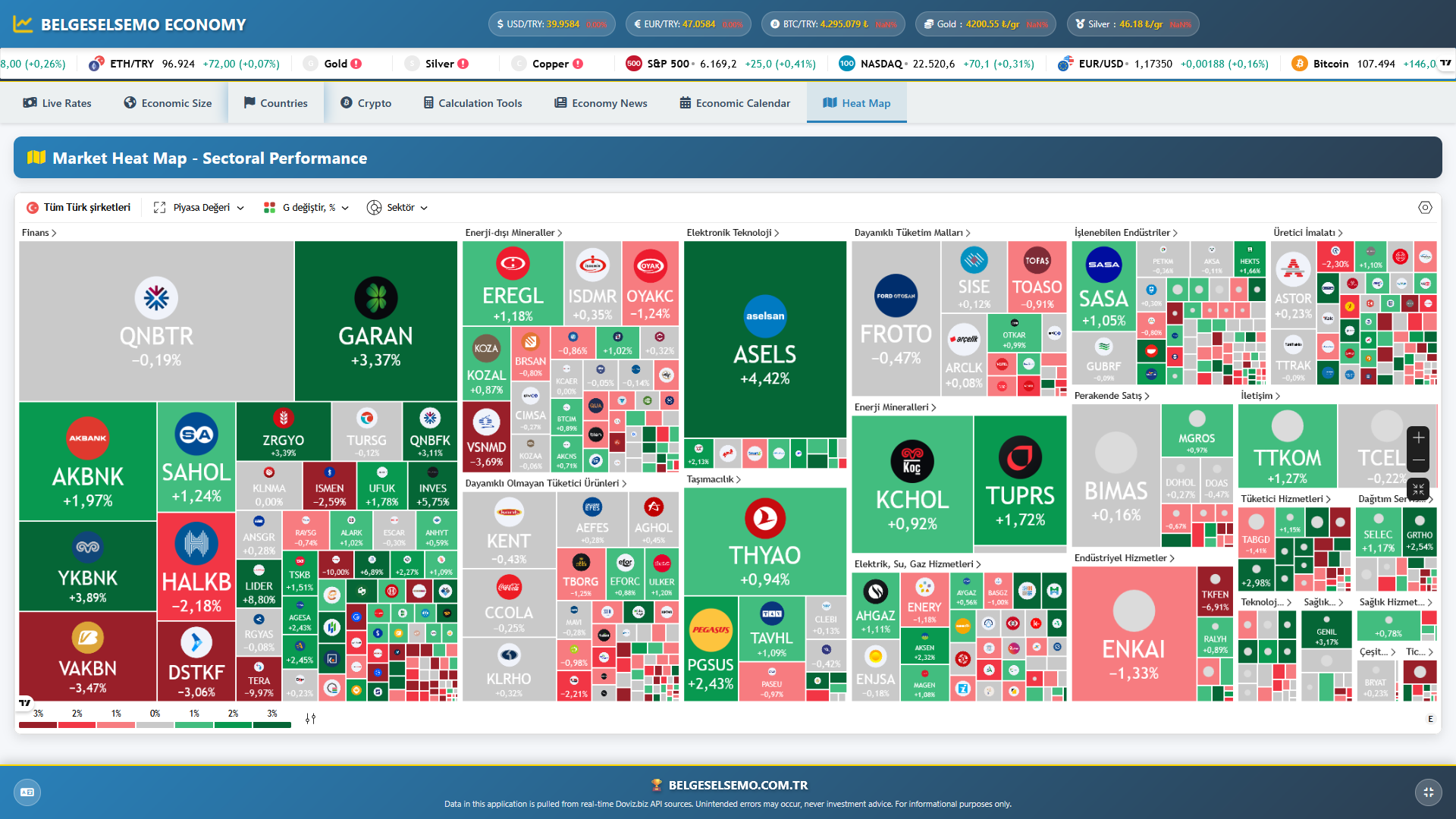
Heat Map
-

Economy News
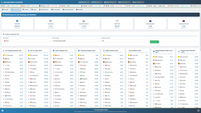
BELGESELSEMO EKONOMİ is a data-driven, visually enhanced, and fully responsive economic comparison platform designed to showcase key economic indicators across 26 countries, including Turkey. Built as an extension of the belgeselsemo.com.tr initiative, the goal is to present global economic metrics in a simple yet powerful HTML-based format that balances clarity, depth, and aesthetic impact. 💡 Inspiration
The project was inspired by a desire to help people answer the question:
“Where does Turkey stand in the global economy?”
Rather than displaying static spreadsheets or overwhelming tables, the aim was to create a user-friendly interface where viewers could explore rankings across GDP, inflation, exports, wages, and more — all in one unified, elegant platform. The concept merges the informative power of documentary-style analysis with the accessibility of interactive web design. 🛠️ How It Was Built
The project was developed using:
Pure HTML/CSS: Fully structured and styled with clean, responsive components.

Dynamic ranking cards: Each economic indicator (GDP, exports, inflation, population, etc.) is shown in a modular block.

Bilingual headings using data-tr and data-en attributes for seamless language switching (Turkish/English).

Reliable data sources: IMF, World Bank, Eurostat, OECD, Numbeo, and national statistical institutes.

Modern logo design: Custom-created to reflect all key elements from the platform — including bread, pension, charts, currency icons, and a play button.
⚙️ Key Features
Clean UI built around flexible “ranking cards”

Data for exactly 26 countries, including Turkey in every ranking

Categories:

    GDP (Nominal)

    GDP per capita

    Export volume

    Population size

    Inflation (split into High and Low Inflation)

    Minimum wage

    Average pension

    Bread price (per loaf)

    Home ownership rate

Consistent and easy-to-expand structure

Fully compatible with mobile and tablet screens

Flat icons and color-coded indicators for instant readability
🚧 Challenges Faced
Data consistency: Finding the most accurate and up-to-date values across multiple sources required deep cross-referencing and validation.

Design scalability: Maintaining a readable layout while accommodating many categories and countries.

Dual-language integration: Ensuring English and Turkish content could coexist without disrupting design.

Ranking logic: Sorting and preserving the visual order while embedding flag icons, values, and translated country names.
📚 What We Learned
Well-structured HTML with intuitive visual hierarchy can communicate complex datasets clearly.

Visual design, such as icons and logos, dramatically improves user engagement in economic content.

Simplicity doesn't mean lack of depth — a clean interface can still carry detailed data.

The best user experiences come from a balance between information density and aesthetic clarity.

Log in or sign up for Devpost to join the conversation.