-
-
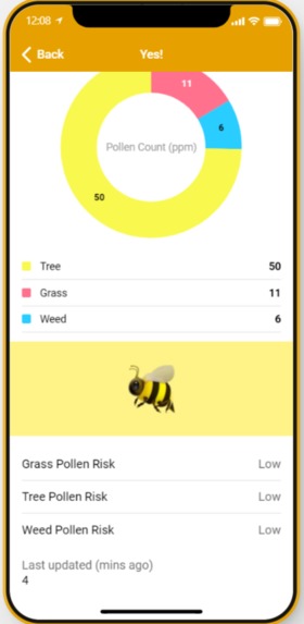
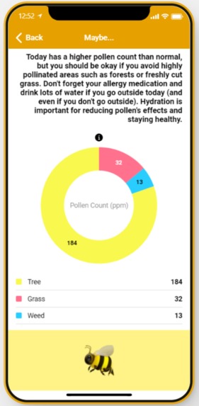
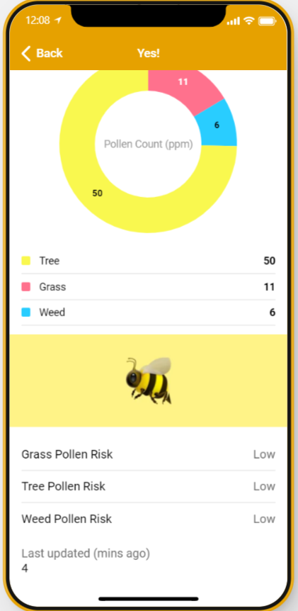
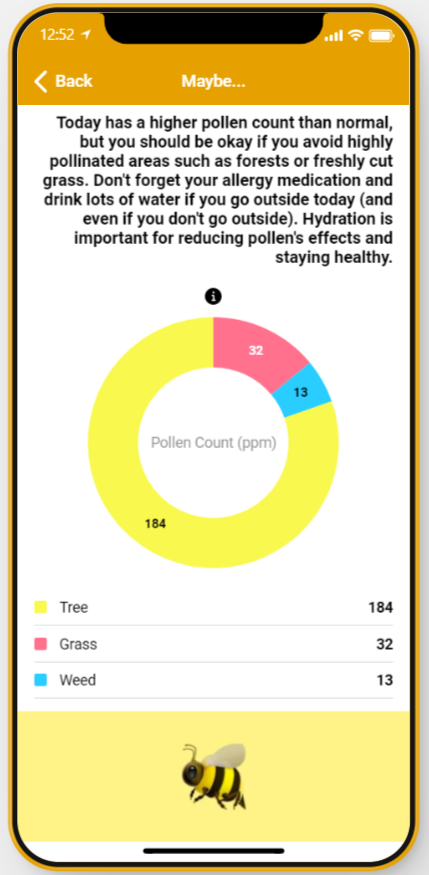
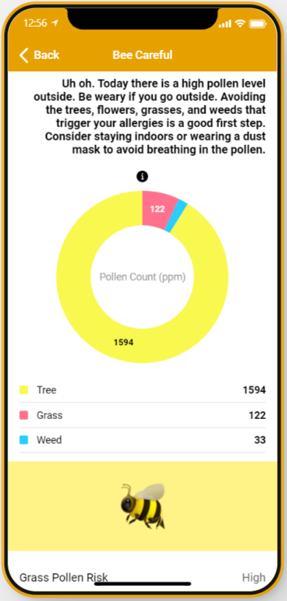
Detailed Rundown with Pollen Count
-
Graph breaking down the ppm of different pollens
-

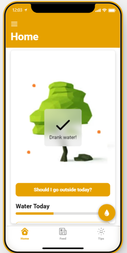
Add to cups of water drank.
-
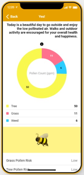
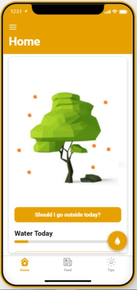
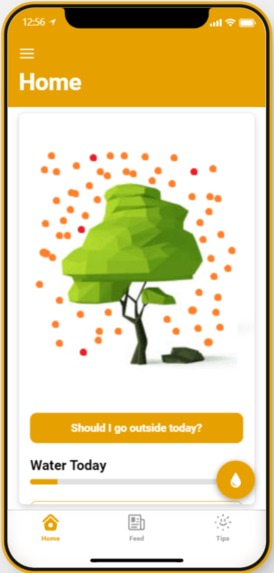
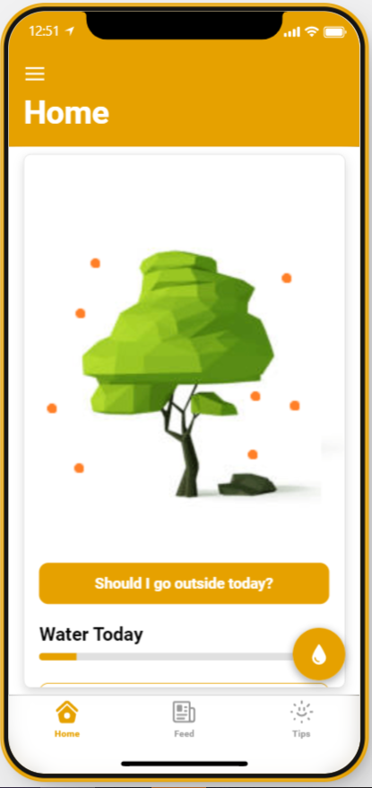
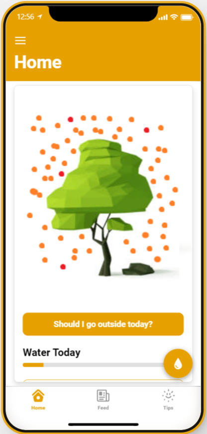
Demonstrating the homescreen and the image that indicates pollen levels outdoors.
-
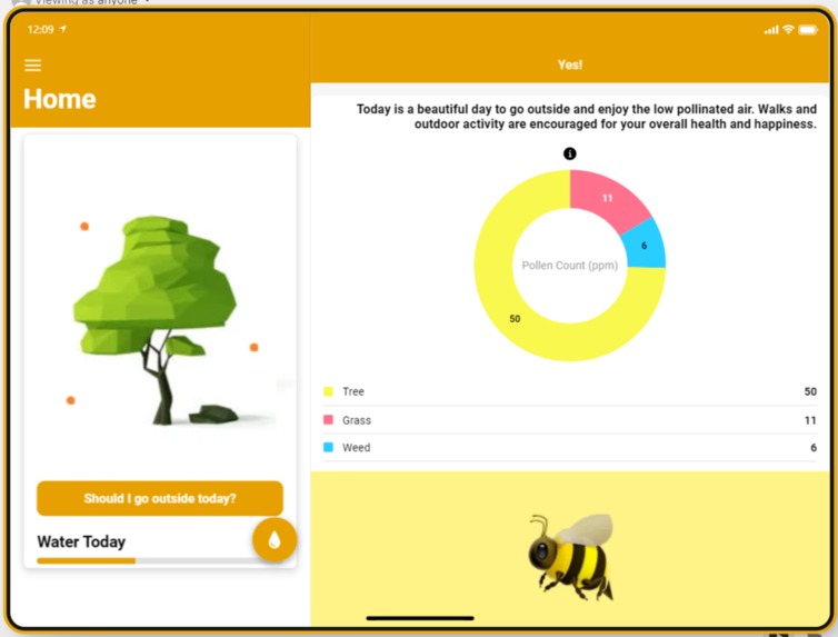
Homescreen on a tablet
-
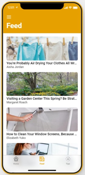
News tab
-
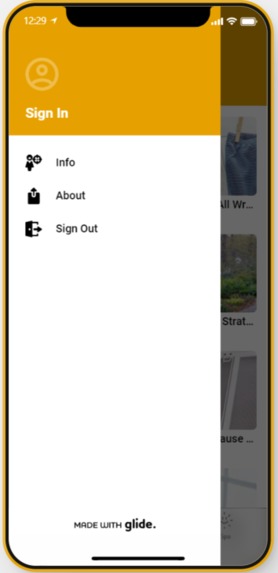
Information Menu
-
Medium Pollen Homepage
-
Medium Pollen Indepth
-
High Pollen Homescreen
-

High Pollen Indepth


Inspiration
This morning before the Hackathon, we both woke up and found ourselves barely being able to breathe because of blooming trees by our windows. This got us thinking about how if we do want to find an allergen forecast, we have to navigate between websites that often have the allergens section hidden away and are hard to follow, along with not having any useful information on remedies or relief.
What it does
BeeCareful uses AmBee API, along with a few others, that allow us to scrape pollen data from around the world, including pollen counts of differing type and new pollen news (with inspiration from GeoTab). Using this API, and a classification tree, we created an intuitive and friendly looking application that warns users about pollen levels at the given moment, as well as recommending whether or not today is a good day to go outside and why.
How we built it
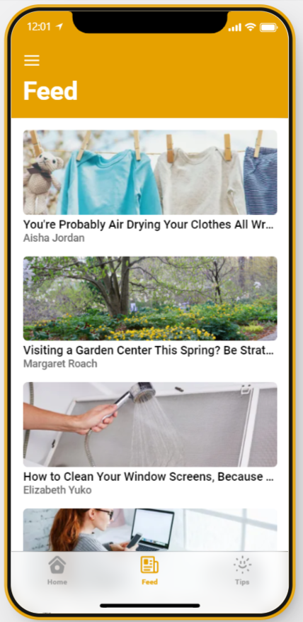
We used Glideapps to organize our front-end and a combination of Google Sheets and JavaScript to process the data that the API's deliver. We have differing front pages based on the forecast of the day and the persons location. We made sure to have the data update itself once an hour, and change based on the users location. The news also is organized based on popularity and relevance from the most recent news articles in the last month.
Challenges we ran into
Initially, we ran into difficulties into implementing the API into Google Sheets in a way that would be both usable in the front-end, but also clear to anyone just viewing the database. This was remedied by parsing the code through several steps rather than just splitting it as if it were simply a CSV.
Additionally, we had some trouble in figuring out how to best deliver the fast information we had collected in a friendly way to the user. Implementing visuals and graphs rather than just lists of numbers for the data allowed the application to feel more inviting.
Accomplishments that we're proud of
We created a database from a combination of living updating APIs which makes viewing the data much simpler than just navigating different websites.
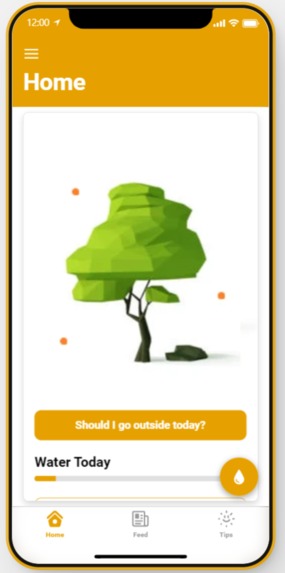
User experience was the priority, so the images visible on the home screen of the app reflect the pollen count in the air as of the most recent update. This makes it extremely easy for the user to tell whether today is a "good allergy day", a "bad allergy day", or something in between. Additionally, the users simple answer to whether or not today's is a good day to go outside is answered through a simple button click, with easy to view information.
What we learned
Learned to the value of incorporating different platforms together and using Geo-spatial data in a way that truly helps people through succinct visualizations.
What's next for BeeCareful: Manage your Allergies
Future outlooks on pollen with forecasted weather (7 day and 14 day view) as well as more tips and helpful relevant information for the user.
Built With
- ambee
- glideapps
- javascript
- sheets


Log in or sign up for Devpost to join the conversation.