-
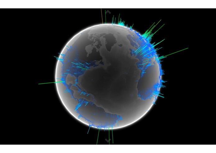
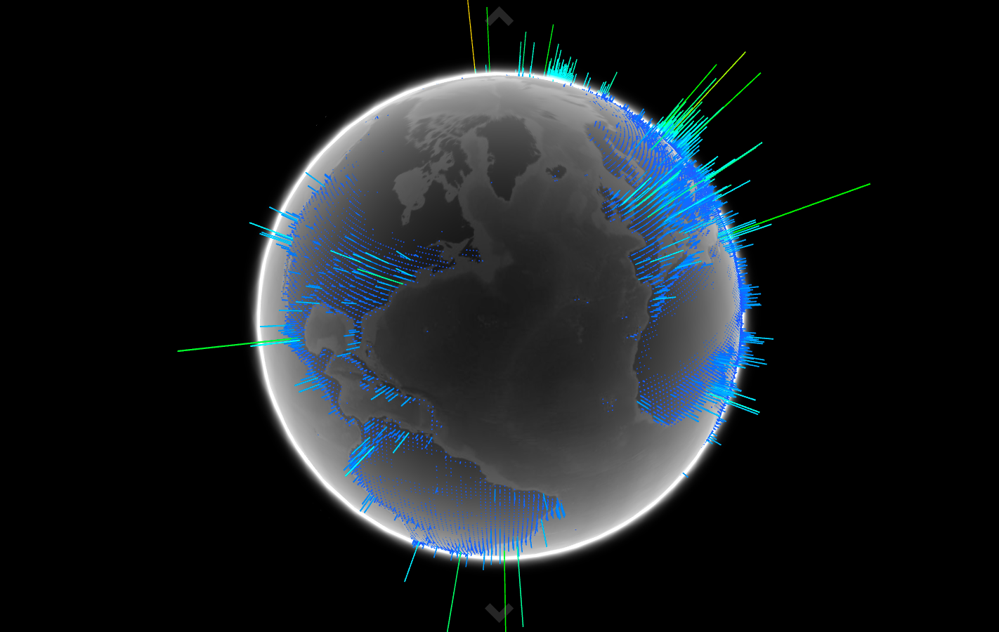
WebGL population visualization
Inspiration
We want users to be able to make informed decisions about where to live and work, correlating population data, air quality data and healthcare outcomes.
What it does
We are correlating population, pollution, and asthma data and visualizing them in WebGL, Mapbox and CartoDB.
How we built it
We used CartoDB, Mapbox, PlanetOS, healthcare.gov and NGA data.
Challenges we ran into
Preparing the data and data cleanup. Understanding the APIs and documentation.
Accomplishments that we're proud of
We're proud of our amazing 3-D globe data visualization, the Mapbox interactive map, and the Carto map.
What we learned
Ways to better visualize the data.
What's next for be-unity
Integrating the datasets. Using hardware such as mobile air quality monitors to crowdsource more granular data. Create better VR interfaces so that the haptic controls can be used to make the data, fun, engaging and interactive.
Built With
- carto
- healthcare.gov
- mapbox
- planetos
- webgl


Log in or sign up for Devpost to join the conversation.