-
-
Splash screen
-
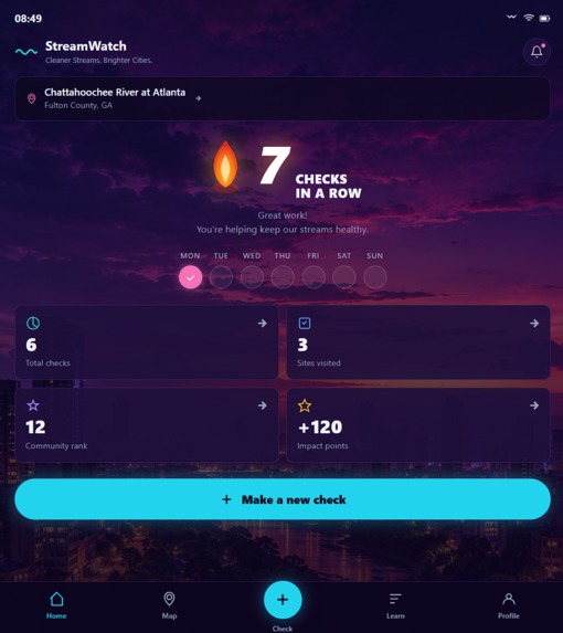
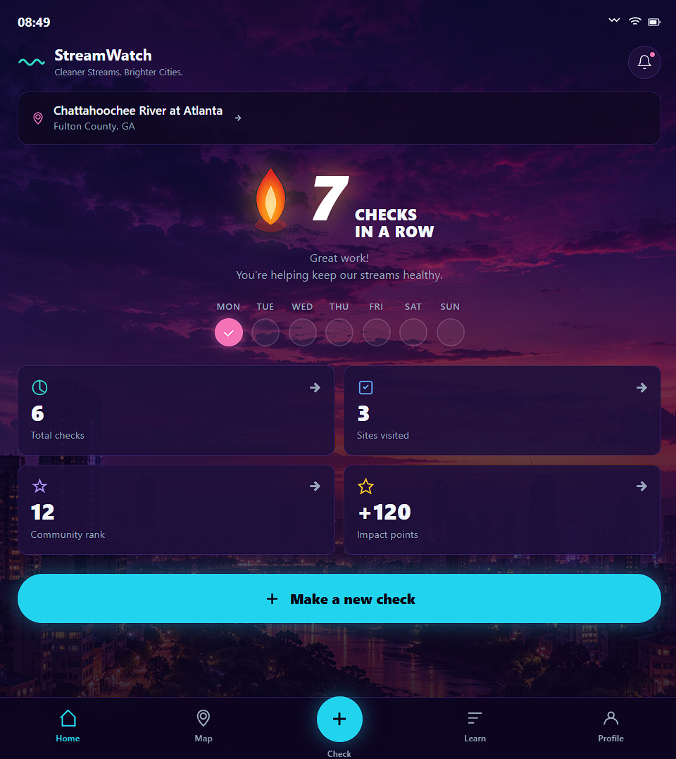
Mobile: Streak & impact dashboard
-
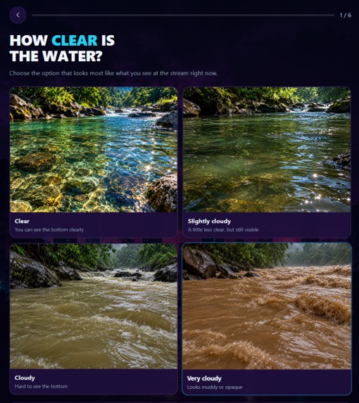
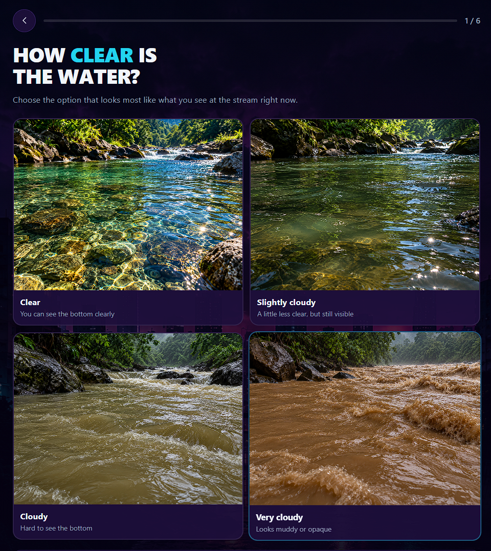
Mobile: Water clarity survey
-
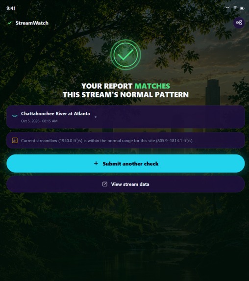
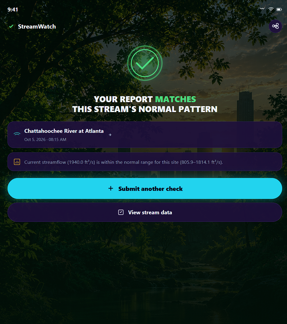
Mobile: Report confirmed
-
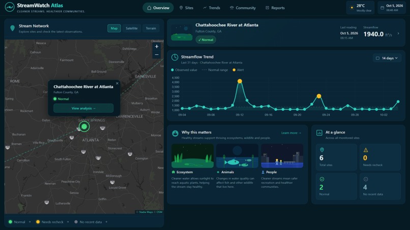
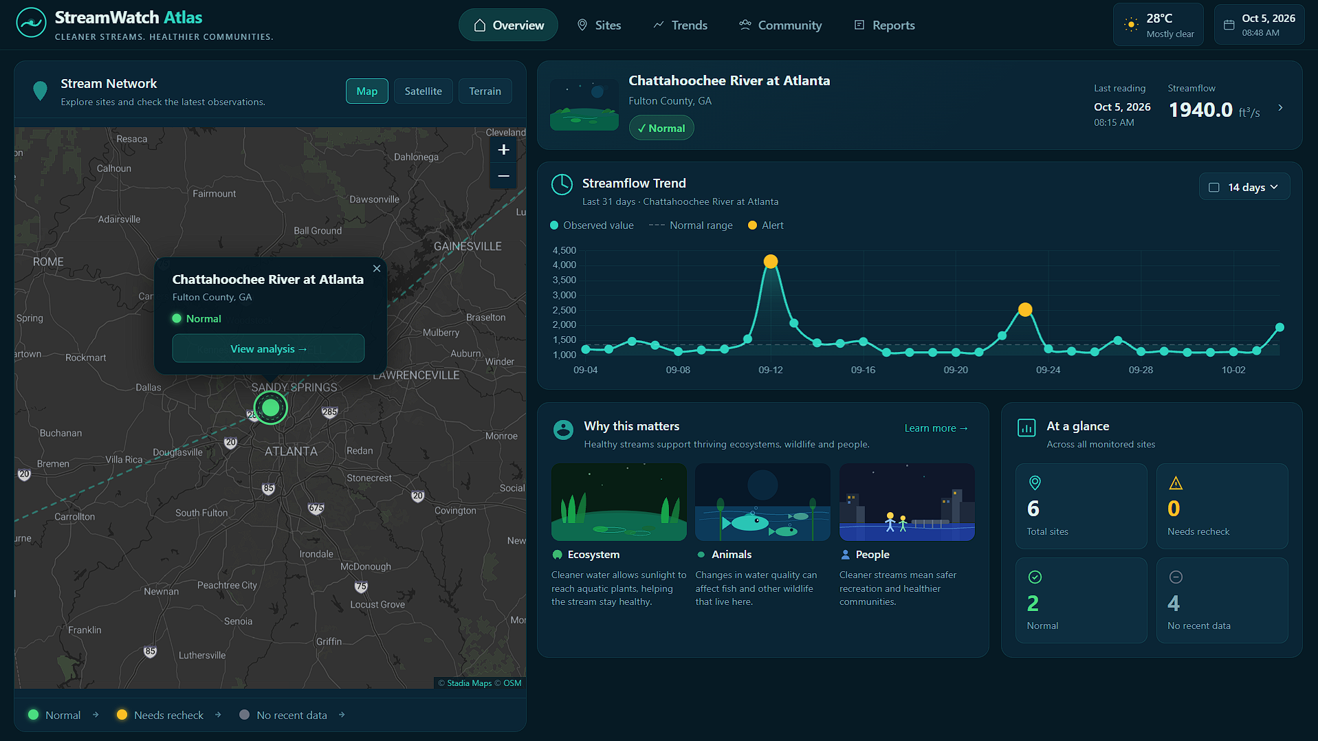
Desktop: Overview dashboard
-
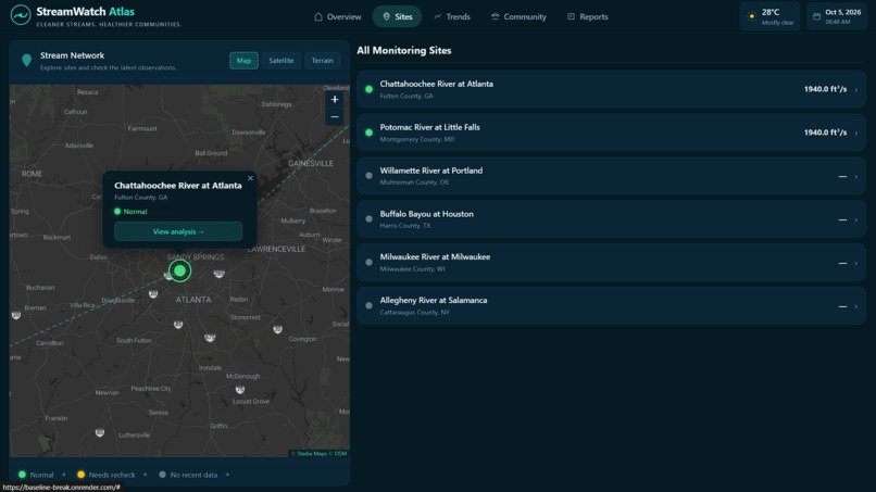
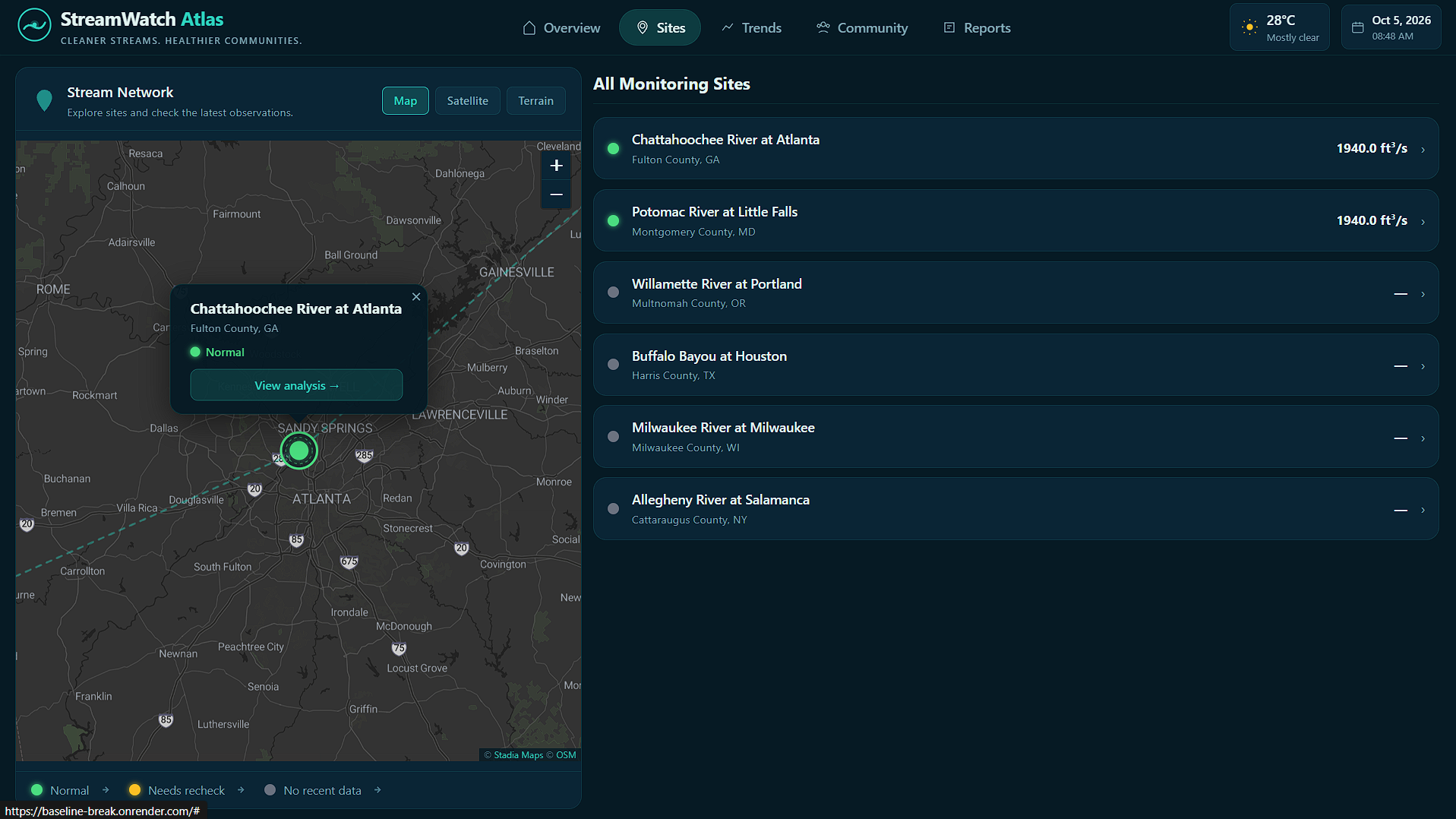
Desktop: All monitoring sites list
-
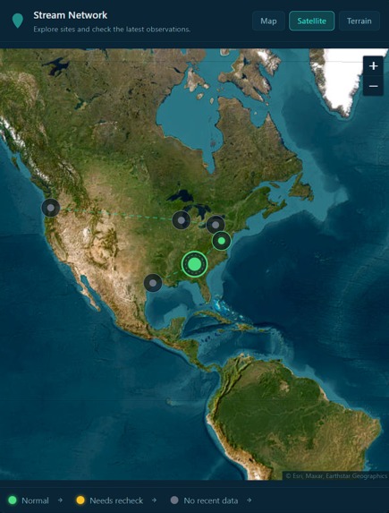
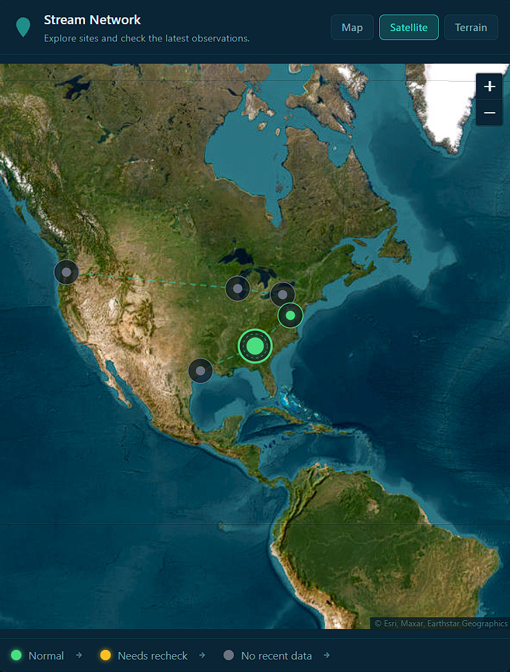
Desktop: Satellite network map
-
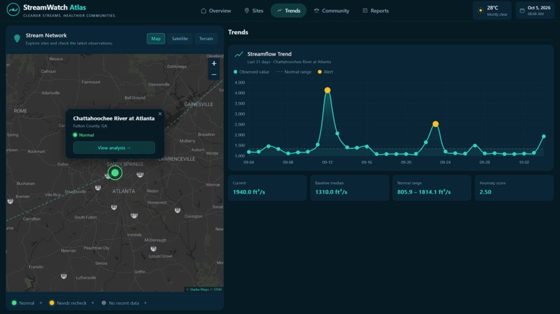
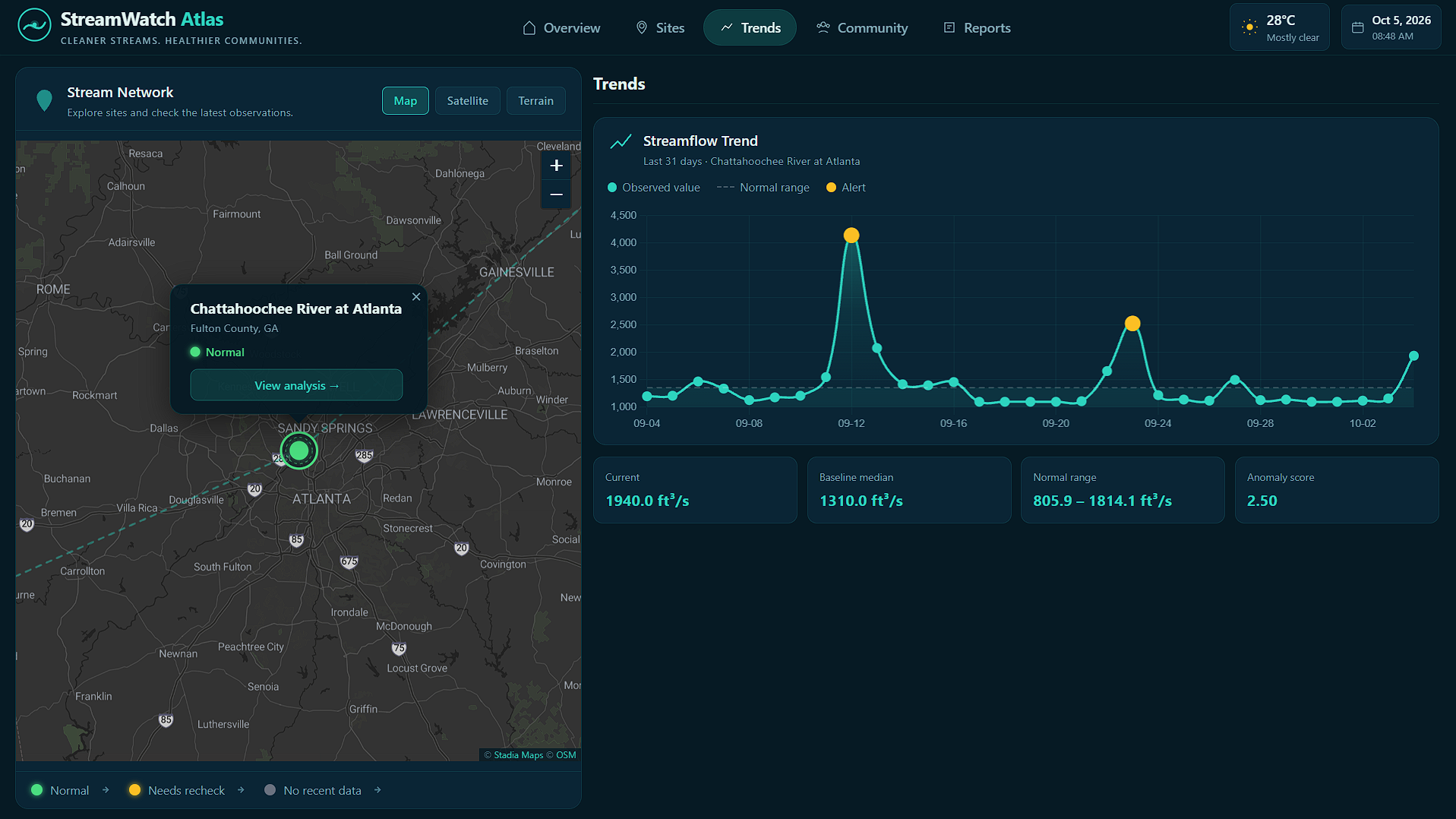
Desktop: Trends chart with anomaly spikes
-
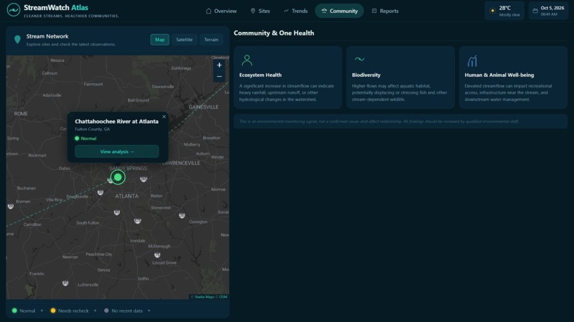
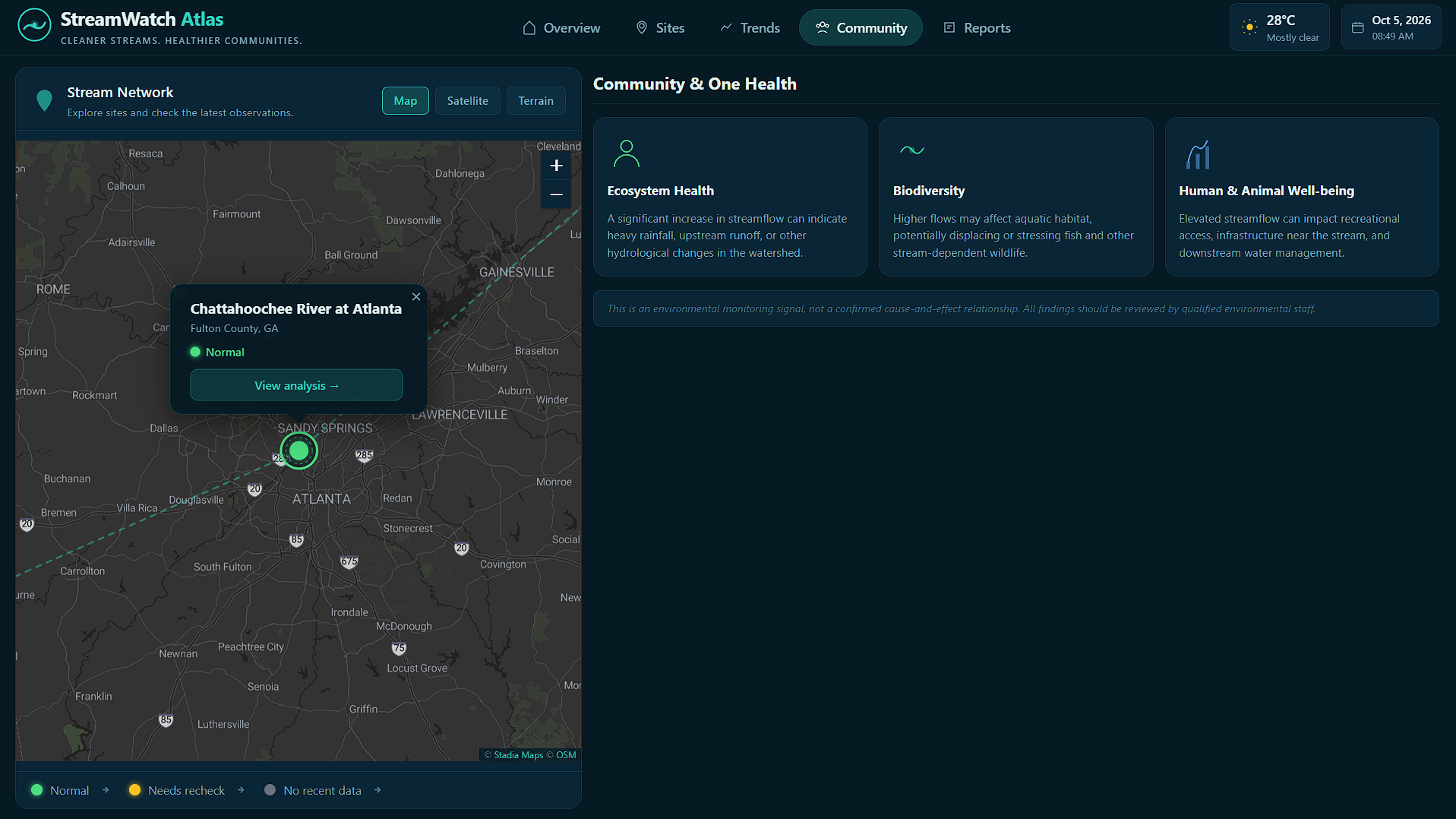
Desktop: Community & One Health panel
-
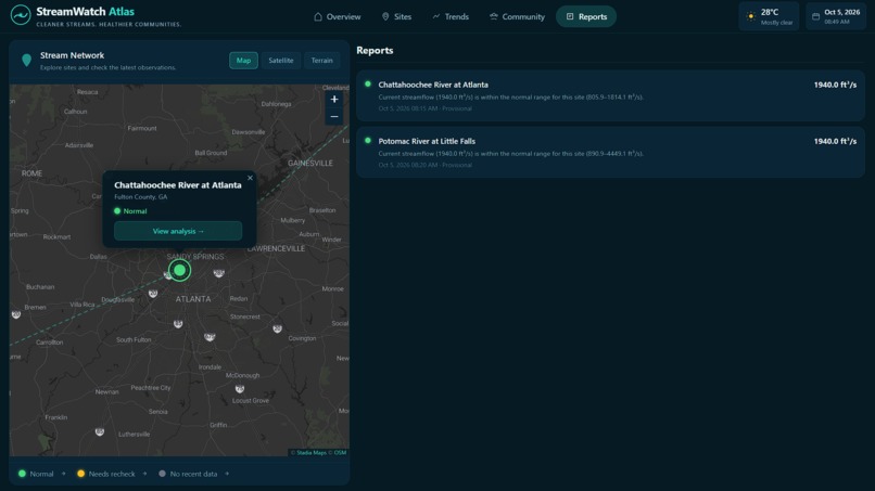
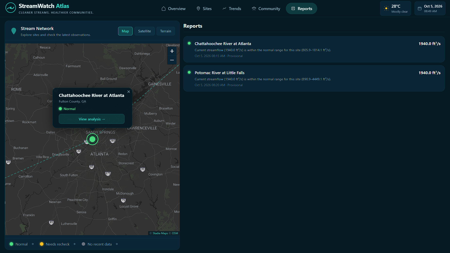
Desktop: Reports panel
Inspiration
Water monitoring systems generate thousands of readings every day. But a high number by itself means nothing - it depends on what's normal for that specific location. A reading of 5000 ft³/s might be a flood warning at one river and a perfectly calm Tuesday at another.
The blind spot we wanted to fix: most dashboards show you data but don't tell you when something has actually changed.
We asked one question - can we build a system that learns what normal looks like for each individual monitoring site, and flags the first meaningful departure from that pattern in a way a non-expert can understand and act on?
What it does
Baseline-Break is a human-in-the-loop early warning system for freshwater ecosystems.
- It connects to the USGS Water Data API and fetches 90 days of real daily discharge measurements for 6 US river monitoring stations
- It builds a site-specific baseline using robust statistics - median and MAD instead of mean and standard deviation, so historical flood events don't distort what counts as normal today
- It scores each new reading with a robust z-score and checks whether the unusual pattern has persisted across multiple consecutive days
- When a break is detected, it shows exactly why - current value, normal range, anomaly score, and plain-English explanation
- It asks a human to verify - never claiming pollution, never making autonomous health decisions
The same backend powers two experiences: a desktop monitoring atlas for researchers and a mobile citizen-science check-in flow for community members.
How we built it
Backend: Python + Flask. The analysis pipeline is split into clean modules - usgs_client.py handles all HTTP with in-process caching, timeseries_service.py normalises raw observations, baseline.py computes median/MAD baselines, anomaly.py runs the robust z-score, persistence.py checks consecutive unusual readings, and explanation.py generates human-readable output.
Frontend: Vanilla HTML/CSS/JavaScript - no React. Leaflet.js for the interactive dark map, Chart.js for the 30-day trend chart with alert dot overlays. The same index.html serves both desktop (≥900px) and mobile (<900px) layouts using CSS media queries.
Data: All data is live from api.waterdata.usgs.gov - the US government's public OGC water monitoring API. Every timestamp and value in the app is real.
Deployed on Render: https://baseline-break.onrender.com
Challenges we ran into
The biggest challenge was the USGS API itself. The modern OGC API uses full 32-character hex time series IDs - our initial probe returned truncated IDs which caused all data fetches to silently return zero rows. Diagnosing that took careful endpoint-by-endpoint investigation.
The second challenge was making the anomaly detection actually fire on real data. Real rivers in October are near their seasonal norms - the detection needed to be sensitive enough to flag genuine departures without triggering on noise. We solved this by injecting today's latest continuous reading (which the daily history doesn't include yet) into the persistence check window.
Accomplishments that we're proud of
- Every number in the app is a real USGS measurement from this week
- The explanation system generates plain English that a non-technical user can understand and act on
- The human review step is a genuine workflow, not decoration - the decision is stored and the system never overrides it
- The responsive design serves two completely different user experiences from one codebase
What we learned
Robust statistics matter for real-world environmental data. The median and MAD handle historical flood events gracefully in a way that mean and standard deviation simply don't. One massive flood three months ago would permanently inflate a mean-based baseline - the median ignores it entirely.
We also learned that explainability and restraint are features. Every time we were tempted to add a claim ("this indicates pollution") we stepped back. The system is more trustworthy because it shows its working and stops short of conclusions it can't support.
What's next
- Seasonal baseline: compare against the same time last year, not just the last 90 days
- Additional parameters: turbidity, dissolved oxygen, pH - same algorithm, more signal
- Citizen observation integration: overlay field reports from the OneAquaHealth app against the same baseline
- FHIR-compatible data export for Track 7 interoperability alignment
- Multi-network support: the architecture is adapter-based - any public monitoring network can plug in
Built With
- chart.js
- css
- flask
- html
- javascript
- leaflet.js
- python
- render
- stadia-maps
- usgs-water-data-api

Log in or sign up for Devpost to join the conversation.