-
-

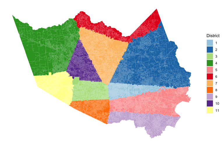
Our proposed redistricting of Houston
-

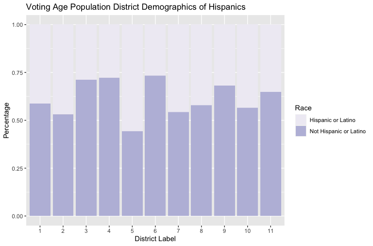
A chart representing the demographics of the Hispanic population
-

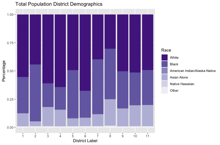
A chart representing the demographics of the total population
-

A chart representing the demographics of the voting age population
-

A chart representing the demographics of the voting age Hispanic population
-

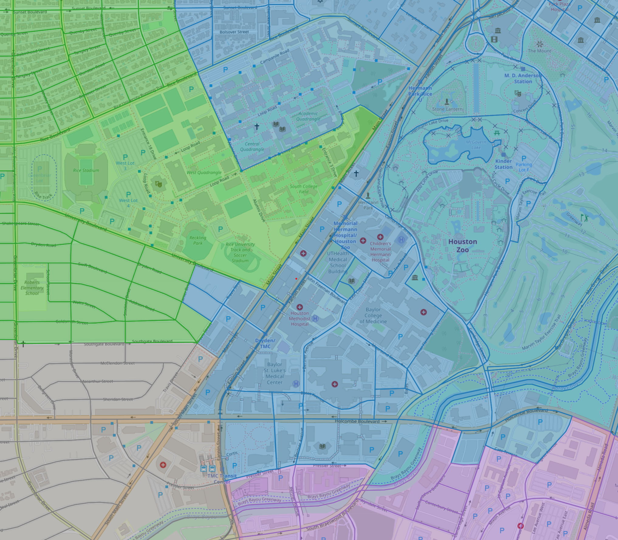
A map of the local Rice area, showing where our redistricting model can be improved. It splits up the local community, when it could not.


Inspiration
We were inspired by BakerRipley's Track, which gave us the task of redistricting Harris County.
What it does
Our program split Houston into 11 districts, balancing demographic fairness and continuous borders.
How we built it
We used Matlab for the analysis and R for the data formatting/cleaning.
Challenges we ran into
We struggled with finding an initial dataset that we liked the formatting of and we could understand. Shapefiles, additionally, were not familiar to us before this Datathon. We attempted to use them with ArcGIS, but the program was too slow to match the amount of data we had.
Another large issue was memory size. The amount of data we collected meant our program running was time consuming.
Accomplishments that we're proud of
We were very proud that we created an output, since we initially found the redistricting task to be very technologically advanced for our skill levels.
What we learned
We gained familiarity with data formatting.
What we could improve on
The interactive map contains metadata that is not very clear. With more time, we would describe and label these data points more thoroughly.
We struggled keeping neighborhoods together. Notably, our model splits Rice campus and the surrounding area into 4 districts.
If given more powerful computers, our programs may be able to perform better with more accuracy. We found ourselves limited by memory stacks, and efficiency.


Log in or sign up for Devpost to join the conversation.