-
-
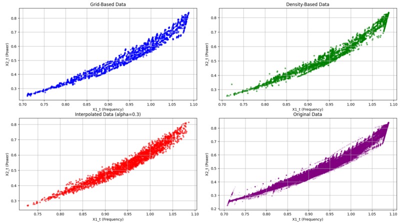
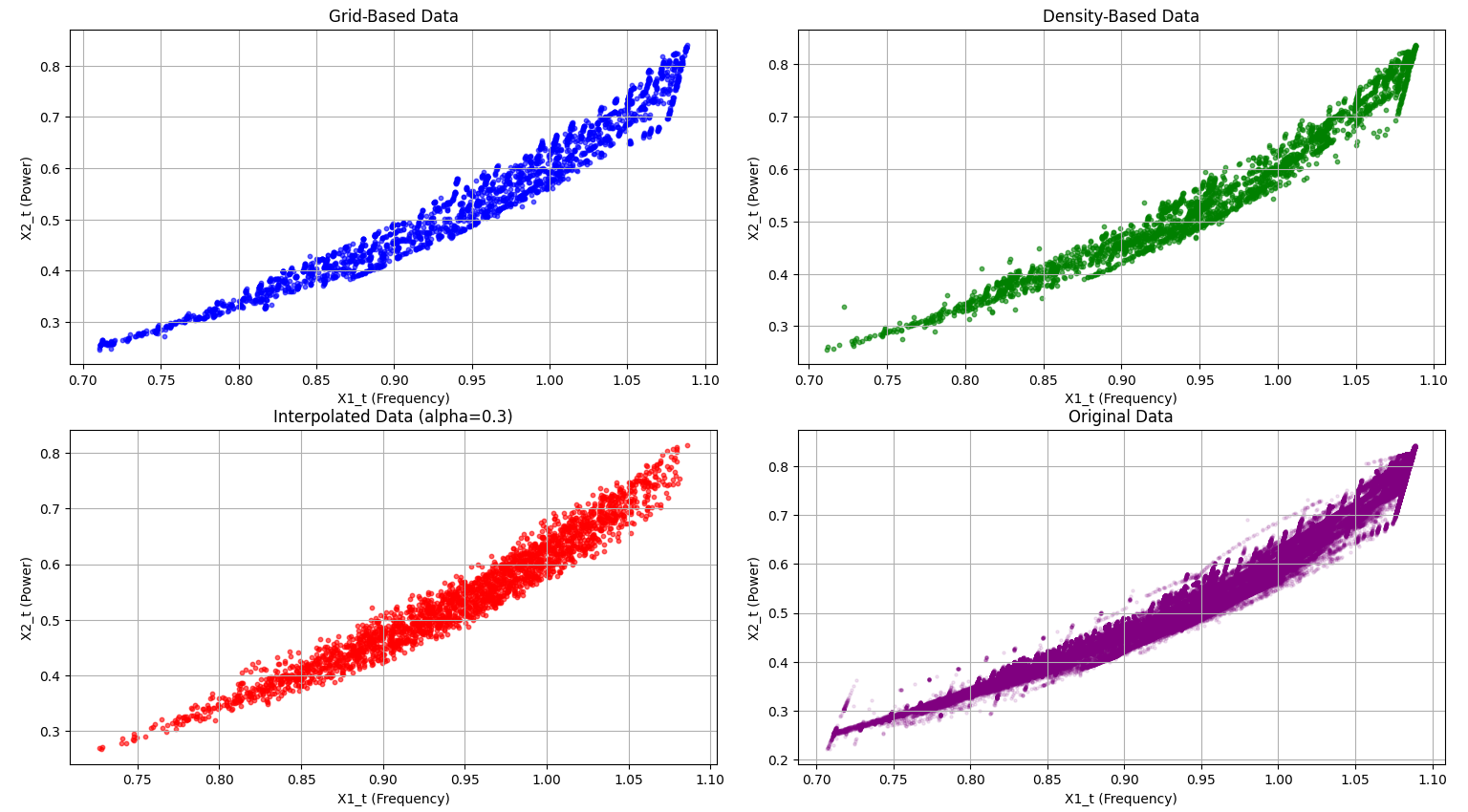
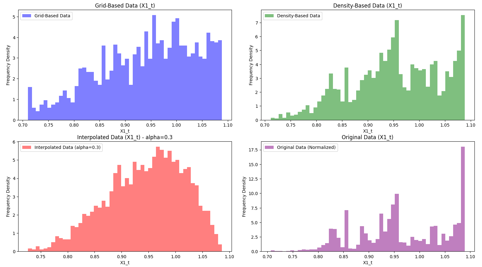
Graphs for the first data set with alpha 0.3.
-
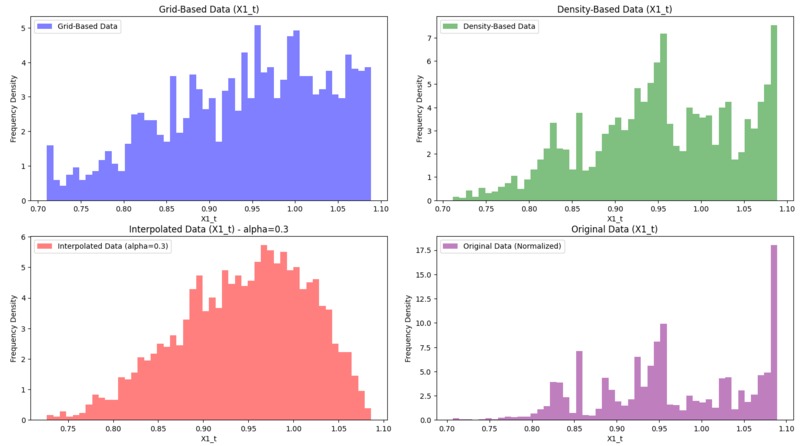
Histograms for the first data set, where alpha is 0.3.
-
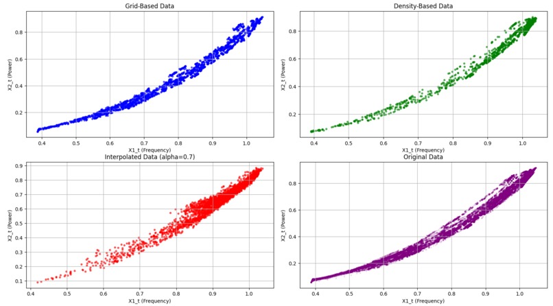
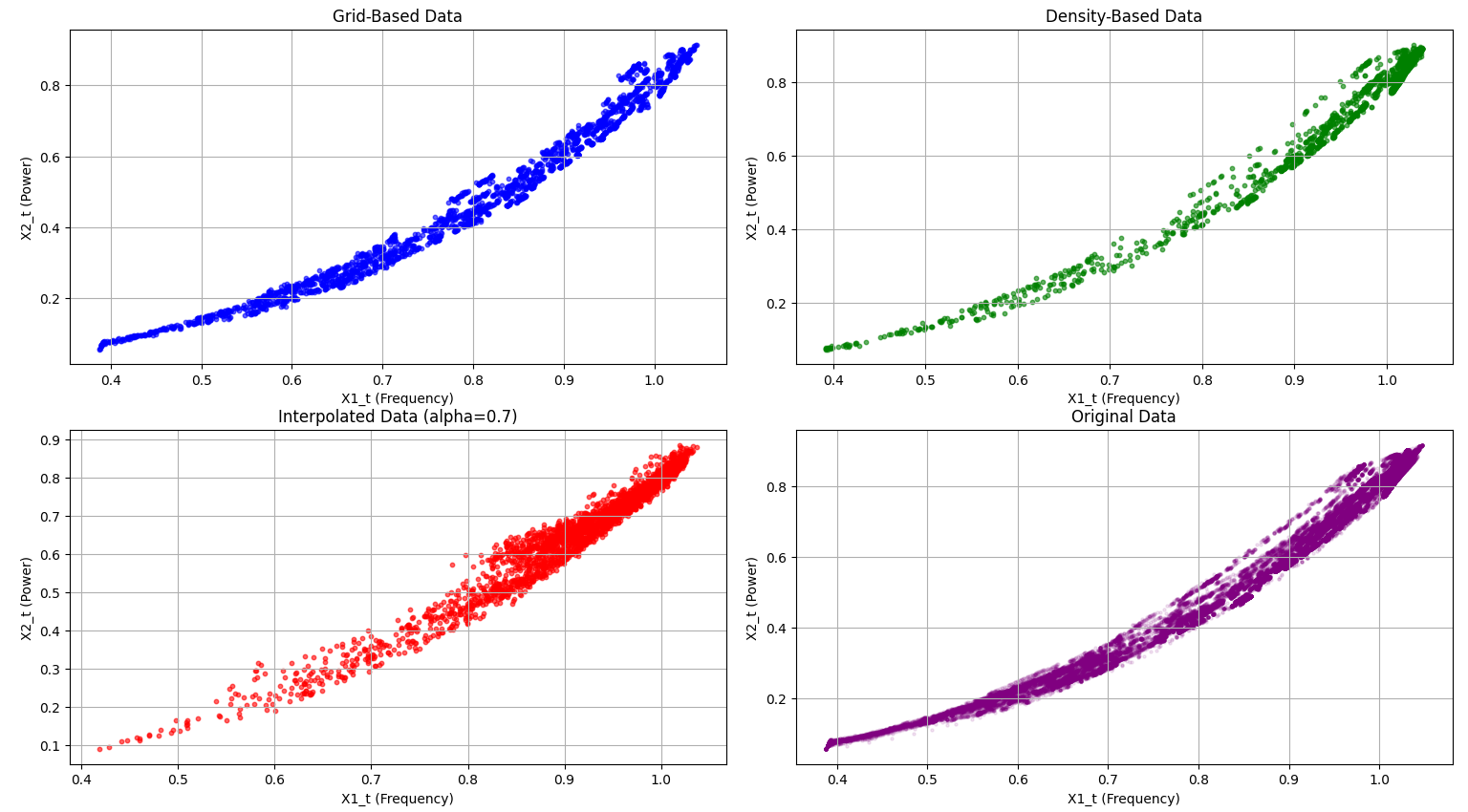
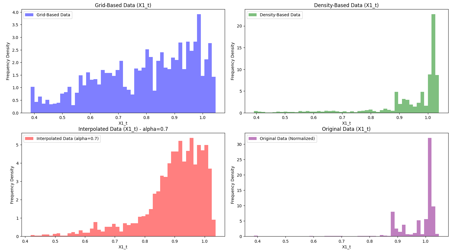
Graphs for the second data sets with alpha 0.7
-

Histograms for data set two, using alpha as 0.7. Notice the distribution that grid-based sampling provides compared to the original data.
Inspiration: We took on this challenge because of its significant real-world impact. Monitoring electric motor health is vital in industries like manufacturing, oil and gas, and energy, where unexpected failures lead to costly downtime, inefficiencies, and safety concerns. By developing a condition monitoring system, we aim to minimize these risks and boost productivity. Some of the key challenges that we faced included selecting representative data points for efficient, real-time predictions and focusing on high-density operational areas to provide targeted insights. This project allows us to understand how industries cooperate and complete tasks while under real-world constraints and considering resource management.
grid based: From the initial given data we first need to create the best possible sampling algorithm that fits the criteria of Selection #1. This is where the data should be reduced to 2,500 data values that are distributed uniformly across each region so that they can be trained equally. We decided to go with a grid-based sampling algorithm, which with a predetermined number of bins, we cap the amount of values for each bin, and try to get as close to a complete uniform distribution as possible. Specifically, we decided to have 50 bins and at most 50 data points, as this resulted from both data sets a close uniform distribution. We can really see this in effect with the provided histograms from the second data set. The data tends to really cluster later into the values, but the uniform distribution model appropriately compensates the lower end of the values, giving us a much more balanced data set compared to the original given data. A challenge that we faced with the grid-based sampling algorithm is finding an appropriate number of bins and values per bin while also considering compilation time. A higher bin count could potentially provide a better uniform distribution, but compilation time greatly increases and may not output intended results for all data sets.
density-based: Now, we needed a sampling algorithm that fits the criteria of selection #2. This requires us to still have a good level of coverage within the entire set, but favor data points where the original data has a high density. Because the high density regions are where the asset is mostly operated, using this algorithm to find appropriate training data will greatly improve overall training quality across more common regions and offer better predictable results for the health of a motor. For this criterion, we decided to use a density-based sampling algorithm. This unsupervised algorithm heavily prefers denser regions by assigning a higher probability of selection to data points located in those clusters. By doing so, it ensures that the model receives more information from the most commonly operated conditions, improving its ability to predict performance and detect anomalies in these critical areas. At the same time, the algorithm removes blatant outlier data to prevent skewed results. The only challenge we faced was to save computational resources and take less time to output results, so we made sure to limit our cluster analysis to 10,000 points per detected cluster, resulting in faster run time. Visualization in the histograms really shows the similarity with the original data and the density sampling data.
Interpolation: For interpolation, we wanted to incorporate a user input so that they are able to gradually change the desired distribution using a parameter, alpha, that goes from zero to one, where zero is completely grid-based sampling and one is completely density-based sampling. Depending on what the user wants, they can pick values in between in order to have a gradual change from one distribution to another. We compared linear interpolation and Radial Basis Function (RBF) interpolation to determine the most effective method for predicting motor health. Linear interpolation estimates values by drawing straight lines between adjacent data points. While it is computationally efficient and simple to implement, it struggles to accurately capture complex, non-linear patterns. This is where we began to experience challenges as we were not getting our desired output, as linear interpolation often results in piecewise linear segments, which leads to sharp discontinuities and an oversimplified model that may miss subtle trends in the data. To solve this issue, we began to shift to RBF interpolation. This uses a smooth, continuous approach by fitting a radial basis function to each data point and combining their influences to estimate unknown values. This method excels at capturing non-linear relationships and provides a smoother, more accurate approximation of the underlying patterns within the dataset.
Visualization: The visualization code creates two sets of 2x2 figures, each comparing different datasets: grid-based, density-based, interpolated, and original. The first set of scatter plots illustrates how each dataset is structured. The top-left plot shows grid-based data in blue, representing a uniform spread across the value range. The top-right plot displays density-based data in green, emphasizing high-density areas where the asset operates frequently. The bottom-left plot shows interpolated data in red, blending grid and density characteristics using an alpha factor. Finally, the original data in purple on the bottom-right serves as a reference for all sampling methods. The second set of figures consists of histograms that display the distribution of the X1_t variable across these datasets. Here, we see how each sampling method affects X1_t frequency density: grid-based data remains uniform, density-based data emphasizes clustered regions, and interpolated data creates a balanced, blended distribution. These visualizations help us compare how each method captures and represents the underlying structure and trends in the data. The graphs were also normalized, as the range is bounded by the frequency density to involve a swift and fair comparison between the different datasets. In the project media, we have provided examples of the graphs and histograms of both data sets.
Project notes: In our code, we made sure that the code will not go through with the interpolation if both samples do not include 2,500 data points. This ensures that there must be 2,500 data points in each analysis.
Conclusion: In conclusion, we extend our gratitude to Baker Hughes for providing us with the invaluable opportunity to work with their real-world data to develop a machine learning algorithm. This experience offered us unique insights into how a leading company leverages data analysis and machine learning to tackle present-day challenges.


Log in or sign up for Devpost to join the conversation.