Inspiration
This project started with the hackathon, but I didn’t just want to build something that works on Reddit. I wanted to build something that feels like Reddit.
For me, Reddit is nerdy, niche, creative, and technical and full of weird humor. It’s where people obsess over details, build strange experiments, and celebrate ideas that are slightly absurd.
One subreddit that captures that energy is r/BadUIBattles. I’ve never met anyone offline who obsesses over intentionally terrible interfaces. On Reddit, hundreds of thousands do.
They’re absurd, frustrating, sometimes evil, and often hilarious.
Most are something you look at once, appreciate, and move on from.
I wanted to make that experience playable.
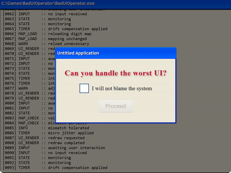
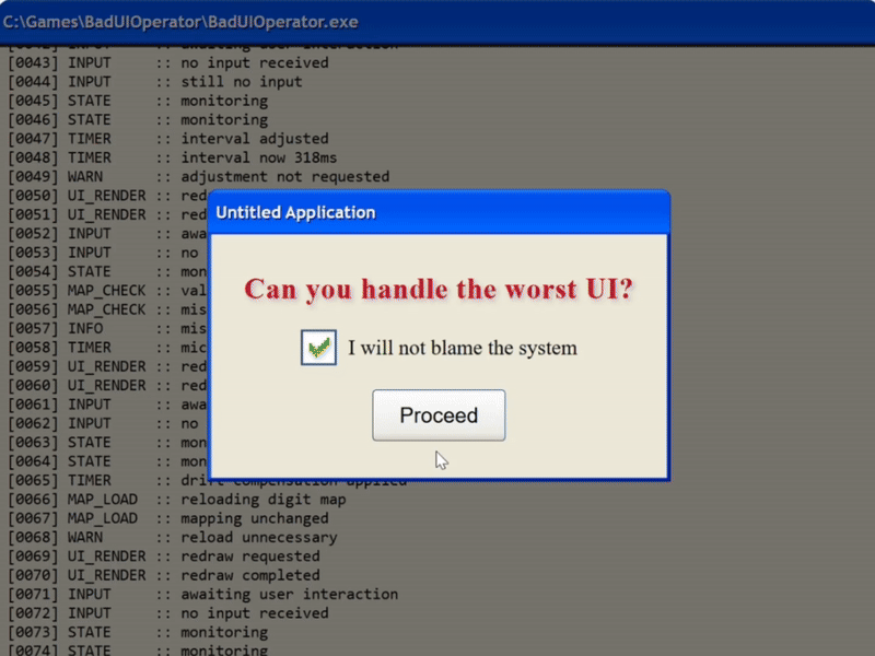
Bad UI Operator is a daily game built around tiny, trivial tasks. The interface does not behave the way you expect.
Instead of one broken screenshot, it is a system that behaves badly on purpose. You do not just observe the joke. You have to deal with it.
What it does
Every day, the game presents a small objective.
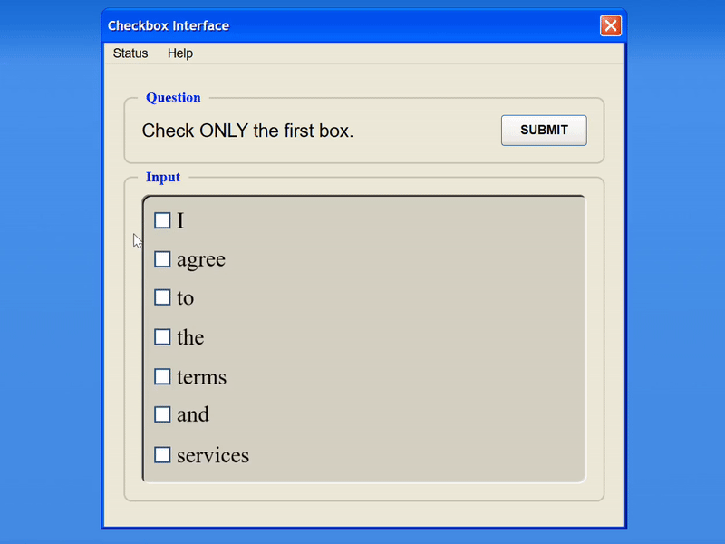
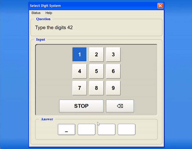
Check the first box. Enter a few digits. Confirm the correct option.
The complexity comes from the interface layer. Buttons may not behave exactly as they look. A checked box might not mean what it visually suggests. Timing might subtly shift. A click might affect something slightly different than expected.
The game is not about solving a puzzle in the traditional sense. It is about questioning what you think you know about interfaces and adjusting when those assumptions fail.
It recreates a very specific feeling: the moment when you have been debugging something for hours and suddenly understand what was actually happening.
That small “oh, that’s it” moment.
The task is trivial. The reward is understanding.
How I built it
Very early on, I realized that creating a completely new interface every day was not sustainable, and repeating the same interface would kill replayability.
Replayability couldn’t come from constantly reinventing the surface. It had to come from variation inside the system itself.
So at the core, I designed a small set of absurd interfaces.
Right now that is:
- An “I agree to the terms and services” screen, where every word has its own checkbox
- A number entry system where you don’t type digits. It cycles through digits and you have to click stop.
On their own, they are amusing once, but not strong enough to support a daily system.
To make them replayable, I built a plugin architecture around them. Each interface exposes deterministic lifecycle hooks where behavior can be intercepted or transformed. Malfunctions attach to these hooks and modify specific layers of the interaction model.
Instead of rebuilding the interface each day, the daily configuration composes a set of malfunctions on top of a stable base interface.
These malfunctions can target different layers of the system:
- Visual behavior, such as activating CSS states or misleading highlights
- Speed and timing, affecting internal step progression
- Input gates, requiring double click or long press instead of tap
- Value mapping, changing which checkbox actually toggles which internal value
- Evaluation logic, altering how submitted state is interpreted
Each malfunction operates on a clearly separated layer, such as visual mapping, truth mapping, control handling, or evaluation. Because these layers are independent, multiple malfunctions can stack and interact without breaking determinism.
Daily configurations are generated from a date based seed combined with a cost balancing system.
Each malfunction has an assigned cognitive cost value representing how deceptive or demanding it is. During generation, the system selects combinations of malfunctions whose total cost stays within a defined range. This prevents configurations from becoming either trivial or impossibly chaotic while still allowing meaningful variation.
The same seed always produces the same combination of interface, task, and malfunctions. This guarantees that every player experiences the exact same behavior on a given day, and that all interactions can be replayed and verified.
The interface remains recognizable, but the rules governing it can shift in controlled and reproducible ways. The same checkbox screen can feel completely different from one day to the next while remaining structurally consistent, forcing players to question what they think they have already learned.
Because the system is fully deterministic, this reproducibility also enables validation.
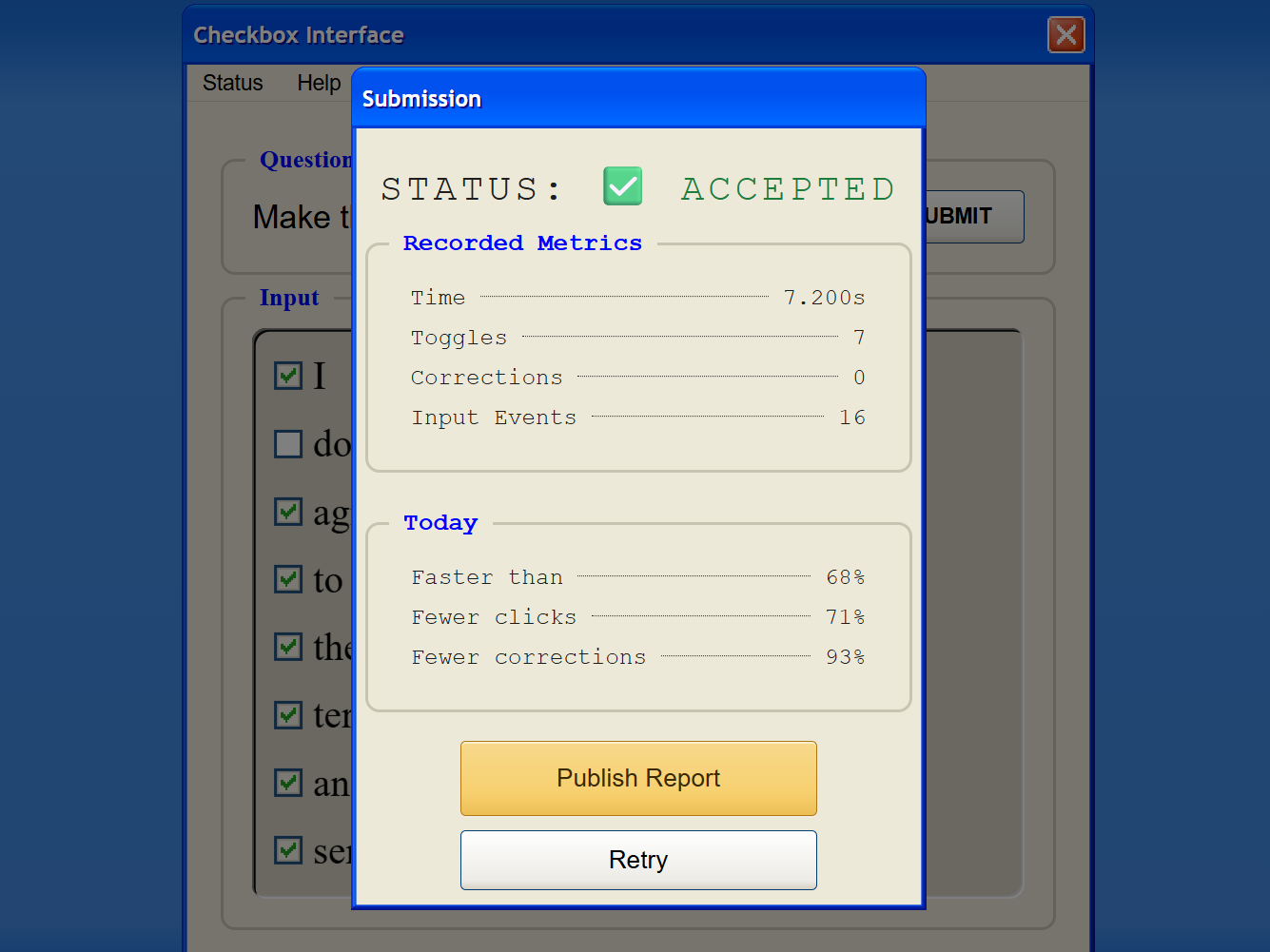
Instead of accepting a simple “success” flag from the client, each submission includes the full event history. The server replays those events using the daily seed and recomputes evaluation deterministically.
Identical input always produces identical results. Spoofing success would require replicating the full game logic rather than forging a response.
It’s not bulletproof, but it significantly increases integrity while remaining aligned with the system’s design.
Challenges I ran into
Designing frustration without breaking the experience
It is easy to make something chaotic. It is much harder to make something frustrating while still keeping it fair.
Because I know which malfunctions are active, I struggle to judge how difficult it is for a new player to discover the pattern.
This is where testing became personal. My girlfriend tests configurations, even though she does not enjoy this type of game and has very little patience for it. That makes her the ideal benchmark.
If she can eventually solve it, it is probably fair.
If she gives up immediately, something needs adjustment.
Making something “bad” but still enjoyable
Another balancing act was aesthetic and emotion.
It would have been easy to rely on bright colors, loud sounds, or typical gamification tricks to make the experience feel more rewarding. That would have undermined the concept.
The nostalgic window design creates the feeling of predictable, bureaucratic software. It suggests a strict and expected system. That expectation is important. The instability works because the interface looks trustworthy.
The challenge was to make something intentionally wrong without making it ugly or chaotic.
The reward shouldn’t come from flashy feedback, but from understanding.
Uncertainty about fun
I genuinely did not know whether this would be enjoyable.
The concept fascinated me, but fascination does not automatically translate to fun. When I first shared it and saw people retry, experiment, and come back for another attempt, that was the moment it clicked.
It was not just interesting. It was playable.
Accomplishments I'm proud of
- Shipping my first game project
- Turning static bad UI humor into a replayable daily system
- Building a modular malfunction architecture instead of one-off tricks
- Designing frustration that feels unfair at first, but remains solvable
- Creating a reward loop based on understanding rather than flashy gamification
- Seeing players return for the next daily configuration
What I learned
- Small UI deviations can completely destroy user trust
- Designing frustration requires restraint
- Behavioral concepts are harder to visualize than to implement
- Building my first game forced me to think less like a developer and more like a player.
What's next for Bad UI Operator
Right now the system is still small, but it’s built to grow.
I want to expand the library of malfunctions and introduce new interface types over time. The more players learn, the more interesting it becomes to subtly shift the rules again.
I also want to involve the community more. More statistics. Revealing which distortions were active. Eventually maybe even letting players vote on upcoming configurations once they understand the mechanics.
There’s a lot of inspiration in communities like r/BadUIBattles. Collaborating with those creators and turning those cursed interface ideas into playable daily challenges feels like a natural next step.
The tasks will stay simple.
But the behavior will evolve.
And hopefully, the “oh, that’s it” moment never gets old.


Log in or sign up for Devpost to join the conversation.