Inspiration
Sometimes the right image is a blurry screenshot, a blocky avatar, or a meme that looks like it has been forwarded through twenty group chats. Those imperfections can give an image exactly the character it needs. I built Bad Quality Image Maker to make that kind of editing easy. I wanted a tool where someone could choose an image, give it a deliberately rougher look, and download it without learning a full photo editor. Practical needs helped shape the idea, too: smaller files for upload limits, lighter images for sharing, and more control over how a picture loses detail.
What it does
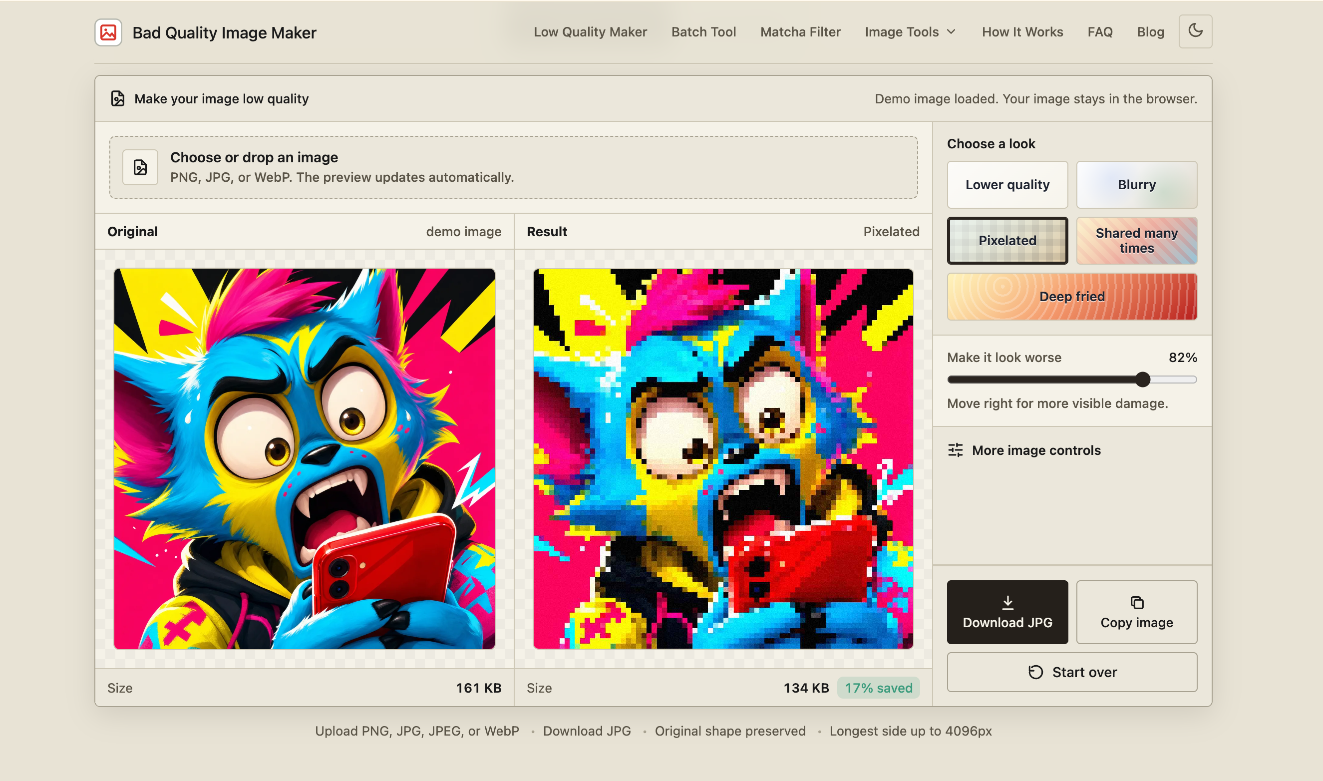
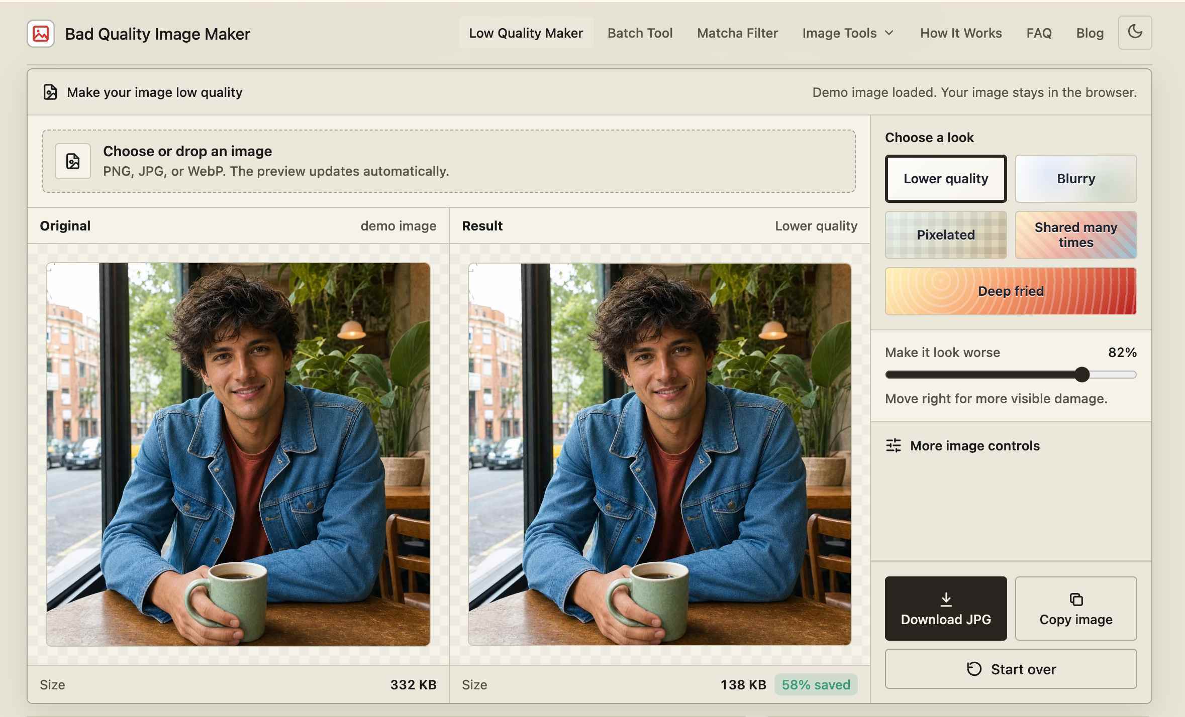
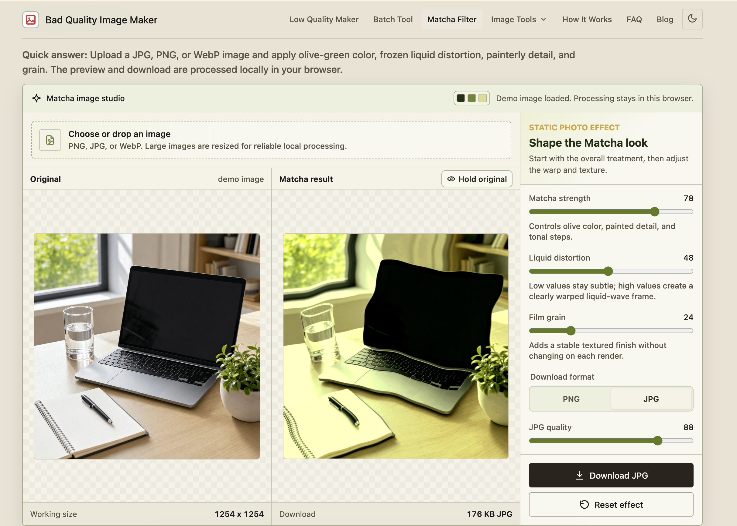
Bad Quality Image Maker is a free browser tool that makes images look intentionally low quality. Users can choose from five looks: Lower quality, Blurry, Pixelated, Shared many times, and Deep fried. A strength slider provides a quick starting point, while detailed controls let users adjust JPEG quality, pixel size, blur, saturation, contrast, noise, and output scale. Before-and-after previews help users judge the result before downloading. The site also includes batch processing for up to ten images with ZIP downloads, cropping tools, circular cropping, a Matcha-style filter, and a target-file-size tool. Image processing happens locally in the browser, without sending the selected image to a processing server. There is no signup requirement or output watermark. The site uses analytics and hosting services, with those practices explained in its privacy policy.
How I built it
I built the website with Astro, JavaScript, and the HTML Canvas API. Astro generates the static pages, while JavaScript handles image selection, effect controls, previews, and downloads. Canvas provides the image-processing foundation for effects such as pixelation, blur, color adjustments, and noise. I designed the interface around a short workflow: choose an image, select a look, adjust the strength, and save the result. More detailed controls remain available for people who want to experiment. Site optimization has been part of the build throughout. I worked on responsive layouts, light and dark themes, compressed example images, and lazy loading for supporting visuals. I also added descriptive metadata, canonical URLs, a sitemap, structured data, and focused guides to help people discover the right tool and understand how to use it.
Challenges I ran into
One challenge was making image degradation feel intentional. Too much blur can erase a caption, while heavy pixelation can hide the subject. Presets needed to create a recognizable style while leaving room for adjustment. Another challenge was explaining the difference between visual quality and file size. Adding noise can make an image look worse while making the file larger. That made previews, file-size feedback, and clear explanations important parts of the product. The interface also needed careful attention across screen sizes and themes. Navigation behavior, preview labels, and text contrast all affect whether a seemingly simple tool feels comfortable to use. Keeping those details consistent became an ongoing part of development.
Accomplishments that I'm proud of
I'm proud of turning an unusual idea into a working tool with a clear purpose. A visitor can start with a familiar visual style, see what changes, and download a result without creating an account. I'm also proud of keeping image processing local while adding useful options such as batch editing and cropping. The before-and-after examples and practical guides are another meaningful part of the project: they give users a way to understand the effects and make more deliberate choices.
What I learned
I learned that a small tool still requires thoughtful product design. Naming a preset clearly, placing the upload control where people expect it, and making a preview readable can matter as much as adding another effect. I also gained a deeper understanding of the relationship between image dimensions, compression, texture, and file size. A result needs to be judged against its intended use: a readable screenshot and an exaggerated reaction image call for different decisions. Working on the site reinforced the value of concrete examples. Showing what one setting changes often teaches more than a long technical explanation.
What's next for Bad Quality Image Maker
I'd like to refine the presets, improve the experience on mobile devices, and make larger-image workflows more responsive within browser limits. I also want to expand the visual guides with controlled comparisons that show how individual settings affect an image. Future additions will be guided by useful, specific editing needs and feedback. My goal is to keep the experience approachable as the site grows: a place where people can quickly give an image the right amount of imperfection.


Log in or sign up for Devpost to join the conversation.