Little background history
Pastoral do Menor is a NGO from Sorocaba, SP, Brazil. I’ve worked with them when I was in college. Me and my team at the time (Rubens Castro and Adston Bazante) did some interviews, research and immersion practices to find out more about them. Here's a picture I took at the time:

We build a new logo and website for them. This was a few years ago, and now I think I can do better.
Since I have more of information about them than I have about other NGOs, I chose to redesign their website - improving my own previous work. I know how many people they attend, how they work, what they want to represent, how are their projects and so on. I’ve been there on their meetings and projects too.
What problem am I trying to solve and who is it solving for?
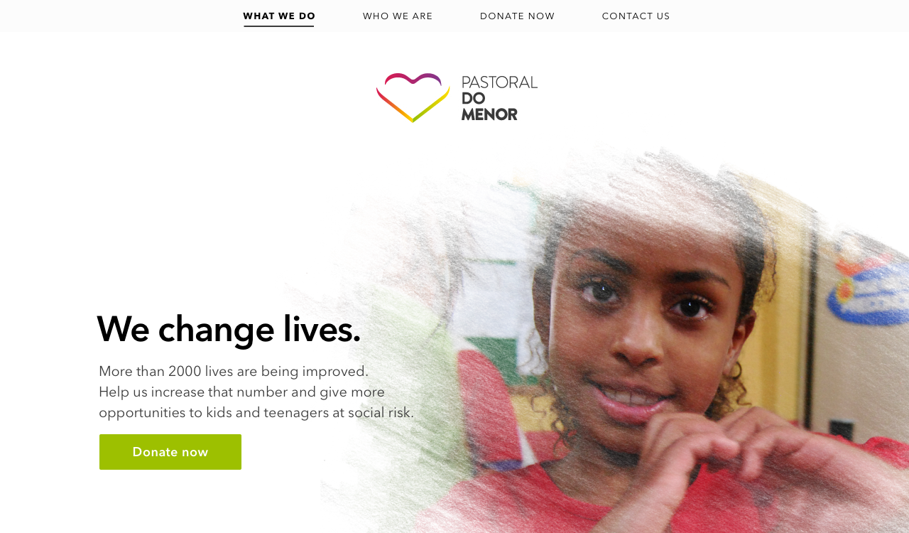
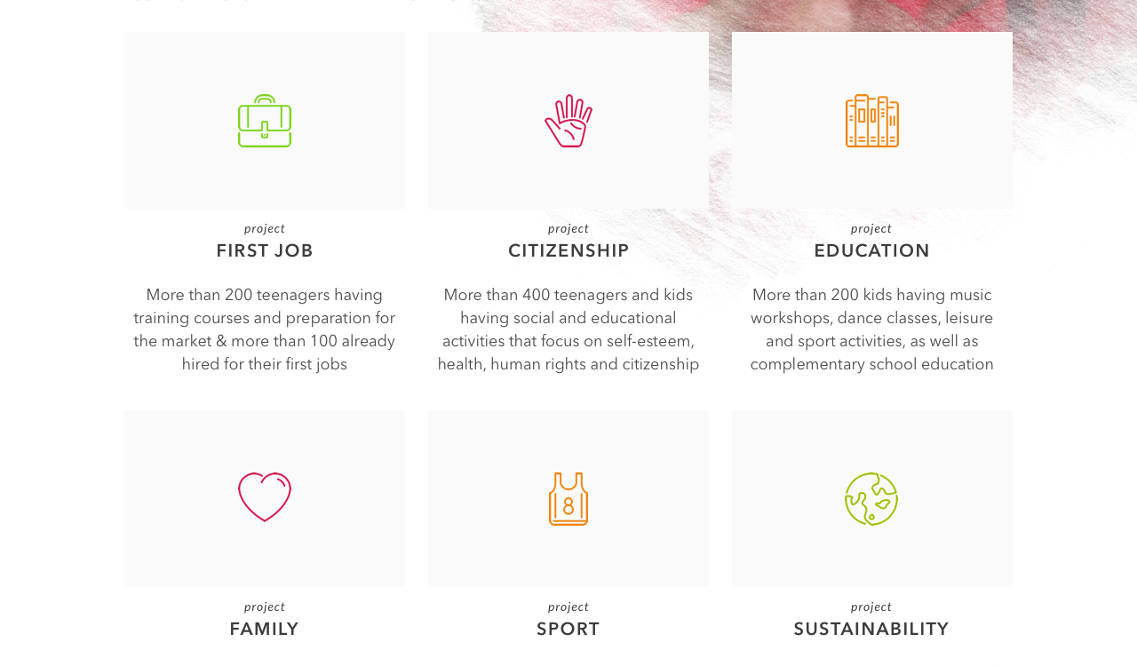
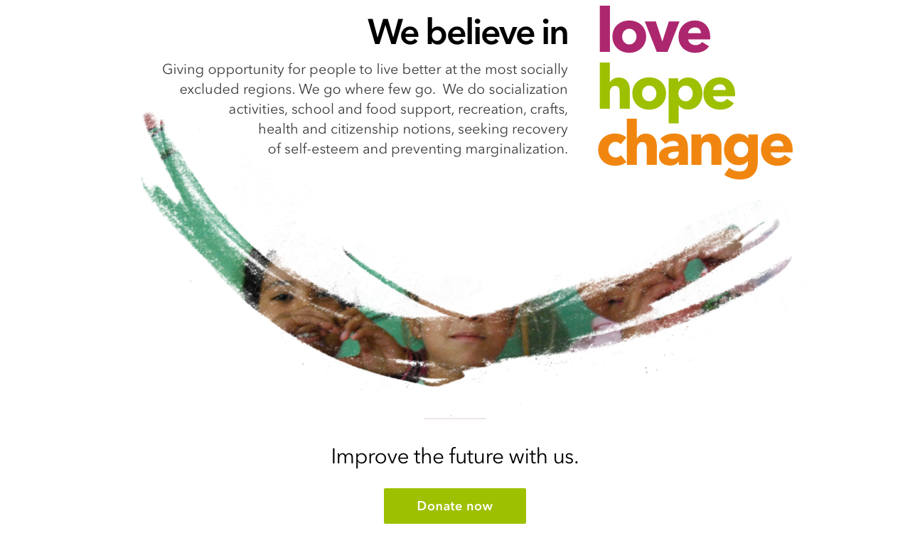
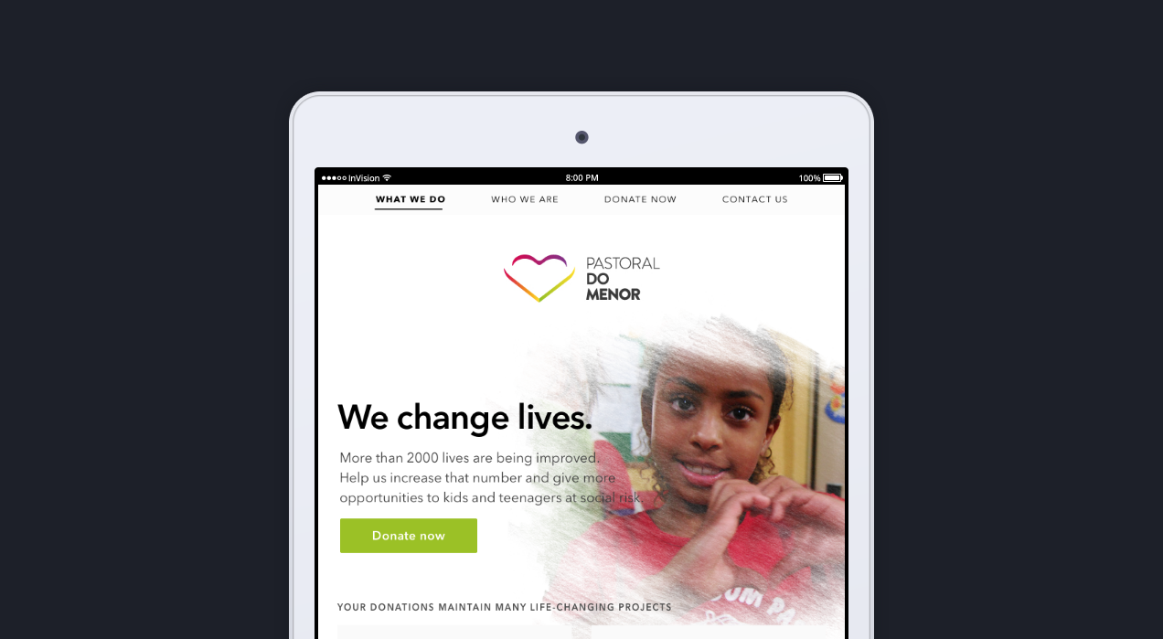
They want (and need) to receive more donations, it was a main point in our conversations. They also really want to show their projects and the kids they attend on the website, so I used real pictures from the kids, that I took when I was there. The kids do a heart with their hands all the time (that’s one of the reasons the new logo has a heart) so I also noticed that is one important thing to keep showing, to maintain their branding consistent. They need to show their work is important and change so many lives in a social risk situation.
Research & more research
I started my process by reuniting and re-reading all the material I had about them on my files. Documents, emails, pictures. Found a picture of what they wrote in post-its about what Pastoral means to them and to the community - hope, change, transformation, inclusion, to listen, to love, to respect, to value, and mainly: to give opportunities. I read articles about improving UX in NGO’s sites and highlighted the main points.

What I found out
- The landing page needs to clearly state what they do and how they use donations
- People want to know what a non-profit stands for, because they want to contribute to causes that share their ideals and values
- Donation killers are: usability problems such as unintuitive information architecture, cluttered pages, confusing workflow, unclear or missing information and confusing terms
- A surprising amount of sites is hiding their “donate” button
Prototyping
Pen & paper in hands, it was time to sketch some options, taking in consideration the information above. After doing some options and showing to family and friends, I selected one that we found better and started building it on Sketch - an app I’m just starting to use and wanted to learn more about.


Invision
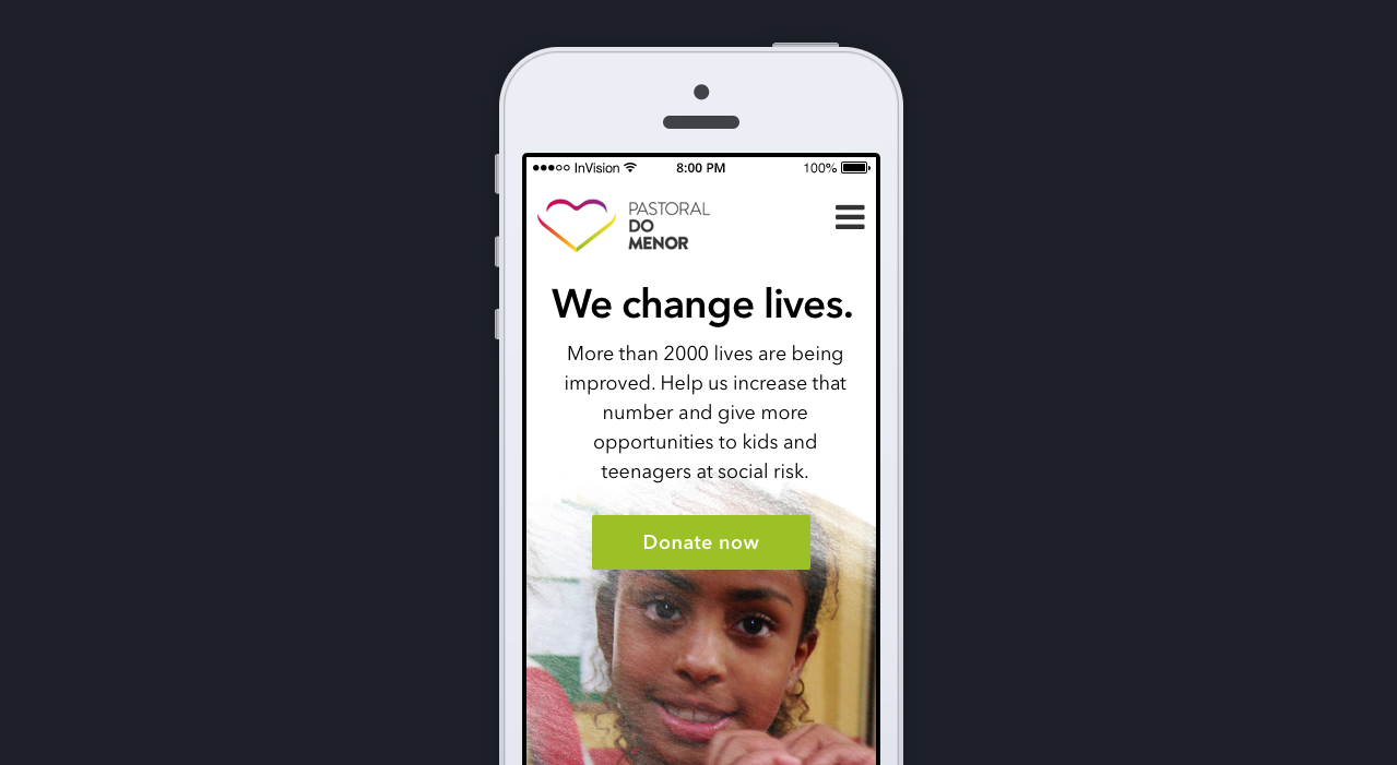
After building the mockups on Sketch, I uploaded them on Invision and added a few things that I think they should have, like a fixed header to maintain the Donate link always showing.


You can check the links here:
What I learned
Organizations that need donations desperately need better design - they need to understand what makes people want to donate and how to make it easier. We don't need cluttered pages showing lots of text - just the main points and main objectives of the projects, to show where the money is used. About using Sketch for the first time, it took some hours to learn the basics, but I'm proud of learning to do these mockups in two days.
Challenge questions
1. How long did the assignment take? About 10h.
2. Did you learn anything new in the process? Yes - UX information about NGOs and how to use Sketch.
3. What was the hardest part? Deciding what to show and how to show it, to engage possible donators.
4. If you could go back and give yourself advice at the beginning of the project, what would it be? I would have spent more time on the sketches stage at the begginning.
What's next
I’ll check if they want me to put this website online for them, after the VanHackathon - So it’s not just a challenge for myself but something “real”, that can help to make a difference for them.


Log in or sign up for Devpost to join the conversation.