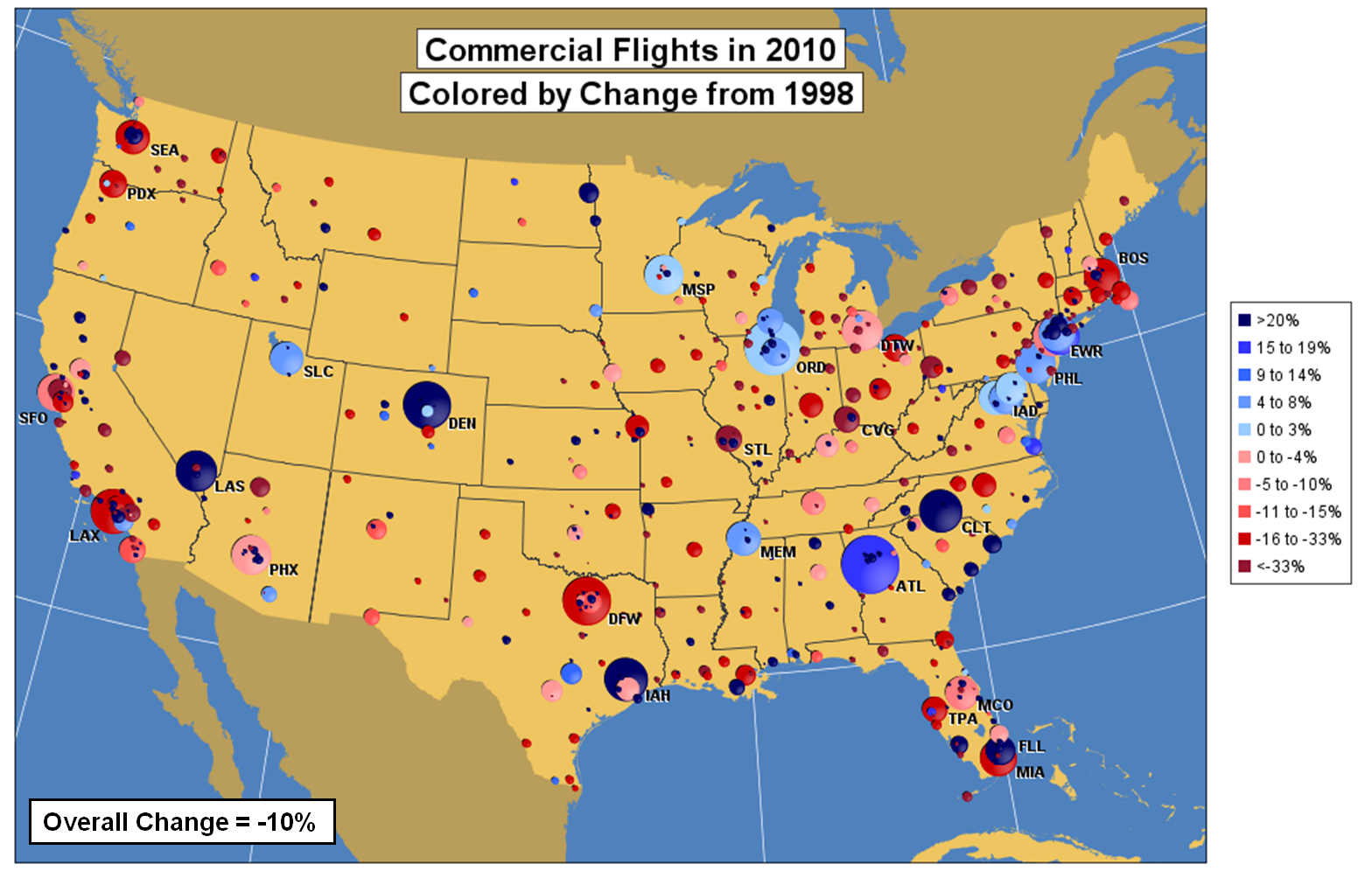
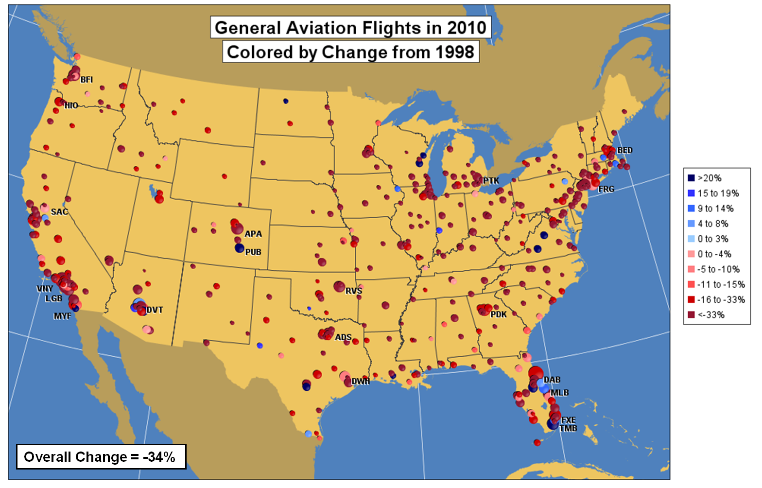
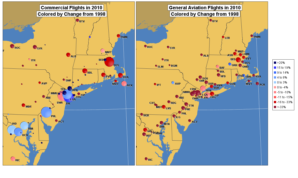
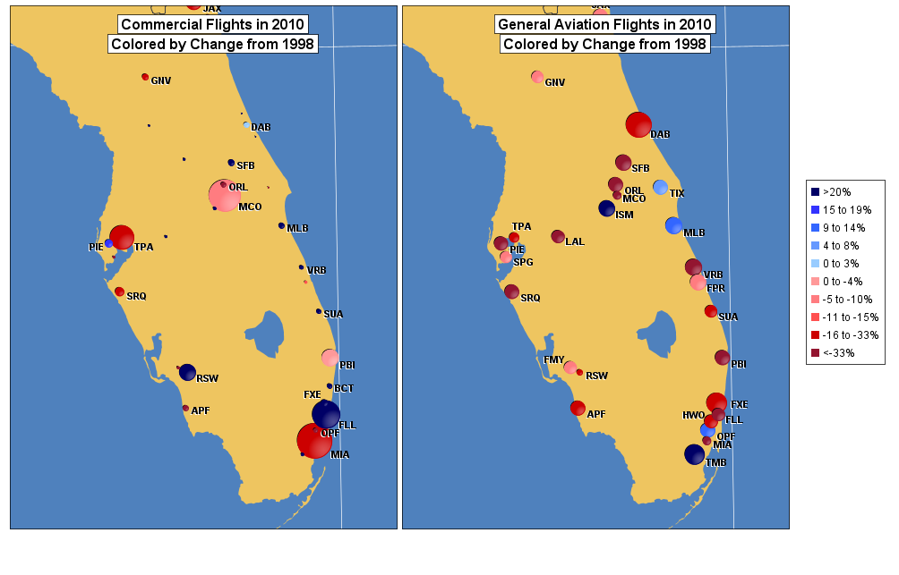
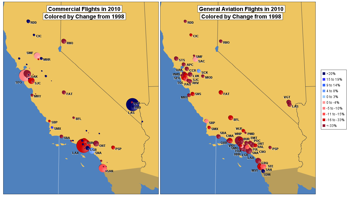
My visualization compares the number of takeoffs and landings at U.S. airports in 1998 and 2010. I chose 1998 as a baseline because 1998 was a busy year for air travel. The images show the number of flights flown by commercial as well as by recreational (or general aviation) pilots. The area of each circle is proportional to the number of flights in 2010, while the colors indicate the percent change from 1998—red indicates a decrease in the number of flights; blue indicates an increase. The charts fuse information from different government web sites and agencies including FAA, Census, and NOAA. The charts show that commercial aviation is heavily concentrated at a few dozen airports, whereas general aviation is less concentrated. The Northeast is densely filled with airports, while airports in California cluster around Los Angeles and San Francisco. Surprisingly, there has been an overall decrease in commercial (-10%) and general aviation (-34%) flights since 1998; areas with big decreases in commercial traffic include the East Coast and small- to medium-sized airports in the Midwest. Although commercial traffic is down overall since 1998, many of the largest airports—Atlanta, Charlotte, and airports in Washington DC, Chicago, and New York—have gained flights. One reason for this shift is that, to lower costs, carriers will route more flights through their hubs, cutting direct flights between smaller airports. Because flights have been added at the busiest airports, delays can increase even though there are fewer airplanes in the sky. For passengers this means more connections and greater trip times regardless of delay. To maximize revenue, airlines are also filling their planes fuller than ever before, to transport more passengers on fewer airplanes (See http://www.bts.gov/publications/key_transportation_indicators/august_2011/html/us_airline_revenue_passenger_miles_load_factor.html and http://www.bts.gov/publications/key_transportation_indicators/august_2011/html/us_airline_passengers.html) The charts show that the U.S. contains many airports that handled more flights in previous years than they do today. To head off future aviation delays by better accommodating future traffic growth, some incentives, such as infrastructure improvements, could help encourage greater use of underutilized commercial and general-aviation airports. Doing so would also provide better air service to people who do not live near a large hub airport. Data sources: Flight counts come from the FAA’s OPSNET database (http://aspm.faa.gov/). General aviation flights that take off and land from the same airport are excluded. The airport locations come from the FAA’s National Flight Data Center database (https://nfdc.faa.gov/portal/index.jsp). I downloaded the U.S. state boundaries from a Census department web site (http://www.census.gov/geo/www/cob/bdy_files.html). I merged these with boundaries for Canada, Latin America, and the Caribbean that I downloaded from a web site run by the National Oceanic and Atmospheric Administration’s National Geophysical Data Center (http://www.ngdc.noaa.gov/mgg_coastline/). Because the boundary files were large and had more detail than I needed, I wrote a computer program to filter out points that could be removed without distorting the map. The maps were plotted using a conic projection (http://mathworld.wolfram.com/AlbersEqual-AreaConicProjection.html) in a java program that I wrote myself.
Aviation in the USA, 1998 to 2010
Updates

Leave feedback in the comments!
Log in or sign up for Devpost to join the conversation.