-
-
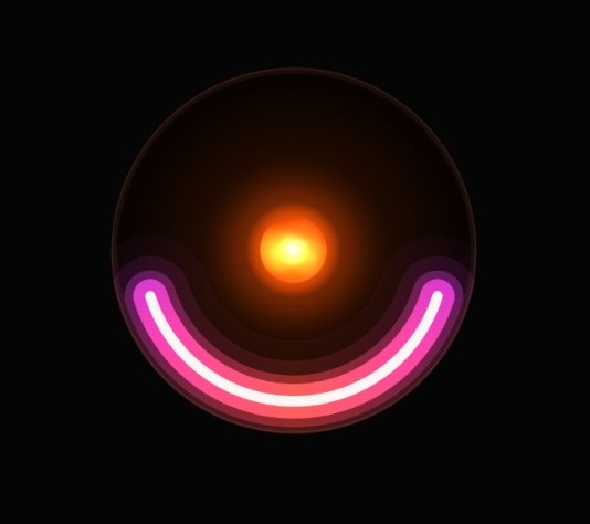
The ring interface displaying peak focus and social energy levels.
-
Interface when the ring detects decreasing focus and social energy.
-
Interface when the ring detects a sharp decline in focus and social energy.
-

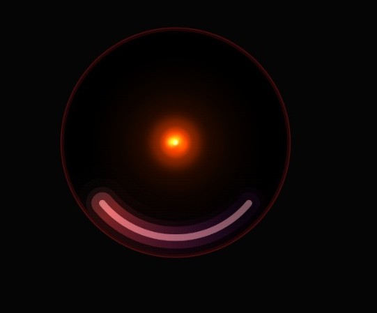
Ring display signaling critically low focus and social energy.

Problem Statement
Identify something intangible, invisible, or previously unmeasurable about the human sensory experience and design a speculative tool to track and influence it. This tool should be designed to support a wellness goal or behavioral change for an individual or a group.
Inspiration
The starting point for our project was a simple question: What invisible signals affect human wellbeing that people struggle to notice in real time?
During our exploration, we found that loneliness is one of the most damaging but often unnoticed experiences, especially among college students. Many students move away from home for the first time, enter new environments, and struggle to build meaningful social connections.
This problem also resonated with me personally. When I first went to college from a small town, I often felt lonely and overwhelmed. At the time, I didn’t realize that these feelings of isolation were also contributing to mental fatigue and reduced focus.
This insight inspired us to design a tool that could make these invisible states more perceptible—helping students understand the relationship between their social interactions and their cognitive energy.
Key Insight
A major insight we discovered was that loneliness and mental fatigue are closely connected.
Often, students interpret their exhaustion purely as academic burnout or lack of focus. However, we realized that limited meaningful social interaction can quietly amplify mental fatigue.
If students could perceive these signals earlier, they might take small actions—such as engaging socially or taking restorative breaks that could significantly improve their wellbeing.
Our goal became to design a system that helps students sense their social energy and focus energy, making these hidden states visible and understandable.
Design Exploration
We explored several wearable form factors while developing our concept.
Initially, we considered a wristband-style wearable, but it felt too generic and similar to existing fitness trackers.
We also explored a thimble-shaped wearable, because fingertip placement could allow sensors to capture electrodermal signals more accurately. However, integrating a meaningful display into such a small form factor proved extremely difficult.
Another direction involved a segmented display band, but this concept felt overly complex for the minimal interaction model we wanted.
Eventually, we arrived at the idea of a ring with a central gem-like display. This form allowed us to create a compact yet expressive interface that felt both personal and symbolic.
Exploration Link
Here is link for design direction ideation link
How It Works
Our system detects two key signals:
Focus Energy
This is measured using Galvanic Skin Response (GSR) and electrodermal sensing, which can indicate cognitive load and mental fatigue.
Social Energy
This is inferred using Bluetooth proximity sensing, which detects nearby devices and interaction duration to estimate social presence and engagement.
Together, these signals help the system estimate a student's cognitive-social balance.
Target Wellness Goal or Behavioral Change
Wellness Dimension
The project primarily addresses two dimensions of student wellbeing:
- Mental Wellbeing — maintaining healthy cognitive energy and preventing prolonged mental fatigue.
- Social Wellbeing — encouraging meaningful human interaction and reducing unnoticed social isolation.
Desired Behavioral Change
Aura encourages students to become aware of two invisible but important signals: Focus Energy and Social Energy.
By visualizing these energies directly on the ring, the system helps students:
- recognize when their focus energy is being depleted
- notice when social interaction has been low for extended periods
- take small corrective actions such as resting, taking a short break, or engaging with others.
When the system detects a critical imbalance, Aura can deliver a subtle haptic nudge or gentle sound cue, prompting the user to pause and reassess their current state.
The goal is not to interrupt the user aggressively, but to provide a lightweight moment of awareness that encourages healthier choices.
Long-Term Outcome
Over time, Aura helps students develop better habits around:
- managing mental energy during long study sessions
- maintaining meaningful social interaction
- balancing focus and recovery
By making these invisible signals visible, the system enables students to intervene early rather than reacting after burnout or loneliness has already taken hold.
How the Tool Works in Everyday Life
Product
Aura is a wearable wellness ring with a gem-like display that visualizes two energies:
- Focus Energy — representing cognitive bandwidth
- Social Energy — representing meaningful human interaction
The ring continuously senses signals related to:
- cognitive fatigue through electrodermal sensing (GSR)
- social presence through Bluetooth proximity signals.
These signals are translated into a simple visual interface on the ring.
The core of the gem represents Social Energy, while the outer arc represents Focus Energy.
Use Case 1 — Detecting Focus Fatigue
During long study sessions, Aura detects signs that focus energy is decreasing.
The outer arc begins to shrink and shift in color, indicating that cognitive energy is being depleted.
If the state becomes critical, the ring provides a gentle haptic pulse, suggesting that the user take a short mental reset.
This subtle feedback helps students recognize fatigue before their productivity drops significantly.
Use Case 2 — Detecting Low Social Energy
If the system detects long periods with minimal social interaction, the core of the ring gradually shrinks and becomes less active.
This visual change signals that social energy is running low.
In critical situations, Aura may trigger a soft haptic cue, encouraging the user to reconnect socially or step into a more interactive environment.
Use Case 3 — Balanced Energy
When students maintain a healthy balance between focus and social interaction, Aura remains in its stable state.
The core appears vibrant and active, while the outer arc forms a strong protective ring.
This state acts as a positive reinforcement, subtly communicating that the user's cognitive and social wellbeing are in balance.
Interface Concept
A key part of the design challenge was translating these signals into a minimal yet meaningful interface.
The ring display is divided into two visual layers:
Central Core : Social Energy
The center of the display contains lava-lamp-like moving blobs. As social interaction increases, these blobs move, merge, and interact with one another, symbolizing growing social connectivity.
Outer Ring : Focus Energy
The outer arc represents focus energy. It acts like a protective shield around the core, visually indicating the user’s cognitive bandwidth and mental state.
This dual-layer visualization allows users to quickly understand the balance between their social engagement and mental focus.
State Design & Visual Feedback
To help users understand complex wellbeing signals at a glance, we designed a set of visual states that communicate the system’s condition through color, motion, and form.
The ring expresses two energies simultaneously:
- Social Energy — represented by the living core
- Focus Energy — represented by the outer arc and rim
Each state visually communicates how these energies change over time.
Calibration State
The first step of the experience is calibration, where the device establishes the user’s baseline signals.
During calibration, the interface uses a neutral color palette to avoid distracting the user.
Once calibration is completed, the ring communicates success visually.
A circular arc travels around the rim of the ring, gradually completing the circle. When calibration finishes, the rim glows with a green aura, signaling a successful setup.
Green was intentionally chosen because it is widely recognized as a universal success indicator, helping users quickly understand that the device is ready.
Normal State
In the normal state, both energies are balanced.
Social Energy (Core)
The inner core represents social energy using a warm color palette, primarily deep amber tones.
Warm colors were chosen intentionally because social interactions often evoke feelings of warmth and emotional closeness.
Inside the core, lava-lamp-like blobs continuously move and interact with each other. These blobs symbolize moments of social interaction like people meeting, conversing, and moving forward in their lives.
This fluid motion makes the interface feel alive and reflective of human social dynamics.
Focus Energy (Outer Arc)
The outer arc represents focus energy.
In the normal state, the arc appears complete and stable, indicating a healthy level of cognitive bandwidth.
The arc uses colors complementary to the warm core—primarily cyan and purple hues—allowing both layers of the interface to remain visually distinct.
The rim of the ring glows green, reinforcing that the system is in a balanced state.
Warning State
The warning state occurs when the system detects that the user’s focus energy is decreasing and social energy is declining.
Visual changes signal this shift gradually.
The outer arc begins to shift from cyan toward deeper purple tones, visually suggesting a transition toward instability.
The rim color changes from green to yellow, indicating an intermediate caution state.
Within the core, the blobs shrink slightly and begin moving faster, suggesting rising tension or imbalance in the user’s cognitive–social state.
This motion introduces a subtle sense of instability without being alarming.
Critical State
The critical state indicates that both energies have reached a dangerously low level.
The interface becomes more intense and urgent.
The rim turns red, signaling that the user’s cognitive–social balance is critically depleted.
The core becomes very small but glows intensely with a bright warm color, inspired by the behavior of collapsing stars that flare brightly before losing energy.
Inside the core, the blobs move rapidly and chaotically, visually communicating internal instability.
The outer arc also shifts toward deep red tones, with subtle wave-like motion traveling around the arc, further emphasizing urgency.
Recovery State
The recovery state visualizes the process of restoring balance.
Instead of abruptly returning to normal, the interface behaves like a living organism regenerating energy.
The core gradually expands from its smallest size, shifting from bright red toward its natural warm amber tone.
At the same time, the outer arc slowly rebuilds itself from a small red segment to a full arc, representing the restoration of focus energy.
The rim transitions from red → yellow → green, visually communicating the user’s return to a stable state.
This gradual transformation reinforces the idea that recovery is a process, not an instant change.
Challenges
One of the biggest challenges was designing an interface that could represent two complex states : social energy and focus energy within a very small display.
We wanted the interaction to remain minimal, intuitive, and emotionally expressive, rather than presenting raw metrics or numbers.
Another challenge was identifying signals that could realistically infer meaningful social interaction while respecting privacy.
Through multiple iterations, we refined the sensing model and interface until we achieved a design that communicates complex wellbeing signals in a simple, glanceable way.
Built With
- chatgpt
- claude
- figma
- figmamake
- humanbrain


Log in or sign up for Devpost to join the conversation.