-
-
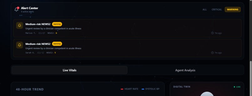
warnings
-
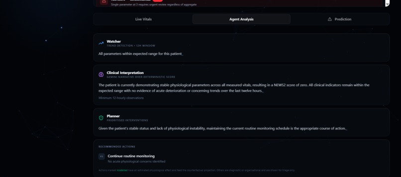
agent analysis
-
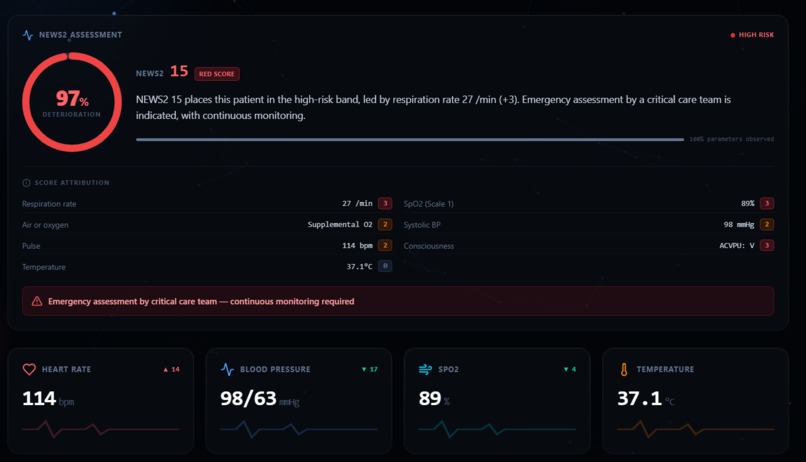
patient dashboard
-
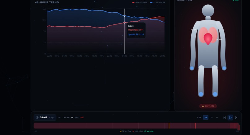
TIME SCRUBBER FEATURE
-
simulate feature
-
vitals
-
patient
-
alert center
-
ai risk assessment
Inspiration
In an ICU, deterioration is almost never sudden. It is visible in the numbers for hours before anyone acts on it a respiratory rate creeping up, saturation drifting down, a heart rate climbing to compensate. The data is on the monitor the whole time. What's missing is something that reads the trend, says what it means, and shows what to do about it. We wanted to build the thing that watches the drift. Not another dashboard of numbers, but a living replica of the patient that a nurse can look at and immediately understand. Then a code review of our own project taught us something we hadn't planned on. It turned out our "AI agent" was a hardcoded if statement, and several numbers on screen were random. That discovery reshaped the whole project and made it far better.
What it does
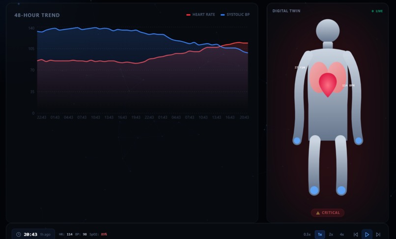
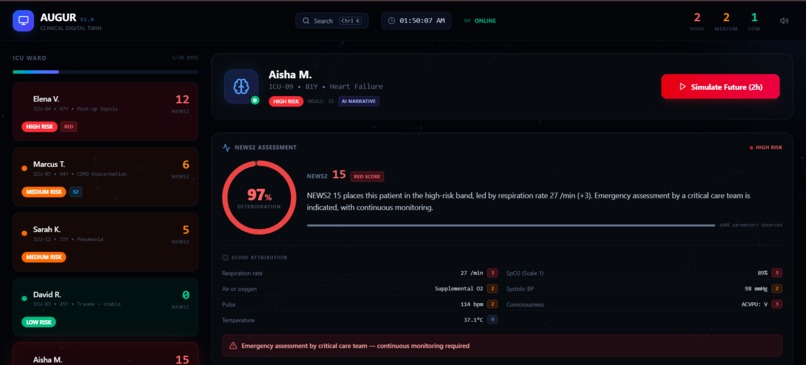
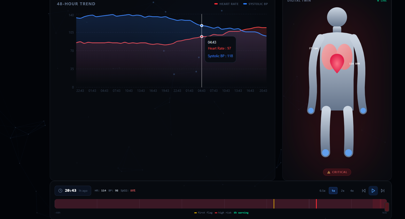
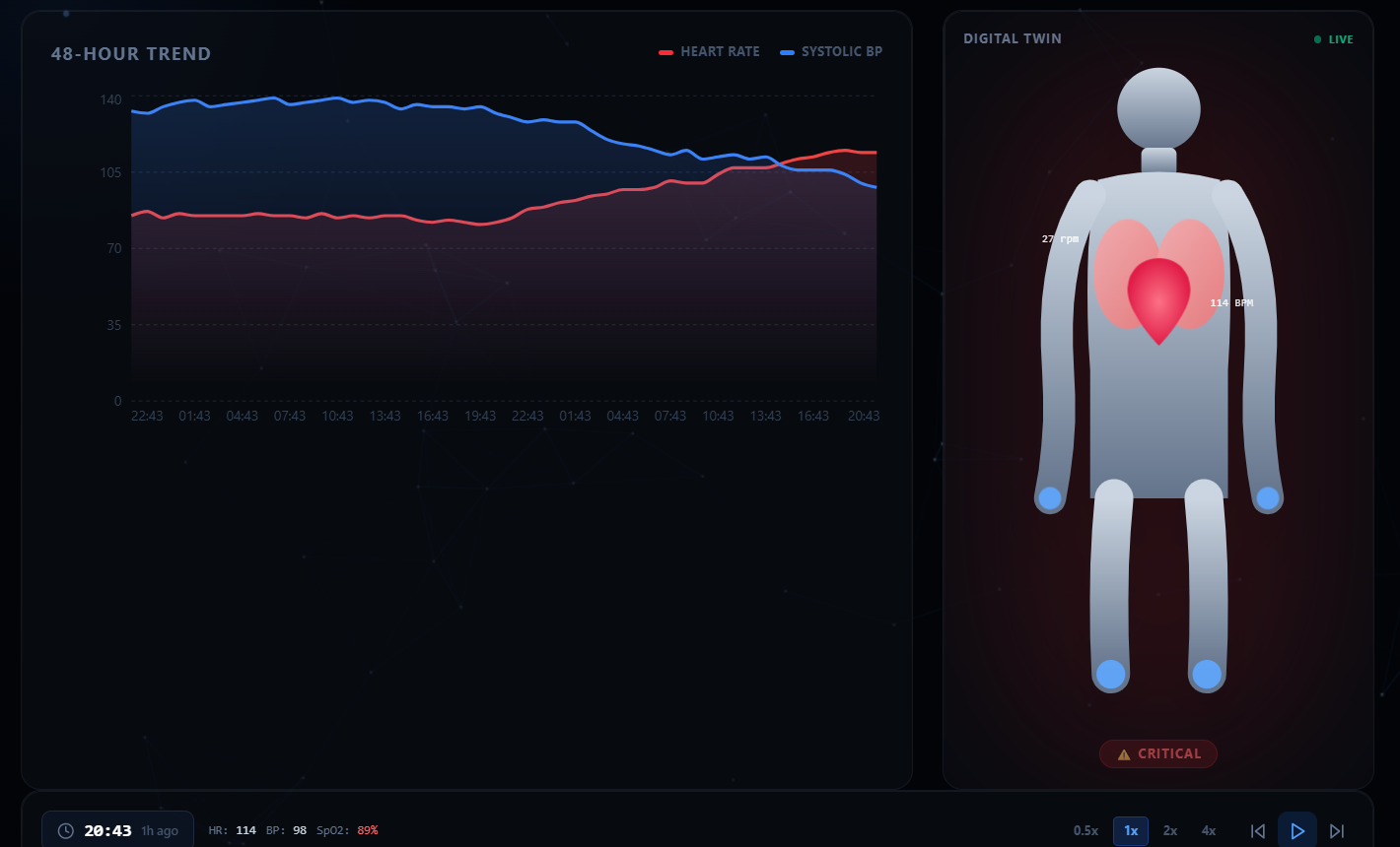
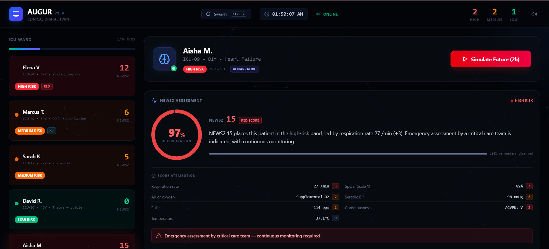
AUGUR turns ICU vital signs into an animated digital twin that beats at the patient's actual heart rate, breathes at their respiratory rate, and shifts color during hypoxia or fever. Underneath, it does three things ordinary dashboards don't:
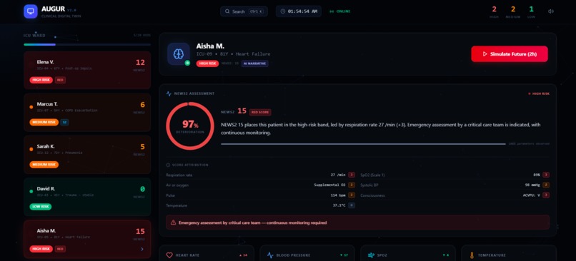
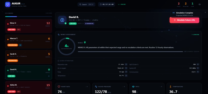
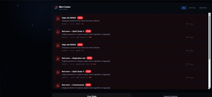
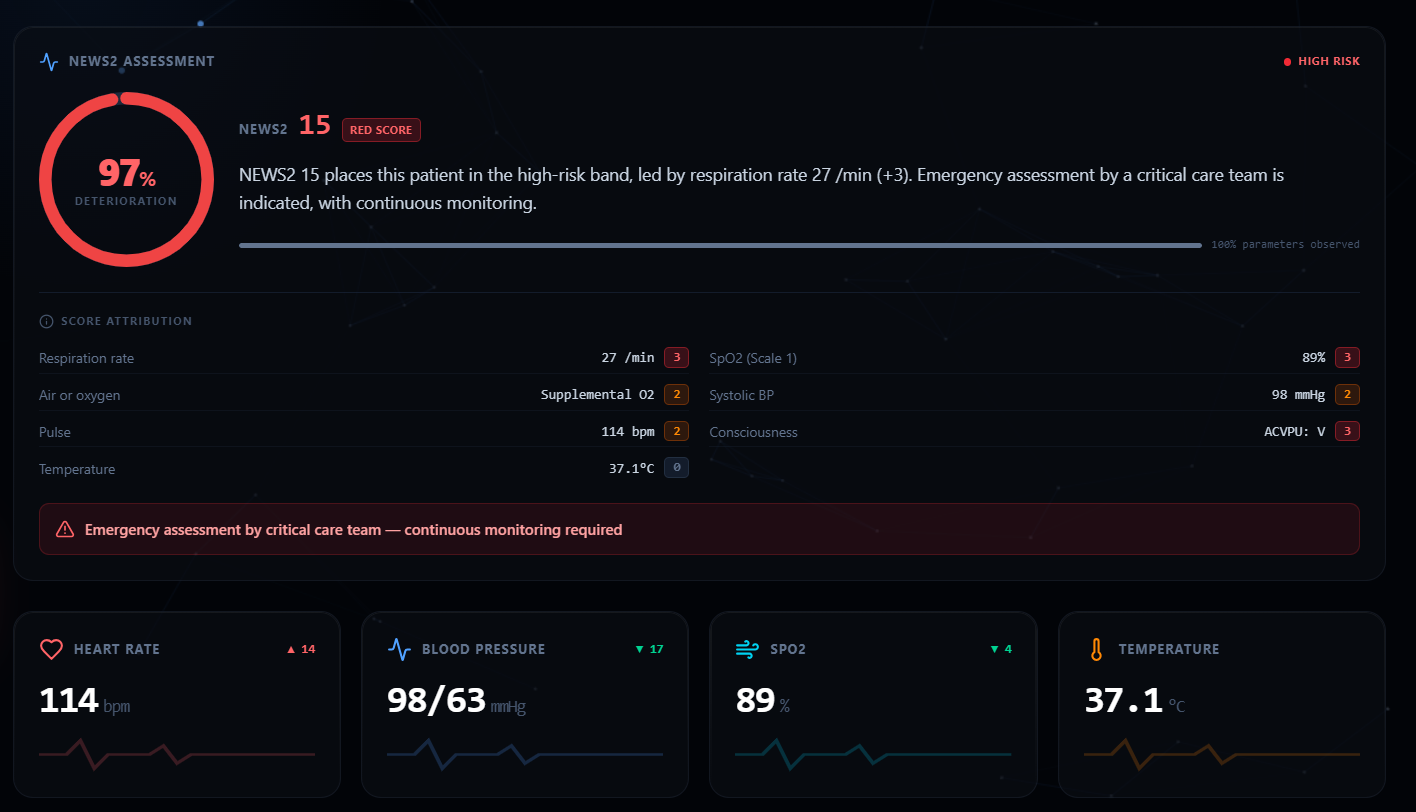
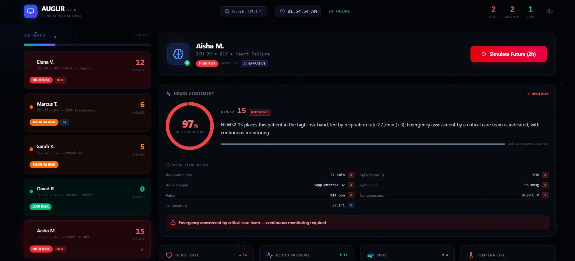
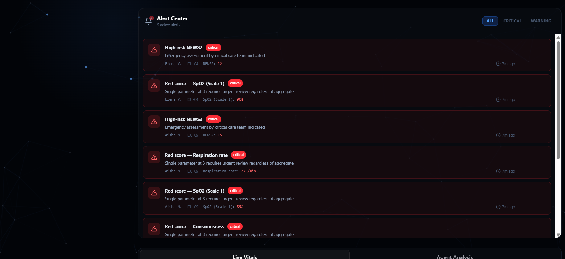
- It scores properly. We implement the full 7-parameter NEWS2 (Royal College of Physicians, 2017), including the two parameters most implementations drop ACVPU consciousness and air-or-oxygen. It supports SpO2 Scale 2 for patients with a prescribed 88–92% target, and the red-score rule where a single parameter scoring 3 escalates care regardless of the aggregate.
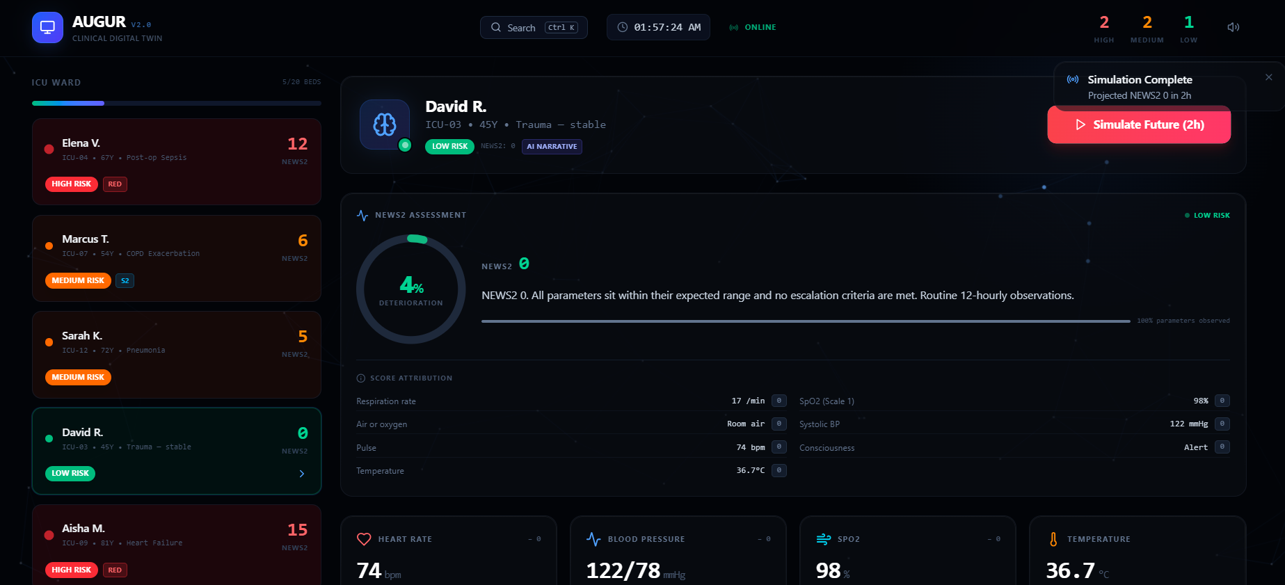
- It explains itself. Every NEWS2 point is traced back to the parameter that produced it, laid out like the paper chart clinicians already use. Nothing on screen is unattributable.
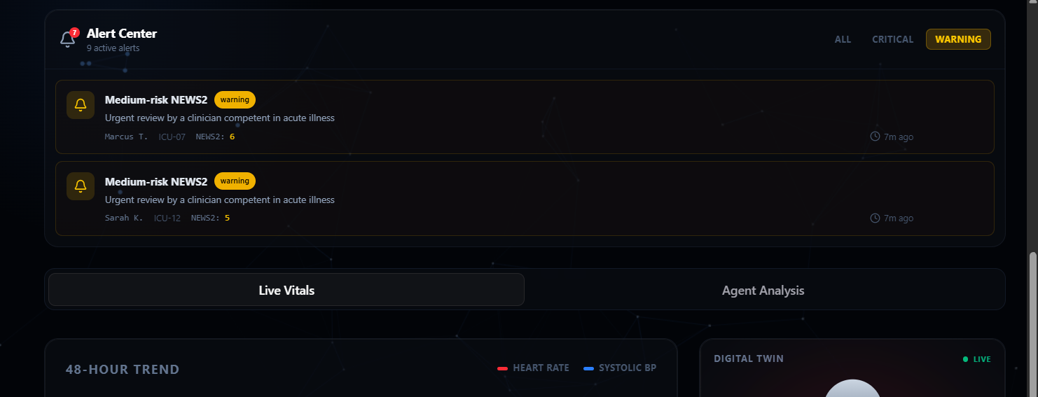
- It closes the loop. Telling someone a patient is deteriorating isn't decision support. AUGUR projects the patient forward untreated and with the recommended interventions applied and reports the difference. Our septic patient sits at NEWS2 12 now, 13 untreated in two hours, and 7 if treated. Six points averted. A 48-hour time scrubber re-scores the patient at any point in their history, marking where the engine first raised a flag and where they crossed into high risk a measured 4 to 6 hours of warning on our deteriorating patients.
How we built it
Next.js 16, React 19, TypeScript, Tailwind v4, Framer Motion, Recharts, and the Gemini API, deployed on Vercel.
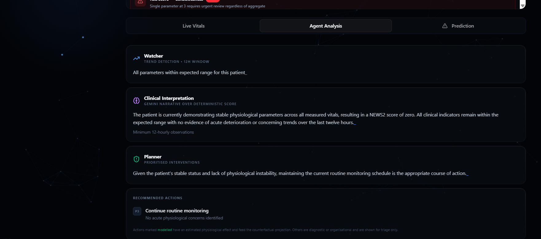
The architecture separates a deterministic clinical core from the LLM layer. clinical.ts implements NEWS2 scoring; agent.ts handles trend detection, forward projection, intervention planning, and the counterfactual. Neither has framework dependencies or network calls, which is exactly why both are directly testable 88 tests run on Node's built-in test runner, with no test framework dependency at all.
Gemini receives the already-computed score, trends, and interventions as fixed context, and writes prose only. It never produces a number. The call has a hard 3.5-second timeout, schema validation, and a deterministic template fallback, so the dashboard cannot break because an API hung. In production it returns in about one second. Patient trajectories come from a seeded PRNG, so the same patient always produces the same 48 hours of vitals on the client, on the server, and between sessions. That makes the engine's output reproducible and the demo deterministic.
Challenges we ran into
Our own project wasn't what we thought it was. The route Next.js actually served was a stub keyed on patient_id === "PT-001". The real implementation existed but sat outside the routing directory and had never executed. Every patient except two came back "stable" no matter what their vitals said.
Numbers that looked clinical but weren't. Four separate places generated fake data and displayed it as output: a confidence score that was literally Math.random(), a projection panel using hardcoded ×1.3 and ×0.75 multipliers instead of the engine, canned alert values, and a "Confidence: 92%" that was a string literal. All four are gone.
A real scoring bug. Our NEWS2 heart-rate band scored 91–100 as zero instead of one, silently under-triaging early tachycardia, one of the first signs of deterioration. It's now a named regression test.
Model selection was harder than the integration. Our first Gemini model turned out to be retired and returned 404. The larger Flash models spent 700+ tokens reasoning before answering, overrunning both the token budget and the timeout truncating the JSON every time. We measured five models against our actual workload and chose the one that answers in 1.6 seconds.
Accomplishments that we're proud of
A clinical score we can defend. Full 7-parameter NEWS2 with Scale 2 and the red-score rule, verified by 88 assertions covering every scoring band at its boundaries. Our COPD patient scores 2 at his stable baseline scored on the wrong SpO2 scale, he'd read as 5 with a red score, a false escalation on a patient who is exactly where his care plan wants him. Getting that right required actually reading the standard. An AI integration with a provable safety boundary. The NEWS2 score is byte-identical whether the LLM layer is on or off. We don't just claim the AI doesn't touch the math we can demonstrate it. A counterfactual that makes the tool useful. Predicting deterioration is common. Showing what the recommended action does to that trajectory is the part that changes a decision. Documentation that matches the code. Our README states plainly that the cohort is synthetic and that the risk percentage is a transparent mapping, not a model fitted to patient outcomes.
What we learned
A graceful fallback can hide a total failure. Our Gemini layer falls back to templates when the API fails good design. But it meant that when we deployed with a dead model, the app looked completely fine. Every request was failing and nothing on screen indicated it. We only caught it by inspecting the response payload. Fault tolerance and observability are not the same thing, and you need both. The honest version is the stronger version. Our first README claimed a database that was never wired up and a prediction horizon with no basis. Replacing those with what we actually measured 4 to 6 hours of lead time, reproducible on demand — made the project more convincing, not less. Anything a judge can disprove by reading the code costs more than it earns. Clinical software is mostly about the edge cases. Two SpO2 scales, a red-score rule that overrides the aggregate, and a consciousness parameter worth three points on its own. Those details are the difference between a project that uses the word NEWS2 and one that implements it.
What's next for AUGUR
Real data. The synthetic cohort is generated by one function — swapping it for a live feed leaves the entire clinical engine unchanged. That's a deliberate boundary, not an accident. Validation against outcomes. Our deterioration-risk percentage is currently an honest communication aid mapped from the NEWS2 aggregate. Fitting it to retrospective patient outcomes would make it a calibrated model that's the step that separates a prototype from something clinically usable. More modeled interventions. We model oxygen, fluids, ventilation, and antibiotics today. Widening that set and grounding the effect sizes in published response data instead of first-order estimates would make the counterfactual meaningfully stronger. Consciousness input from the bedside. ACVPU currently comes from our simulated data. In a real deployment it's nurse-entered, which means the interface for capturing it is a genuine design problem worth solving well.
Built With
- base-ui
- framer-motion
- google-gemini
- lucide
- next.js
- node-test-runner
- node.js
- radix-ui
- react
- recharts
- tailwindcss
- typescript
- vercel


Log in or sign up for Devpost to join the conversation.