Inspiration
Climate data and scientific/academic research can often be difficult to understand or even obtain if you're not a professional in the field. Even academic scholars struggle with obtaining and interpreting massive amounts of data from scientific agencies, finding it even harder to translate such material into terms the public can understand.
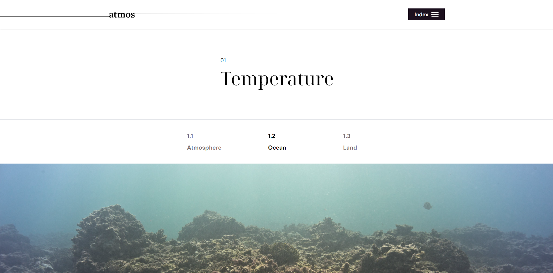
My project, Atmos, derived from the prefix "atmo-" in Latin, is a science article/blog that promotes obscure data from difficult-to-reach databases and presents it in a manner such that nonscientists like you and I can easily visualize scientific information and follow an interactive storyline to learn about the effects of global warming.
What it does
Atmos visualizes historical climate data from all around the world in interactive maps and graphs along a story-like approach toward education in climate change.
How we built it
Initially Understanding climate change, how it occurs, what it affects, and how to reverse its effects. I read through numerous articles surrounding the different aspects of climate change, primarily in temperature change and how it affects a variety of factors ranging from animals to socioeconomic conditions to natural systems. I also cross-checked information to ensure that everything presented in the Temperature index of my website is accurate and backed by scientific evidence.
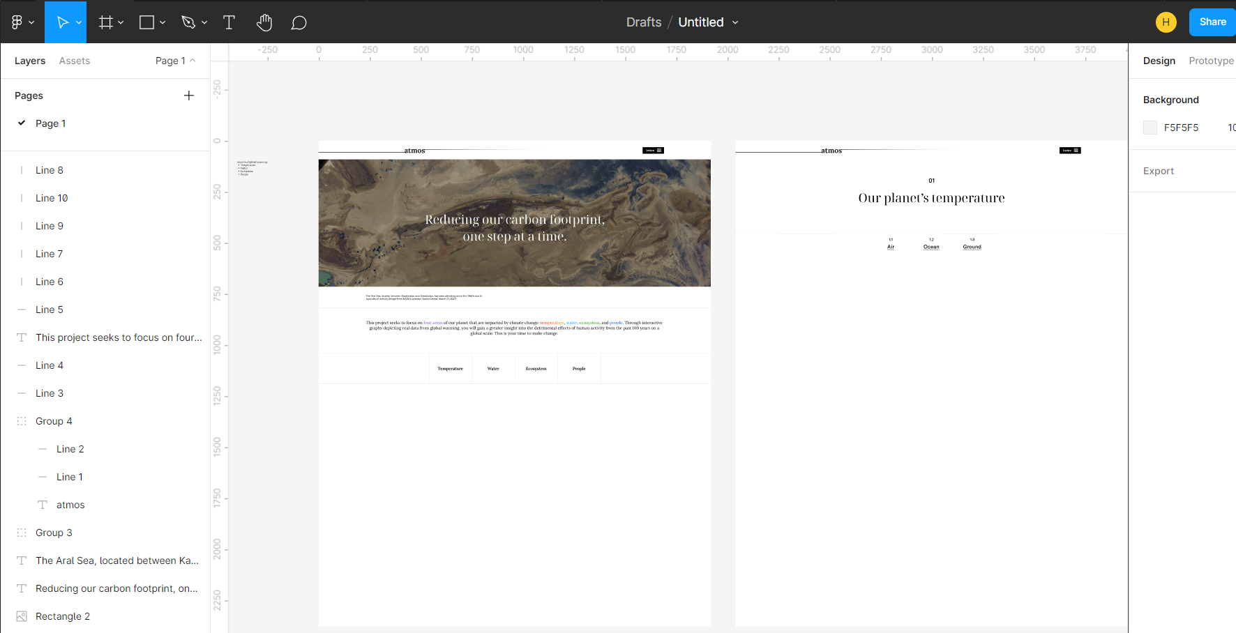
Presentation is key, so I experimented with a few designs on Figma until I reached one I liked. I settled on one that was modern, minimalistic, and clean, hoping to reflect the cleanliness of Earth's future within the design itself.
Secondly Figuring out how to present the information alongside visualized data-- should I use graphs? Maps? How hard is that to implement..?
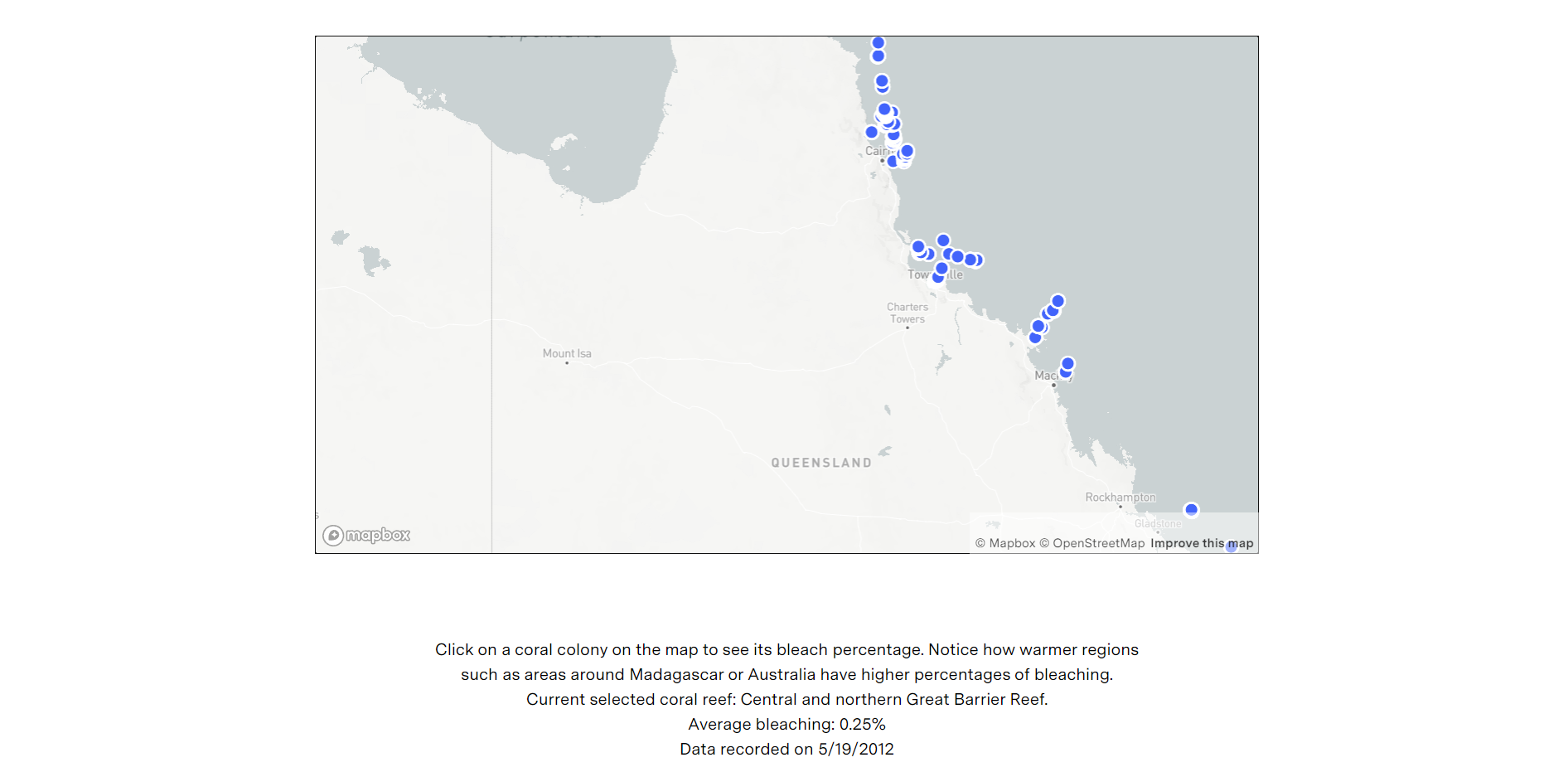
After hours of experimentation and running around three map APIs (Google Maps, Mapbox, CARTO), I settled on Mapbox GL JS API and Regraph because both were easy to customize and implement. Well... Mapbox not so much. But installing and rendering graphs with Regraph was a breeze.
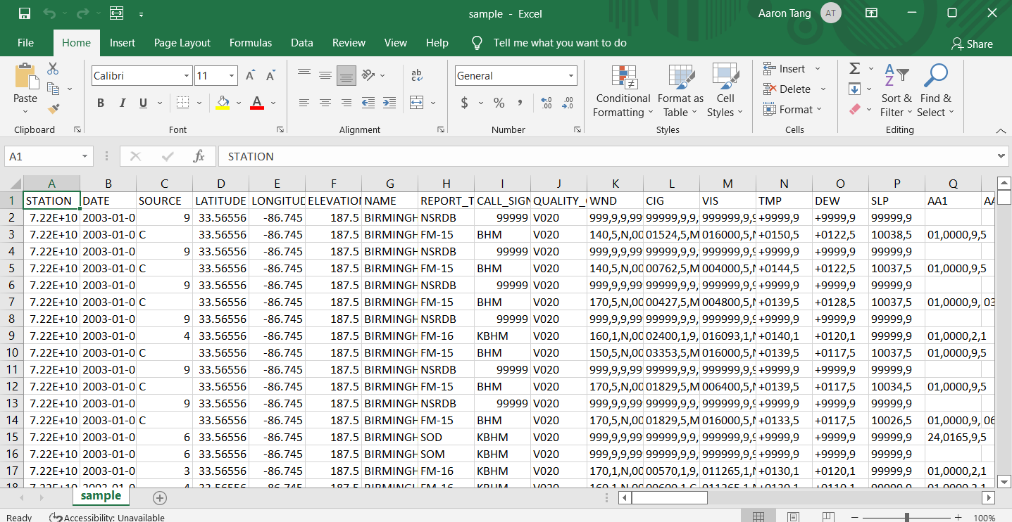
Then the data. What was the use of implementing graphs and maps if there was no data to display? After scouring the Internet for databases, scrolling through Reddit posts trying to find responses to questions from others like me, searching for a reliable government database where they contained the correct data type I wanted- geoJSON or KML-- I finally stumbled upon a few that were perfect. However, I encountered a lot of data that was uninterpretable, like some that displayed an image with numbers in a CSV file or others that were way too large to even download.
Thirdly Implementing the data into Regraph and Mapbox's API. Regraph documentation was intuitive, easy to navigate, and I was able to cook up a few sick graphs in under 5 minutes. But Mapbox... I'll just say I probably grew a few gray hairs trying to understand their documentation. In the end, though, I was able to squash a few large bugs and get the application to run at last.
Lastly Citing all my sources! I made sure to cite everything, whether it be photographs (I made sure to only choose ones under Creative Commons licenses for fear of getting sued) or databases. It was a pain going back to my browsing history and trying to figure out which websites I visited and actually used, so I'll be sure to be more mindful of my researching journeys in the future. Also, I'll be sure to cite sources in a correct format so it's more in line with my academic expectations.
Challenges we ran into
Implementing Mapbox was by far the most rewarding and insufferable experience I've ever endured. There was a bug toward the end of touching up my project where the map worked perfectly on my local server but provoked a lot of errors during the build. After trying about a dozen solutions from StackOverflow and the GitHub community, I learned how annoying Babel can really be. The solution that eventually solved all my problems was two lines of code configured in my package.json file. Nevertheless, I think enduring through all that suffering came with great rewards as I was able to finally deploy my project properly and see the final product live.
I also encountered a major issue with uploading and deploying my code to GitHub. Since the geoJSON files were too large to be uploaded to GitHub, I blindly tried various techniques such as using GitHub LFS, Amazon S3, Amazon Amplify, and Vercel. Eventually I figured out how to host my data externally on an S3 bucket instead of keeping it in my local project. I also will admit it was my fault for not pushing any changes until I was finished with the entire project and for waiting until my files accumulated to over 1.6GB. I definitely will not make the same mistake again.
Surprisingly, a lot of the challenges I faced were not within the technical aspect of creating the website. Things like finding the right data and doing the research was by far the most tedious and challenging aspect of this project, but I came out of this experience learning not only about obscure React hooks and API implementation but also a greater knowledge of global warming and my generation's climate crisis.
Accomplishments that we're proud of
- Getting Mapbox to work in React and display interactive data
- Writing all the article content myself
- Overcoming aforementioned difficulties
- Working as a solo project in general ## What we learned A lot about global warming and API's.
What's next for Atmos
- Completing more pages for Energy, Ecosystem, and People
- Requesting private climate data from large enterprises and government agencies and implementing them into the website
- A content management system with a backend to allow data scientists and journalists to contribute to the project
- More comprehensive, well-written information in the articles
- Incorporating comprehensive historical weather data in the maps and covering other aspects of climate change, not just limited to coral reefs and forests
- Loading component for maps
- Citing sources properly!!

Log in or sign up for Devpost to join the conversation.