-
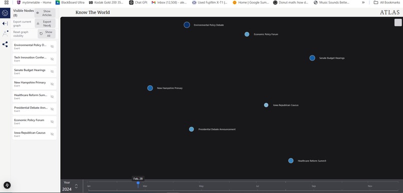
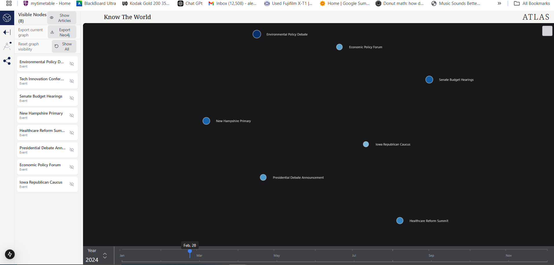
Main graph space
Inspiration:
Inspired by Oracle and using temporal graphs to understand correlation between events.
What it does:
Aggregates live data from news sites to determine how strongly key events link to a main topic, and as a proof of concept this is used to track how events link to the USA 2024 Election. The strength and significance of these links is varied with time, which can be paused to give a instant snapshot. You can also click on events to see their individual trends over time, such as in public opinions of events the event.
How we built it:
We mapped out our project into 3 core steps: web data collection, normalisation and parsing; data manipulation and temporal variation; and UI and graphing. We started with the first and last sections to determine what data we could detect and how we could display it, to increase how quickly we could work. We then moved onto the connecting step and finding supporting web datasets.
Challenges we ran into:
As our data is entirely collected by API, pulling from news sites and social media always ended up being rate limited. This caused lots of bugs and meant many datasets needed combining. Adding a temporal variation made the
Accomplishments that we're proud of:
Learning new programming and development skills, and working well as a team to tackle separate problems and then integrate our solutions.
What we learned:
Temporal graph databases and networks. Large web API extractions and data management. Integration between languages/API/software.
What's next for Atlas
Expandability: being able to collect more data allows us to draw more nodes initially and plot more backdata. Older backdata would allow us to try and use these connections, to predict the further events or property changes and compare to what actually happened. Extra funtionality: when clicking on event nodes, more informationwould be displayed. This can include more trends of how the events vary or link to others.

Log in or sign up for Devpost to join the conversation.