-
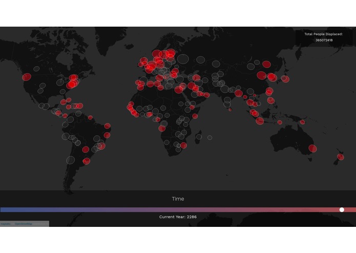
A screen capture of predicted flooded cities in 2286

Inspiration
Most people understand the risks and impacts of global warming that will affect all of us in the coming years. However, we felt that the general public might not have a vision of how grim the future may look as we keep on living our daily routines. Our goal was to offer an interactive visualization of one of the biggest consequences of climate change, which would affect millions and cost trillions; rising ocean levels.
What it does
A user is able to visualize the sea levels rising and which cities get completely flooded as time elapses. On completion, the user can opt to visualize the impacts of different levels of carbon emissions has on water levels, and therefore cities that are at risk at getting flooded. The number of people displaced due to the flooding of cities is also indicated to emphasize the number of human lives affected.
How we built it
We used flask as our web server and python to parse various data that was used in our visualization. The front-end comprised of HTML, CSS, JavaScript and related libraries (notably, maptalk)
Challenges we ran into
Some challenges we ran into was parsing data, particularly numbers as they were rarely in a consistent format--e.g. some had commas or were written in alphabetical letters ("million" instead of the numerical equivalent).
Accomplishments that we're proud of
We have something that works.
What we learned
How to throw frisbees! We also learned more about climate change and how to use some unfamiliar-to-us javascript libraries.
What's next for Atlantis
More data, and more accurate predictions based on research.


Log in or sign up for Devpost to join the conversation.