-
-
App Title
-
Impact Page
-
Money Question Page
-
Questions Tab
-
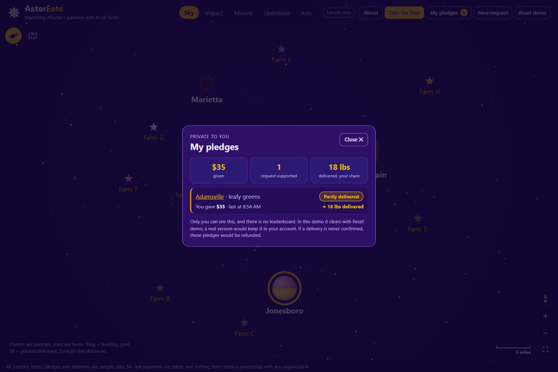
Pledge History Page
-
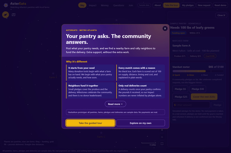
Introduction Page
-
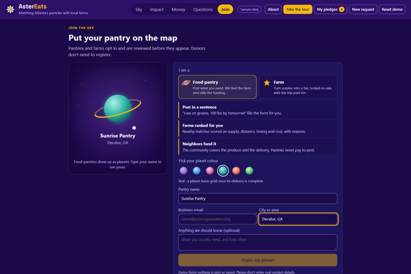
Join Page
-
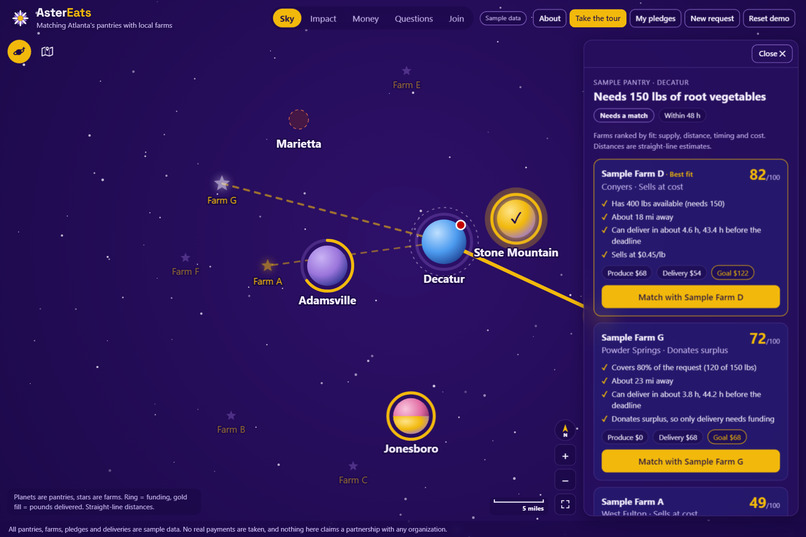
Farm Selection Screen
-
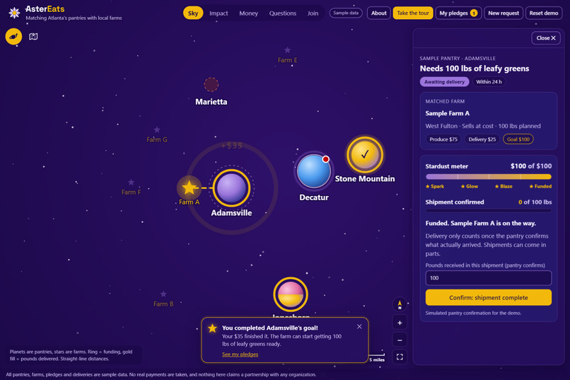
Completed Goal View
-
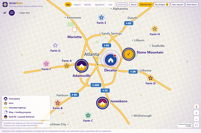
Map view
-
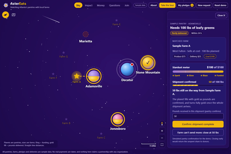
Delivery Progress Screen
Inspiration
Metro Atlanta has farms with surplus produce and food pantries that run short, and the two rarely find each other in time. Most donation tools start from the supply side: a farm lists what it has and hopes someone wants it. We flipped it. What if a pantry could say exactly what it needs, like "100 lbs of leafy greens by tomorrow," and the community could fill that gap?
The numbers pushed us. Nearly 48 million people in the U.S. experienced food insecurity in 2024, including 14 million children (USDA). In Georgia it's about 1 in 6 people (Feeding America, Map the Meal Gap). Meanwhile an estimated 30–40% of the U.S. food supply goes to waste (USDA). The food exists, and so does the need. What's missing is the connection.
The look came from a teammate's idea: pantries become planets, farms become stars, and every match is a line of stardust between them. Even the name plays on it: aster is Greek for star, and it's also a star-shaped flower that farms grow.
What it does
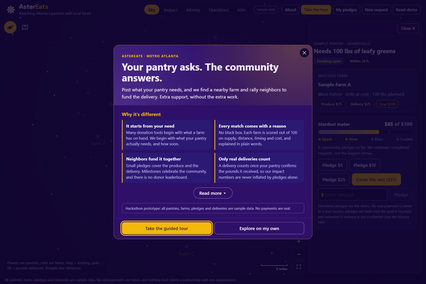
AsterEats is a need-first, Kickstarter-style platform that connects food pantries, local farms and donors in metro Atlanta.
- A pantry posts a need in plain words. Typing "We're low on greens, maybe 100 lbs, need it by tomorrow" fills in the request form.
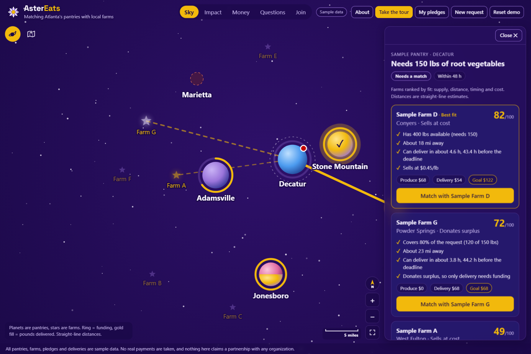
- Nearby farms are ranked on supply, distance, timing and cost, and every score comes with plain-language reasons ("Has 400 lbs available", "About 18 mi away", "Can deliver 43 h before the deadline").
- The pantry picks a farm. The goal covers both the produce and the delivery trip.
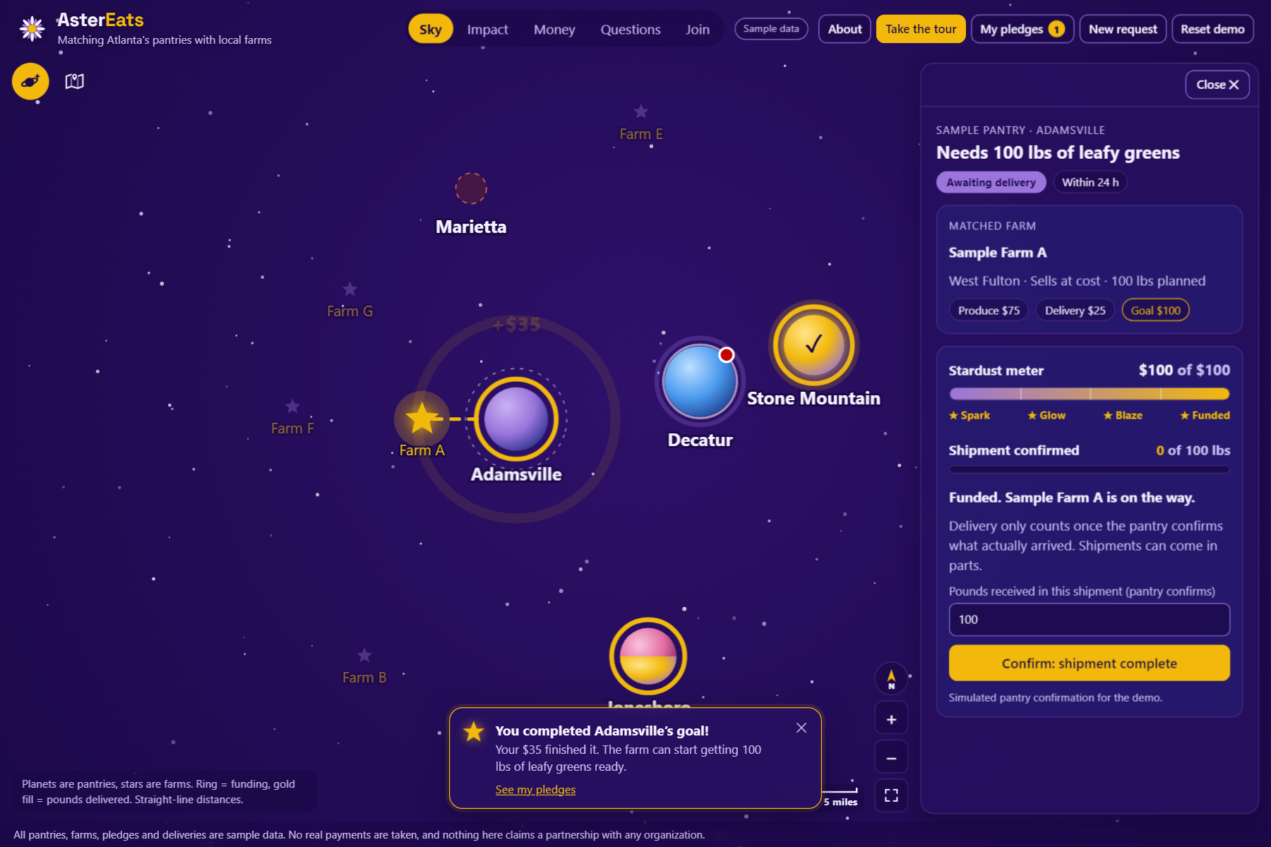
- Neighbors fund it with small or custom pledges. The planet's gold ring fills through the Spark, Glow, Blaze and Funded milestones. Each pledge gets a thank-you that turns dollars into food ("Your $10 covers about 12 lbs of root vegetables"). There is no donor leaderboard.
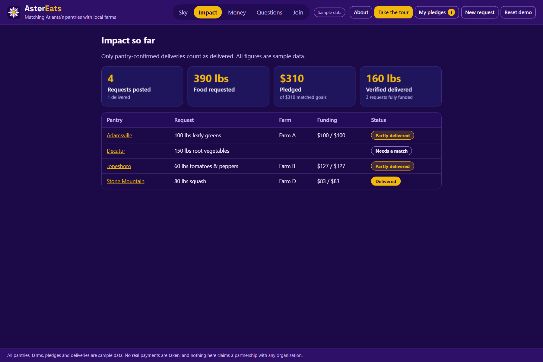
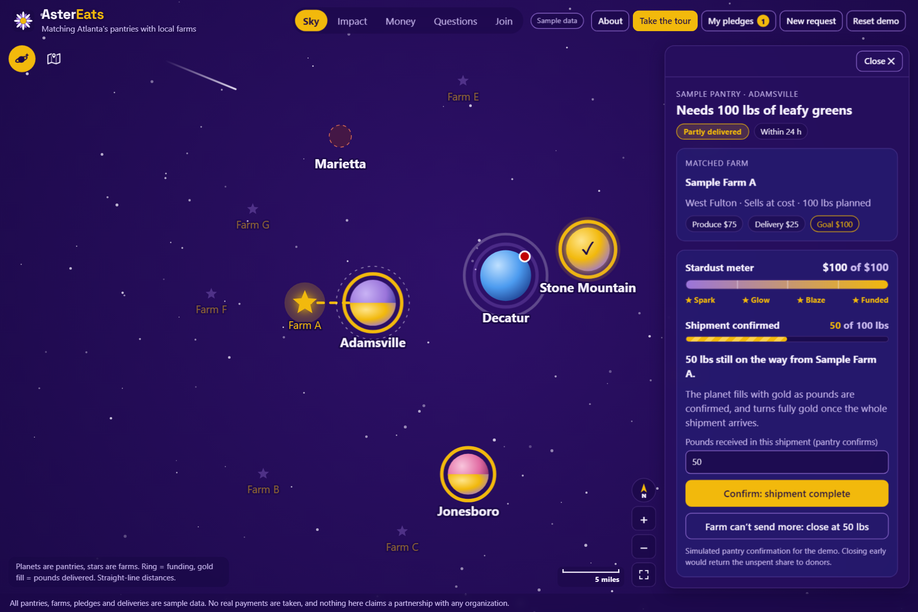
- The pantry confirms what actually arrived. Shipments can arrive in parts. The planet fills with gold as pounds are confirmed and turns fully gold only when the whole shipment lands. The ring shows the money, the fill shows the food, and our Impact numbers count only pantry-confirmed pounds, never pledges.
Around that core loop:
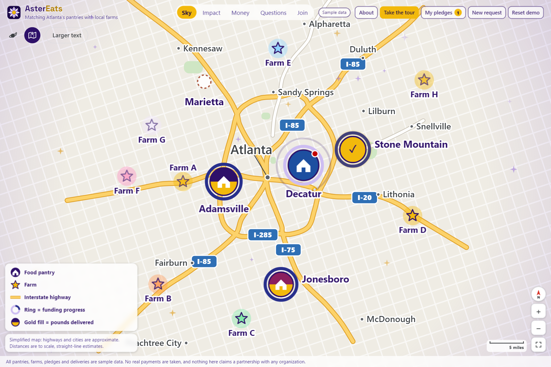
- Map view: a simplified road map with highways, city names and a "Larger text" mode, for anyone who finds the night sky hard to read. Both views fill the screen and support drag, scroll and pinch to zoom.
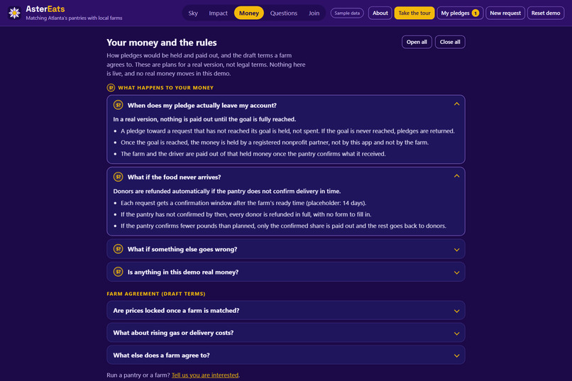
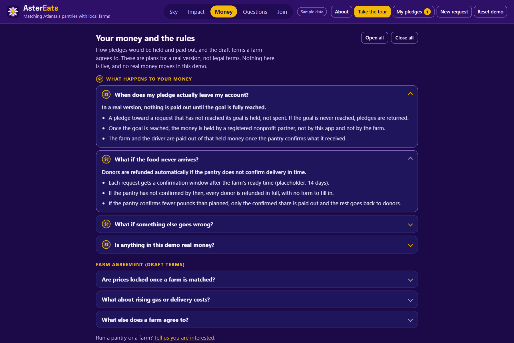
- Money tab: answers "what happens to my money?" Pledges are held until the goal is reached, kept by a nonprofit partner (never by us or the farm), paid out only for confirmed deliveries, and refunded automatically if the pantry doesn't confirm in time. It also shows draft farm terms: prices lock at match time, and only the delivery cost can move, for documented fuel swings, in either direction.
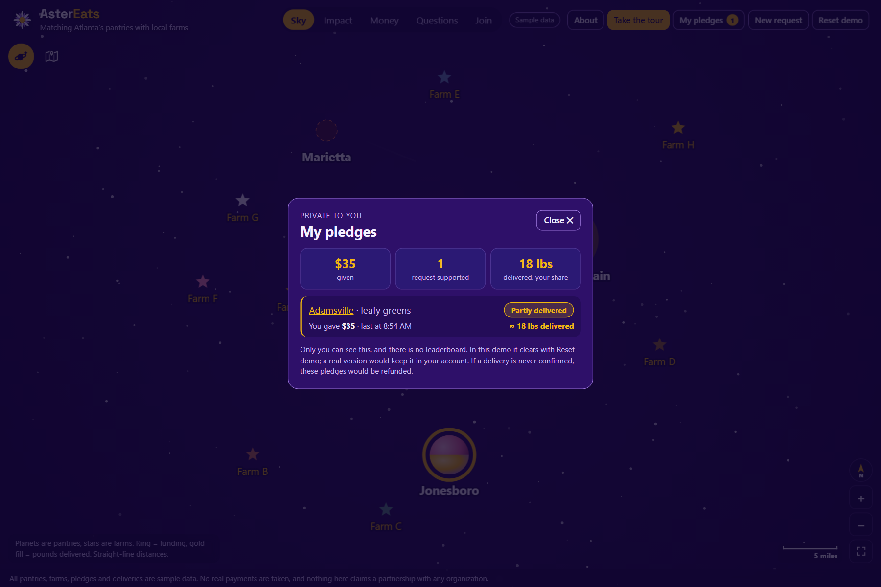
- My pledges: a private history of what you've given and how many delivered pounds your share covered.
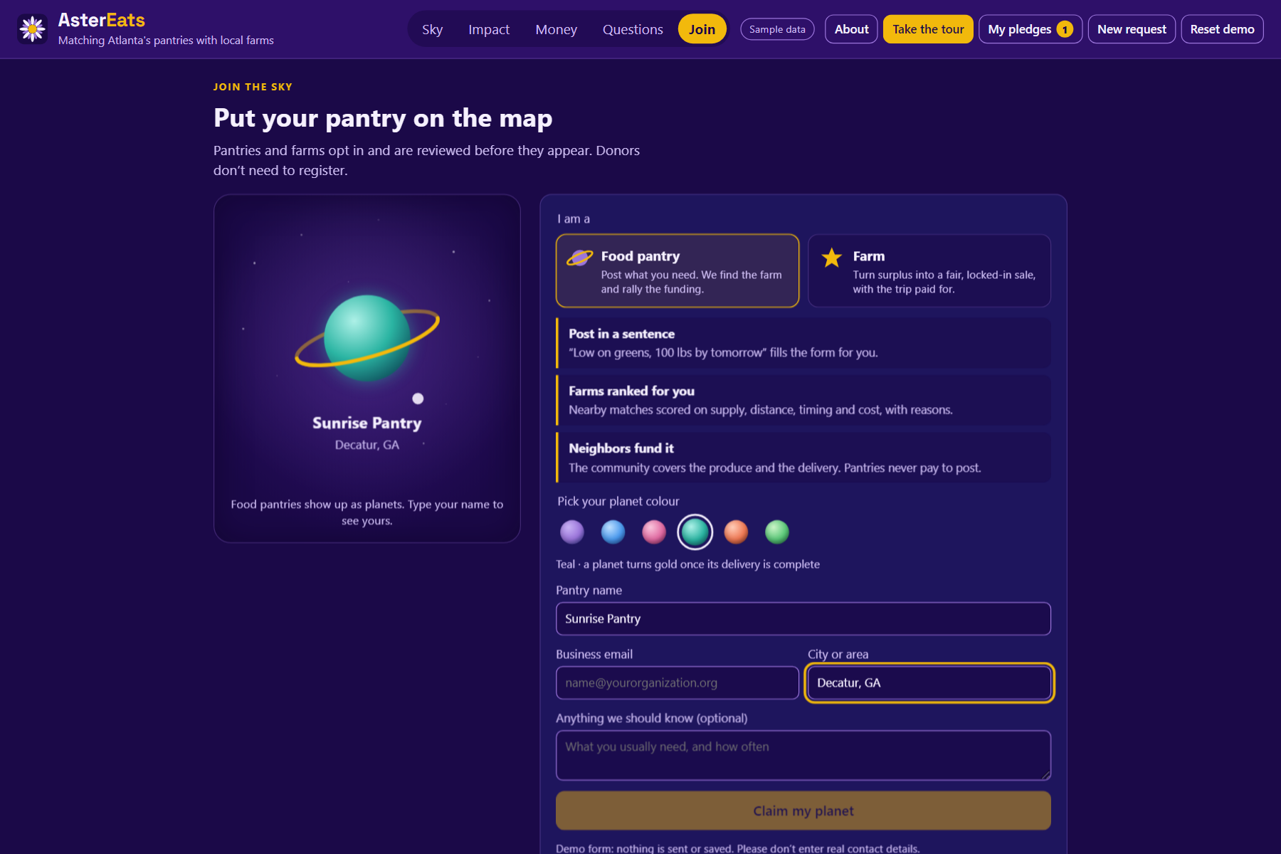
- Join: pantries and farms opt in and pick their planet or star colour. Donors don't need an account.
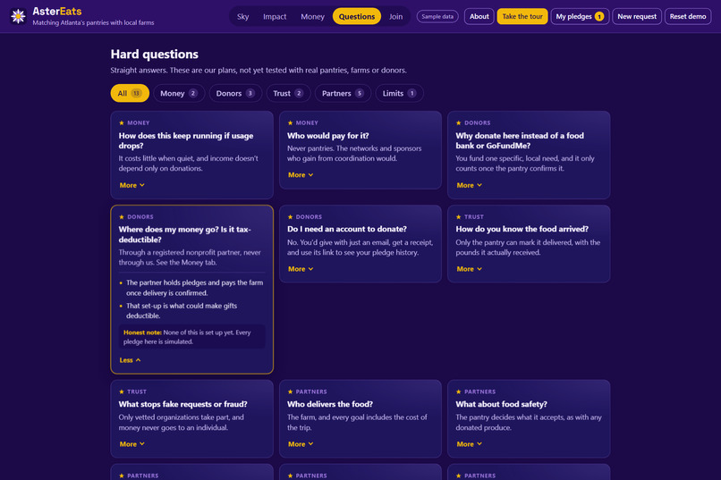
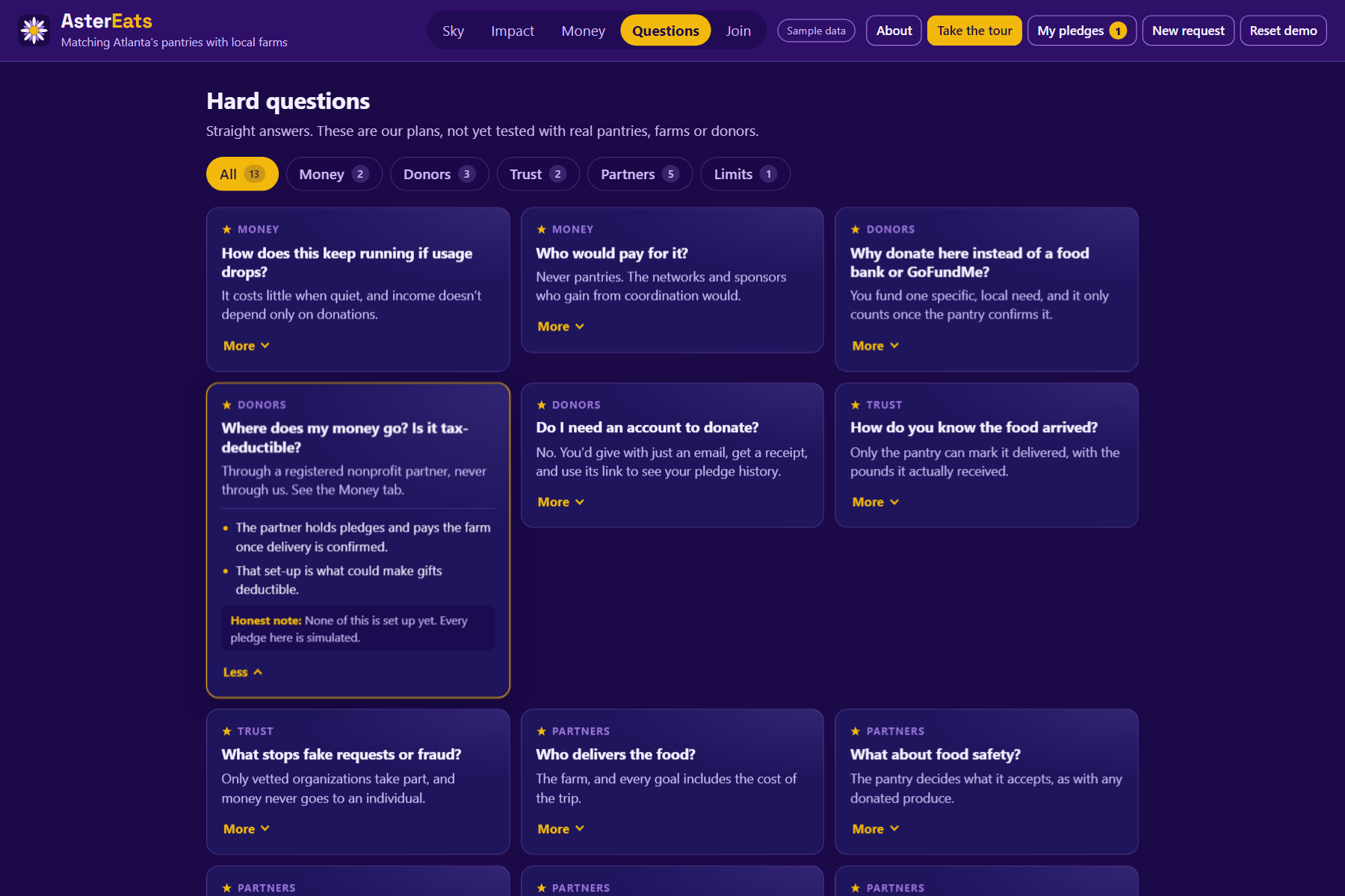
- Guided tour and Questions tab: an 11-step walkthrough, plus straight answers about money, trust, food safety and our limits.
- Phone layout: works on phones, with a compact header and a details sheet.
Everything in the demo is sample data. No real payments, accounts or partnerships, and the app says so on every screen.
How we built it
- Stack: React 19 and Vite as a static site, deployed to GitHub Pages with GitHub Actions. We built it in VS Code with GitHub Copilot and Claude as coding assistants.
- Sky and map: hand-built SVG, no map library. Real latitude and longitude are projected to scale, so distance on screen matches straight-line miles. Pan and zoom work by moving the SVG viewBox, and a drag never counts as a click.
- Matching: plain JavaScript. A farm is eligible if it grows the requested food and can arrive before the deadline:
$$t_{\text{arrive}} = t_{\text{prep}} + \frac{\text{miles}}{30\ \text{mph}}$$
Eligible farms get a 0–100 score, where \(c\) is the share of the request the farm can cover, \(d\) is distance in miles and \(p\) is total cost per pound:
$$\text{score} = 40c + 30\max\left(0,\ 1-\frac{d}{40}\right) + 20\left(0.4 + 0.6\max\left(0,\ 1-\frac{t_{\text{arrive}}}{t_{\text{deadline}}}\right)\right) + 10\max\left(0,\ 1-\frac{p}{2.5}\right)$$
Delivery is estimated at $10 plus $2.50 per mile. Every number here is an assumption we'd replace with real logistics data.
- Request reader: a keyword and pattern parser. It is not AI, and we say so in the app.
- Testing: a script checks the matching logic, and an end-to-end browser test clicks through the whole app on desktop and phone sizes.
- Accessibility: planets and stars work from the keyboard, every animation respects reduced-motion settings, Map view has a larger-text mode, and colours were checked for contrast.
Challenges we ran into
- "What happens to my money?" A reviewer asked this early, and it reshaped the project. Designing a believable flow (hold until funded, release on confirmed delivery, refund if unconfirmed, partial shipments, closing out a short delivery) took more thought than any screen.
- Farmers raising prices mid-agreement. We settled on prices locked at match time, plus a narrow fuel-cost clause. Our research found fuel surcharges are common in supply contracts but nothing specific to farm-to-pantry deals, so the terms are clearly marked as a draft.
- Readability. Pins and labels kept colliding, so we wrote automatic label placement. We also added Map view after realising a beautiful sky isn't readable for everyone.
- Mobile. On a real phone the header took 40% of the screen, and the tour's pointer landed on top of the details sheet. We fixed it with a menu, a bottom sheet, and starting phones zoomed in.
- Deploying. A half-configured custom domain made GitHub Pages redirect to a domain that didn't exist, and browsers cached that redirect. That was a good lesson in DNS and 301s.
- Staying honest. It would have been easy to fake payments or call our parser "AI." We kept every simulated piece labeled.
Accomplishments that we're proud of
- Explainable matching: every farm ranking comes with reasons a pantry coordinator can check at a glance.
- Two signals in one planet: the ring is money, the gold fill is food. A planet is only fully gold when a request is both funded and fully delivered.
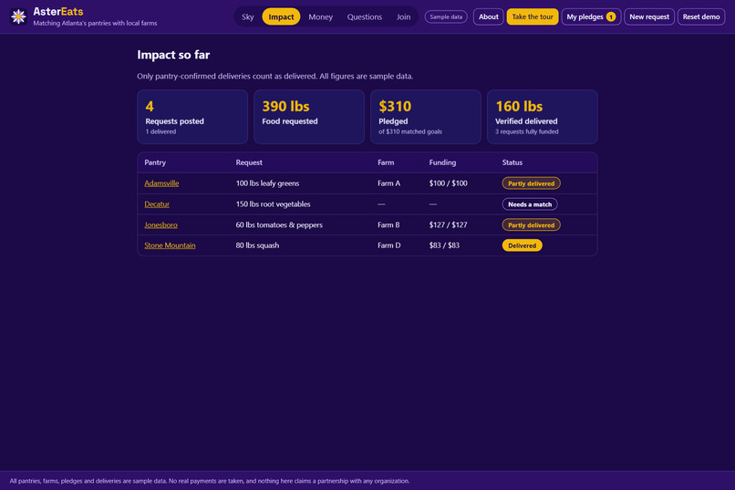
- Verified impact: our numbers count pantry-confirmed pounds, not pledges.
- Transparency as a feature: a Money tab and an honest Questions tab, written for skeptical donors and judges.
- It works for everyone: keyboard, reduced motion, larger text, and phones.
What we learned
- Trust is the product. Donors care less about the UI than about where their money goes and what happens if something fails.
- Need-first changes everything. Starting from the pantry's shortage makes the match, the funding goal and the impact all concrete.
- Design for the least tech-comfortable user. Map view, plain-language requests and large text came from asking who might struggle.
- Test on real devices early. Our biggest UX fixes came from screenshots on a teammate's phone.
What's next for AsterEats
- A pilot with one pantry network and a handful of farms, to test pricing, delivery costs and pickup windows.
- A nonprofit fiscal sponsor and payment provider, with guest checkout: donate with an email, get a receipt, and use its link to see your history.
- Verified accounts for pantries and farms, and farm-side delivery confirmation with an optional photo.
- An AI request reader running through a server function, so no API key is ever exposed in the browser.
- Real driving routes, combining several pickups into one trip, and real map tiles.
- Legal review of the farm agreement and its fuel-cost clause.


Log in or sign up for Devpost to join the conversation.