-
-
PulseMap
-
Environmental Burden Score methodology diagram
-
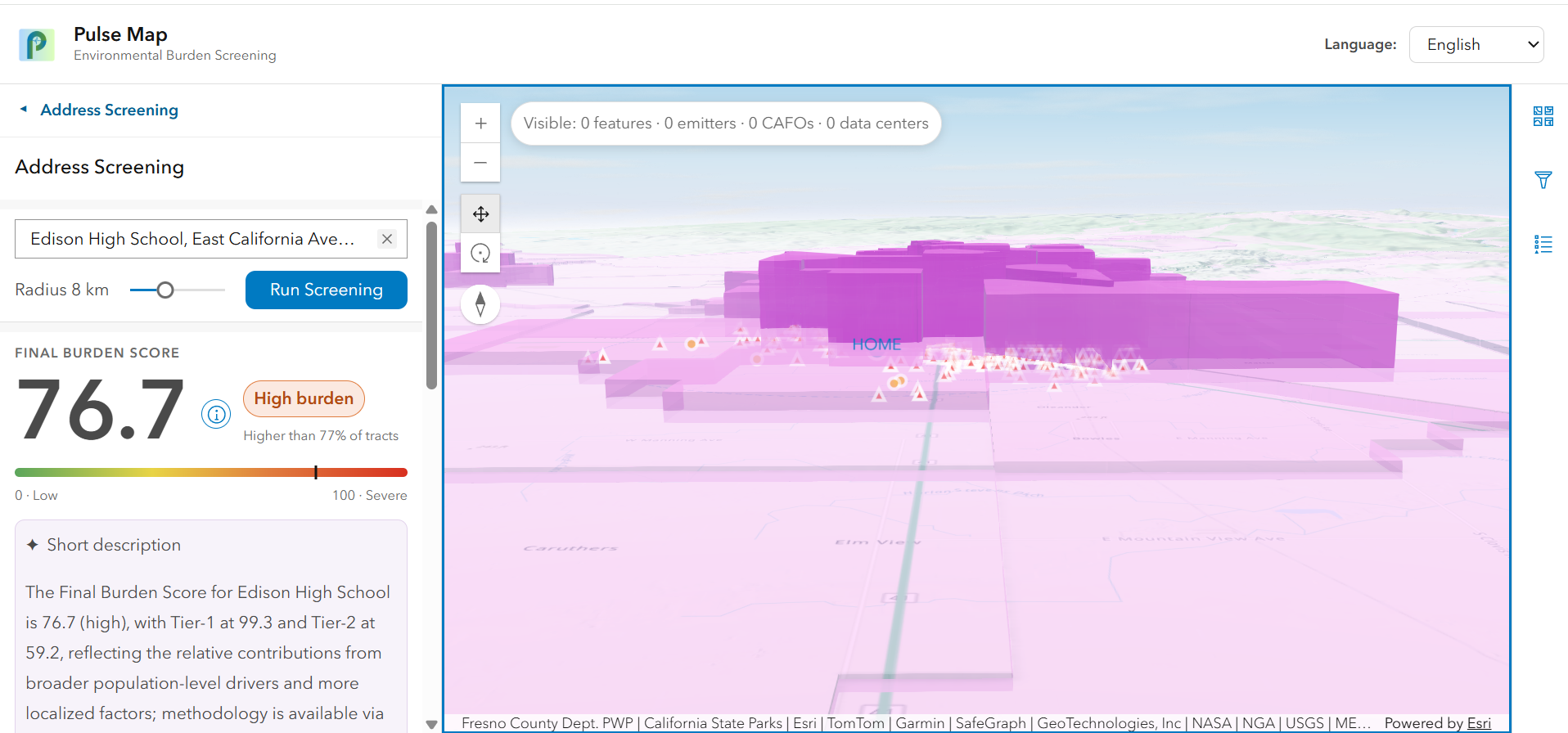
Edison High School Environmental Burden Screening 3D SceneView

Inspiration
Your health depends on where you live. That idea, the foundation of geospatial health and GeoMedicine, is what drove this project. More than fifteen years ago, Bill Davenhall, who led Esri's Health and Human Services team, gave a TED talk called "Your Health Depends on Where You Live" (Davenhall, 2010), arguing that the places we spend our lives leave a measurable mark on our health that medicine too often ignores. When we discovered his work while looking into Esri's own history, PulseMap became something more than a hackathon project: a chance to build a small, actionable continuation of the gap he identified, turning the link between spatial factors and health outcomes into a tool people can actually use.
That gap is starkest in California's San Joaquin Valley, which has some of the worst air quality in the country (American Lung Association, 2026). In the Fresno County 2026 Community Health Assessment, residents ranked environmental conditions as their #1 health concern (Fresno County Department of Public Health, 2026). This is an environmental-justice problem: the communities carrying the heaviest environmental burden are often the ones with the fewest resources to understand or respond to it. Maria brings a public-health background; Margo and Maddie come from environmental science, and Margo and Maddie live in North Carolina and Iowa, two states with some of the highest densities of concentrated animal feeding operations in the country, so the questions this app asks are ones we've lived near ourselves.
The tools that measure environmental burden today work at the census-tract level and are built for regulators, not residents. A family wants to know about their block, not their tract, and they want it in language that helps them act. We also noticed that emerging hazards like data centers are multiplying across the Valley faster than regulators can track them. Inspired by Davenhall's vision and by Esri's own Health and Human Services team, we set out to put address-level environmental screening directly in residents' hands, empowering people with the knowledge to own their health.
Please reference "Try it out" links for sources.
What it does
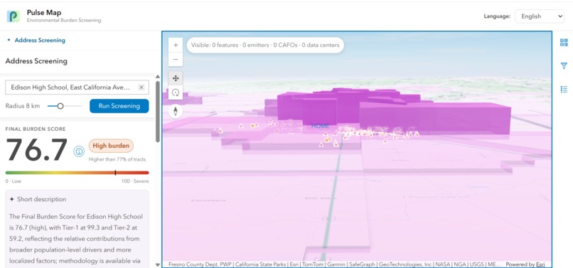
PulseMap is an address-level environmental-health screening web app for Fresno County and the surrounding San Joaquin Valley. A resident enters their address and gets an Environmental Burden Score, a screening indicator combining how vulnerable their community is (health, socioeconomic, water, and air-quality conditions) with how much hazard is nearby (proximity to industrial facilities, CAFOs, data centers, and highways). The map visualizes the tract-level Environmental Burden Score where dark red tracts score the highest and light red tracts score the lowest. Residents can see the specific sources near them with distances, toggle between English and Spanish, switch between 2D and 3D views, and open a plain language panel that translates the data into digestible text and suggests questions to bring to their doctor.
Crucially, PulseMap is a screening tool, not a diagnosis. It shows where environmental hazard and community vulnerability overlap, it never claims any source caused any person's illness. Our scores are relative: they rank neighborhoods against their Valley neighbors, surfacing where to look and what to ask.
How we built it
We built the data pipeline in ArcGIS Pro and published everything as hosted feature layers on ArcGIS Online, all standardized to EPSG 3310 (California Albers) so distance math is accurate in meters.
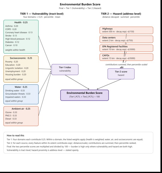
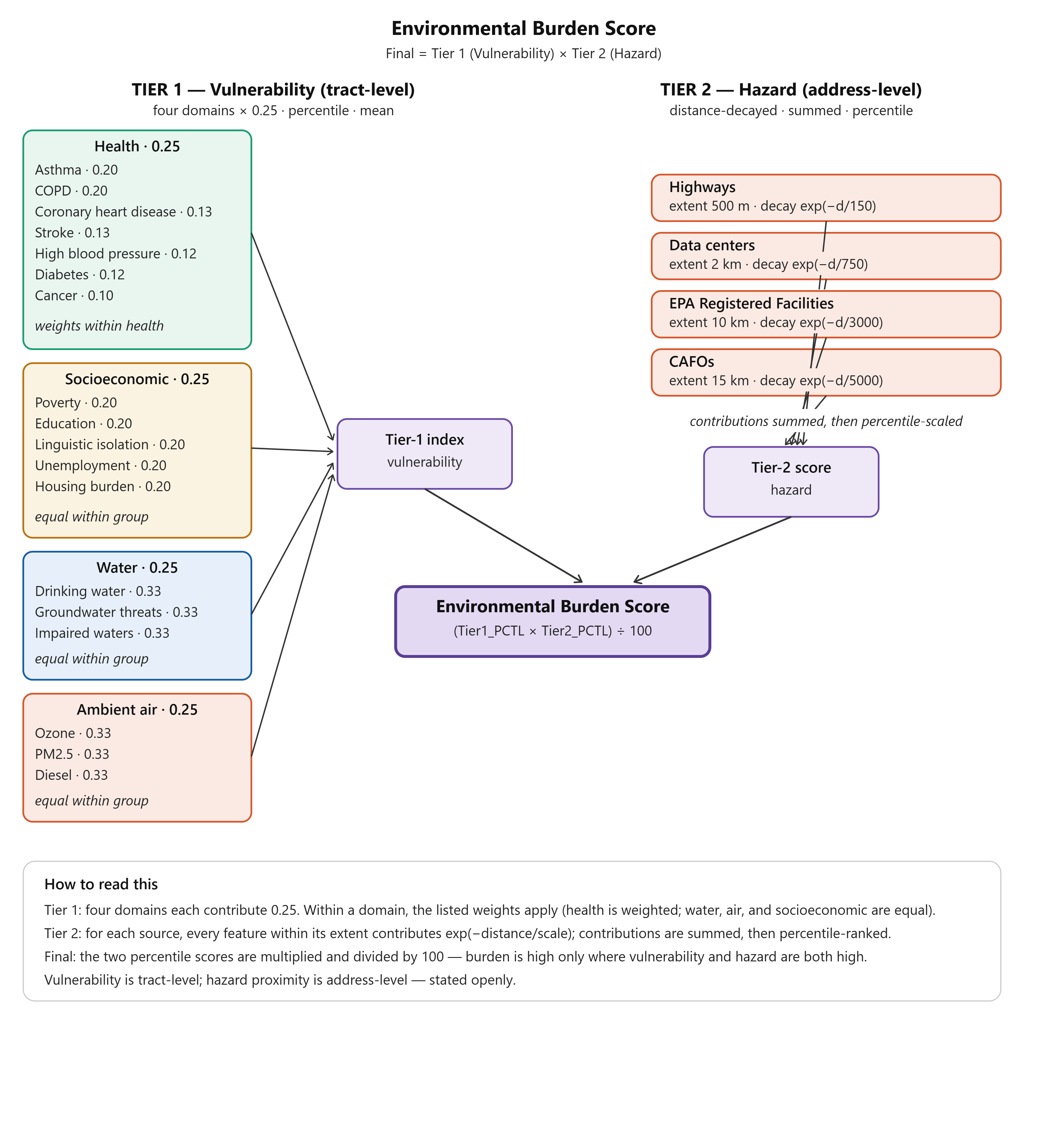
Tier 1: Vulnerability combines four equally weighted domains built with the Calculate Composite Index tool: seven health measures from CDC PLACES (weighted toward respiratory and cardiovascular disease, informed by the Fresno County Community Health Assessment), plus socioeconomic, water, and ambient-air indicators from CalEnviroScreen 5.0. We fed in raw indicator values and percentile-scaled them across our five-county study area, so every factor is normalized the same way.
Tier 2: Hazard measures distance from each address to four source layers: EPA-registered facilities, CAFOs (dairies/feedlots), data centers, and state highways, applying a per-source distance-decay function (exp(−distance/scale)) tuned to the published literature on how far each pollution type travels.
The final burden score multiplies vulnerability by hazard, so a place scores high only when both are elevated. The app (ArcGIS Maps SDK for JavaScript) geocodes the address, looks up the tract vulnerability, computes hazard proximity, and renders the result as a 3D scene, with an LLM-powered panel generating the plain-language explanation.
Challenges we ran into
One real challenge was deciding where to place the air-quality factors, ozone, PM2.5, and diesel, within the scoring model. These are significant contributors to environmental health risk in the San Joaquin Valley, so getting their placement right was central to the whole model. We decided to include them in the Tier-1 vulnerability composite, equally weighted alongside the health, socioeconomic, and water factors. Our reasoning: ambient air quality is a census-tract-level measure of a community's environmental health vulnerability, which fits Tier 1, whereas Tier 2 captures address-level hazard determined by proximity to specific pollution sources. Keeping the tract-level ambient measure in vulnerability and the source-proximity measure in hazard let us represent air pollution without conflating the two very different things it means at those two scales.
Another hurdle was building the 3D scene. We originally wanted a continuous raster 3D SceneView driven by a live, address-level distance query. That proved more than we could reliably build in the time we had, so we made a deliberate call to fall back to a polygon, tract-level 3D SceneView that extrudes the tract-level environmental burden score. It's a cleaner, more reliable visualization, and it still delivers the core "watch the burden rise off the map" experience.
The next barrier we had to pass was wiring the app. We had some struggle getting the web app to toggle smoothly between the 2D and 3D views, a deceptively intricate piece of the front end that took more effort than expected.
One of our biggest challenges was fitting it all into five minutes. We had a huge amount of ground to cover: Fresno County's context, the environmental factors, the science and public-health reasoning behind our weights and calculations, and the fields of GeoMedicine and geospatial health that inspired the whole project. This all had to be integrated into a five-minute presentation that also made room for heartfelt storytelling and a live demo of the app.
Accomplishments that we're proud of
We're proud that PulseMap is genuinely honest. At every step we chose the defensible option over the impressive-sounding one: we state our resolution limits openly (hazards are address-level, vulnerability is tract-level), we frame every score as screening rather than diagnosis, and we document our data's sources and known gaps.
We're also proud of the technical completeness: a full multi-source data pipeline (thousands of validated facilities across five counties), a defensible two-tier scoring model grounded in the actual Fresno health data, and a resident-facing 3D app that's bilingual and built for the people who actually live in this community.
What we learned
We learned that the community-tuned, data-driven decisions matter more than the code. Any of us could run the geoprocessing tools; the hard part was deciding what the numbers should mean: how to weight health conditions, whether to sum or average hazard sources, where air pollution belongs, and how to combine two tiers without double-counting. Nearly every one of those was a judgment call we had to make deliberately and defend.
We gained empowering knowledge about geospatial health and what that means. No matter how healthy you eat or how much you exercise, if you live next to a factory farm or large data center, you are going to be exposed to environmental contaminants such as particulate matter (PM 2.5) which are linked to negative cardiovascular and respiratory effects.
What's next for Arcitects
Looking ahead, Arcitects plans to expand support for additional languages, making environmental health information accessible to an even broader audience. We also aim to give users the ability to adjust environmental burden score weights so results can better reflect the pollutants and environmental factors most relevant to their communities and personal concerns.
We plan to integrate automated data updates through APIs, ensuring our maps and analyses remain current as new information becomes available from sources such as EPA facility registrations, CalEnviroScreen 5.0, and CDC PLACES. In addition, we are exploring the development of a trained AI agent that will allow users to customize how information is explained and presented, building upon the capabilities of our current AI chat tool.
Arcitects is excited to continue improving the platform to better serve community members, researchers, and decision-makers. Our long-term goal is to expand the model across California and eventually nationwide, while keeping every score tailored to the unique environmental and health conditions of the communities it represents. Stay tuned for future updates by following us on Instagram: @esri_arcitects.
Built With
- aiguidedanalysisforarcgisprobeta
- arcgismapssdkforjavascript
- arcgisonline
- arcgispro
- arcpy
- caclulatecompositeindex
- calcitedesignsystem


Log in or sign up for Devpost to join the conversation.