Inspiration
Fluoride contamination in groundwater is not a hypothetical problem in Telangana — it's severe enough that "Nalgonda syndrome" is a recognized medical term for the skeletal and dental fluorosis caused by drinking contaminated water in that district. Millions of people across the state still depend on bore wells and hand pumps whose water has never been meaningfully explained to them in a way they can act on. Government water-testing data exists, but it lives in raw tables of parameter values and permissible-limit thresholds — readable to an engineer, meaningless to the person deciding whether it's safe to give this water to their kids.
We wanted to build something that closes that gap: take real, already-collected water quality data and turn it into a plain answer — is this safe, and why — for the people who actually need to act on it.
What it does
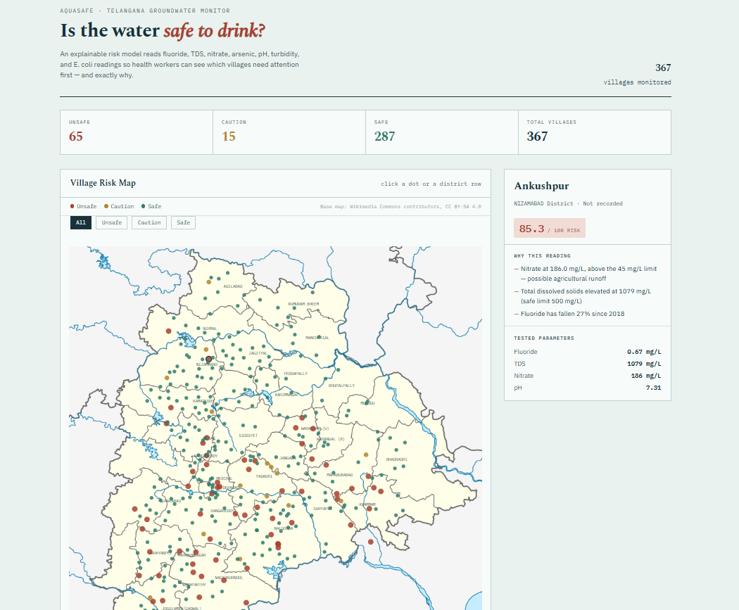
AquaSafe is an explainable AI dashboard that classifies groundwater safety risk — Safe, Caution, or Unsafe — for villages across Telangana, based on real water quality testing data (fluoride, TDS, nitrate, and pH).
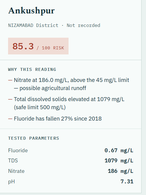
For every village, it doesn't just show a score — it shows why: "Fluoride at 2.98 mg/L — above the 1.5 mg/L safe limit," in plain language, generated directly from what the model actually weighed. A real geographic map lets you see risk patterns across the state at a glance, and clicking any village or district drills into its specific readings. Where multiple years of data are available, AquaSafe also surfaces genuine trend insights — e.g. "Fluoride has risen 38% since 2018" — turning three years of static survey data into an early-warning signal, not just a snapshot.
How we built it
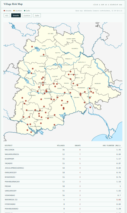
The pipeline is a straightforward, honest chain: real Telangana groundwater survey data (2018–2020 post-monsoon) → a logistic regression classifier trained against BIS/WHO permissible-limit exceedance → per-village explainability generated from the model's own feature coefficients → a self-contained dashboard with a real lat/lon-projected map, filterable by risk tier, with a district-level rollup table.
We deliberately chose logistic regression over a more opaque model. The whole premise of the project is that a health worker or citizen should be able to trust why a village is flagged, not just trust a number — so every prediction ties back to a specific parameter and its specific BIS/WHO limit.
While we waited to get proper access to the real dataset, we built and validated the entire pipeline against a synthetic dataset constructed from real published Telangana fluoride ranges and real district geography — which let us confirm the architecture worked before real data ever entered the picture. When the real 2018–2020 survey data came in, the same pipeline ran against it with only the data-loading layer changed.
Challenges we ran into
Getting real data was harder than expected. India's official water quality datasets (the Jal Jeevan Mission portal) are marked "Restricted" and require government portal registration to download; Kaggle mirrors require account access too. We treated this as a real constraint to design around rather than a blocker — we built the full pipeline against a synthetic dataset grounded in real published fluoride studies first, so the project worked end-to-end from day one, and swapped in real data the moment it was accessible.
The real data didn't have everything we wanted. The 2018–2020 survey only tests pH, TDS, fluoride, and nitrate — no arsenic, turbidity, or E. coli, unlike the national JJM schema we'd designed around. Rather than assume a value we didn't have (e.g., quietly treating missing arsenic as "0" or "not detected"), we made the model honestly train on only the four parameters that were actually tested, and the dashboard explicitly states which parameters weren't tested rather than implying full coverage. We felt that a tool claiming to be "explainable AI" has an obligation not to fabricate the inputs it explains itself with.
Messy real-world data. One row in the 2020 CSV had a malformed pH value ("8..05") that silently forced the entire pH column to be read as text instead of numbers — a classic real-data landmine. We caught it, coerced the column properly, and dropped the one unparseable row rather than guessing at the intended value, keeping 367 of 368 villages.
Accomplishments that we're proud of
The model's outputs line up with real, independently published science without us telling it to: Nalgonda and Mahabubnagar — the two districts most documented in fluorosis literature — surfaced as the highest-risk districts purely from the data patterns, not from any hardcoded rule favoring them. That's a strong signal the approach is sound, not just plausible-looking.
We're also proud of holding the line on honesty under real constraints — when the real data didn't have every field we originally designed for, we chose to shrink the model's claims rather than quietly patch the gap, even though that meant more engineering work (branching the entire scoring and explanation logic by data mode) instead of a quick shortcut.
What we learned
Real-world data almost never matches the shape you designed around, and the right response isn't to force it to fit — it's to make the tool honest about what it actually knows. We also learned firsthand how much friction exists just in accessing public government data in India, even data that's nominally open — which is its own small insight about why tools like this matter: the information exists, but almost nobody outside a data scientist with time to burn can actually get to it, let alone interpret it.
What's next for AquaSafe Expand from the current district coverage to all 33 districts of Telangana as more survey years become accessible Add multilingual support (Telugu first) so the tool is actually usable by the people it's meant to help, not just English-literate reviewers Explore lightweight SMS/IVR alerts for rural health workers in flagged high-risk villages, since smartphone/dashboard access can't be assumed everywhere the risk is highest Re-integrate arsenic/turbidity/E. coli scoring if and when a data source that actually tests for them becomes accessible, rather than backfilling them now

Log in or sign up for Devpost to join the conversation.