-
-
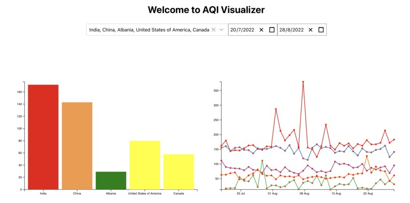
Bar Chart and Line Chart
-
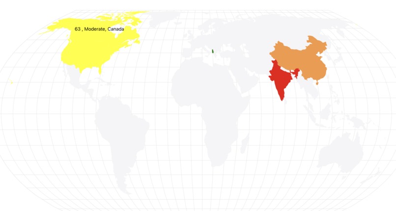
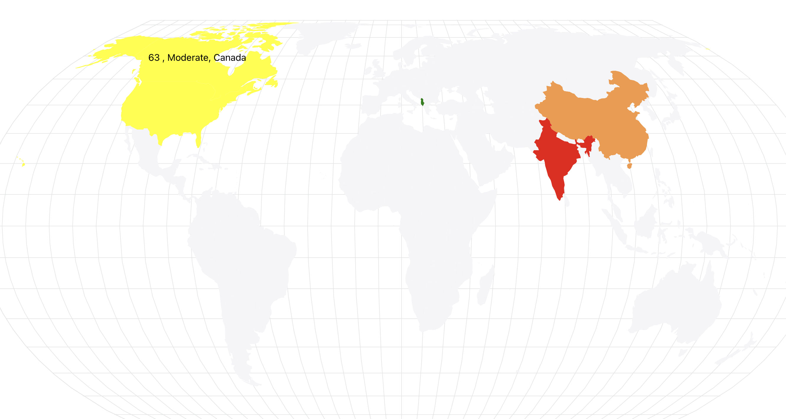
Choropleth Map
-
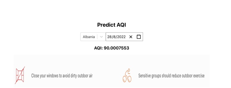
Prediction System


Inspiration
We were inspired to build this project by understanding and realizing the lack of visualization systems that visualize air quality and how these tools can be used by other users to make informed decisions to their lifestyles.
What it does
In this project, we have built a Data Visualization system that visualizes Air Quality indexes worldwide.
We have built a bar chart and a multi-series line chart that shows air quality indexes of different countries.
The bar chart shows the average Air Quality Index of daily samples collected between start and end dates specified by the user.
The multi-series lines line chart also shows the same data. However, instead of calculating an average of the daily samples, it shows the value of the air quality index of each collected sample to extract more detailed information.
We have also shown data using a choropleth map, which shows a map and the Air Quality index of the selected countries. The color represents the category of the Air Quality Index.
We have built a prediction system that predicts the Air Quality Index by specifying the date and country we want information from.
Along with calculating the Air Quality Index, it shows us the necessary precautions that need to be taken for the corresponding Air Quality Index.
How we built it
We built our front-end using React.js, and hosted it using Google Cloud App engine.
We built our back-end using Node.js, and hosted it using Google Cloud App engine.
We stored all our data in a MySQL instance hosted using Google Cloud SQL.
We built our prediction system using a deep neural network that was built using Keras. The network was trained with over 40000 parameters to give a good accuracy to our AQI Predictions.
We stored that model using a Google Cloud Storage Bucket, and hosted it using Google Cloud Vertex AI.
Challenges we ran into
We ran into multiple challenges as there was a steep learning curve involved in building these visualization tools.
We also had to learn how to use Googlke Cloud Vertex AI, as it was our first time to deploy our service there.
Accomplishments that we're proud of
We are proud to build a high-end system that has good usability, design, and necessary functionalities in a short duration of 48 hours.
What we learned
We learned how to implement excellent data visualization techniques and how they can be leveraged to build good products and provide users with good insights into data.
What's next for AQI Visualizer
Our product right now focuses on air quality indexes of different countries.
We can expand it to cities, states, and even different localities.
Built With
- d3.js
- google-cloud
- google-cloud-app-engine
- google-cloud-sql
- google-cloud-vertex-ai
- keras
- node.js
- react


Log in or sign up for Devpost to join the conversation.