-
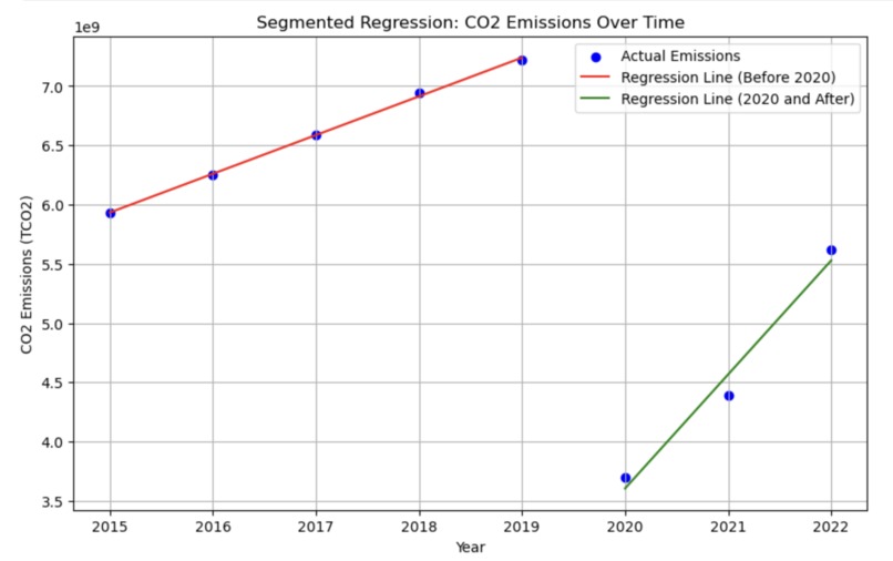
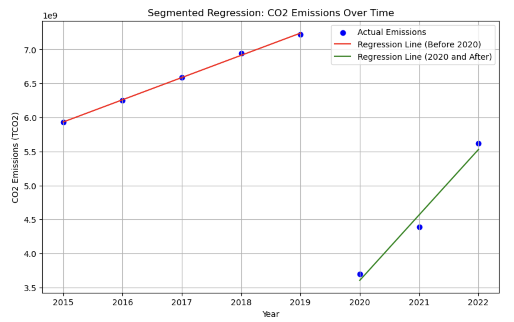
Segmented Regressions: CO2 Emissions Over Time
-
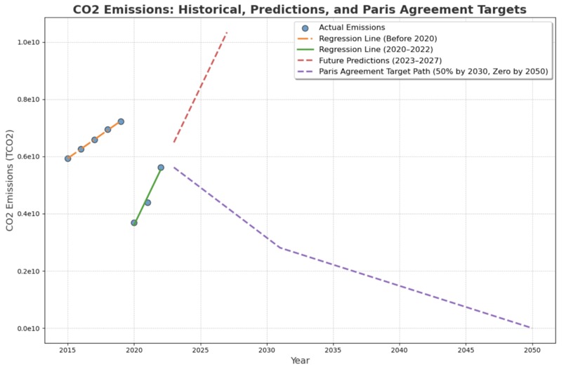
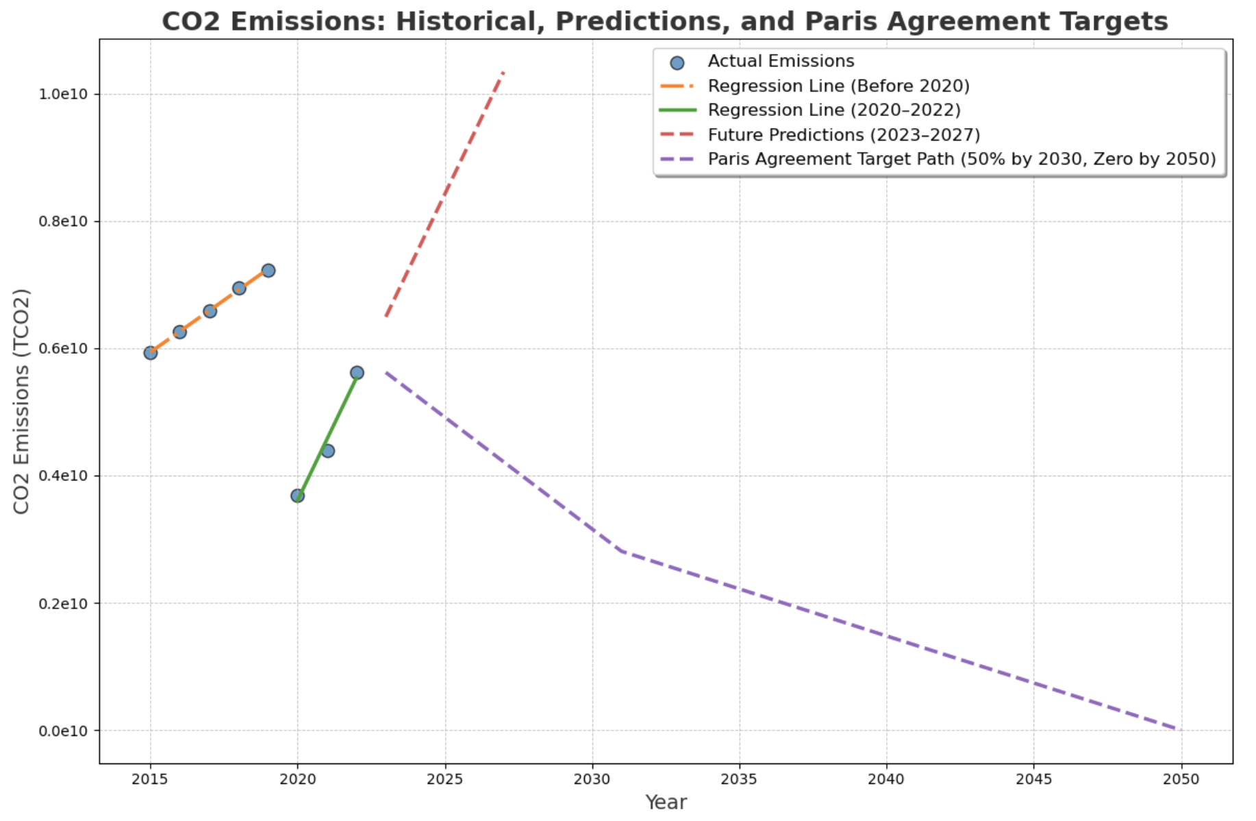
CO2 Emissions: Historical, Predictions, and Paris Agreement Targets
-
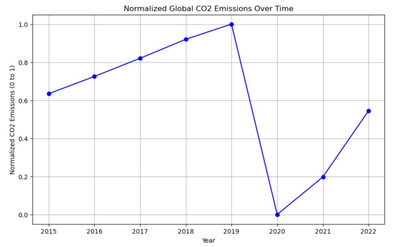
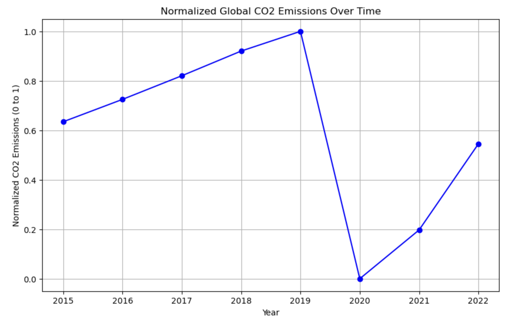
Normalized Global CO2 Emissions Over Time
-

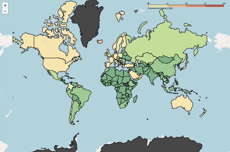
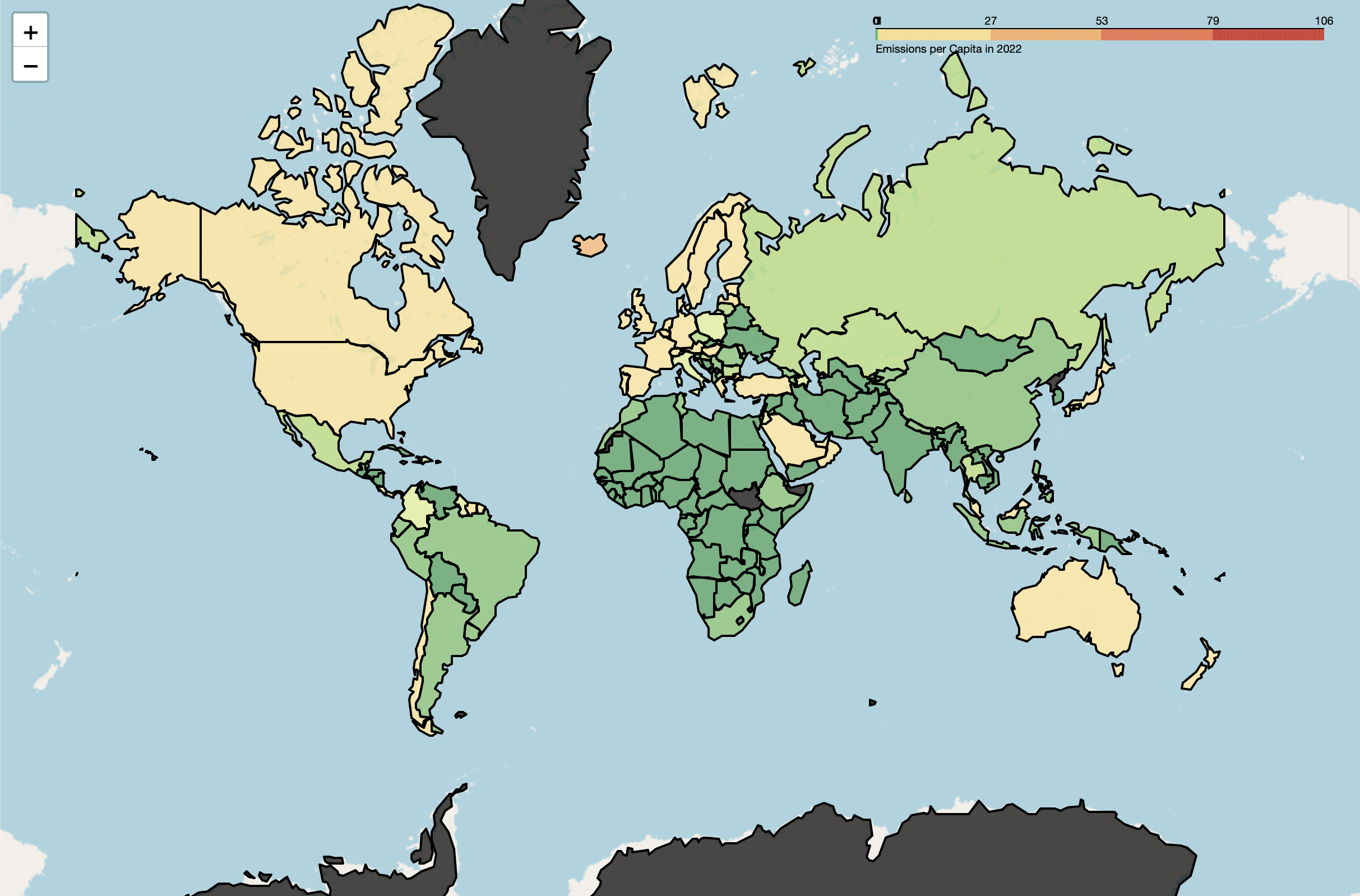
Global Emissions per Capita for 2022
-
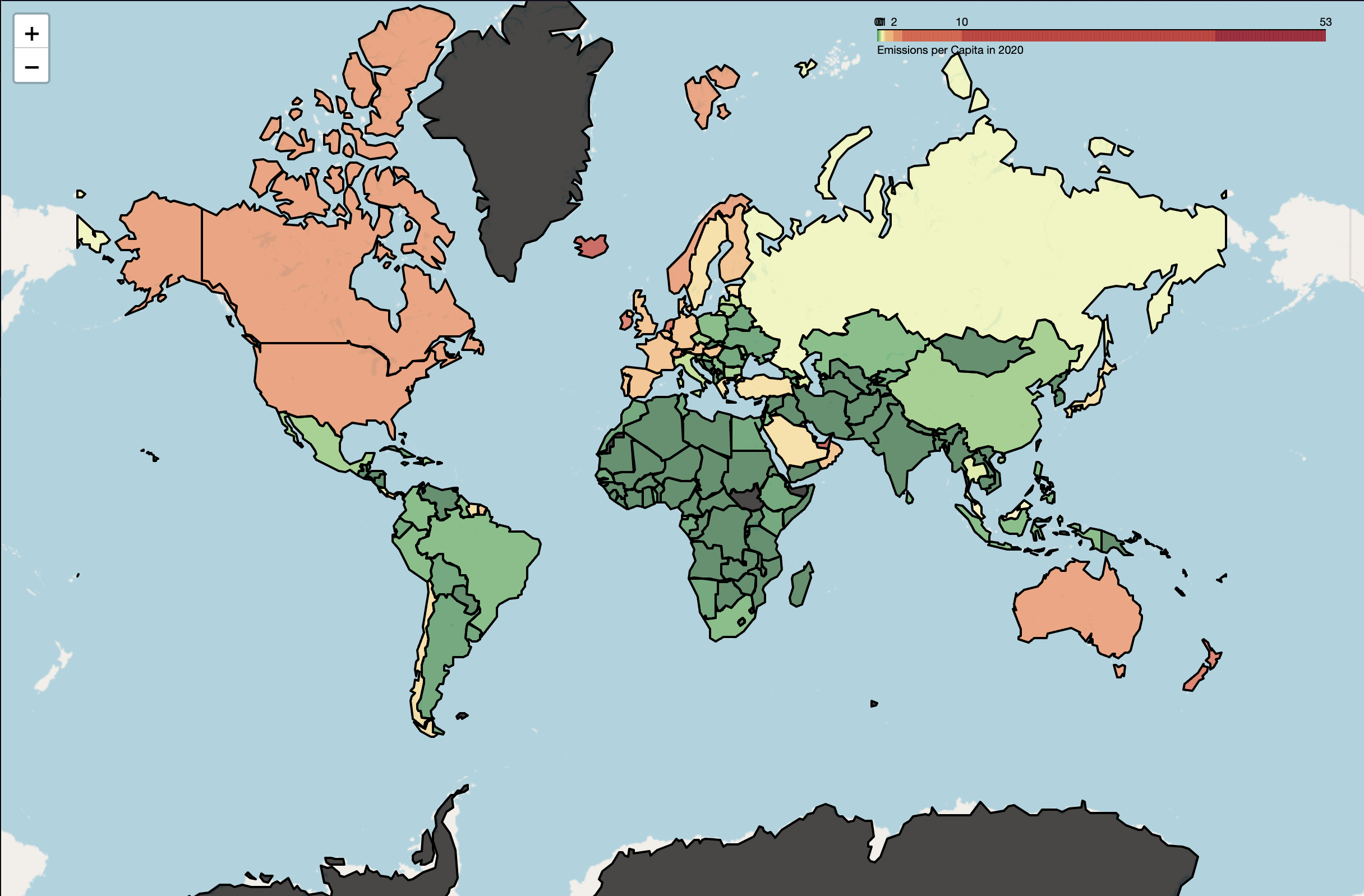
Global Emissions per Capita for 2020
-

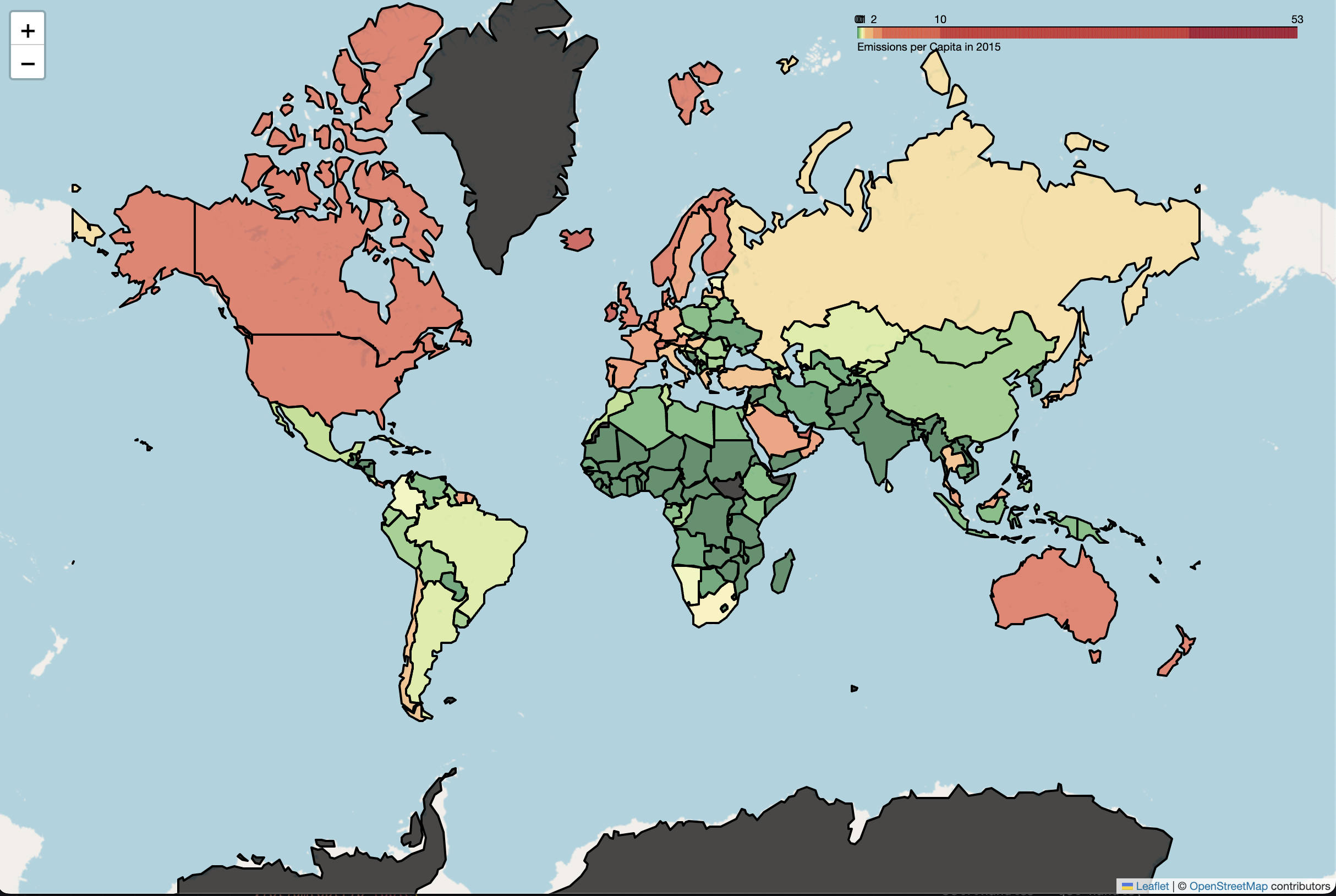
Global Emissions per Capita for 2015
Inspiration
Climate change is one of the most pressing issues of our time, and understanding how global emissions contribute to it is crucial for taking effective action. We were inspired to build a tool that visualizes emissions data in a meaningful way, empowering individuals and policymakers to grasp the impact of carbon emissions from air travel. Additionally, we wanted to leverage machine learning to predict future trends, helping the world anticipate and mitigate future emissions.
What it does
Our project provides an interactive map that visualizes global emissions per capita, making it easy to identify which countries are contributing most to carbon emissions. It also incorporates a machine learning-based linear regression model to predict future emission trends. Users can explore both past data and future forecasts to make informed decisions and drive climate action.
How we built it
We collected emissions and population data from various open datasets, which were merged and analyzed using Python. We used Folium to build dynamic maps that display per capita emissions by country. The maps use a green-to-red gradient to represent emissions levels, making it visually intuitive. For predictive analysis, we trained a linear regression model to forecast future emissions trends, integrating this with the data visualization for a holistic view of global emissions. We also used an outside data set link in order to be able to create a variable known as EPC (emissions per capita) that let us visualize data while taking into account the population these countries have.
Challenges we ran into
One of the biggest challenges was cleaning and merging the datasets to ensure accurate and meaningful data representation. Some countries had missing or incomplete data, which required handling through interpolation or data sourcing from alternative providers. Another challenge was fine-tuning the color scheme to provide clear and distinct visualization without overwhelming the user.
Accomplishments that we're proud of
We're proud of creating a user-friendly tool that not only displays global emissions but also forecasts future trends. The combination of interactive maps with machine learning-based predictions allows users to both explore the current state and prepare for what’s next. Successfully merging and analyzing large datasets while maintaining performance was another key accomplishment.
What we learned
We deepened our understanding of data visualization techniques and learned how to make large datasets more digestible through interactive mapping. We also explored machine learning applications for environmental data, gaining valuable insights into predictive modeling. We learned that at the rate we're currently going, we won't be able to match The Paris Agreement's limit on global CO2 emissions link. Additionally, handling real-world data brought us new learnings on how to manage incomplete or inconsistent datasets.
What's next for Analyzing CO2 emissions from air travel & predicting trends
Next, we aim to expand the project by incorporating more granular data, such as emissions from specific sectors like air travel or other industries. We also plan to enhance the machine learning model by exploring more advanced algorithms for better accuracy in trend predictions. Integrating real-time data updates and allowing users to interact with forecast models would further improve the project’s impact.
Built With
- api
- data-science
- emissionsdataset
- folium
- json
- linear-regression
- machine-learning
- matplotlib
- numpy
- os
- pandas
- python
- requests
- scikit-learn
- webbrowser
- world-population-database

Log in or sign up for Devpost to join the conversation.