-
-
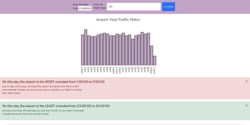
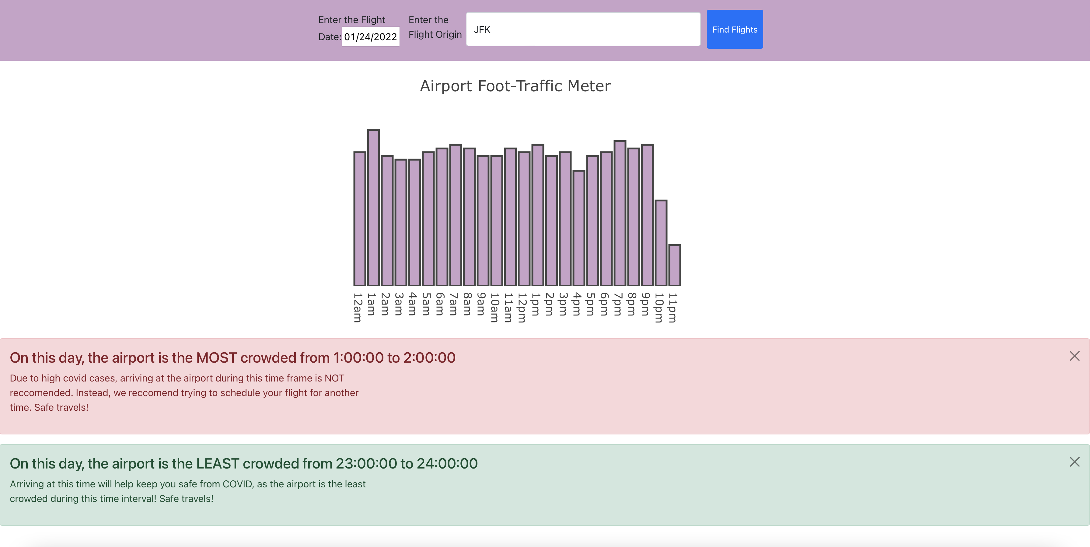
A sample of our website with example flight information!
Our inspiration for this project was our own experiences traveling during recent years; flying during the pandemic is a frightening process, and the worst part is the amount of time spent waiting in large crowds at the airport. Even before the pandemic, it was difficult to know when to arrive at the airport and how to plan accordingly with time spent going through TSA. We wanted to find a way to determine when an airport would be at its least crowded, so we could know the optimal time to schedule our flight. We also wanted to know when an airport would be the busiest, so we could stay COVID conscious and plan our trips accordingly.

Our website extracts data from American Airlines flight logs, which gives information regarding flight departures and arrivals, as well as the length of flight and distance traveled. Our website creates a user interface where an inputted date and departing airport will generate information about the ideal and discouraged times to fly.

We used React and JavaScript to create our project. We created a React application and created components to represent the Flight Data and the Bar Graph. We used the Heroku platform to run a sample API and we used Axios to call this API from React. We used input platforms with a button to take in the user data and directly append it to the URL for the API. The link of the API itself allowed us to sort data by origin and date, and from this data, we used a for loop to find times in which the most departures occurred. We used a plot to graph these findings, and we used bootstrap alerts to show the most popular and least popular times in the airport.

Some challenges we ran into were using unfamiliar coding languages during our project. We had to use JavaScript and HTML to code our website, as well as various additional frameworks such as react, bootstrap, and Axios. Working with these new languages and additional tools was difficult and time-consuming, as we had no prior experience with them. Other challenges included including the graph to show the foot traffic at each hour, formatting our website to be user-friendly, and extracting data from the API we were using.

We are proud of learning how to use HTML and JavaScript to develop a website, as well as using Axios to get data from our API. We are proud of using react to create the website. We are proud of creating the graph and including it in our website seamlessly. We are proud of completing the challenge.

There are a few ways we could upgrade the system we created. Our method of determining foot traffic was creating time ranges based on the departure times for a specific airport on a specific date back to 2 hours before the plane was set to take off. A more accurate way of calculating this would be to include the time ranges for the arrivals scheduled for that same airport and date, extending from the arrival time to one hour after. Another way to improve this accuracy would be to include the departure intervals for the flights occurring the following day, whose intervals would coincide with the inputted day, as well as the arrival intervals of the flights occurring the previous day whose intervals coincide with the inputted day. Beyond this, we could also look to include flight data from other airlines, or utilize actual passenger counts rather than making the assumption that planes carry relatively the same amount of people.


Log in or sign up for Devpost to join the conversation.