-
-
AMBER
-

Amber User Flow - Elderly User
-
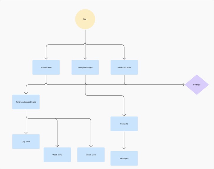
Amber User Flow - Family Member
-
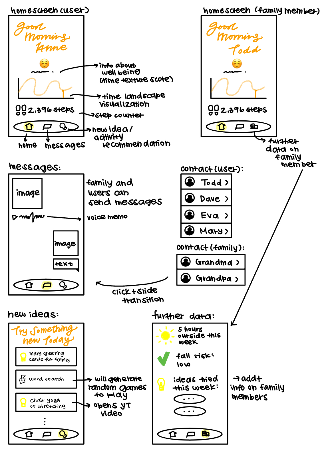
Amber Wireframe
-

Our Inspiration
-
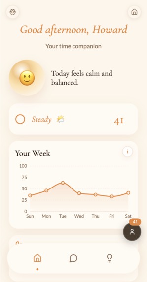
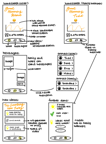
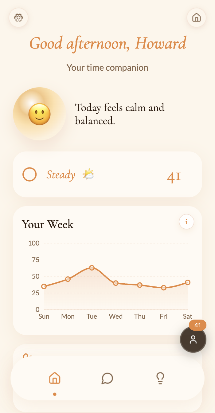
Home Page
-
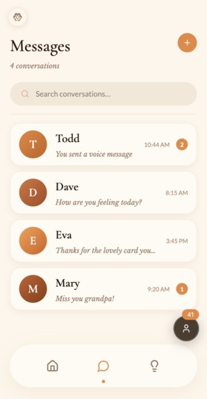
Messages
-
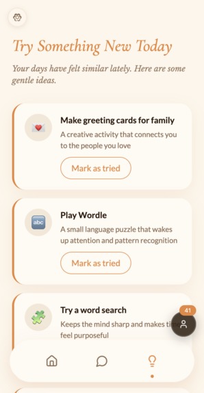
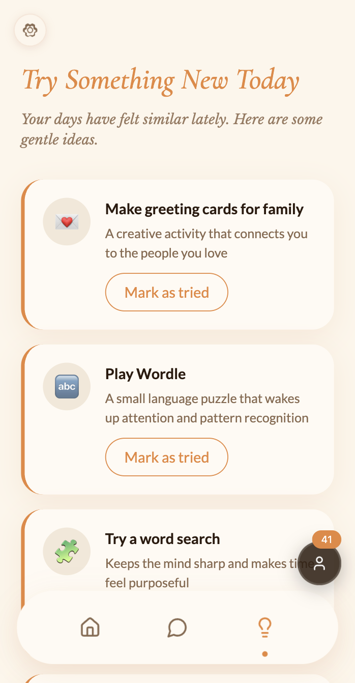
Novelty Ideas
-

Additional Data
-
Haven and Cairn
-

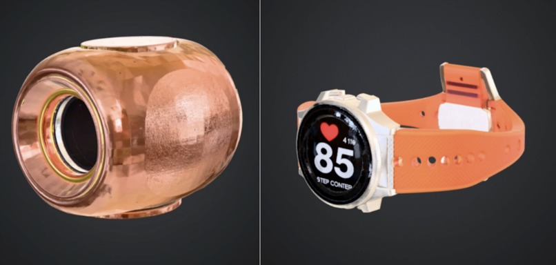
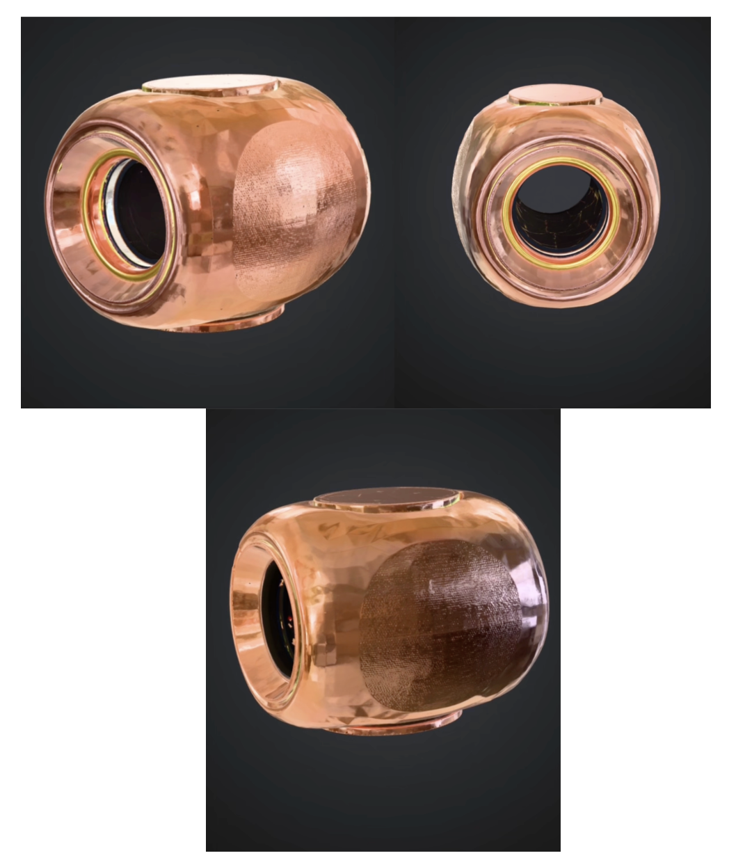
Haven 3D Render
-

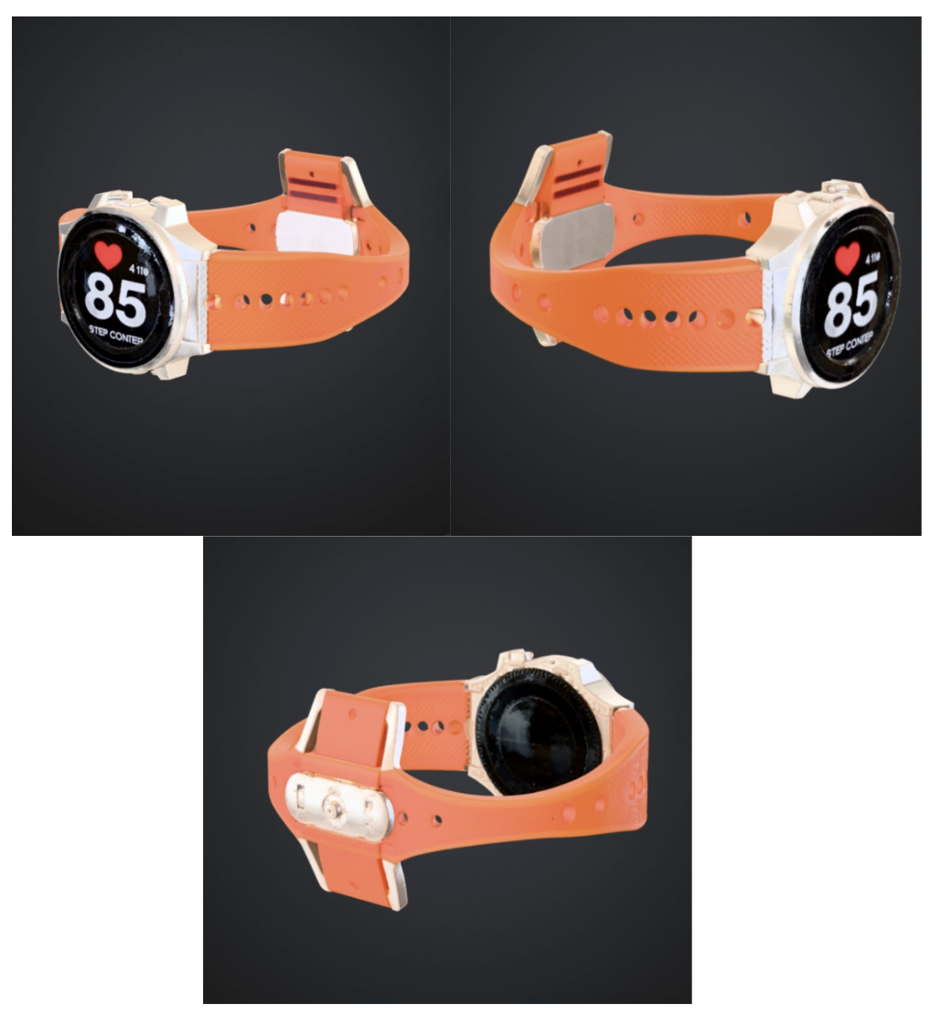
Cairn 3D Render


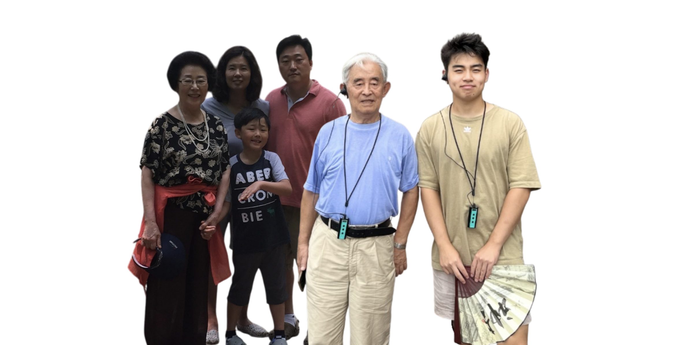

What Inspired Us
My grandmother described it quietly, almost like she was embarrassed. After my grandfather died and she retired, her days started to feel indistinguishable. James’ grandfather struggled similarly; he called his later years a long blur of identical Tuesdays. Although our doctors had explanations: depression, early-onset dementia, our families felt guilt and shame for not being there for them earlier on. What we didn’t know was that both of them were describing the same biological mechanism: a brain that had run out of reasons to hit record.
So, when James and I saw the prompt for this year’s FigBuild, we were instantly drawn to this idea. We dug into why our family members and so many elderly people across the world were feeling this way, and this is what we found. The root of this issue has a name: memory encoding density. When you’re young, everything is new, so your brain encodes life to its fullest. Everything from a scraped knee to a new face or cereal box is worth saving in your brain. But by adulthood, your brain is already familiar with the world, so it shifts into what we call predictive mode. Essentially, this is when the brain only records/remembers what is surprising to us. And routine basically becomes invisible. And the older you get, the stronger the routines become, and the faster your brain compresses everything. $$\hat{t} = \frac{N_{\text{frames}}}{k}$$
We came across this formula in our research called the perceived time formulation. \(N_{\text{frames}}\) is the number of distinct memory frames encoded, and \(k\) is a perceptual scaling constant. Essentially, the more novelty you come across in your life, the greater the number of frames there are. More frames = more perceived time. The oddball effect backs this: a surprising event is perceived as lasting longer in your brain than a familiar one, even when the duration is identical. We used this formulation to help calculate what is called the Time Texture Score in our app (reference How We Built It). But overall, the tragedy is simple. The more comfortable and predictable your life becomes, the faster your brain deletes your experience of it. For elderly people whose world can be repetitive and mundane, oftentimes, the compression is profound, and it can manifest as depression and cognitive decline.
What Is AMBER
Amber is a dual-view mobile companion built around a single neuroscientific insight: the brain only remembers what surprises it. As people age, their worlds grow more routine and predictable, and the brain, running its compression algorithm, stops finding reasons to record the days. Entire weeks disappear. Years blur. What looks like depression or cognitive decline often starts as something simpler: a life the brain has stopped finding worth saving.
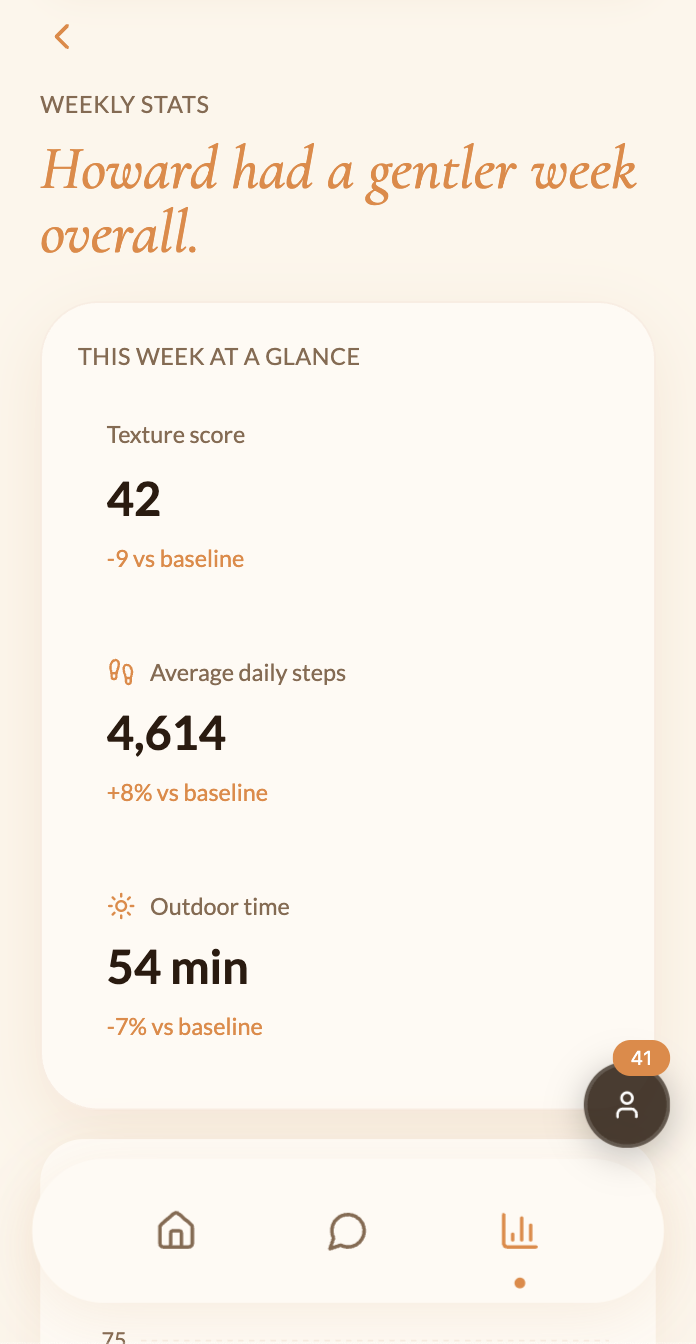
Amber addresses that directly. At its core is the Time Texture Score, a custom algorithm that quietly tracks four daily signals: movement, novelty, engagement, and memory anchoring. Those signals combine into a terrain visualization that shows the shape of the week. Peaks are the days that had texture. Valleys are the days that got compressed. Underneath the terrain sit memory anchors: small, named moments the brain actually kept.
The app has two completely separate views. The elderly user sees a simple daily companion that notices when the days are flattening and surfaces gentle activities to break the pattern: trivia, word searches, nature soundscapes, and chair yoga. Things specifically chosen because they introduce something unexpected into an otherwise routine day. The family member sees the same person's week as patterns rather than raw data: how much they moved, whether they tried something new, whether the terrain has been rising or falling, and knows exactly when to reach out.
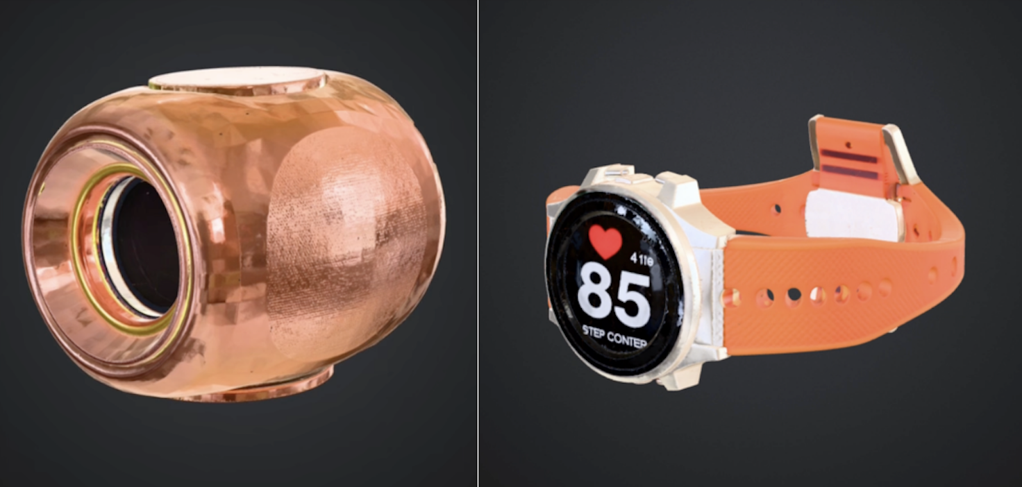
Completing the ecosystem are two physical products. Haven is a small home speaker that sits on the counter, tracks daily rhythms like movement and daylight, and listens to daily debrief conversations so the app always has the full picture. Cairn is a wrist watch that tracks heart rate, steps, and stillness, feeding real biometric data back into the Time Texture Score so the picture of how someone is doing is grounded in what their body is actually telling them.
What We Learned
We used Figma Make for prototyping, Figma Jam for brainstorming and user flow mapping, Figma Design for the design system, and component architecture to complete this prototype. We learned how to create a dual-view component system and how to manage a live API state without the app falling apart. We also learned how to build an AI model that will respond to your chats like a real person and how to create an algorithm based on actual data that became the base of our time texture score. But most importantly, we learned how to work through our disagreements and bounce ideas off of each other.
We’re a diverse team with diverse backgrounds, different family structures, and different relationships with aging. When we first started this build, we thought these differences would come up as friction - and they definitely did sometimes. We disagreed about what data the family view should show and what privacy entails in a wellness app. But something kept happening that we didn’t expect. James would describe his Thanksgiving visit to his grandfather, the long silences and the way the days seemed to have lost their edges, and I would go quiet because I knew how it felt exactly. Not because our families are similar. They're not, really.
But the fear of watching someone you love lose their grip on time is not cultural or geographic. That’s the thing, design doesn’t always teach you, and the most powerful brief you’ll ever get is the one that comes from something real.
How We Built It
(1) Brainstorming: In our first brainstorm, we removed all screens from our room. We just thought, what sensory experiences made our day feel real? We described our memories. The smell of something baking, a phone call that went longer than expected, the light flickering in the afternoon. We realized we wanted an app that could trace back to something like that. From that conversation, time texture emerged. This is the idea that days have density. Some days are full and layered, and others feel flat and forgettable.
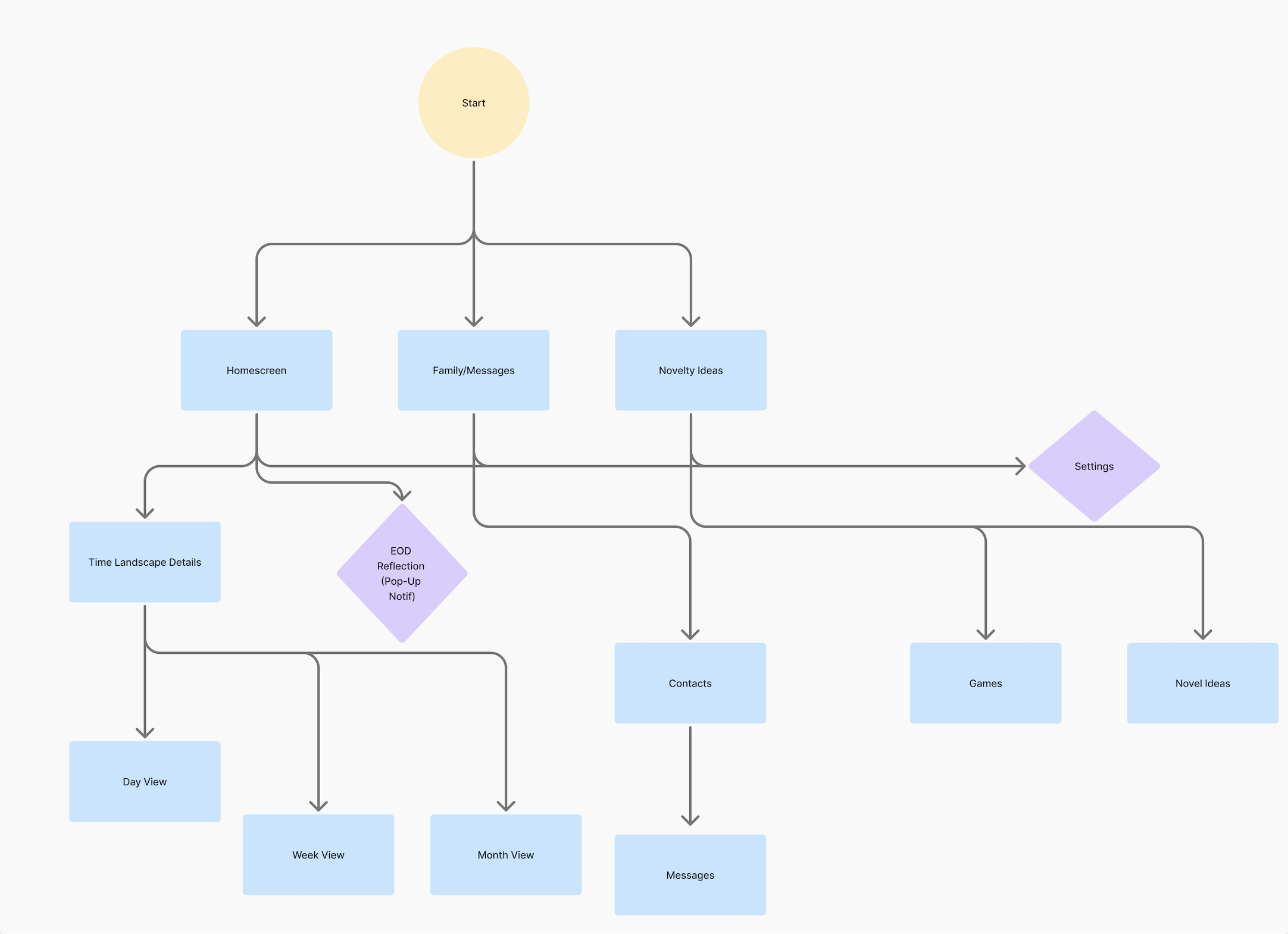
(2) User Flow Mapping: We mapped the user flows before touching any design tool. We covered every path a user could take, from opening the app for the first time to sending a message to marking an activity as complete. From that, we built wireframes. We went through three rounds of iterations, each one stripping away complexity to fit the needs of our elderly audience. We constantly kept in mind: Can someone in their 70s or 80s, with reduced dexterity, in low light, use our app comfortably? That further branched into our dual-view architecture. Amber needs to serve two completely different people simultaneously. The elderly user needs simplicity and warmth. The family member needs data and reassurance. (reference the User Flow and Wireframe images above).
(3) Visual Design: Next, we built the design in Figma Make. The color palette is as follows: Background (#FDF6EC), Primary amber (#E8873A), Deep amber (#C4601A), Card (#FFFAF3). The typography: Cormorant Garamond for display headings, Lato for body. Motion: Spring-based micro-animations on every interactive element, cubic-bezier(0.34, 1.56, 0.64, 1). We also added a grain texture at 4% opacity across all backgrounds to make the app feel more comfortable when transitioning.
(4) Time Texture Scores: Next was figuring out the time texture score calculation. This score quantifies how memorable a given day was likely to be, based on the neuroscience of memory encoding density. The score is calculated from four weighted signals: $$\text{TTS} = w_1 \cdot M + w_2 \cdot N + w_3 \cdot E + w_4 \cdot R$$
Where: M (Movement) is the steps taken and time outside, normalized against the user’s personal baseline. N (Novelty) is the number of new activities tried, weighted by how different they are from the user's routine. E (Engagement) is the number of messages sent, conversations had, games played, and time spent in active interaction. R (Memory Anchoring) is the specific named moments logged or detected in the day.
We weighted \(w_1 = 0.25\), \(w_2 = 0.35\), \(w_3 = 0.25\), \(w_4 = 0.15\), with novelty being weighted the highest. These scores are what create the Time Landscape. The peaks are high-time-texture days, and the valleys are compressed days. The scores are also what determine what the emoji of the day is and the labels that appear throughout the app. To build this at scale, we generated a custom AI database of realistic user profiles. Each user profile has months of historical signal data reflecting genuine human behavioral patterns. For example, Howard Fletcher, age 79, is a puzzle and games lover. Walter Price, age 81, is a quiet homebody. Each profile has a distinct texture signature as well. Howard's score spikes on days he plays trivia, and Walter's is low and flat most of the week with occasional peaks when his daughter visits. Try exploring our prototype with different mock users by clicking the persona icon in the lower right corner!
(5) The App: While iterating on Figma Make, we made sure to have no fake data. Every piece of information in Amber that looks real is real, pulled from live sources: Claude API (creates a conversation history so the AI prototype responds when you text in that chat), OpenTDB Trivia API, Official Joke API, Freesound API, Mixkit Audio Library, Google Fonts API, Phosphor Icons, Unsplash (for photo IDs in the chat threads).
(6) Additional Products: Alongside the Amber App, we also designed two physical products to complete the ecosystem. Both products were modeled in 3D to make the ecosystem feel like a real product family. (a) Haven: a speaker that can track movement and daylight changes. It can be used to record daily debriefs or conversations by the elderly user as a form of companionship. It can also hold calls between the family members and the user. (b) Cairn: a watch that tracks heart rate, steps, and stillness. This will track real biometric data in Amber’s Time Landscape and allow emergency notifications to family members. (reference the Haven and Cairn prototypes above!)
(7) User Testing: Before submitting, we user-tested with approx 20 friends and family members through a structured Google Form^1, targeting elderly adults or those who had a close elderly family member they communicated with regularly. This is the most common feedback. (a) Clarity: Some participants struggled to immediately understand what the Time Texture Score meant or why it mattered. This led us to restructure the entire explanatory code and create the emoji format. It also led us to add the "today felt quieter than usual" statement rather than "your score is 18." (b) Simplicity of Navigation: participants over 65 struggled with having too many options visible at once. This made them hesitant to tap anything. We reworked and stripped our screens down, which resulted in the minimal layouts with larger touch targets and generous white space.
The Challenges
A huge aspect of UX design is deciding who your audience is and how to cater your app to their liking. Every instinct in modern app design calls for more. More features, more options, more on the screen at once. For our users, we decided that would be actively harmful. A cluttered screen is counterintuitive for elderly users. So, instead, we emphasized larger touch targets and font sizes that felt almost too big. Every time we were tempted to add something, we had to ask ourselves: Does this earn its spot on the app, or are we doing it to look flashy?
Another feature we wanted to showcase was our dual-view architecture. Since our app is built for both family members and elderly users, there were a few difficult barriers. We spent a lot of time going back and forth on which data to show to the users and which to show to the family members. What information will create paranoia? What’s overkill? We decided that elderly users often don’t find much value in the nitty-gritty of their own data, but the family members do. So, we gave the family members an “Additional Data” section on their navigation bar, and exchanged that for a “Novelty Ideas” section for the users. Instead of having the users worry about their health or stats, the novelty ideas give the elderly a chance to try out new activities and boost their time texture score.
Lastly, much like all wellness apps, there was the concern about privacy. From step counts to heart rate to movement patterns and daily moods, we had to reckon with what this data meant ethically and legally. So, we went and researched it properly. Under the FDA’s updated 2026 General Wellness Guidance^2, only products that are noninvasive and pose little safety risk qualify as general wellness products. So, anything involving implants, lasers, or radiation falls outside this framework and may be subject to full medical device regulation. Amber, Cairn, and Haven are both noninvasive and make no diagnostic claims, which means they qualify for enforcement discretion, and the FDA does not intend to regulate them as medical devices.
However, Amber draws data from multiple sources, including a connected wearable. So, the FTC's July 2024 amendments to the Health Breach Notification Rule^3 apply. Most health app developers act as covered health care providers when they furnish health care services to consumers, and apps that sync with fitness trackers and are managed primarily for the individual are subject to the Rule. In practice, this shaped 3 rule decisions for us: (1) This is what we collect: movement (steps), heart rate, daylight exposure, and debrief summaries with the consent of the user. Nothing diagnostic and no values that mimic clinical thresholds or imply medical-grade measurement. (2) This is what is stored: Only what serves the user’s experience of their own time. Absolutely nothing is shared with third parties. Raw data older than 90 days is compressed into a summary form and deleted. (3) This is what the user controls: Settings → delete my data. This wipes everything with a single confirmation. The elderly user has full ownership of everything Amber knows about them. We made this a single step intentionally. The moment deleting your data feels complicated or buried, it stops being a real choice. So, we wanted privacy to be continuously accessible and a priority on our app. (4) This is how we prevent the family view from becoming surveillance: The elderly user can see exactly what their family member sees at all times. They can hide any data point from the family view at any time. And the family view shows weekly patterns, never real-time location or moment-by-moment activity. Raw daily data is never shown in isolation and it always appears in the context of a seven-day trend, so a single quiet day cannot be misread as a crisis. (5) This is how we protect against false negatives: The algorithm runs two separate systems that never interfere with each other. The first is relative: the Time Texture Score measures change against the user's personal baseline, which means it gets smarter and more accurate the longer someone uses it. The second is an absolute floor system: a set of hard thresholds that fire regardless of baseline, because some things are worth flagging no matter how quiet someone's life has always been. These thresholds are (1) fewer than 200 steps for three consecutive days, and (2) heart rate anomalies that fall outside healthy ranges for any adult. When the absolute floor system detects something, it sends one direct message to the family member: "We've noticed something that might be worth checking in about."
This conversation on privacy was one of the most meaningful parts of the whole process. It really forced us to be honest about what we were asking people to trust us with. If our grandparents, parents, and even our future selves were using our products, what data would we want shared? We built something that deserved our trust.
Accomplishments
We’re most proud of the fact that this started as something real and stayed that way. We didn't invent a user persona or manufacture a problem to solve. We walked into the room with our actual families, with my grandmother and James' grandfather, and we built something for them. That specificity shaped every decision. The font sizes, the touch targets, the way the memory anchors read like diary entries rather than activity logs, the reason the family view shows patterns instead of numbers. None of that came from a design principle. It came from knowing exactly who we were designing for.
We're also proud of the Time Texture Score. Taking a neuroscientific concept (memory encoding density, the oddball effect, the perceived time formulation) and turning it into a real working algorithm with weighted signals and a terrain visualization that actually means something is not a small thing. It would have been easy to slap a wellness score on the app and call it innovative. Instead we went back to the research, figured out what the brain actually responds to, and built the score around that. The math is real, the weights are justified, and when the terrain peaks on a day the user tried something new, it's the algorithm working exactly the way the science says it should.
What’s Next For AMBER
The prototype we built proves this time perception concept is real, and the experience is something people actually want. The next phase is about making it matter at scale.
Research and Validation: The most immediate priority is longitudinal research. We tested with approximately twenty people through a structured Google Form, and that feedback shaped the product in meaningful ways. But the real question is whether improvements in the Time Texture Score actually correlate with improved subjective well-being over time. This requires ninety days with elderly participants who actually live inside the experience. That study will be the foundation on which everything else is built.
Product Development: Haven needs its full voice. The version we want to build lets the elderly user debrief their day conversationally, just talking, the way you'd tell someone how it went over dinner, and feeds those conversations back into the memory anchor system automatically. Cairn needs its emergency layer: the ability to detect genuine health deviations through quiet pattern recognition rather than clinical alarms, surfacing a gentle nudge to the family member when something is worth checking on.
Access and Equity: Haven and Cairn are physical products with real costs. The people who need Amber most are often the ones least able to afford a hardware ecosystem. We want to build a software-only mode that delivers the core experience, the Time Texture Score, the novelty ideas, the family view, and the memory anchors, using nothing but a smartphone.
Regulatory and Ethical Considerations: Right now, Amber sits within the FDA's general wellness guidance, as it is noninvasive and has no diagnostic claims. But as the algorithm gets richer and the data gets deeper, that line may shift. We would rather define our own ceiling before we approach it. We are actively thinking about what data Amber should never collect, what insights it should never surface, and what it means to be genuinely trusted with the daily texture of someone's life.
Citations and Footnotes:
Built With
- api
- css
- custom-user-database
- figma
- freesound-api
- google-fonts-api
- html
- javascript
- mixkit-audio-library
- official-joke-api
- opentdb-api
- phosphor-icons-api
- react
- unsplash-images-api


")

Log in or sign up for Devpost to join the conversation.