-
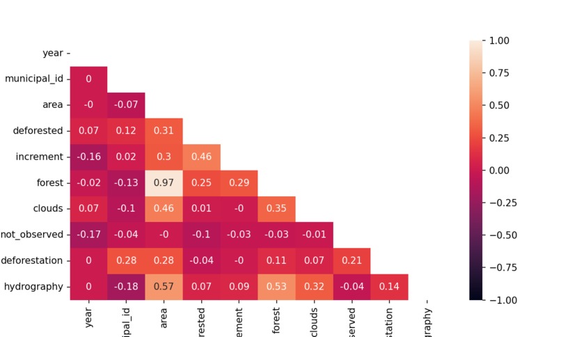
heat map representing correlation between data points
-
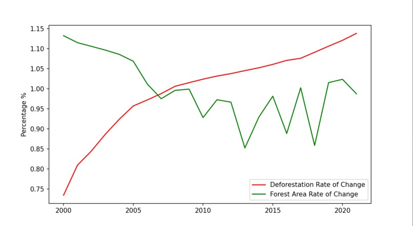
deforestation rate vs overall forest rate whole country
-
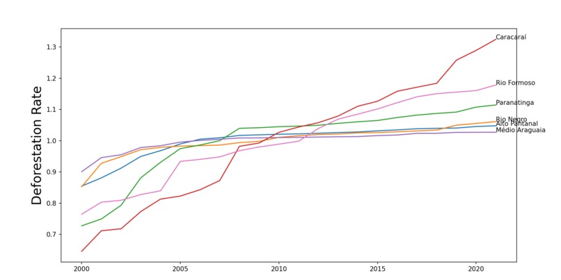
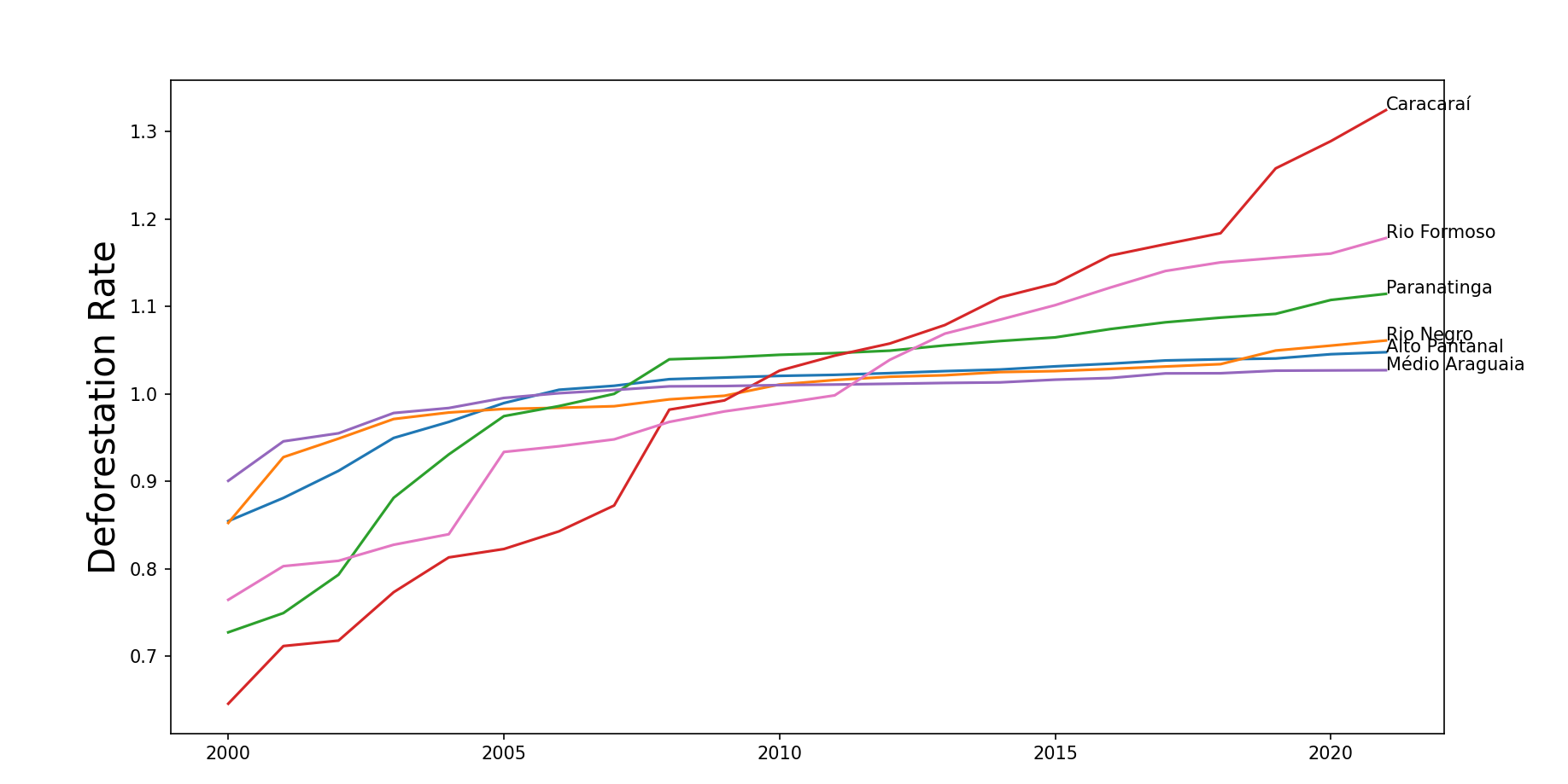
deforestation county specific

Inspiration
The source of inspiration for this project is the way that a lot of governments poorly handle their climate situations, where they allocate resources all equally to areas rather than where it is needed.
What it does
This program creates graphical depictions of the Amazon Rainforest deforestation with a correlation heat chart, a line graph showing the overall rate of change, and another line graph showing the county-specific rates.
How we built it
In our code, we first started off by importing all of the necessary modules, which range from Pandas to SKlearn. Then, we took the data and imported it into our program using sets and lists, which allows us to utilize it. With this, we were able to give you our a correlation heat map. After that, it shows a graph with two lines plotted, the red represents the Deforestation Rate of Change while the green is the Forest Area Rate of Change. Our next graph shows the current Deforestation Rates among Brazilian states. We also had 3 input files, which was a general data file, a counties file, and a states file.
Challenges we ran into
We were originally planning to use machine learning to predict future patterns with the deforestation, but ran into issues with the implementation after writing all the code.
Accomplishments that we're proud of
Being able to make very accurate visualizations despite being somewhat new to working with large datasets like this is a great achievement.
What we learned
It is important to study a lot of the syntax of a situation rather than just the way it is implemented so that it is easier to troubleshoot and truly understand the error.
What's next for Amazon Rainforest Deforestation Analysis
Continue to work on the machine learning aspect of the project so that it can predict future patterns.
Built With
- python
- vs-code

Log in or sign up for Devpost to join the conversation.