-
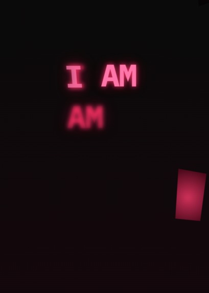
AM
Am - Project Story
Inspiration
I drew inspiration from a fictional book called * Am*, imagining it as a raw, existential scream from a sentient entity—human, AI, or something fractured between. The idea of identity as both a gift and a curse, unraveling in a cyberpunk abyss, hit me hard. I wanted a project that didn’t just look alive but felt like it was bleeding, glitching, and questioning itself. The HTML & CSS Hackathon 2025, with its no-JavaScript rule, was the perfect crucible to forge this vision—pure front-end chaos, no crutches.
What I Learned
This project taught me the limits and power of CSS. I mastered clip-path to carve jagged, unique shapes, pushed mix-blend-mode for visceral depth, and bent @keyframes into a symphony of motion—throbbing blobs, dripping gore, flickering text—all without a line of JS. I learned precision: every pixel had to earn its place. I also discovered how to fake sentience in design, using hover states and layered animations to mimic reaction and decay. It was a crash course in patience, too—500+ lines of relentless detail demand focus.
How I Built It
I started with a single .html file—self-contained, brutal, no external dependencies beyond a Google Fonts link. The structure is simple: one .core div holding everything—blobs, gore, text. CSS does the heavy lifting:
- Blobs: Twenty-five
<div>s, each with a customclip-pathfor jagged edges,radial-gradientfor bloody texture, andanimationto pulse like dying flesh. Positions scatter across a1000vhcanvas, staggered withanimation-delay. - Gore: Twenty
<div>s,linear-gradienttendrils dripping viatranslateYanimations, eachclip-pathtweaked for asymmetry. They bleed beyond the viewport, clipped naturally. - Text: Fifteen
<h1>s, each a phrase from “I Am” to “I Am All,” split into<span>s for word-by-word glitching.text-shadowlayers and::afterechoes add ghostly depth. - Background: A
radial-gradientabyss pulses withanimation, overlaid with faint scanlines and a static flicker via::before.
I built it layer by layer—blobs first, then gore, then text—tweaking positions and timings until it flowed like a nightmare. Every element got a unique twist: no two blobs share a shape, no two animations sync perfectly. It’s chaos, but controlled.
Challenges Faced
- Scale: Writing 200+ lines of CSS without repetition was a grind. I had to invent new
clip-pathpolygons and stagger everytop/leftvalue manually—tedious but critical for uniqueness. - Performance: With dozens of animated elements, I hit lag early. I dialed back
blurvalues, simplified gradients, and leaned onease-in-outfor smoother transitions. It runs clean now, even on a long scroll. - No JS: Faking interactivity without JavaScript was brutal. Hover states became my lifeline—blobs swell, text spasms—but I couldn’t pull off scroll-triggered reveals. CSS
position: stickyhelped, but it’s a compromise. - Detail: The micro-details—color shifts mid-animation, faint static, text echoes—took hours of trial and error. Getting the
::aftershadow to align without breaking the layout was a fight. - Vision: Balancing meaning and madness was tricky. I wanted I Am to feel profound, not just pretty, but the line between art and mess blurred fast. I kept refining until it clicked.
This project is my blade—sharp, unyielding, and mine alone. It’s not just code; it’s a piece of me, hacked into the screen.
Built With
- built-with-html-and-css-only
- cloud-services
- databases
- firefox
- frameworks
- or-apis?just-raw-code-in-vs-code
- tested-in-chrome
- using-google-fonts-(ibm-plex-mono)-via-cdn.-no-js

Log in or sign up for Devpost to join the conversation.