-
-
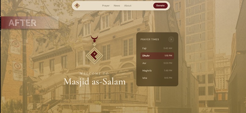
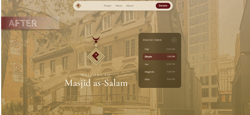
After: Homepage
-
Before: Homepage
-
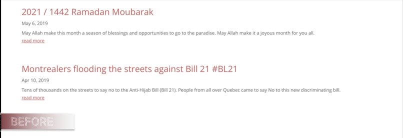
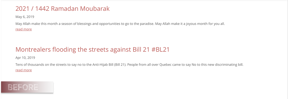
Before: Events/News Announcements
-
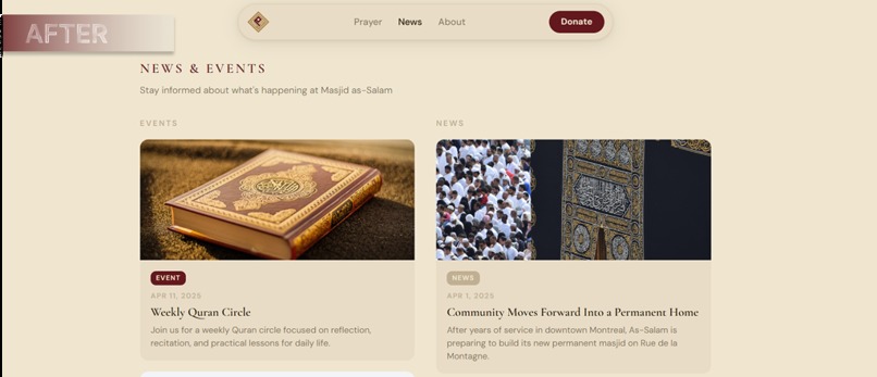
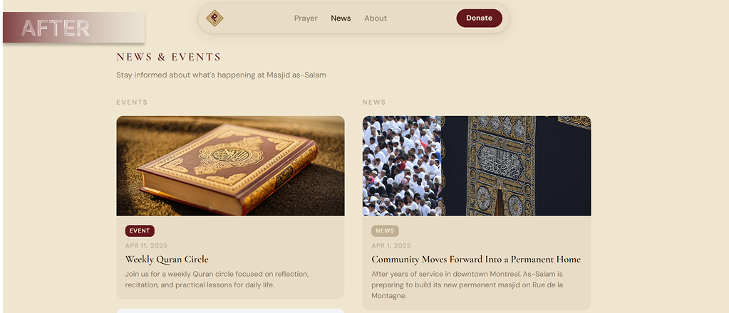
After: Events/News Announcements
-
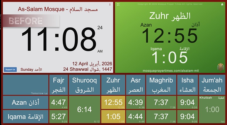
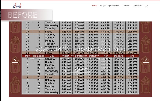
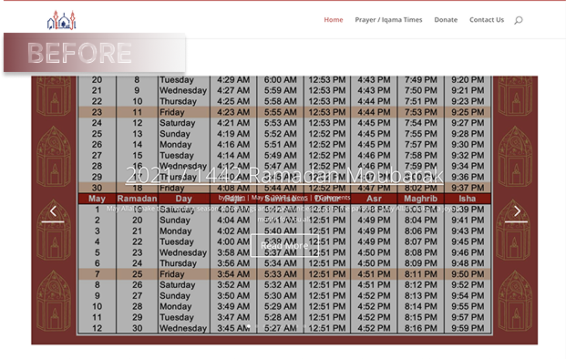
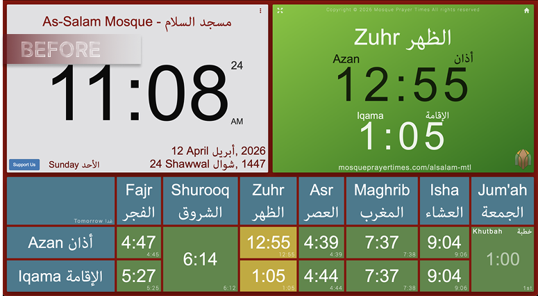
Before: Prayer Times
-
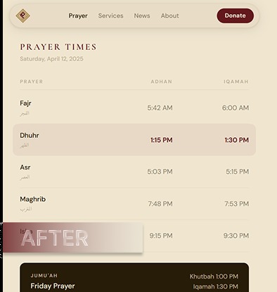
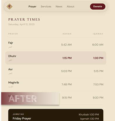
After: Prayer Times
-
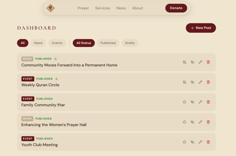
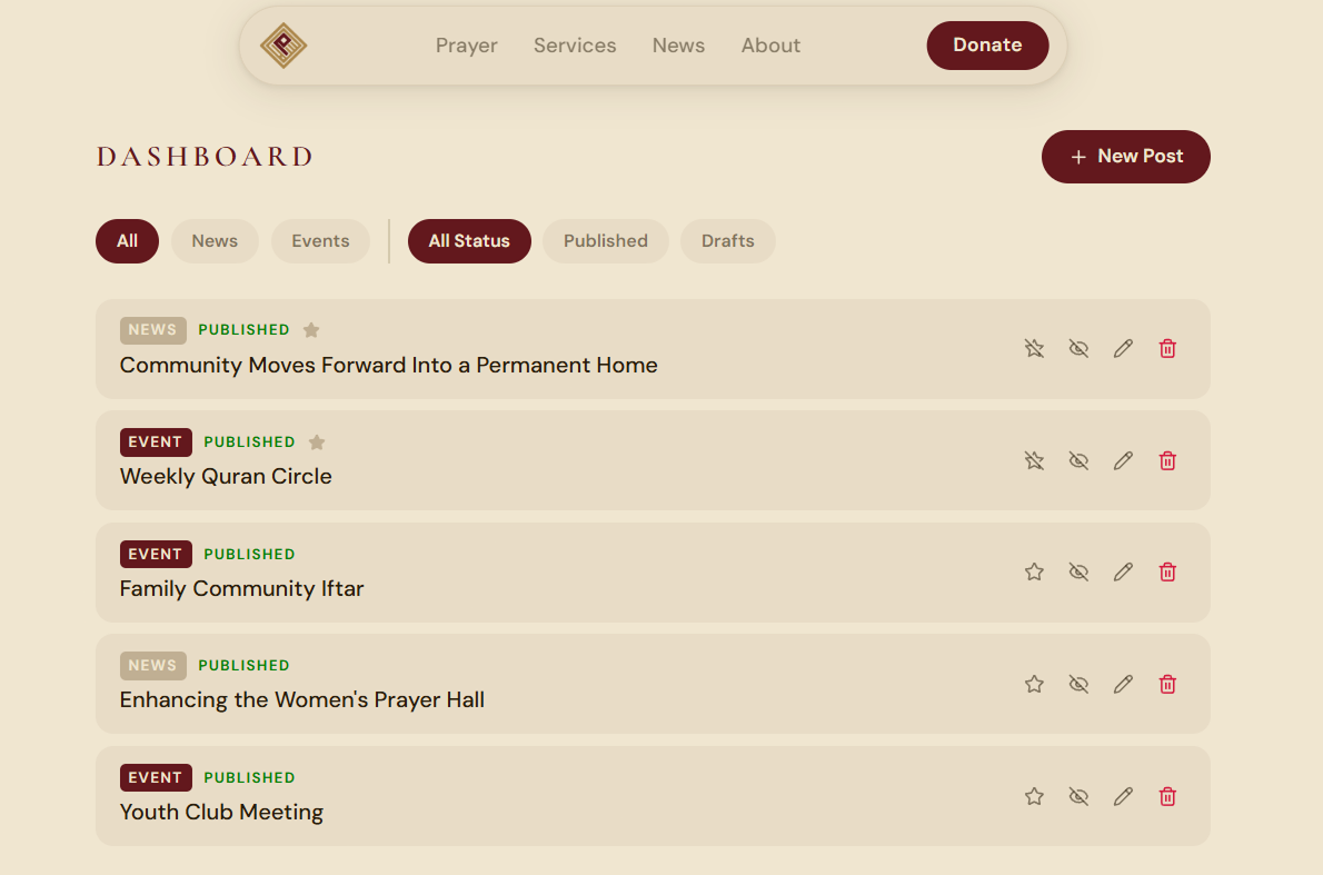
Admin Dashboard to Add new Events/News
-
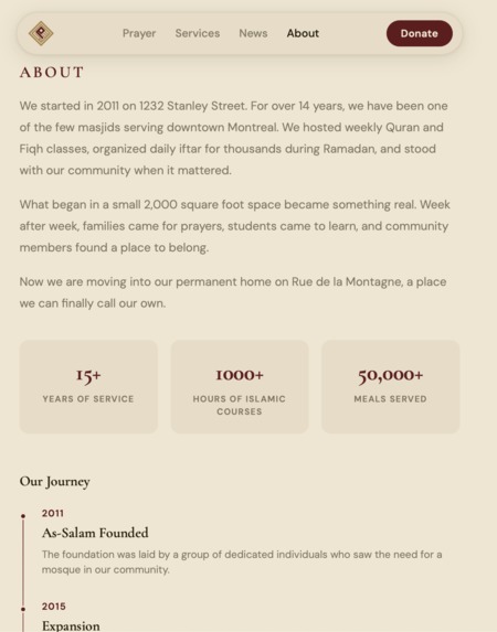
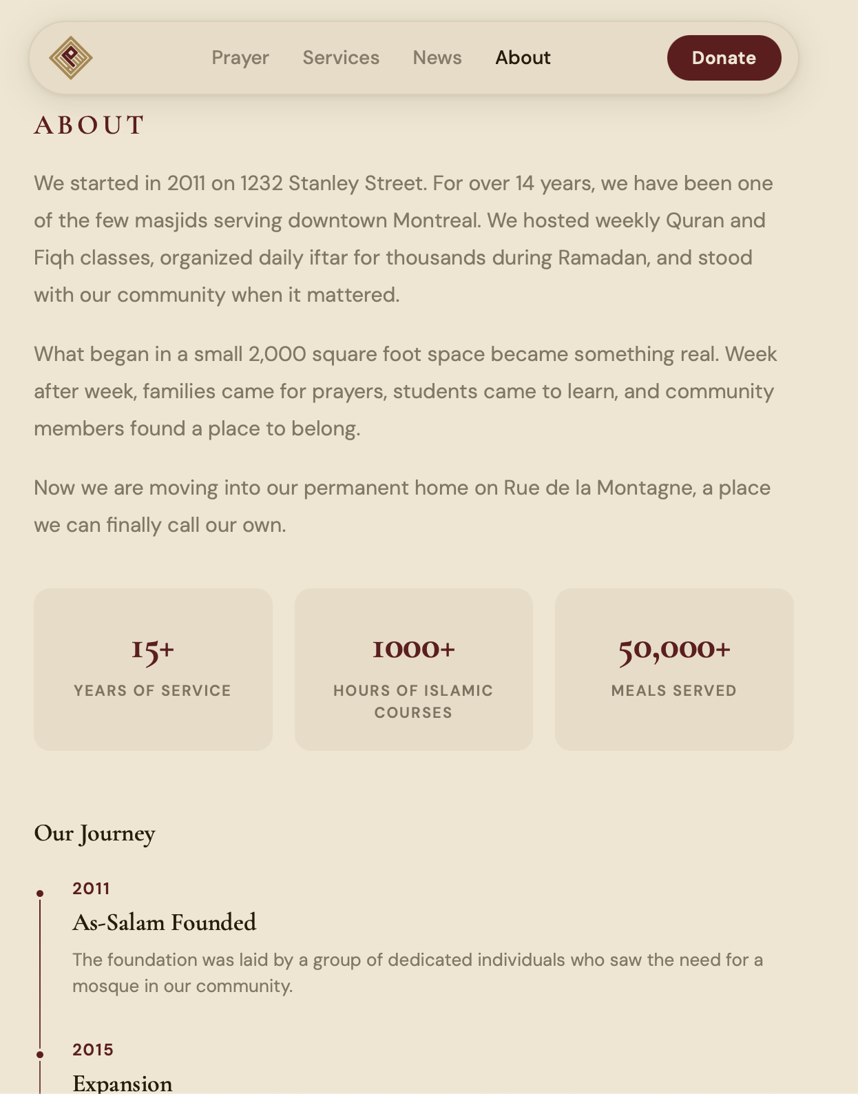
About Us Section
-
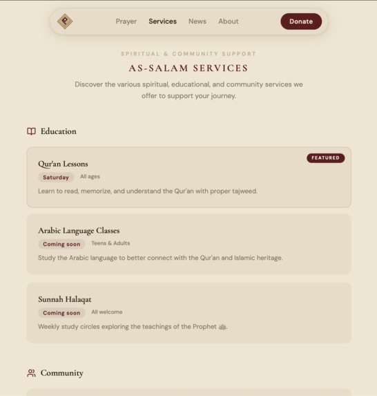
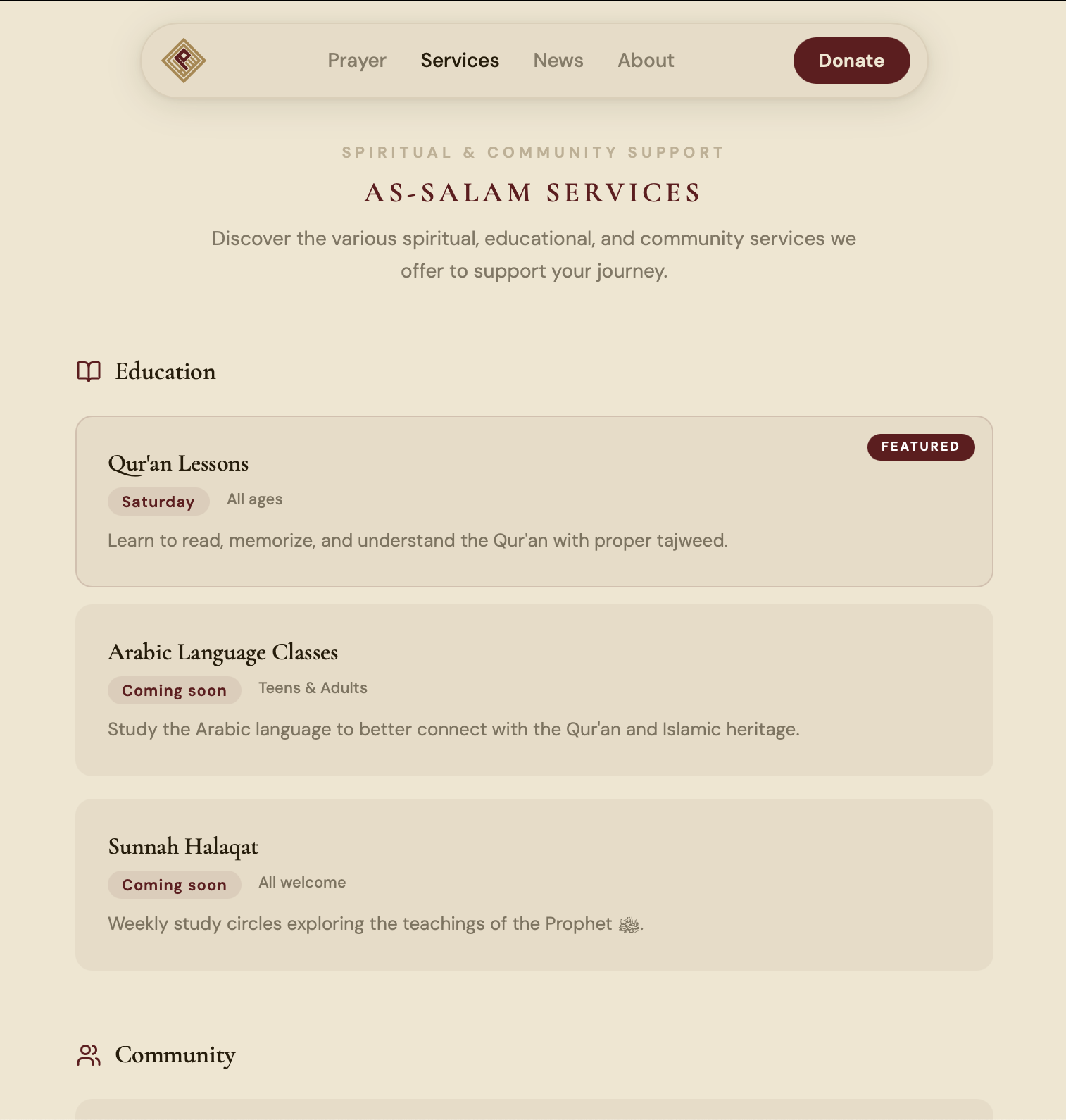
Services Offered Section
Inspiration
As students in Montreal, we have spent a lot of time in mosques that gave us a real sense of belonging, community, and stability. Masjid Al-Salam was one of those places for us. Since coming to McGill, it has been a space where we prayed, learned, and connected with other Muslims in the city.
We wanted to give back in a way that matched our strengths. Web design and UI are areas we genuinely enjoy, so redesigning a mosque website felt meaningful to us. We chose Masjid Al-Salam because of its impact on the downtown Montreal Muslim community and because we felt there was an opportunity to present its story, services, and events in a clearer and more beautiful way.
What it does
Our project is a modern UI redesign for Masjid Al-Salam’s website.
It creates a cleaner and more welcoming digital experience focused on clarity, trust, and community engagement. The redesign includes an About Us page that tells the mosque’s story, a News section separated into Events and News, individual pages for announcements and events, and an Admin Dashboard concept that allows mosque administrators to manage content in a simple and intuitive way.
We also designed the experience with mobile users in mind, since many people in the community will likely access the site from their phones.
How we built it
We began by analyzing mosque and Islamic organization websites to understand what design patterns were already working well. Using Reform, we studied competitors and found strong UI ideas in websites such as Haramain and similar platforms. That helped us identify the types of layouts, content blocks, and visual structure that felt trustworthy and polished.
After that, we moved into Figma to design the overall UI direction and map out the page structure. Once we had a clearer design vision, we used Claude together with the Superpower MCP by obra to build the initial skeleton of the website and turn our ideas into working components more quickly.
We also used Reform during the process to improve our interface and explore additional design directions. Since the platform was under heavy usage and token limits became restrictive, we shifted back to Claude and Superpower MCP for the remaining implementation work. That workflow helped us move faster while keeping more control over the final product.
Challenges we ran into
One of the biggest challenges was working with the tools under hackathon pressure. While Reform was helpful for competitor analysis and UI exploration, it could be unstable at key moments. Changes sometimes took a long time to apply, and there were multiple times where the site crashed and forced us to restart parts of the UI process from scratch. The same thing happened during competitor analysis, where the process had to restart several times, likely because of platform traffic and heavy usage.
Another challenge was figuring out how to prompt Reform effectively. Getting strong and relevant competitor references was not always straightforward, and the workflow for doing this was not fully obvious at first. We had to experiment quite a bit before we started getting useful outputs that actually helped shape our design direction.
On the implementation side, we also ran into issues with custom visual assets. Integrating SVG files into the website was more difficult than expected, especially with the 3D spinning logo that we created ourselves in Blender. Bringing those assets into the frontend cleanly while preserving the intended visual quality took extra time and troubleshooting.
Claude also helped us move quickly, but like any fast development workflow, it came with its own friction. Some iterations required repeated adjustments, and getting the generated UI to match our exact design intent still required careful back and forth. Managing that process while staying within hackathon time constraints was a challenge in itself.
Accomplishments that we're proud of
We are proud that we built a polished redesign for a real community institution that means something to us personally.
We are also proud that the project feels grounded in a real use case. We thought carefully about how a mosque should communicate its story, how events and announcements should be organized, and how an admin could realistically manage that content through a clean dashboard.
We are especially happy with the visual direction, the structure of the content experience, and the effort we put into making the site feel warm, modern, and community-centered.
What we learned
We learned how important it is to stay flexible when project assumptions change. Discovering that the mosque already had a newer website forced us to rethink our direction quickly and make stronger design decisions.
We also learned a lot about combining design tools and AI-assisted workflows. Figma helped us shape the vision, Reform helped us study and refine UI patterns, and Claude with Superpower MCP helped us turn those ideas into a working product. We also got hands-on experience dealing with the practical side of implementation, especially when integrating more custom visual assets like SVG graphics and Blender-based elements.
What's next for AlSalam Mosque UI Redesign
The next step is to turn the prototype into a fully functional platform.
We want to connect the admin dashboard to a real backend so mosque administrators can publish events and news directly from the site. We also want to complete homepage integration for featured posts, improve the content workflow, and continue refining the mobile experience.
Long term, we would love to evolve this into a production-ready platform that could genuinely serve a mosque community and make it easier for administrators to keep people informed, connected, and engaged.
Important Note for Vercel Link
The SVG logo (the one that spins) might take some time to load. Give it a couple of seconds and it will appear.


Log in or sign up for Devpost to join the conversation.