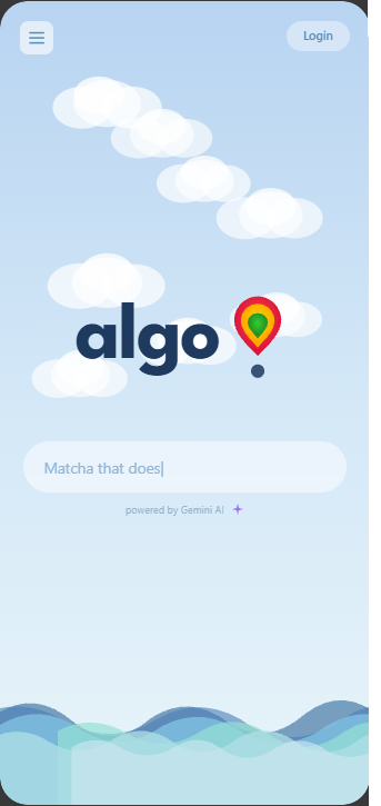
Algo
Rediscover the places your city forgot to tell you about.
Inspiration
People don’t struggle to find places — they struggle to find the right place for how they feel.
Apps like Google Maps and Yelp overwhelm users with popularity-driven results: thousands of reviews, sponsored listings, and trending spots. That works if you want “the best-rated café.”
It fails if you just want somewhere to exist — quietly, comfortably, intentionally.
We noticed a pattern:
- People open these apps → get overwhelmed
- Default to the same 2–3 places
- Or give up entirely
The problem isn’t lack of options.
It’s too much noise and not enough signal.
Algo was built to reverse that.
What it does
Algo is a mood-first place discovery app.
Instead of asking:
“What’s nearby?”
It asks:
“How do you want to feel right now?”
From there, Algo:
- Translates mood → environment (calm, social, focused, etc.)
- Surfaces 3–5 highly relevant places (not 200)
- Prioritizes overlooked, low-visibility spots
- Filters out chains, ads, and algorithmically inflated locations
Core principles:
- Mood-first, not filter-first
- Obscurity is a feature, not a bug
- Clarity over choice overload
The result:
You don’t scroll. You decide.
How we built it
This is a design-first prototype, not a full production system.
We focused on:
- Discovery flow:
From vague intent → confident recommendation - Mood input system:
Translating human feeling into structured signals - Place cards:
Emphasizing vibe, energy, and context over raw ratings - Minimal UI:
Reducing cognitive load at every step
Conceptually, the recommendation logic:
- Downranks high-review, high-traffic places
- Prioritizes smaller, consistent, local spots
- Uses qualitative signals (vibe, noise level, social density)
Challenges we ran into
1. Translating “vibe” into something usable
“Quiet,” “cozy,” and “low-energy” sound similar — but they’re not identical.
We had to define distinct emotional states that map cleanly to places.
2. Avoiding fake differentiation
It’s easy to say “we’re not Yelp.”
It’s harder to actually design something that doesn’t behave like Yelp underneath.
We had to constantly ask:
Are we simplifying — or just hiding complexity?
3. Constraint vs. usefulness
Showing only 3–5 results creates clarity…
…but risks missing something better.
We intentionally chose confidence over completeness.
Accomplishments that we’re proud of
- A clear, non-generic product thesis (not “better recommendations,” but different logic entirely)
- A UI that feels calm and decisive, not overwhelming
- Strong thematic alignment:
- Lost & Found → rediscovering overlooked places
- Chaos → Clarity → reducing decision fatigue
- Lost & Found → rediscovering overlooked places
- Avoiding feature creep — we stayed focused on the core experience
What we learned
- Most discovery products optimize for engagement, not decision-making
- Less choice → more satisfaction (if trust is high)
- “Vibe” is a powerful but underutilized input dimension
- Good design isn’t about adding features — it’s about removing noise
Also:
If your product can be replaced by better filters in an existing app,
you don’t have a product — you have a UI tweak.
What’s next for Algo
This is where things get real.
1. Real data layer
- Lightweight user-submitted “vibe tags”
- Passive signals (time of day, crowd density trends)
2. Trust-building system
- Micro-reviews (short, structured, vibe-focused)
- Weighting consistency over volume
3. Personalization
- Learning individual preference patterns over time
- Adapting recommendations based on behavior, not just input
4. Expansion beyond places
- “Where should I go” → “How should I spend this moment”
- Parks, spaces, events, and non-commercial environments
One-line pitch
A place-discovery app that cuts through algorithmic popularity to surface quiet, overlooked spots that actually match how you want to feel.
Canva presentation: https://canva.link/khue3ebzhavwisr
Built With
- figma


Log in or sign up for Devpost to join the conversation.