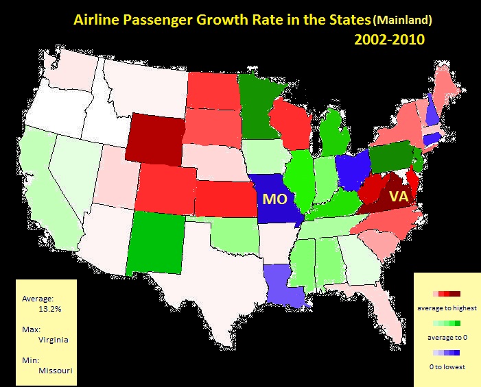
This picture shows the airline passenger growth rate in U.S.mainland from 2002 to 2010. The average growth in the country is 13.2%. TheStates marked in red represent their growth rates are larger than the average.The dark red means a higher growth rate. The States marked in green represent thattheir growth rate is between the average and 0. Pale green means the rate isclose to the average and dark green means the rate is close to 0. The States markedin blue represent their rates are negative, which tells the number ofpassengers decrease. Dark blue means a higher decrease rate. This data visualization product reveals the regionalcharacteristics of airline industry. For example, the growth in Western UnitedState is approximately the average level while in the Mid-West, the growth isconsidered to be beyond average. This product may instruct the investors on their decision.Although the development of airline industry is hugely influenced by 9/11,increasing labor costs, added security requirements and high fuel price, thedemand of air transportation, based on the data, is still increasing. To get abetter reward, investors should focus on the states that possess the higherpassenger growth rate, which is marked in red in this picture.
Airline Passenger Growth Rate
Updates

Leave feedback in the comments!
Log in or sign up for Devpost to join the conversation.