-
-
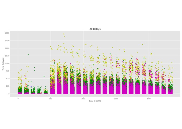
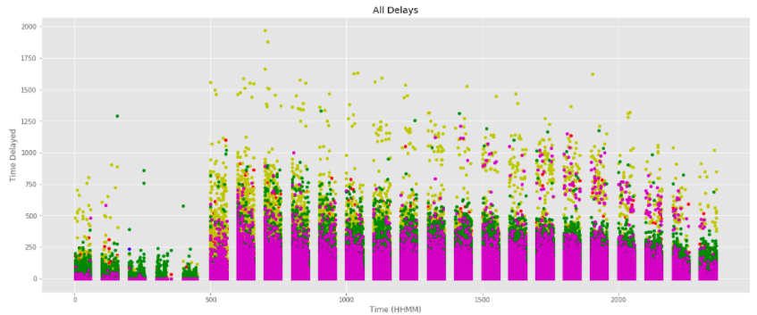
All Types of Delays Over Time
-
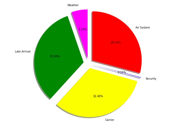
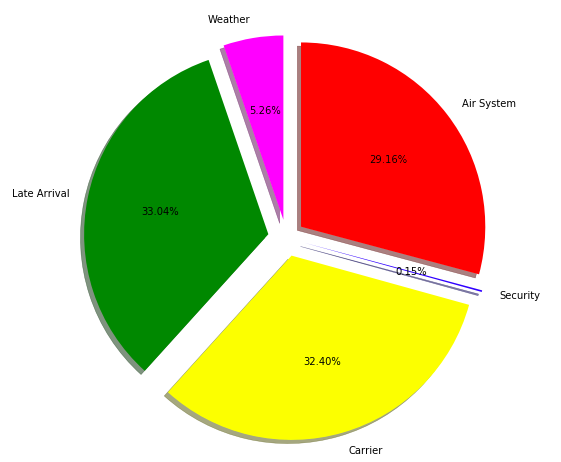
Percentage of Each Delay
-
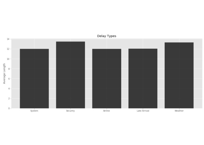
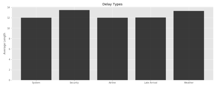
Average Delay Time
Inspiration
I love airplanes and big data is bae
What it does
Analysis of airline delay data with some 'fancy' visualization.
How I built it
I created all the visualizations with a Jupyter Notebook which utilized Python's analytical libraries: Pandas & Numpy. I also gained access to a Department of Transportation .CSV file that contained all the information I needed for airline delays in 2015 (https://www.kaggle.com/usdot/flight-delays/data).
Challenges I ran into
My biggest struggle was figuring out the little differences between using pandas to plot vs. using matplotlib to make visualizations. Also, the lack of time and lack of creativity definitely impeded our process to create more visualizations. One of the biggest surprises I found, was the lack of online resources to help me create these visualizations. A lot of the problems I had, I fixed simply by looking at many different solutions online and figure out a way to manipulate the information to fix my problem.
Accomplishments that I'm proud of
I feel super accomplished that I produced some reasonable visualizations and created, hopefully, something compelling and worth-while.
What I learned
I learned a ton about plotting and how to wrangle data, googling for help, different ways to approach data, etc. Overall a great experience.
What's next for Airline Delays Visualization
Not quite sure, maybe more data wrangling to look for different aspects of travel that could be fixed.

Log in or sign up for Devpost to join the conversation.