-
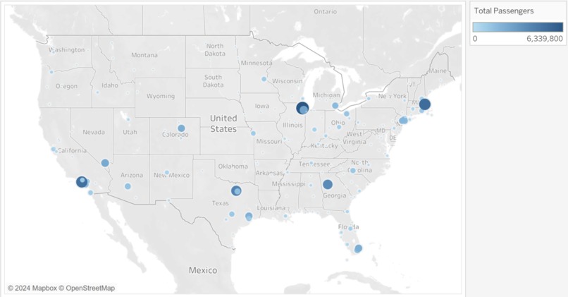
Heatmap of US Airport Passenger Traffic

Inspiration
At first, we decided to come up with analysis of our own. What insights can be draw? What business action can we suggest? What industry trends can we recognize? We soon realized that we can never really extract everything from the expansive data available. In lieu of that, we decided to also craft an interactive tool to aid others in easily and accurately visualizing relevant data to allow users to extract meaning on their own!
What it does
Our tool is a Streamlit Python web-app that shows key data visualizations comparing the top airports for inbound and outbound passenger traffic. It has a map visualization to show a geographic representation of all airport traffic in the US with size and color differences to show passenger counts. There are 2 line charts for the top 10 inbound and outbound airports to show their trends and growth over time. We also have a tool where the user can compare the passenger flow between 2 airports over time.
How we built it
We utilized pandas and numpy for data preprocessing, while scikit-learn was employed to build our time series regression model. The app itself was developed using Streamlit, and we created all visualizations using Matplotlib.
Challenges we ran into
We wanted to find a way to have the user be able to interact with our data, which led to challenges in code structure so that it was flexible for user input and showed meaningful comparisons. We also overcame challenges in making the data geographically represented and getting the correct counts of the daily average data as it was split many times.
Accomplishments that we're proud of
We are proud of creating a useful visualization through the analyzed data. We aspired to create a tool that would be a method for a user to access the useful custom data visualizations instead of relying on static images.
What's next for Air Travel Analysis Tool
We would want to expand on this tool to have more analysis and visualization features and capabilities. In its current phase, it allows for some powerful and simple analysis, but we would want to have more ways for a user to interact with air travel data. This could include the ability to compare several variables across time, visualize more on a single graph, and allow for more customizable capabilities to maximize a user’s vision of an analysis!
Built With
- anaconda
- jupyter
- python
- scikit-learn
- streamlit

Log in or sign up for Devpost to join the conversation.