Inspiration
The quality of air condition in Taiwan used to be pretty good. However, in recent years, the quality becomes worse and worse every year. People never experienced such blur eyesight before. Many people claim that with the rapid development of environment demanding industries, the quality of air rapidly worsen. Yet, some might argue that it is due to the air pollutions brought by the wind blows from China, instead of those local factories.
What it does
In our final project, we utilize the geographical and time-series visualization techniques to help people find out the possible causes of air pollution; to help people predict future air conditions based on the current pattern; to help people make decisions like "which city should I travel for health concern?" or "In which area should we enforce environmental protection regulations?".
Our system contains following components:
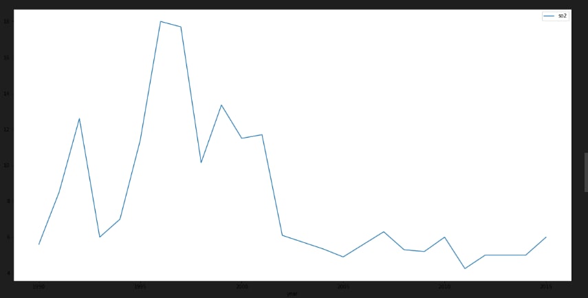
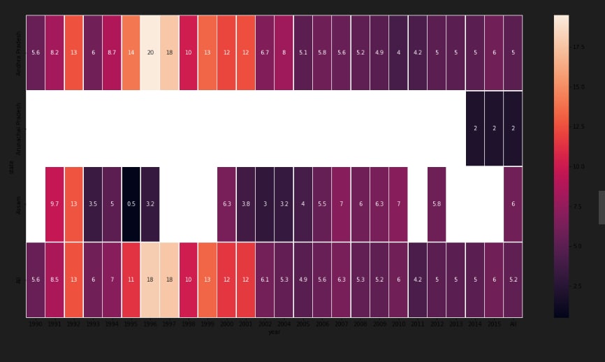
A time-series line chart - which displays all historical data in five years; A circular heatmap - which reveals the change patterns of values in a yearly-base; A parallel coordinate - which compares the relations between specific pollutants (at most four items); A scatter plot matrix - which helps users identify correlation between different variables.
How we built it
using python and data visualisation Our system is very user-interactive. The users could click on the Google map to see the air pollution data on that location. Also, they could select several variables to analyze their correlation via drop-down lists. They could select a specific time period of data to focus on further detailed information and changes by using the adjustable timeline. '''code: !pip install geopandas
Import useful libraries
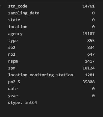
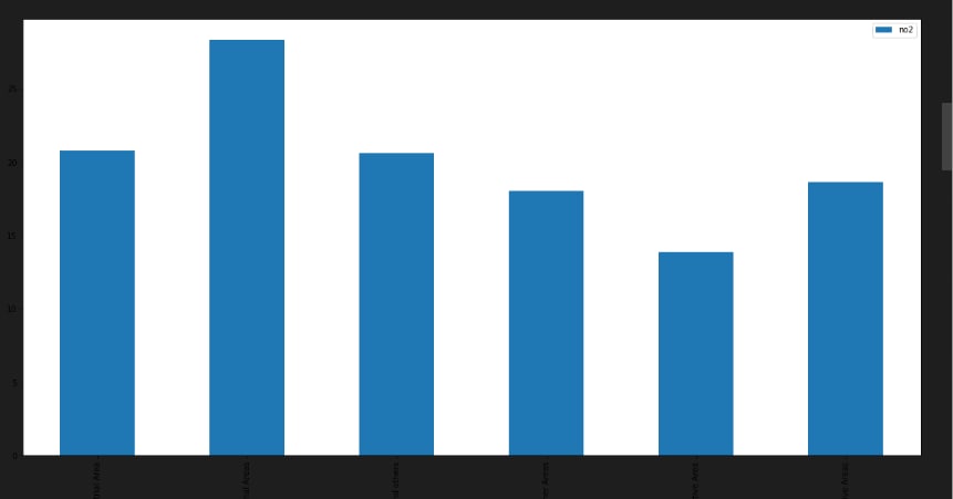
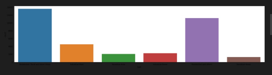
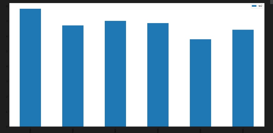
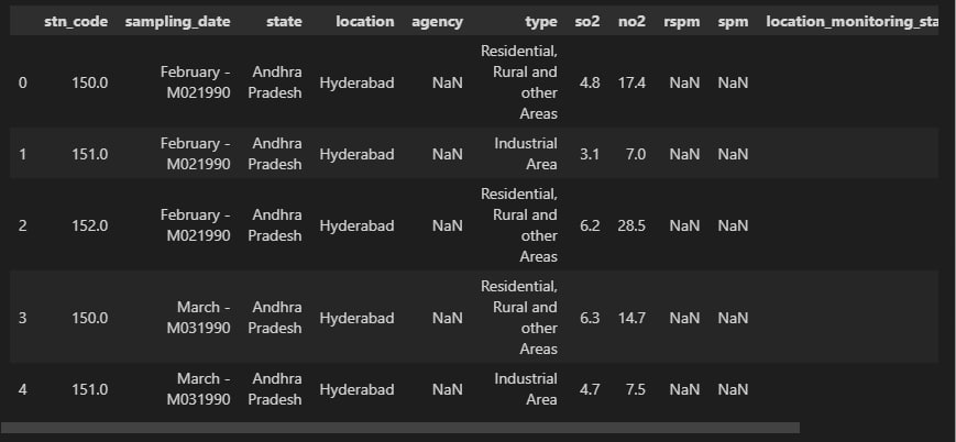
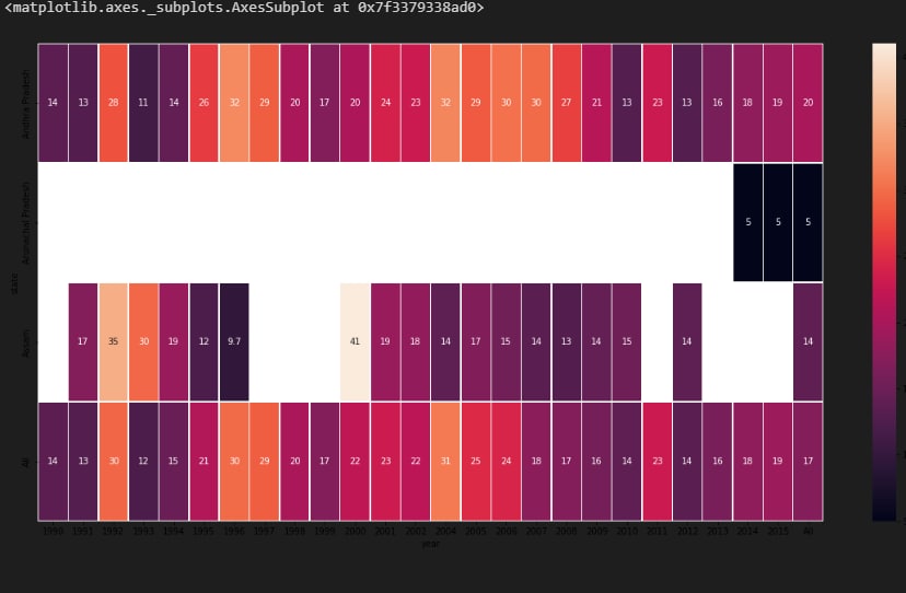
import pandas as pd import numpy as np import seaborn as sns import matplotlib.pyplot as plt import geopandas as gpd df = pd.read_csv("data.csv", encoding = "ISO-8859-1") df.head() df['date'] = pd.to_datetime(df['date'],format='%Y-%m-%d') # date parse df['year'] = df['date'].dt.year # year df['year'] = df['year'].fillna(0.0).astype(int) df = df[df['year']>0] df.shape df.dtypes.value_counts() df.isnull().sum() def printNullValues(df): total = df.isnull().sum().sort_values(ascending = False) total = total[df.isnull().sum().sort_values(ascending = False) != 0] percent = total / len(df) * 100 percent = percent[df.isnull().sum().sort_values(ascending = False) != 0] concat = pd.concat([total, percent], axis=1, keys=['Total','Percent']) # print(percent) print (concat) print ( "----------------------------------------------") printNullValues(df) df["type"].value_counts() sns.catplot(x = "type", kind = "count", data = df, height=5, aspect = 4) grp = df.groupby(["type"]).mean()["so2"].to_frame() grp.plot.bar(figsize = (20,10)) grp = df.groupby(["type"]).mean()["no2"].to_frame()
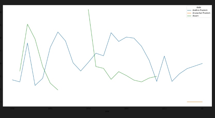
grp.plot.bar(figsize = (20,10)) df[['so2', 'state']].groupby(['state']).median().sort_values("so2", ascending = False).plot.bar(figsize=(20,10))


Log in or sign up for Devpost to join the conversation.