Inspiration
We were inspired by a data visualization project created by PhD students working with Dr. Zhao (KSU). This project focused primarily on visualizing x-ray data taken from material samples and allowed a user to interact with the data in many ways.
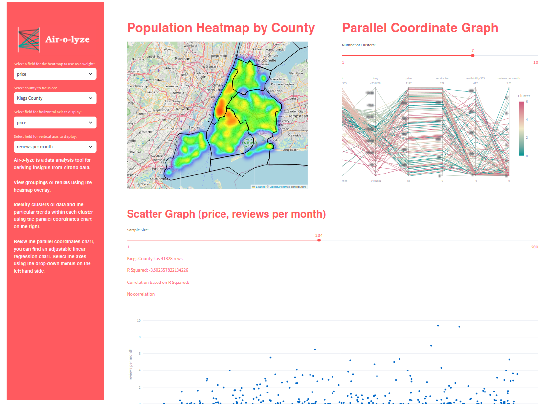
What it does
Air-o-lyze allows a user to view Airbnb rental data within the state of New York. The dataset we were provided with only contains data for New York City, but our project can support any data within the state of New York. Users can view heatmaps to see how the rentals are distributed across the state, and may interact with various plots to gain specific insights from the data as needed.
How we built it
We used Python with Pandas, Geopandas, Scikitlearn, Streamlit, and Folium.
Challenges we ran into
Getting the map functionality to work was difficult. We ran into a lot of issues with getting the map display to successfully communicate with the back-end.
Accomplishments that we're proud of
We feel that our interface is attractive and easy-to-use, and that it will help users identify trends in Airbnb rentals.
What we learned
We learned a lot about analyzing geographical data in Python, as well as producing interactive charts.
What's next for Air-o-lyze
We plan to make Air-o-lyze more dynamic, allowing it to support more data from more sources, across more states and countries.


Log in or sign up for Devpost to join the conversation.