-
-
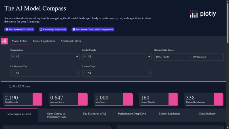
Dashboard UI
-
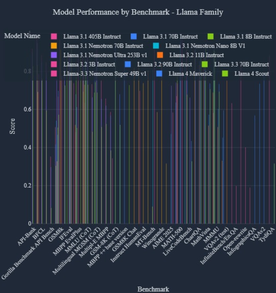
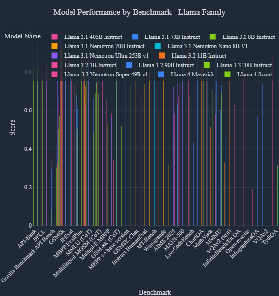
Generational Leap Bar Chart
-
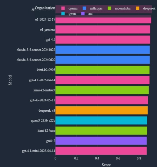
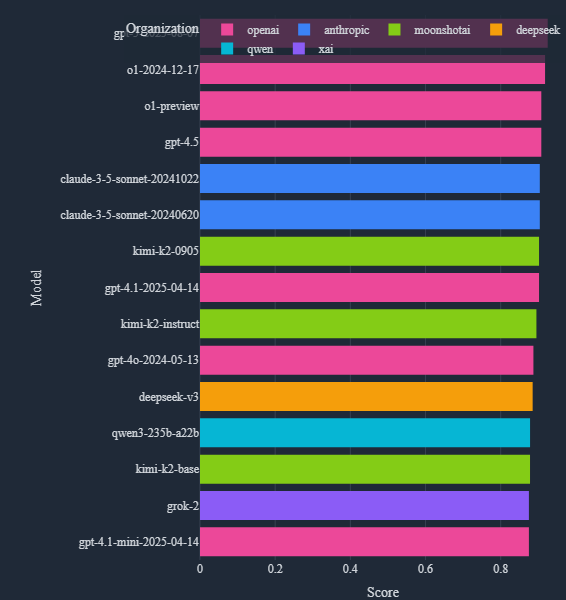
Benchmark Leaderboard
-
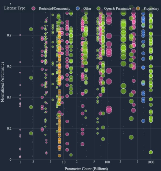
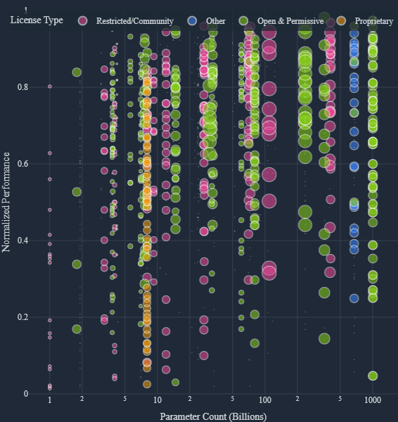
Parameter Count vs Performance
-
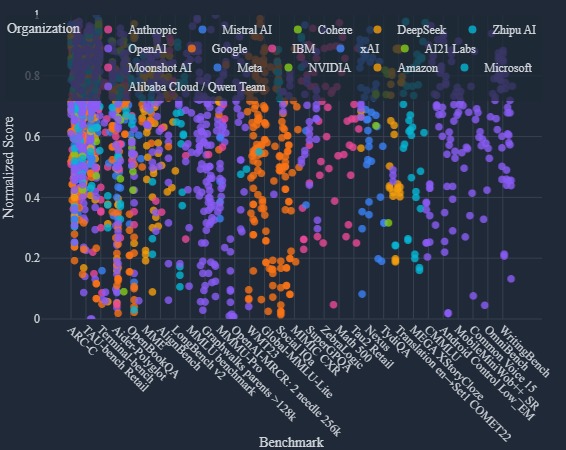
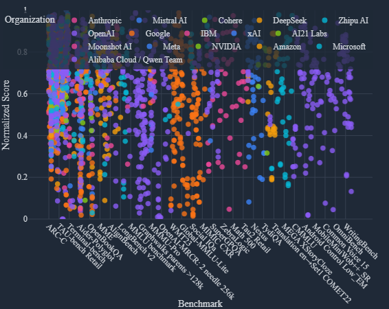
Model Performance Comparison
-
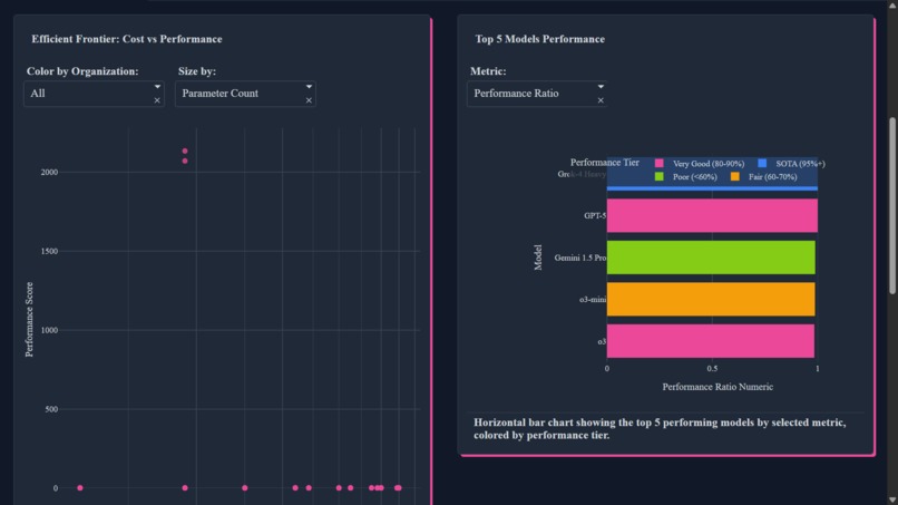
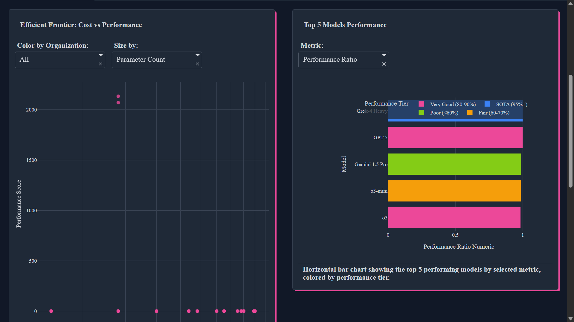
Dashboard view
-
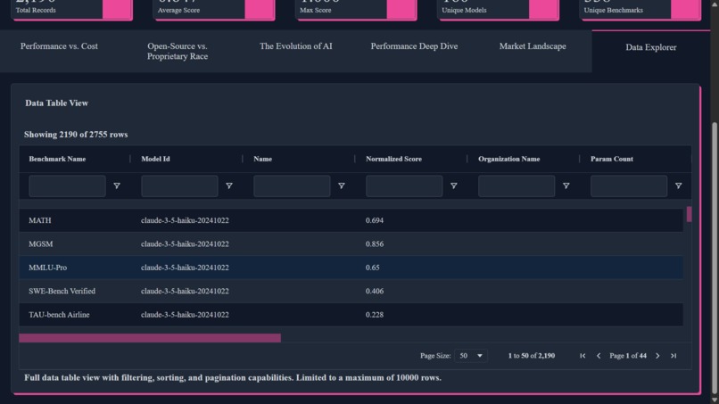
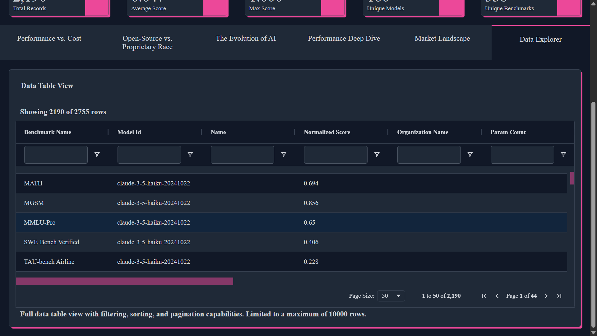
dataset view
What Inspired Me
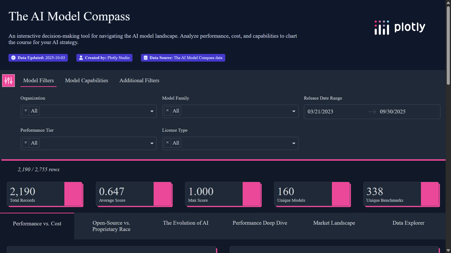
The inspiration for "The AI Model Compass" came from a challenge I believe every developer, CTO, and business leader faces today: navigating the overwhelming complexity of the AI model landscape. The market is saturated with hundreds of models, each with its own set of performance benchmarks, pricing structures, and licensing agreements. Making a data-driven decision is critical, as the choice of model can impact everything from product performance to budget allocation. I realized there was a need for a clear, interactive tool that could cut through the noise and empower users to compare models on the metrics that matter most to them. I wanted to build not just a static leaderboard, but a dynamic decision-making engine that could answer critical business questions like, "What is the most cost-effective model for my specific coding task?" or "How has the open-source ecosystem kept pace with proprietary models over the last year?"
What I Learned
This project was a journey of discovery on two fronts: technology and data-driven storytelling.
First, I learned the incredible power and speed of Plotly Studio's agentic workflow. The ability to go from a raw, complex CSV file to a functional, multi-tab Dash application in minutes was transformative. My development process shifted from writing boilerplate code to having a conversation with the AI, using natural language to refine layouts, add interactive controls, and generate sophisticated visualizations. This allowed me to focus my energy on the most important part of the project: uncovering and communicating insights.
Second, diving deep into the data revealed fascinating and non-obvious narratives about the AI industry. I learned that a model's performance isn't just about its score; factors like the cloud provider can impact latency and cost. I quantified the "algorithmic progress" in the industry, visualizing how newer, smaller models are now outperforming older, much larger ones. By engineering new features from the raw data, I was able to tell compelling stories about the competitive race between open-source and proprietary ecosystems and even map the geopolitical landscape of AI development.
How I Built It
"The AI Model Compass" was built entirely within the Plotly Studio ecosystem, leveraging its AI-native capabilities from start to finish.
Data Preparation: The process began with extensive data cleaning and feature engineering on the initial dataset. I created new, more insightful columns, such as a unified cost metric calculated as a weighted average: $Cost_{IO} = 0.25 \times Cost_{Input} + 0.75 \times Cost_{Output}$. I also engineered categorical features for model size and license types to fuel the visualizations.
Initial App Generation: I uploaded the cleaned dataset into Plotly Studio. Its AI agent immediately analyzed the data and generated a multi-page Dash application, providing a robust foundation with over half a dozen charts and interactive controls.
Iterative Refinement: From there, I used natural language prompts to sculpt the initial draft into the final application. I issued commands like, "Create a new tab named 'Evolution of AI'," "On that tab, change the scatter plot to an animated plot with
release_year_monthas the animation frame," and "Add a dropdown to the 'Performance vs. Cost' tab to filter by benchmark category." This conversational approach to development was both rapid and intuitive.Deployment: Once the application was complete, I used Plotly Studio's one-click deployment feature to publish it directly to Plotly Cloud, making it instantly shareable.
Challenges I Faced
The primary challenge was not in the coding, but in the data and the narrative.
Data Complexity: The initial dataset, while rich, was not immediately usable. It contained duplicate entries, missing values, and required significant preprocessing to be ready for analysis. The most time-consuming part of the project was the initial data wrangling phase—deduplicating records, imputing missing values, and creating the engineered features that would ultimately power the application's core insights.
Crafting the Narrative: The second major challenge was designing a user experience that told a clear and compelling story. It wasn't enough to just display charts; I had to structure the application into distinct analytical narratives that would guide a user from a high-level overview to specific, actionable conclusions. Choosing the right combination of plots for each narrative—like pairing an interactive scatter plot with a treemap and a bar chart for the cost-performance analysis—required careful thought to ensure the visualizations were complementary and not overwhelming.

Log in or sign up for Devpost to join the conversation.